")


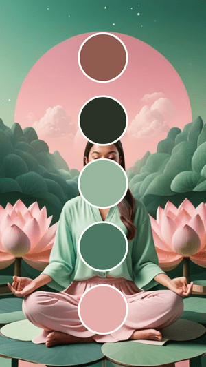
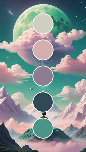
If you’ve been scrolling through endless color palette inspiration feeling like everything looks the same, here’s your friendly nudge to consider something totally unexpected: pink and green together.
I know what you’re thinking – “Pink and green? Isn’t that a bit… much?” Trust me, I had the same reaction at first. But here’s the thing: this color combination has been quietly revolutionizing modern branding, and once you see why it works so well, you’ll wonder why more people aren’t using it.
Why This “Weird” Combo Actually Works Better Than Expected
The combination of green and pink might seem unconventional at first glance. But here’s something I’ve learned from working with dozens of brands: the most memorable palettes aren’t always the most obvious ones.
This dynamic duo has been making waves in contemporary design because it does something most color combinations can’t. It creates what we call “balanced tension” – professional enough to build trust, but playful enough to stand out.
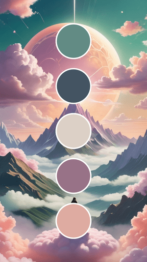
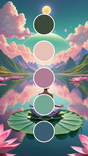
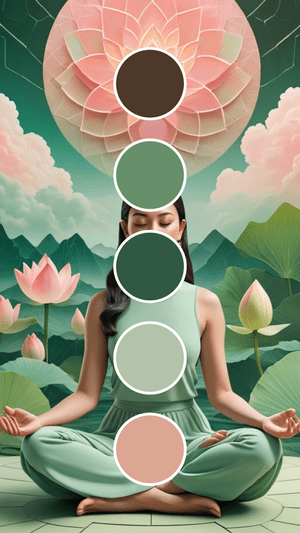
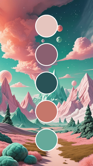
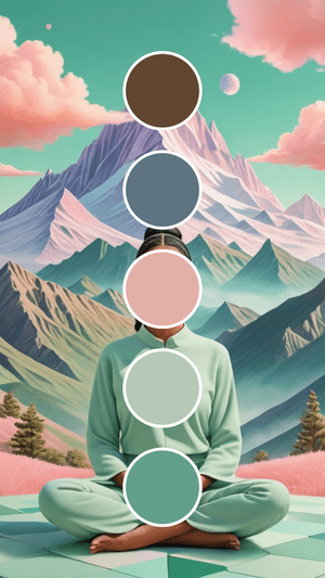
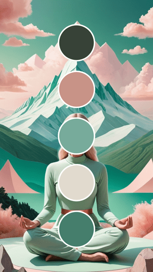
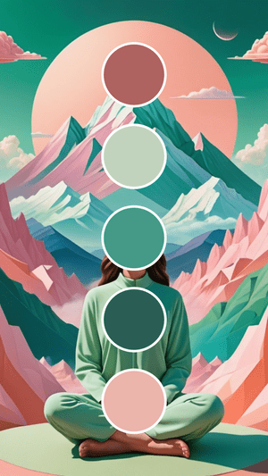
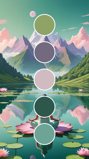
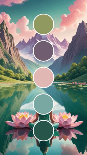
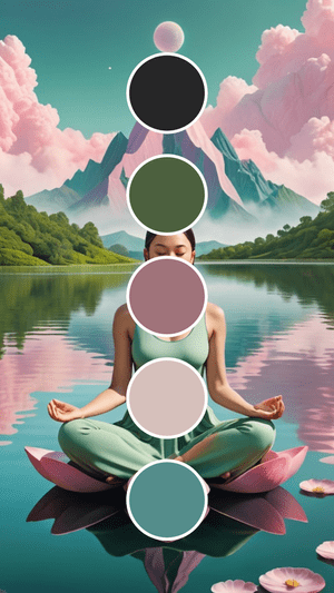
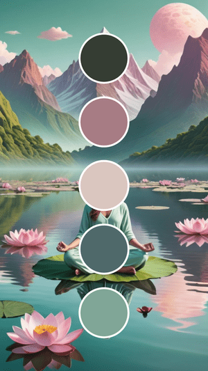
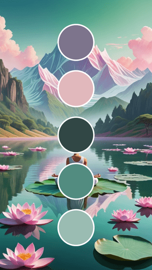
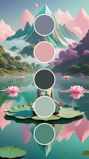
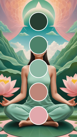
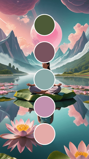
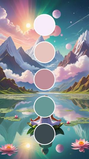
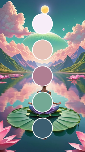
Nature figured this out long before we did. Think cherry blossoms against spring leaves, or watermelon flesh against its rind. These aren’t accidents – they’re proof that pink and green create something special together.
This pairing brings together green’s natural trustworthiness with pink’s warm approachability. It’s like having a business partner who’s both reliable and genuinely fun to work with.


The Secret Psychology Behind These Colors
Here’s something most entrepreneurs don’t realize: your colors are working for you (or against you) before people even read your first word. Color psychology isn’t just design theory – it’s your secret weapon for instant connection.
What Green Tells Your Customers
Green whispers powerful messages to your audience:
- Growth and renewal – perfect if you help people transform their lives
- Balance and harmony – ideal for wellness or stress-relief businesses
- Nature and sustainability – essential for eco-conscious brands
- Wealth and abundance – great for financial or luxury services
- Health and vitality – must-have for anything wellness-related
What Pink Brings to the Table
Pink speaks directly to the emotional side of decision-making:
- Nurturing and compassion – exactly what service businesses need
- Youth and playfulness – fantastic for brands that aren’t stuffy
- Romance and tenderness – perfect for creating emotional connections
- Creativity and innovation – ideal for showing your imaginative side
- Energy and confidence – essential for empowerment-focused businesses
The Magic When They Work Together
When you combine these colors, something interesting happens. You get a palette that feels both professional and approachable. It tells your audience, “I’m serious about results, but working with me won’t be boring.”
This works especially well if you’re trying to stand out in a crowded market (and honestly, who isn’t these days?).
Perfect Industries for Pink + Green Palettes
This color combination works across more industries than you might expect. Here’s where I’ve seen it create real impact:
Beauty and Wellness Brands
Beauty and cosmetics companies love this combo because it feels natural and feminine without being too girly. Wellness and health food brands use it to show both natural benefits and caring support.
Sustainable and Eco-Friendly Businesses
Sustainable fashion brands find it perfect for showing environmental values while keeping things stylish. Plant-based product companies get the nature connection from green, while pink adds warmth that all-green palettes sometimes lack.
Modern Service Industries
Here’s where it gets interesting: tech startups are choosing pink and green to break away from the endless sea of blue logos. It immediately says “we do things differently here.”
Children’s brands get playful energy without looking like a toy store. The sophistication appeals to parents while the fun factor delights kids.
Lifestyle and Personal Brands
The wedding industry has embraced this palette for couples wanting fresh and romantic (but not traditionally feminine). Health and wellness coaches find it perfectly balances natural wellness with nurturing support.
Organic skincare brands use it to emphasize both natural ingredients and gentle results.
How to Make Pink + Green Work for Your Specific Brand
The key isn’t just throwing any pink with any green and hoping for the best. (I’ve seen some combinations that… well, let’s just say they didn’t work out as planned.)
Start with your brand personality. Are you more sophisticated or playful? Dusty rose with sage green feels completely different from hot pink with lime green, even though they’re the same color families.
Consider your specific audience. A wellness brand targeting busy moms might lean into softer shades, while a tech startup might choose more vibrant versions.
Think about balance. Often, one color becomes your primary while the other serves as an accent that makes everything pop.
Here’s something I’ve learned the hard way: test your colors with real people, not just other business owners. What feels “too bold” to you might be exactly what makes potential customers stop and pay attention.
Your Next Step (Because Pretty Colors Won’t Market Themselves)
Take an honest look at your current brand colors. Do they tell the story you actually want to tell? Do they make people feel excited to work with you?
If you’re feeling stuck with safe, forgettable colors, consider this your permission to be bold. You don’t need a complete rebrand to get started. Pick one place – maybe your social media graphics or email headers – and test a pink and green combination.
Remember, you don’t need the perfect palette to begin. The most important thing is to start with something that feels right for your brand. You can always refine it later (and honestly, most successful brands evolve their colors over time anyway).
Choose wisely, but don’t overthink it. Each palette tells a story and communicates your personality before you say a word. Test thoroughly with your actual audience, and don’t be afraid to break conventional rules.
What if this time next month, you had colors that made potential customers stop scrolling and actually notice your brand? That made them feel both confident in your expertise and excited to work with you?
These possibilities are absolutely within your reach. You just need to take that first step and try something beautifully unexpected.

-high fidelity-3x")


")
