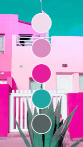
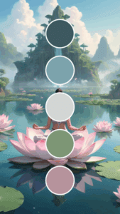
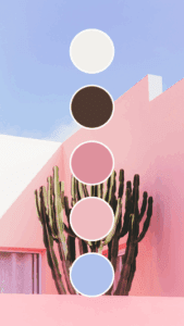
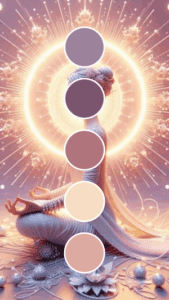
Ever noticed how you instantly recognize certain brands just by their colors?
Think about that distinctive red and yellow combo that makes you suddenly crave fries, or that teal blue that signals your coffee fix is just around the corner.
That’s not an accident – it’s the power of strategic color selection at work.
If you’ve been putting off developing a proper color strategy for your brand, consider this your friendly nudge to finally make it happen.
Your colors aren’t just decorative elements – they’re powerful communication tools that work even when words don’t.
Why Colors Matter More Than You Think
Let me cut straight to it – color does way more heavy lifting for your brand than most business owners realize. Here’s what the right color palette actually does for you:
- Triggers emotional responses in your audience without saying a word (imagine trying to create “trust” with a bright orange bank logo)
- Builds recognition so customers can spot you from a distance or while scrolling quickly
- Communicates your values before anyone reads a single word of your content
- Influences purchasing decisions – studies show color can account for up to 85% of why someone chooses one product over another
- Creates inclusion when thoughtfully designed with accessibility in mind
I used to think color selection was just about picking what “looked nice.” Then I watched a client completely transform their conversion rates by switching from an aggressive red call-to-action button to a calming blue one that better matched their wellness brand values. The difference was immediate and measurable.
The Psychology Behind Color Choices
Before jumping into the tools, let’s talk about what different colors typically communicate. While cultural differences exist, these associations tend to hold true across many markets:
- Red: Energy, passion, urgency, excitement
- Blue: Trust, dependability, tranquility, professionalism
- Green: Growth, health, prosperity, environmental consciousness
- Yellow: Optimism, clarity, warmth, attention
- Purple: Creativity, wisdom, luxury, quality
- Orange: Friendliness, confidence, cheerfulness, innovation
- Black: Sophistication, authority, elegance, exclusivity
- White: Simplicity, cleanliness, purity, minimalism
Think about what emotions you want your customers to feel when they interact with your brand. Need them to take quick action? Red might work well. Building long-term trust relationships? Consider blue tones.
6 Practical Tools to Find Your Perfect Brand Colors
Let’s explore some fantastic tools that’ll help you develop colors that align with your brand personality without needing a design degree.
1. Adobe Color
Adobe Color works like your personal color consultant, helping you create harmonious schemes that look professional and intentional.
What makes it valuable:
- Extract colors directly from your inspirational images (that sunset that captures your brand vibe? Turn it into your palette!)
- Check your palette for accessibility issues so everyone can engage with your brand
- Seamlessly use your colors across the Adobe ecosystem if you’re already working there
Start by uploading a photo that represents the feeling you want your brand to evoke. The tool will extract a perfect palette that captures that essence.
2. Coolors
When you’re short on time but need quality results fast, Coolors is the tool to turn to.
Why you’ll find it helpful:
- Generate complete color schemes with a simple spacebar tap
- Check how your colors appear to people with different types of color blindness
- Save and organize your favorites for future projects and brand evolution
Pro tip: Use their contrast checker to make sure your text remains readable against your background colors. Nothing drives customers away faster than content they struggle to read!
3. Canva Color Palette Generator
Already have a photo that perfectly captures your brand’s personality? Let Canva turn it into your color palette.
What sets it apart:
- Creates palettes directly from your existing brand photos or inspiration images
- User-friendly interface that requires zero technical knowledge
- Direct integration with Canva’s design platform for quick implementation
This is perfect if you already have a strong visual identity but haven’t formalized your color scheme yet.
4. Paletton
For those who want more precise control over color relationships, Paletton offers depth without overwhelming complexity.
Standout features:
- Provides various color harmony models (complementary, triad, etc.) to ensure balanced designs
- Shows how your palette will look in real-world website contexts before you commit
- Allows fine-tuning of brightness, saturation, and other attributes across your entire palette
The website preview feature alone can save you from investing in colors that don’t work well together in practice.
5. ColorSpace
Need fresh inspiration? ColorSpace uses AI to generate unique combinations you might not have considered.
Why it’s worth trying:
- Creates unexpected color relationships that stand out from competitors
- Generates beautiful gradients perfect for modern digital branding
- Offers multiple export options to seamlessly share with your team
I’ve seen businesses completely refresh their look using ColorSpace’s innovative suggestions when they felt stuck with the same old industry colors.
6. Khroma
Want a tool that learns your preferences? Khroma adapts to your style over time.
What makes it unique:
- Uses AI to learn which colors you’re naturally drawn to as you use the platform
- Generates endless personalized inspiration based on your preferences
- Helps organize and categorize palettes for different brand applications
This is particularly helpful if you’re building a brand with multiple sub-brands or product lines that need cohesive but distinct identities.
Putting Your Colors to Work
Once you’ve found your perfect palette, here’s how to implement it consistently:
- Document everything in a simple brand guide (hex codes, RGB values, etc.)
- Start with your website – update your site with your new palette
- Create templates for social media that use your brand colors consistently
- Update your email signature with your new brand colors
- Consider physical materials – business cards, packaging, signage
Remember that consistency is key. When customers see your colors repeatedly across different touchpoints, brand recognition grows exponentially.
Making Color Work for Your Business Goals
The best brand colors don’t just look good – they actively support your business objectives:
- Selling luxury products? Consider deep purples, golds, and sophisticated neutrals
- Marketing to children? Bright primary colors often perform best
- Promoting wellness services? Soft blues and greens create calm and trust
- Launching a tech startup? Blues with vibrant accent colors convey innovation and reliability
What if your current colors aren’t working? Don’t worry about making a gradual transition rather than an overnight rebrand. Your most loyal customers will follow along if you communicate the reasons behind the change.
Moving Forward with Color Confidence
You don’t need to be a professional designer to create a color palette that works. Start with one of these tools today, experiment with what feels right for your brand, and pay attention to how your audience responds.
The most important thing is to begin – even if you’re just selecting a primary brand color to start with. You can always expand your palette as your brand evolves.
What if this time next quarter, your brand was instantly recognizable just by its colors? That kind of visual recognition is absolutely within your reach with some thoughtful color planning today.
Now go add some strategic color to your brand world!


