")


If you’ve been playing it safe with neutral colors and wondering why your brand isn’t getting noticed, here’s something worth considering: maybe it’s time to go bold.
Maybe it’s time for yellow.
I know what you’re thinking – “Yellow? Isn’t that a bit… much?” But here’s the thing: in a world where everyone’s trying to blend in with beiges and grays, yellow makes you unforgettable.
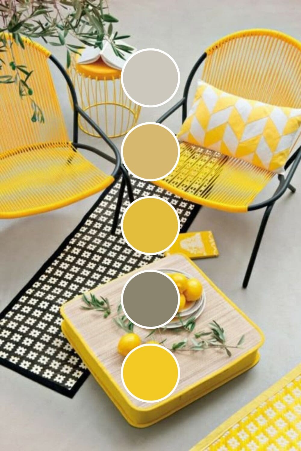
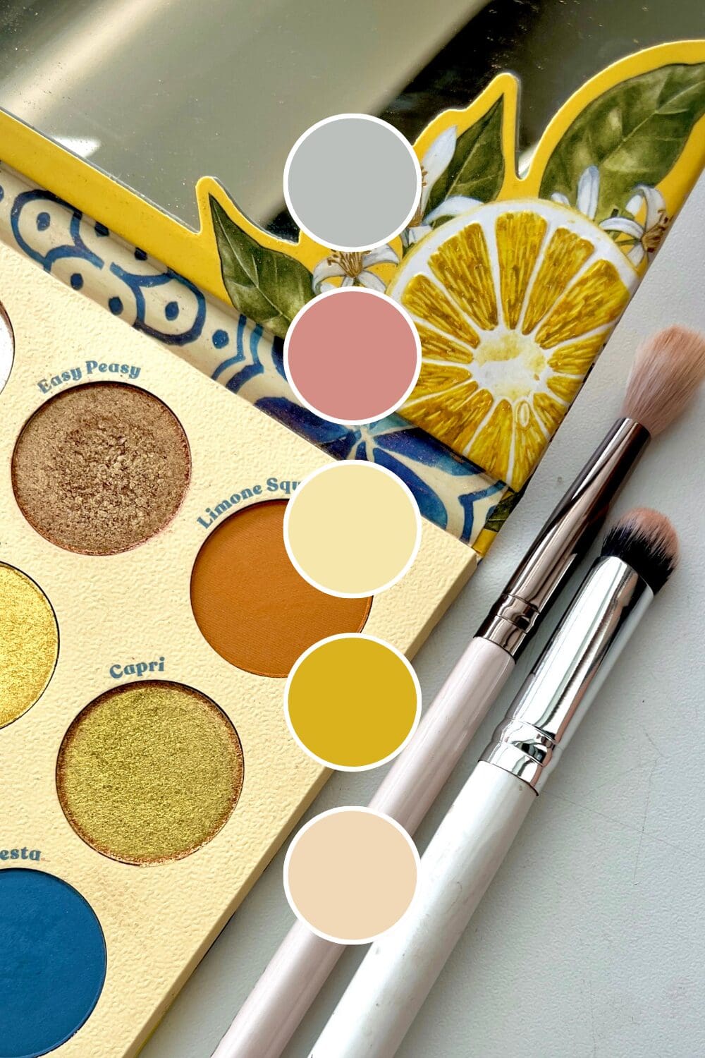
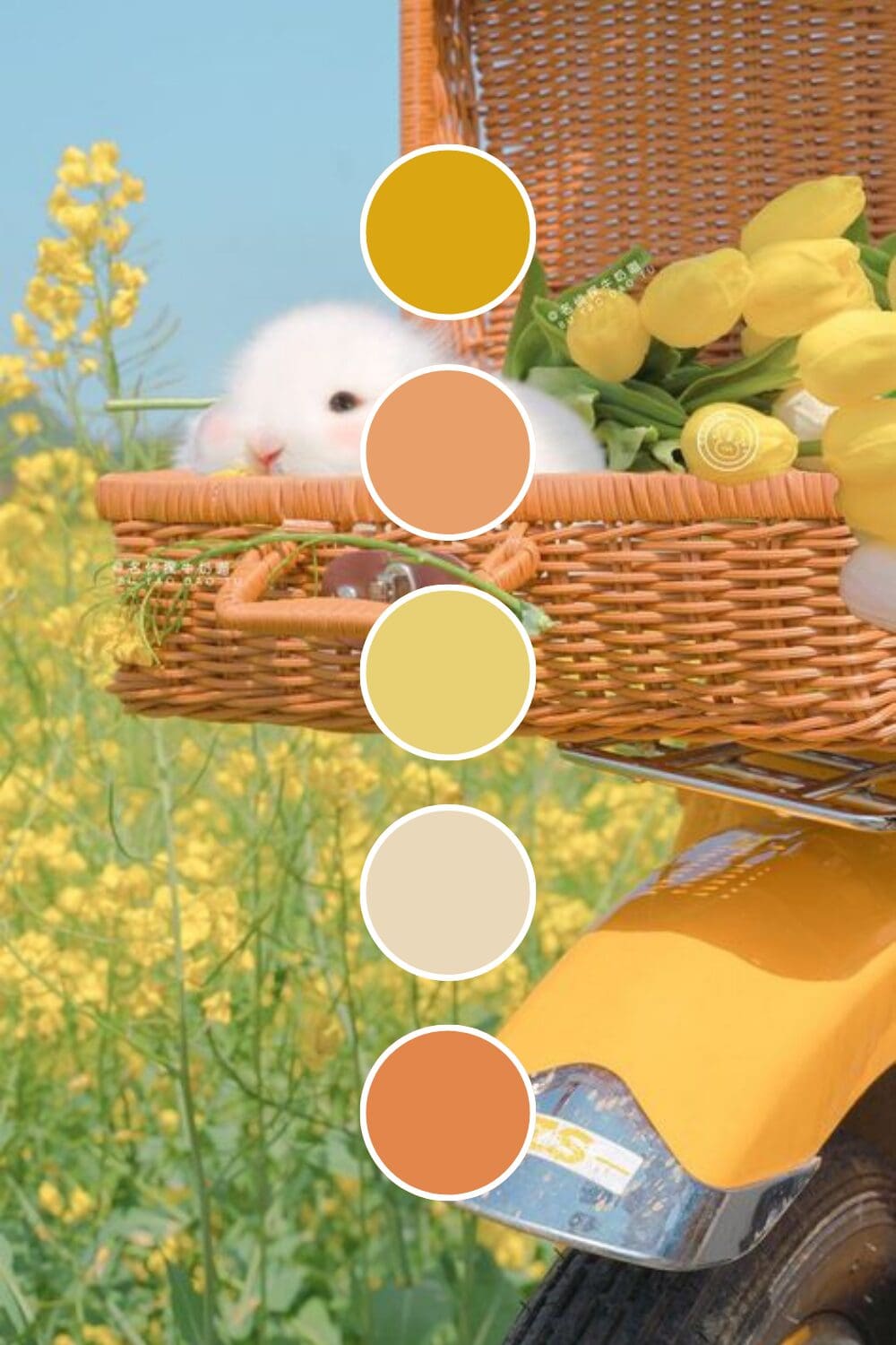
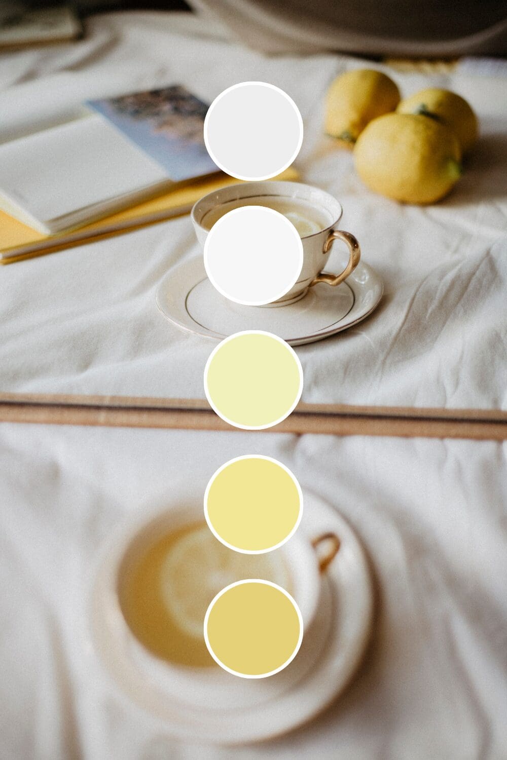
These 100 yellow color palettes will help you find that perfect combination that captures attention without overwhelming your audience.
Why Yellow Is Your Brand’s Secret Weapon
Yellow is a mood booster, an attention grabber, and a confidence builder all rolled into one.
Soft yellows feel like sunshine and optimism. They’re perfect if you’re in wellness, coaching, or education – anywhere you want people to feel hopeful and energized about their future.
Bright yellows practically vibrate with creativity and innovation. Creative agencies, design studios, and anyone in the arts often choose these because they say “we think outside the box” before you even read their bio.
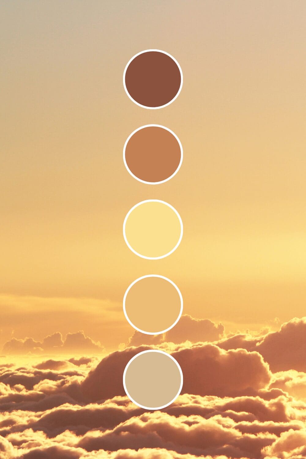
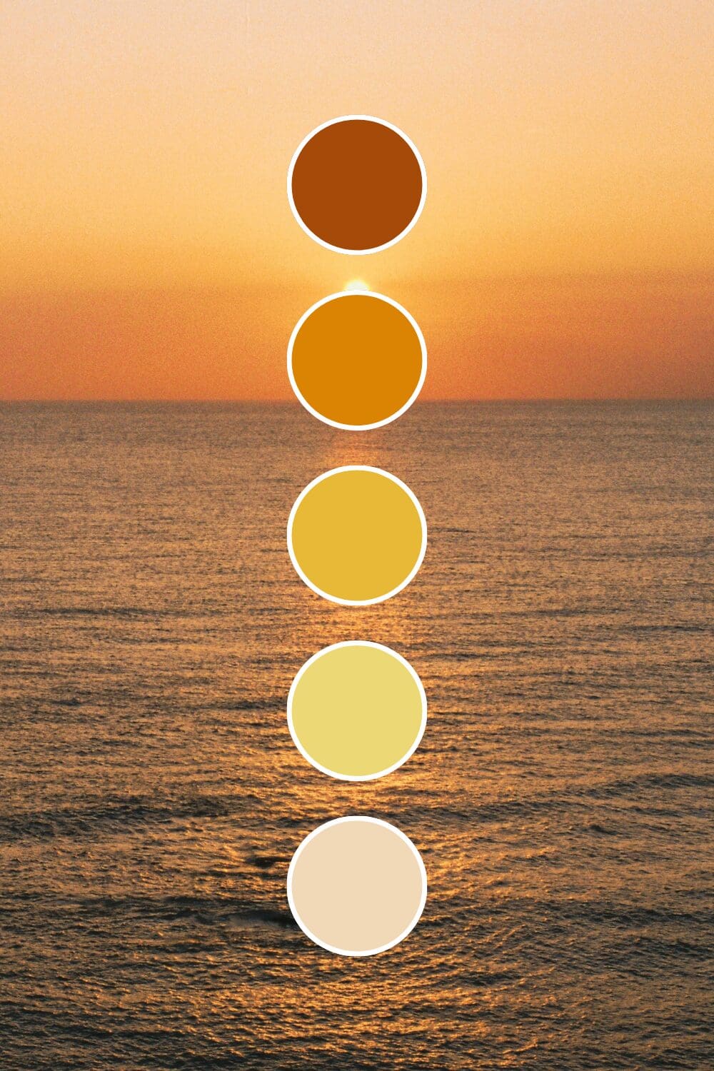
Golden yellows whisper luxury and premium quality. High-end consultants and established businesses love these because they suggest prosperity and success without being flashy about it.
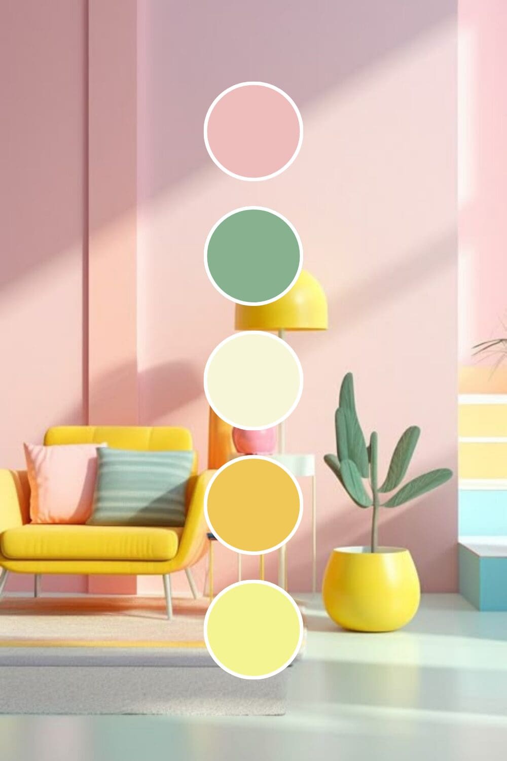
Mustard yellows bring warmth and sophistication together. They’re having a major moment right now, especially with lifestyle brands and boutique businesses.
Yellow might feel risky at first, but I promise it’s one of the most powerful tools you can use to make your brand memorable.
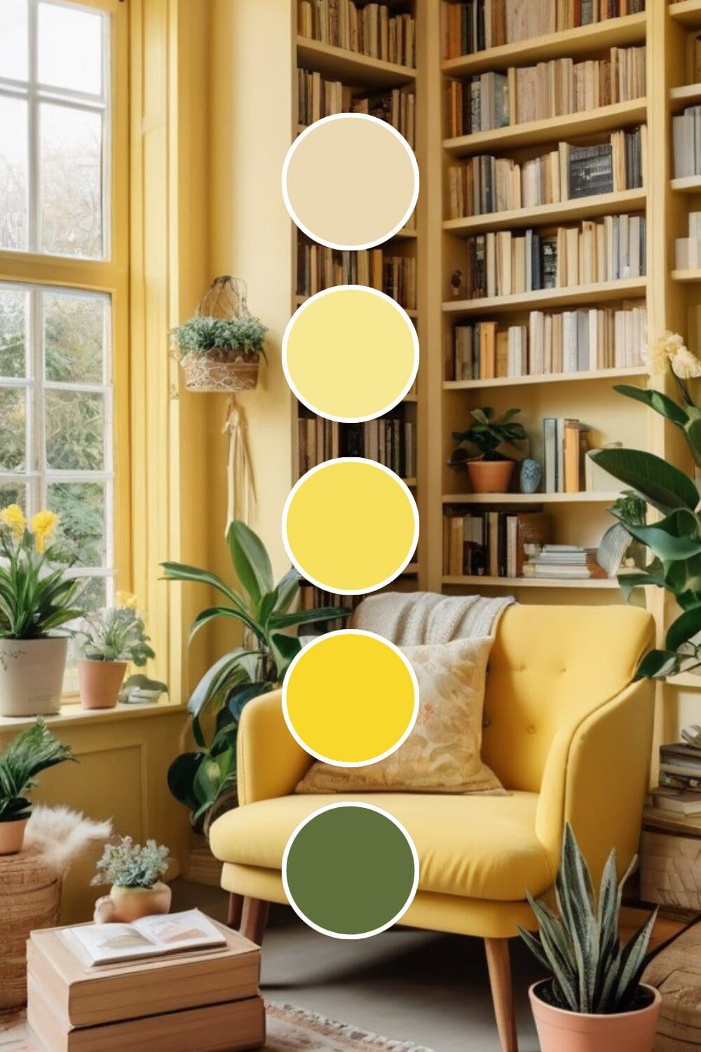
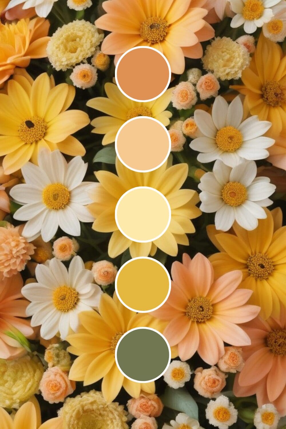
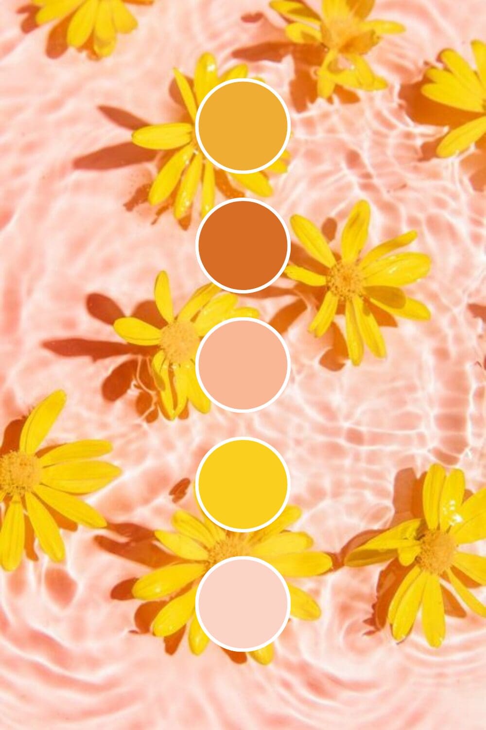
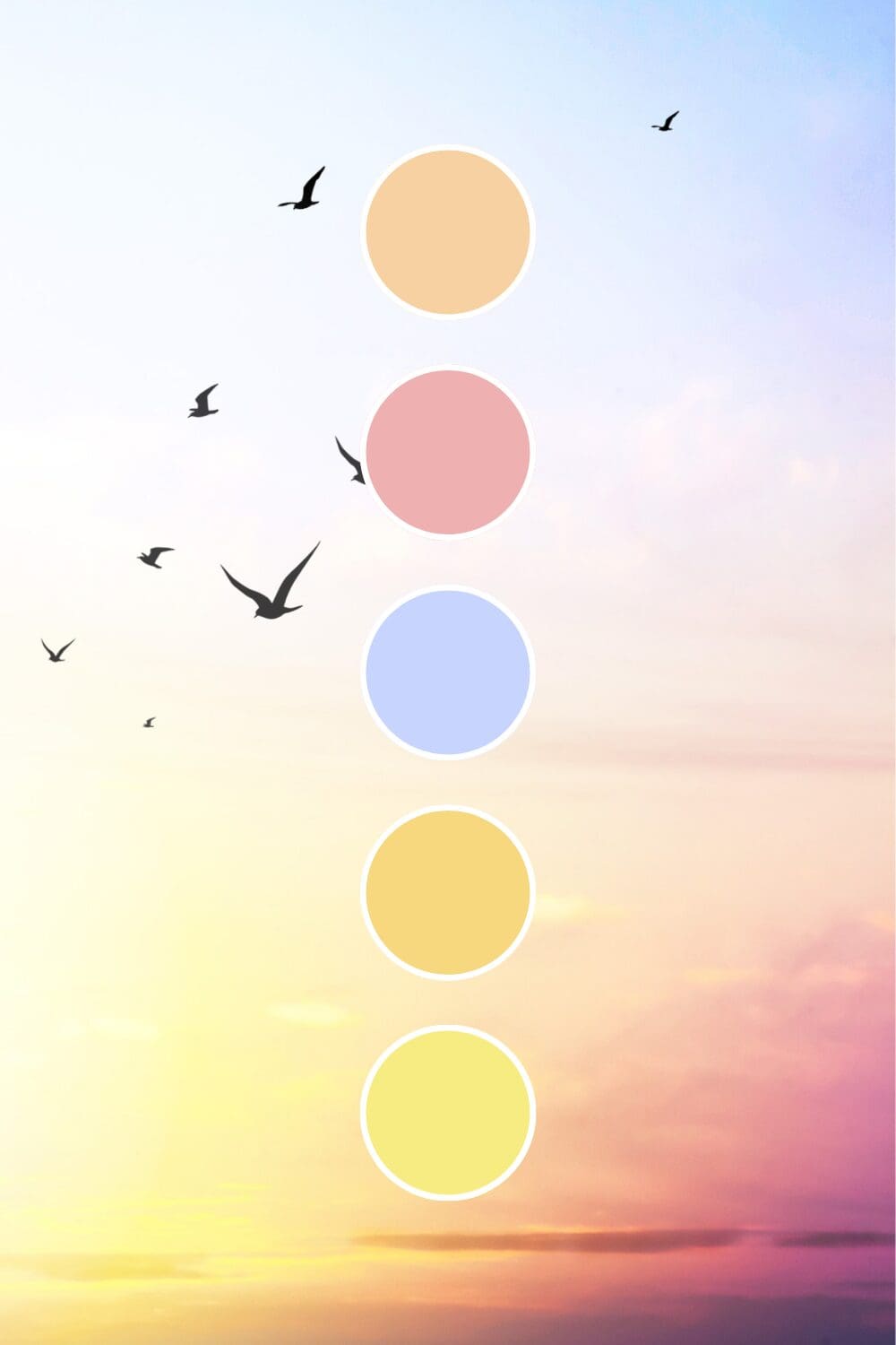
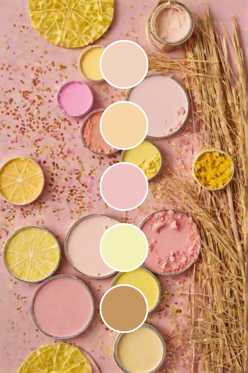
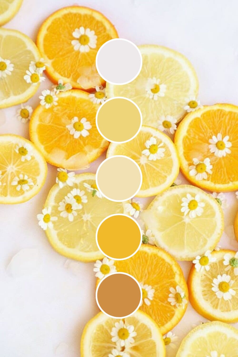
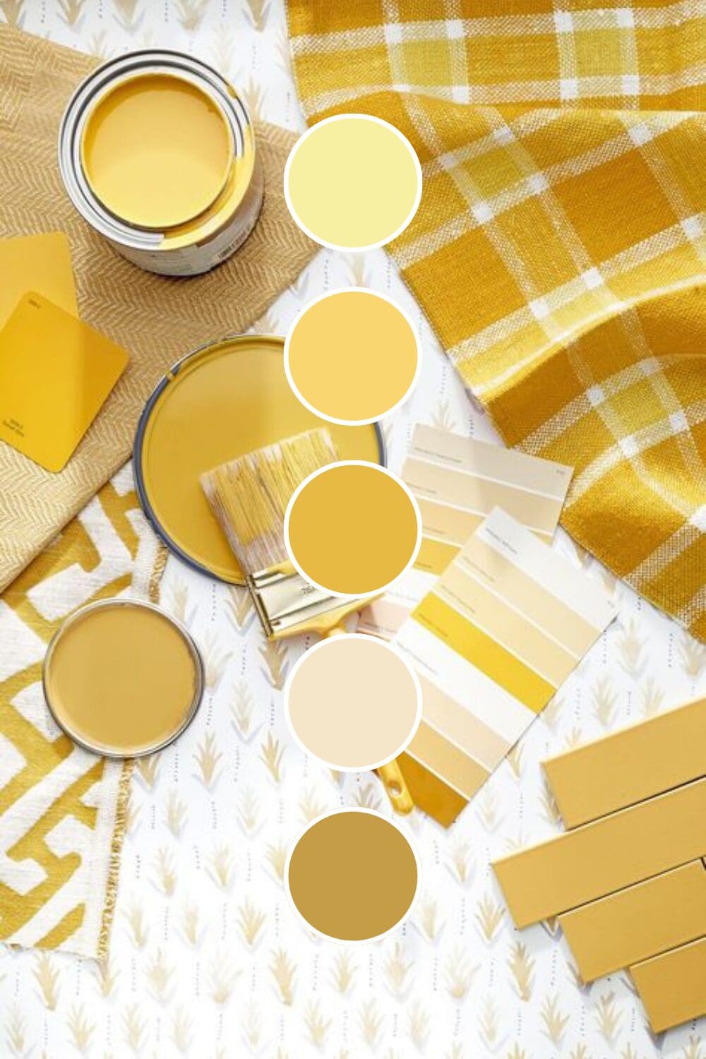
Discovering Your Perfect Yellow Shade
Yellow comes in more flavors than you might expect, and each one tells a completely different story about your business:
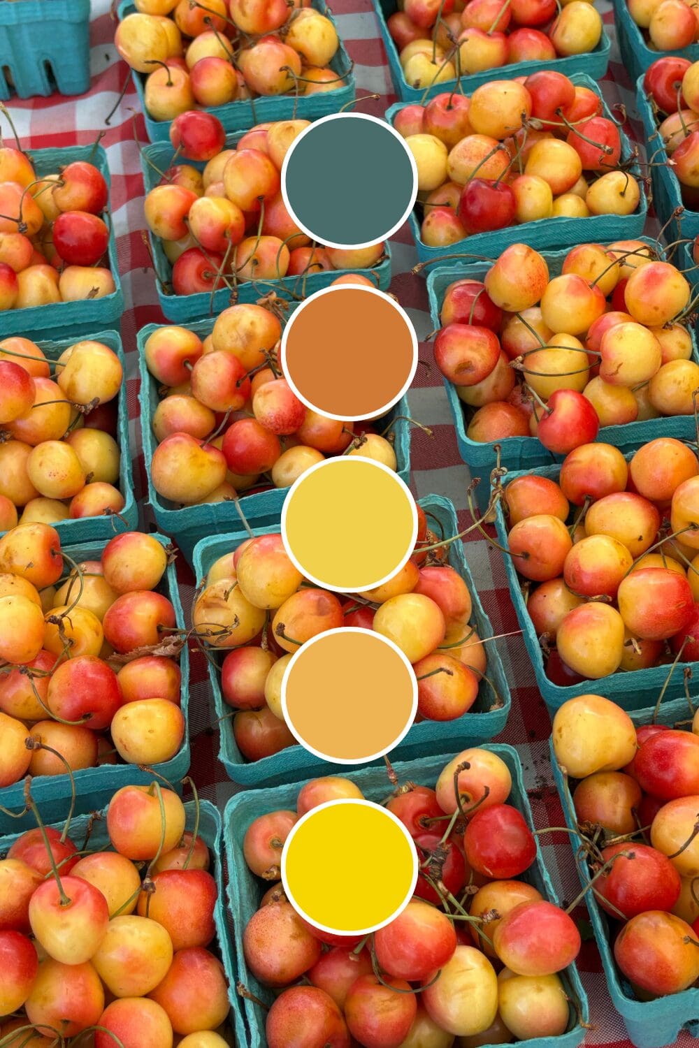
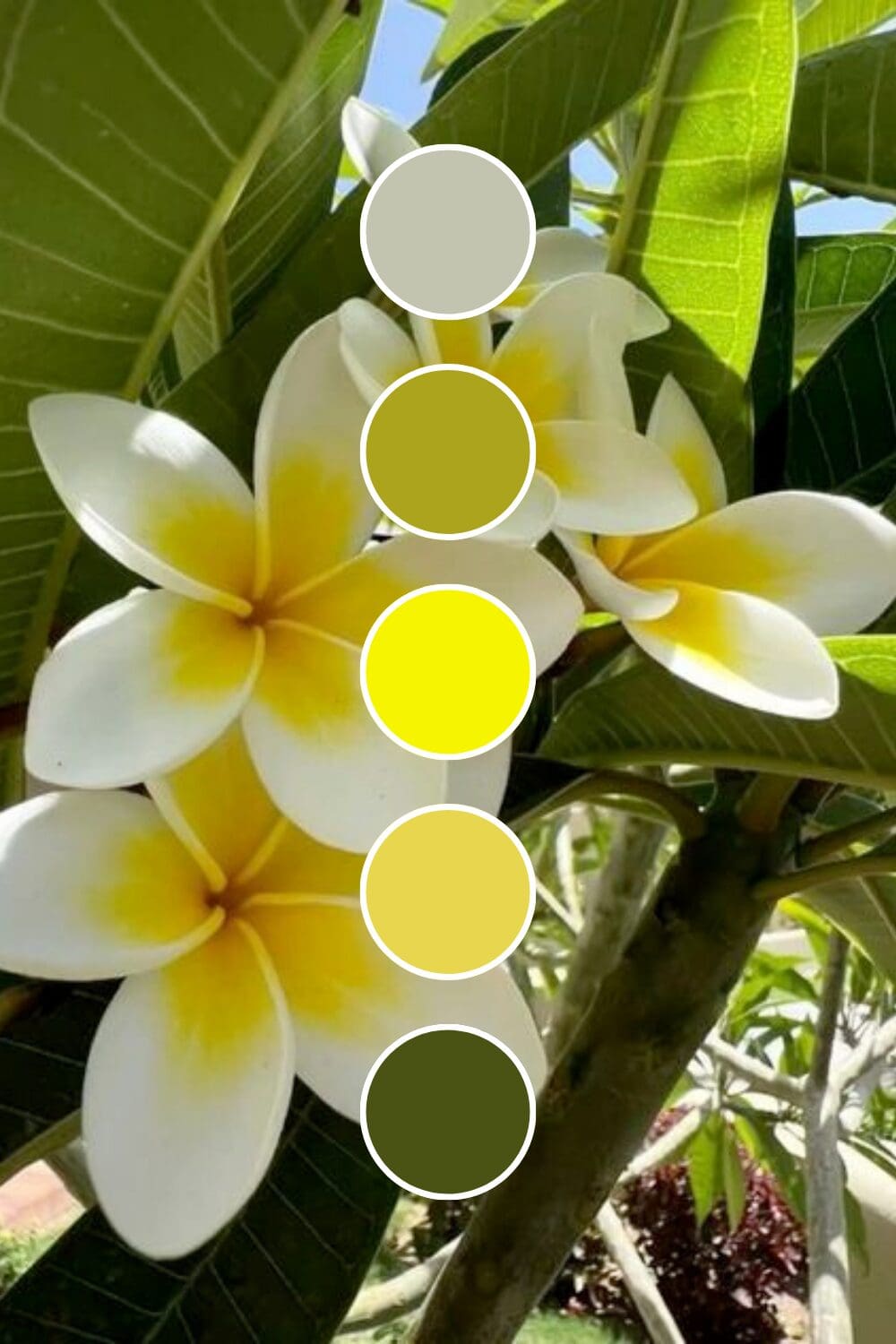
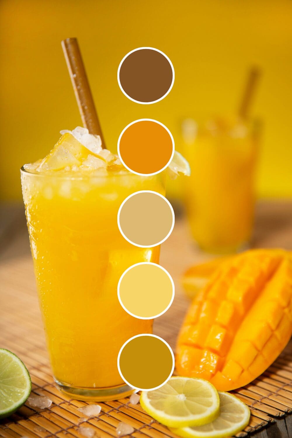
Lemon Yellow is pure energy and freshness. Fitness coaches and motivational speakers gravitate toward this because it practically radiates “let’s do this!” energy.
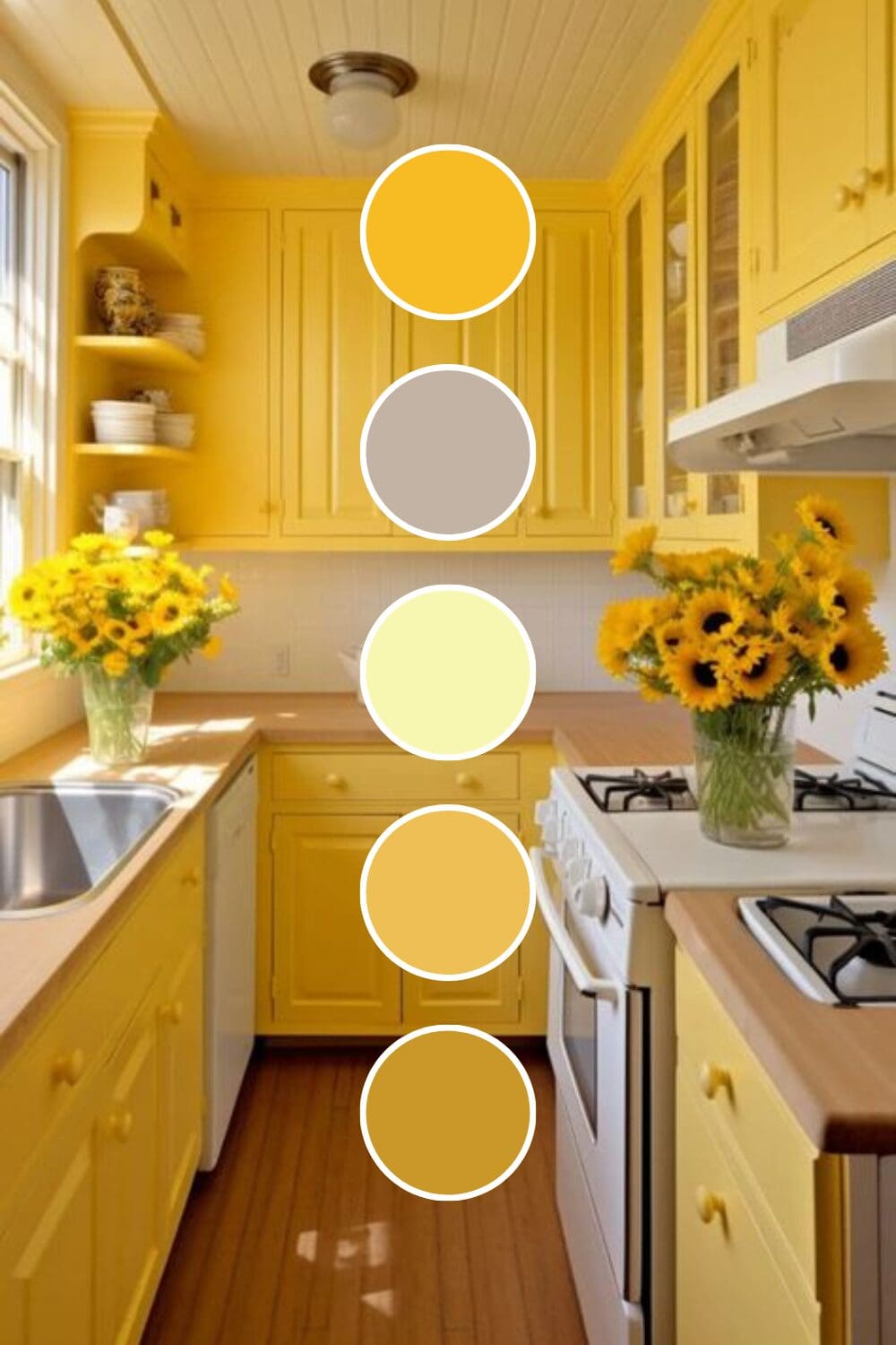
Sunshine Yellow feels approachable and warm. Life coaches and educators love this because it makes complex topics feel less intimidating.
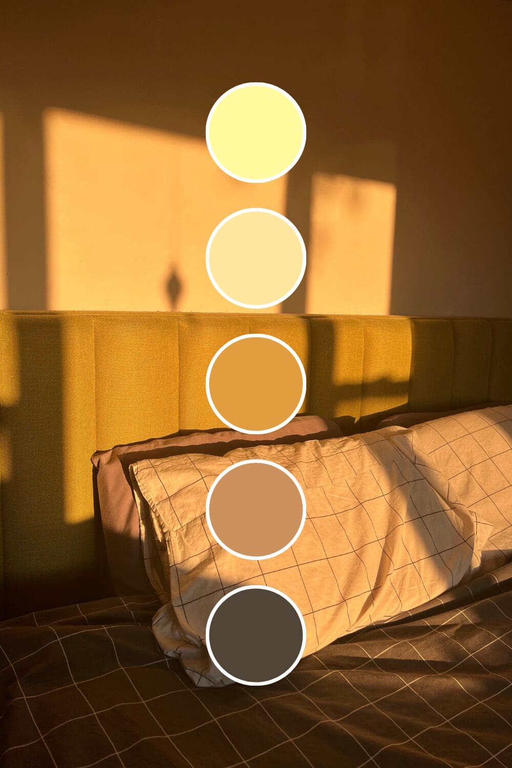
Amber Yellow suggests wisdom and established expertise. Consultants and business strategists often choose this when they want to convey years of experience.
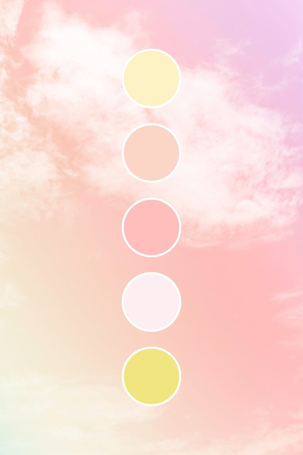
Butter Yellow brings gentle optimism without being overwhelming. It’s perfect if you want the benefits of yellow but need something a bit more subdued.
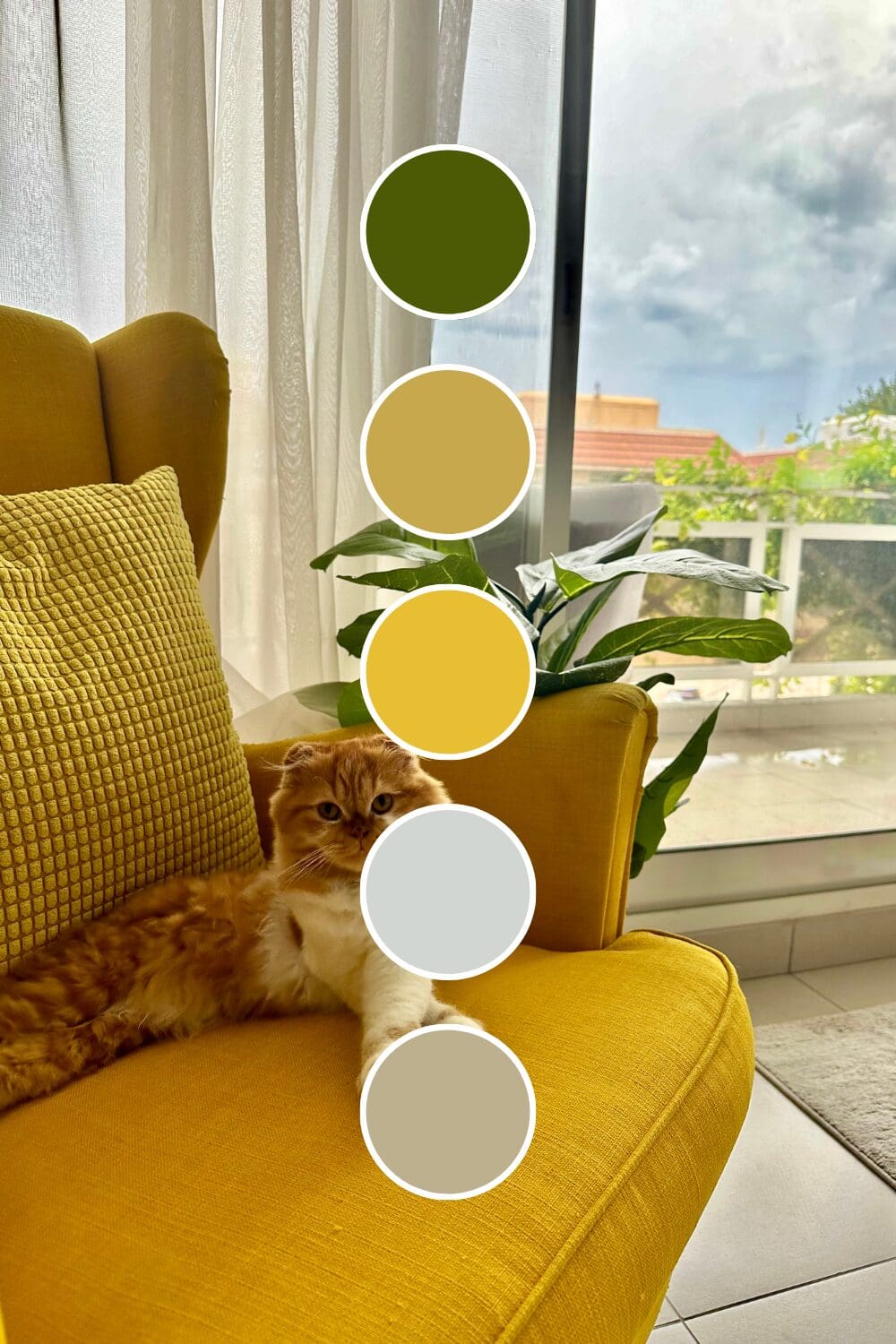
Marigold Yellow adds earthiness and authenticity. Sustainable brands and artisan businesses often choose this because it feels both natural and intentional.
Starting with one strong yellow foundation might feel bold, but it’s exactly how the most memorable brands begin their color journey. You’ve got this!
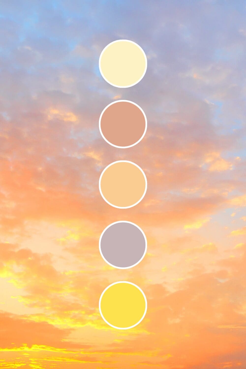
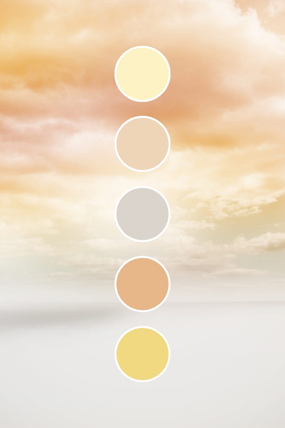
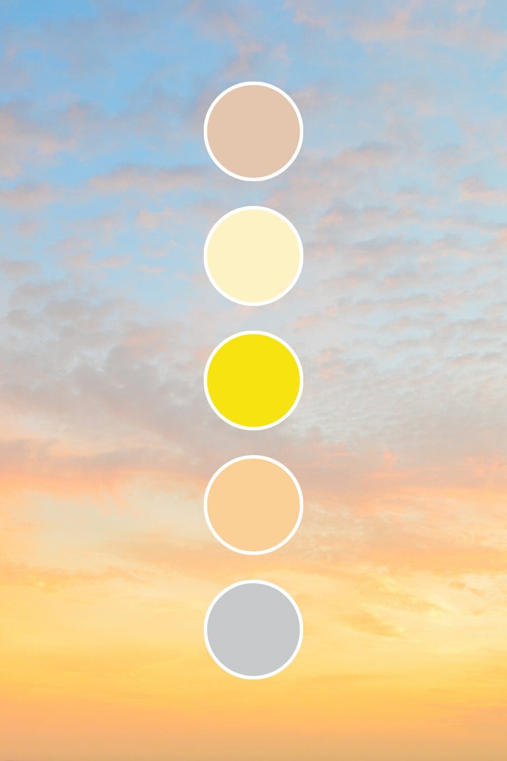
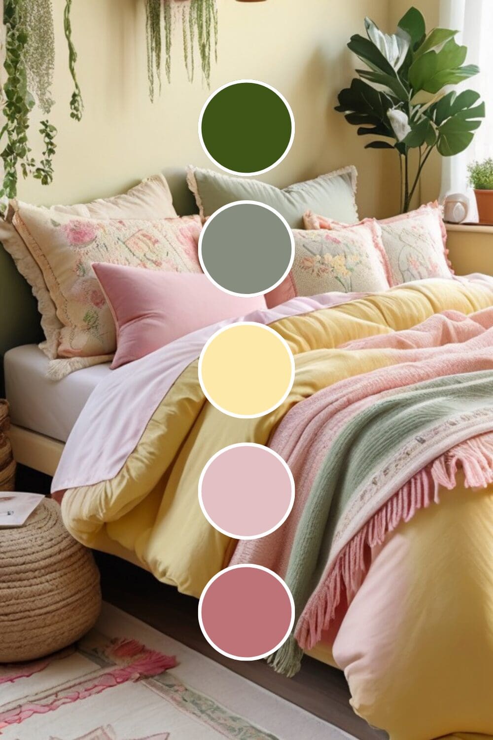
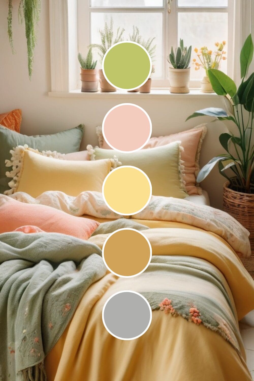
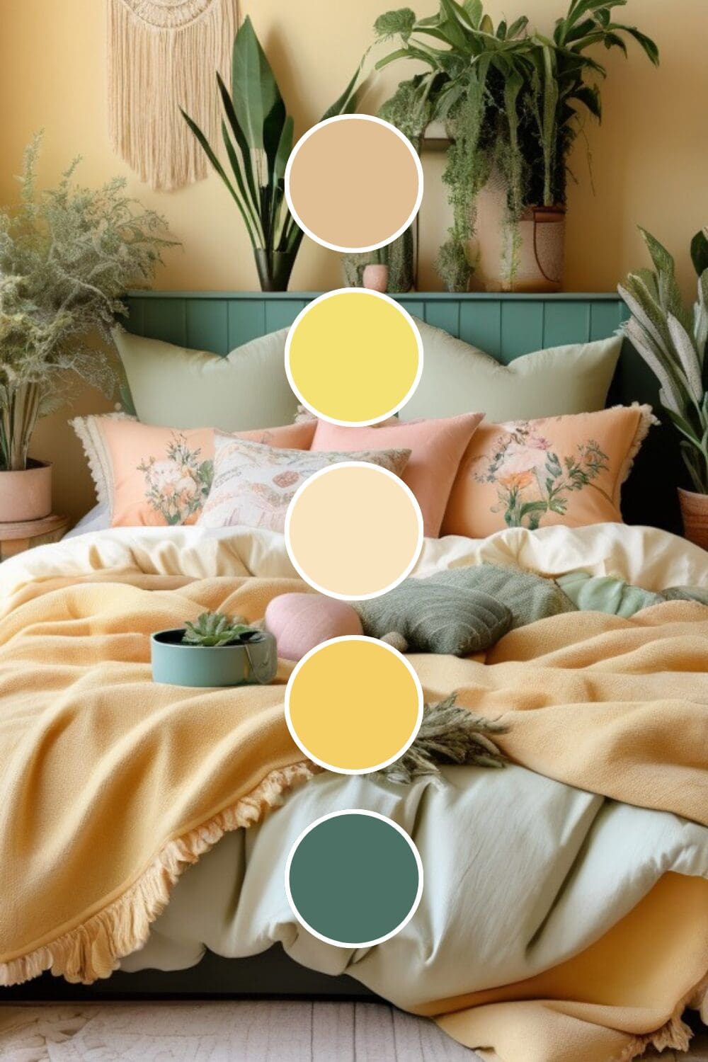
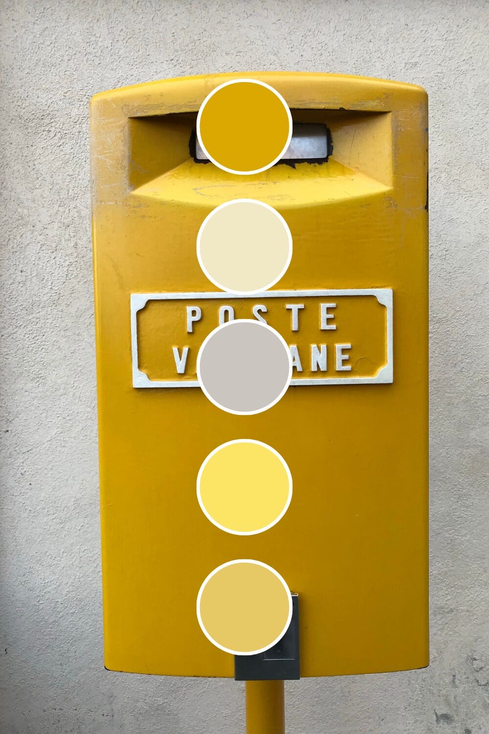
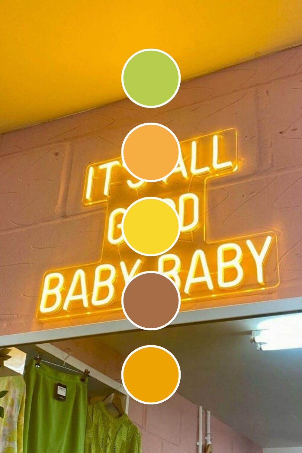
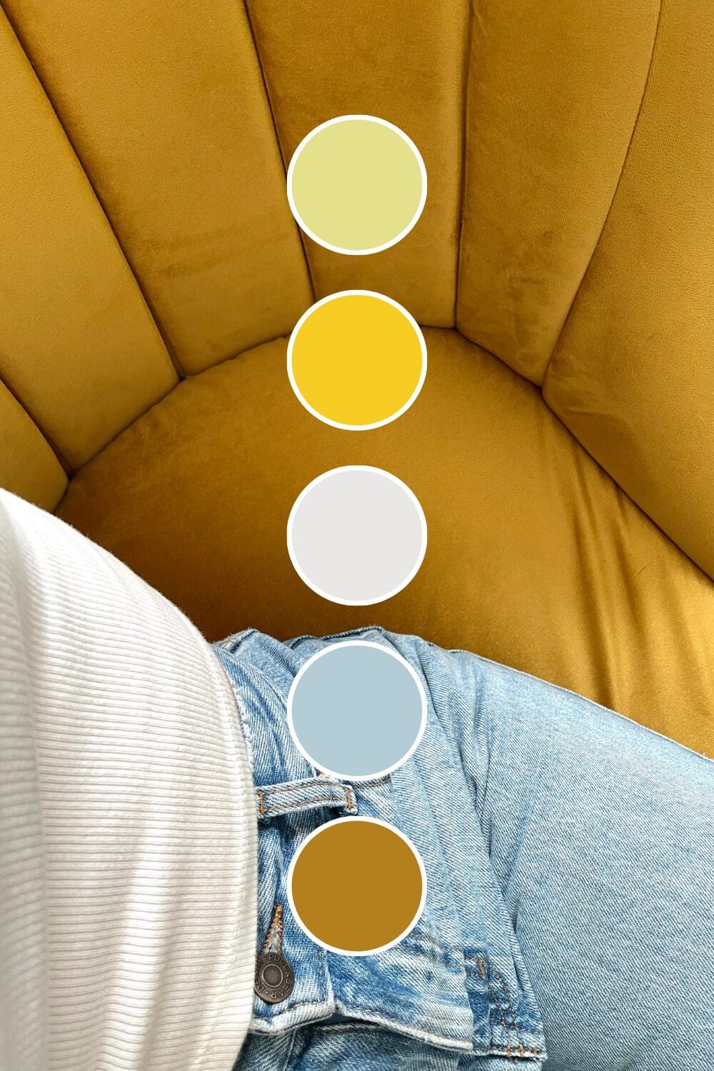
Color Combinations That Create Magic
This is where yellow really shines (pun intended). The right color combinations can make your yellow work beautifully without overwhelming anyone:
The Foolproof Favorites
These combinations have been tested by successful brands across industries:
- Yellow + Navy Blue creates the perfect balance of energy and trust – think optimistic professionalism
- Yellow + Charcoal Gray brings sophistication while keeping yellow’s playful energy
- Yellow + White feels clean and fresh (perfect for wellness and lifestyle brands)
- Yellow + Black is classic contrast that never goes out of style
The Show-Stopping Combinations
Here’s where you can really differentiate yourself (and these often perform better because they’re unexpected):
- Yellow + Deep Teal creates stunning contrast that feels both modern and timeless
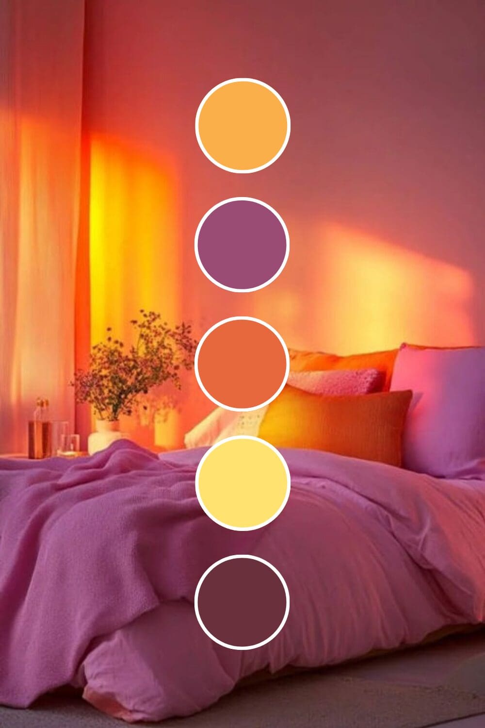
- Yellow + Burgundy brings rich warmth that suggests both creativity and luxury
- Yellow + Sage Green offers natural harmony that photographs beautifully
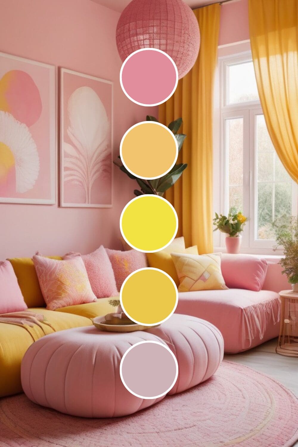
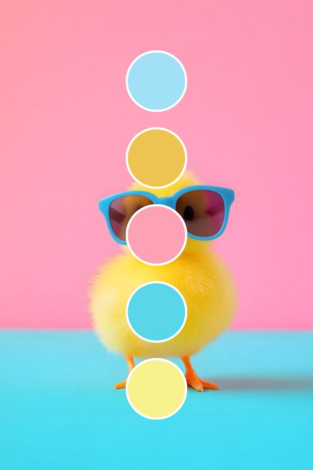
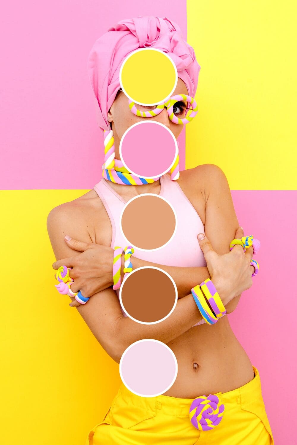
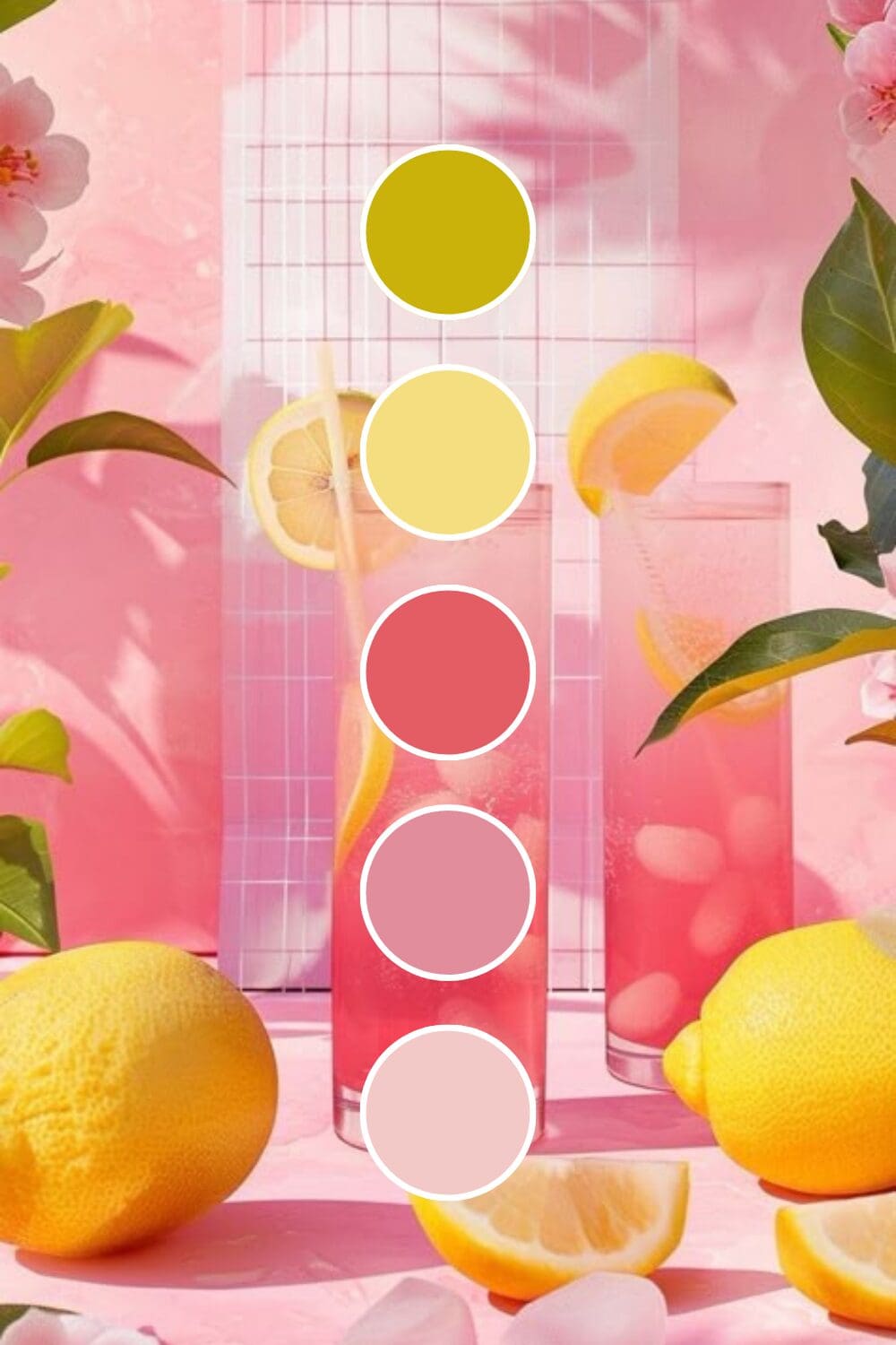
- Yellow + Soft Pink creates playful sophistication that works especially well for female entrepreneurs
Just between us, the unexpected combinations often outperform the safe choices because they stick in people’s minds.
Building Your Yellow Brand System
Your brand needs to feel intentional, not chaotic. Here’s my simple formula for creating yellow palettes that work:
- Choose your primary yellow – pick one that matches your energy and industry
- Select 1-2 supporting colors that balance yellow’s intensity
- Add neutral anchors (white, cream, or gray work perfectly)
- Test across all your platforms before making it official
Yellow can look completely different under various lighting conditions. Always check your colors on different devices and in different settings before committing.
The goal is consistency without monotony. Your website should feel connected to your social media, which should align with your business cards and presentations.
Where Yellow Makes the Biggest Impact
Yellow isn’t limited to creative industries (though it certainly excels there). I’ve watched it transform:
- Coaching businesses where optimism and energy are part of the service
- Educational brands that want learning to feel exciting, not intimidating
- Creative agencies that need to showcase innovation immediately
- Lifestyle brands targeting people who want more joy in their lives
- Wellness businesses where positivity is literally part of the healing
This works especially well if you’re entering a traditionally serious industry and want to bring fresh energy to outdated approaches.
Common Yellow Concerns (And Why They’re Not Deal-Breakers)
Let me address the elephant in the room: yes, yellow can be tricky. But every concern I’ve heard has a simple solution:
“It’s too bright!” – Use softer yellows or balance with calming neutrals.
“It won’t look professional!” – Pair with navy or charcoal for instant credibility.
“What if people don’t like it?” – The right people will love it, and they’re your ideal clients anyway.
Remember, you’re not trying to appeal to everyone. You’re trying to attract the people who need exactly what you offer.
Your Yellow Brand Journey Starts Here
Ready to test yellow in your brand? Here’s how to start small and build confidence:
Week 1: Add yellow accents to your social media graphics.
Week 2: Update your email signature with a yellow element.
Week 3: Create one piece of marketing material using your yellow palette.
Week 4: Ask for feedback from people whose opinions you trust.
You don’t need to transform everything overnight. The most important thing is to start somewhere and pay attention to how yellow makes you (and your audience) feel.
Here’s something exciting to consider:
What if six months from now, people instantly recognized your brand just by seeing your signature yellow?
These possibilities are absolutely within your reach. Sometimes the boldest move is exactly what your brand needs to finally stand out in all the right ways!

-high fidelity-3x")


")
