")

There’s a reason some brands seem to radiate off the screen – it’s not just good photography or clever captions. It’s color. Specifically, pink. When used with intention, pink can be magnetic.
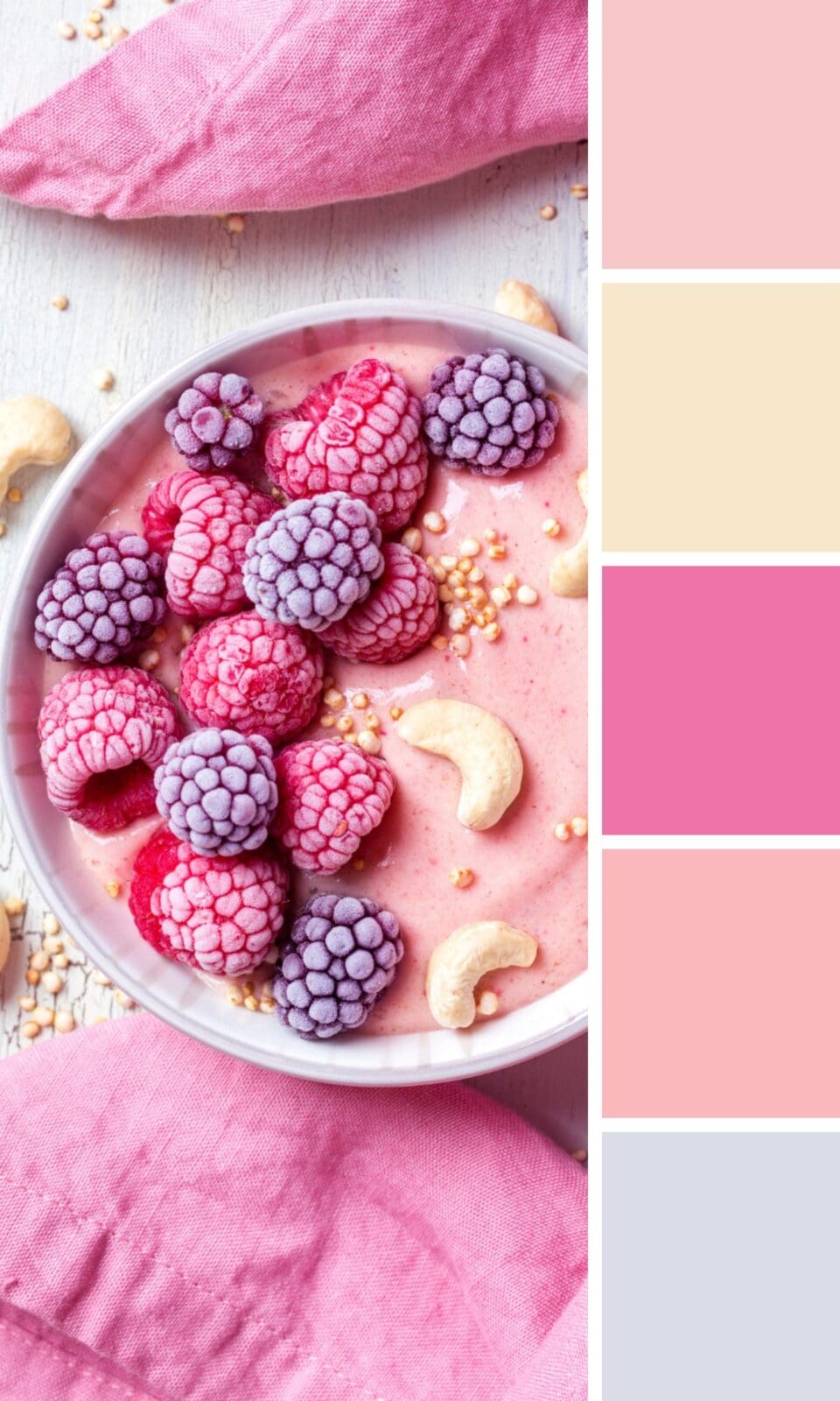
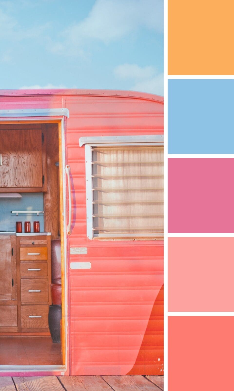
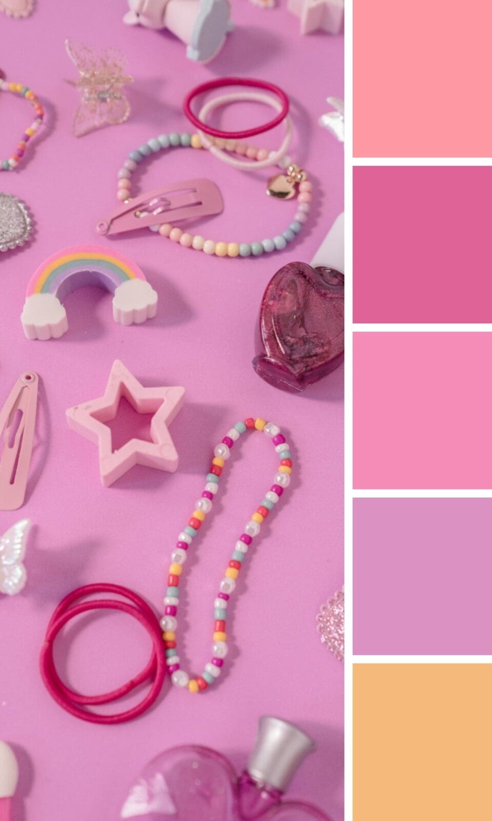
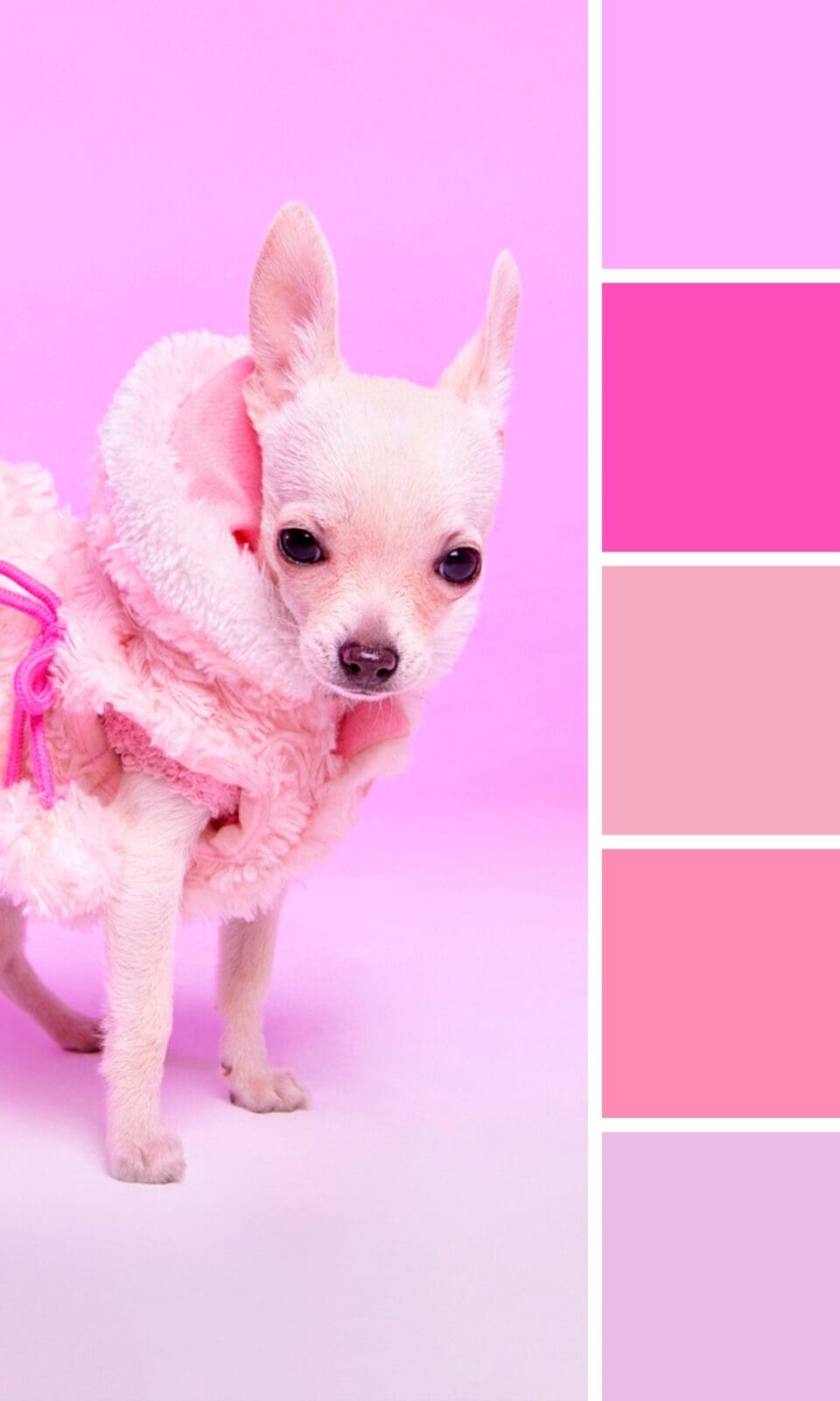
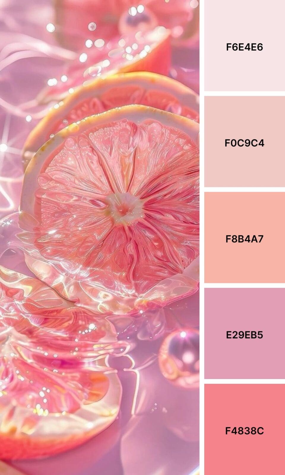
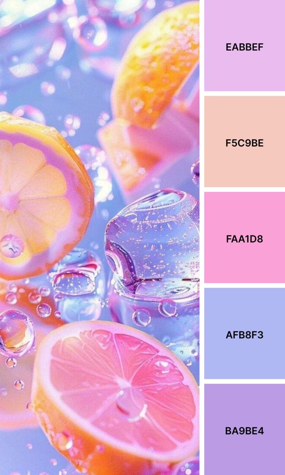
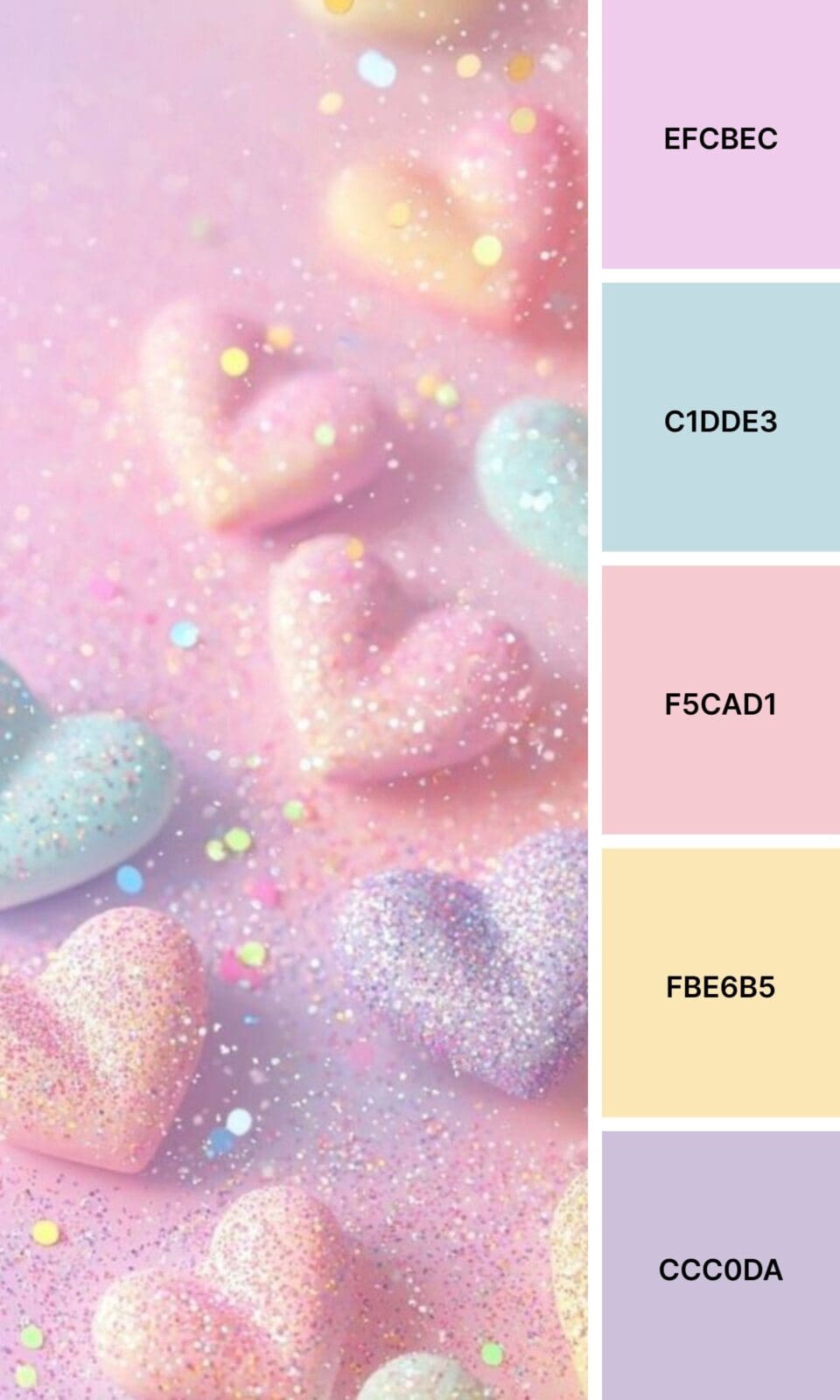
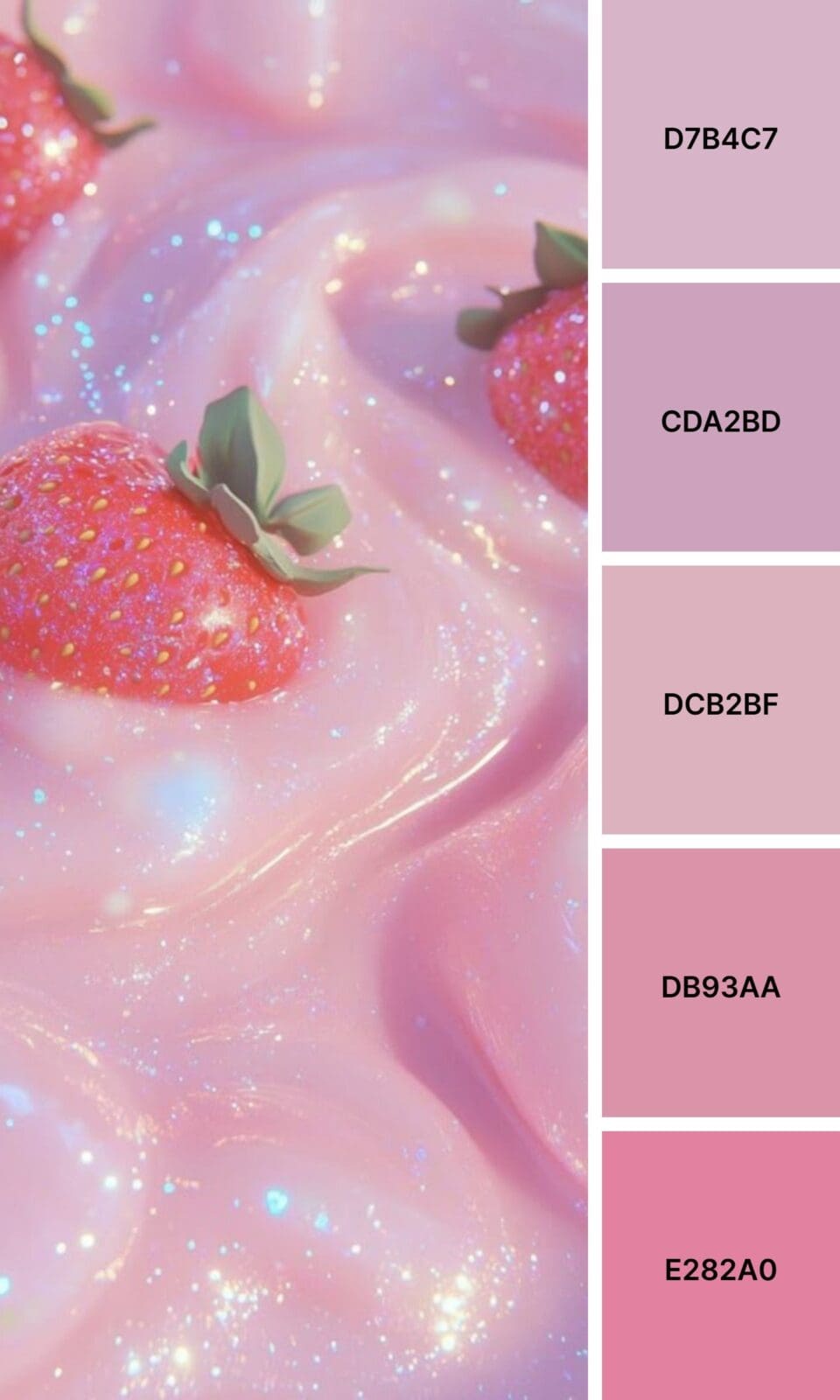
Pink isn’t just a pretty color. When used strategically, it becomes one of your most powerful branding tools. Whether you’re launching a new business or giving your current brand a fresh look, these 100 pink color palettes will help you find that perfect combination that feels authentically you.
Why Pink Works So Well in Branding
Here’s something I’ve learned from working with hundreds of entrepreneurs: pink isn’t just one emotion. It’s like a whole toolkit of feelings, and understanding this can completely transform how your audience responds to your brand.
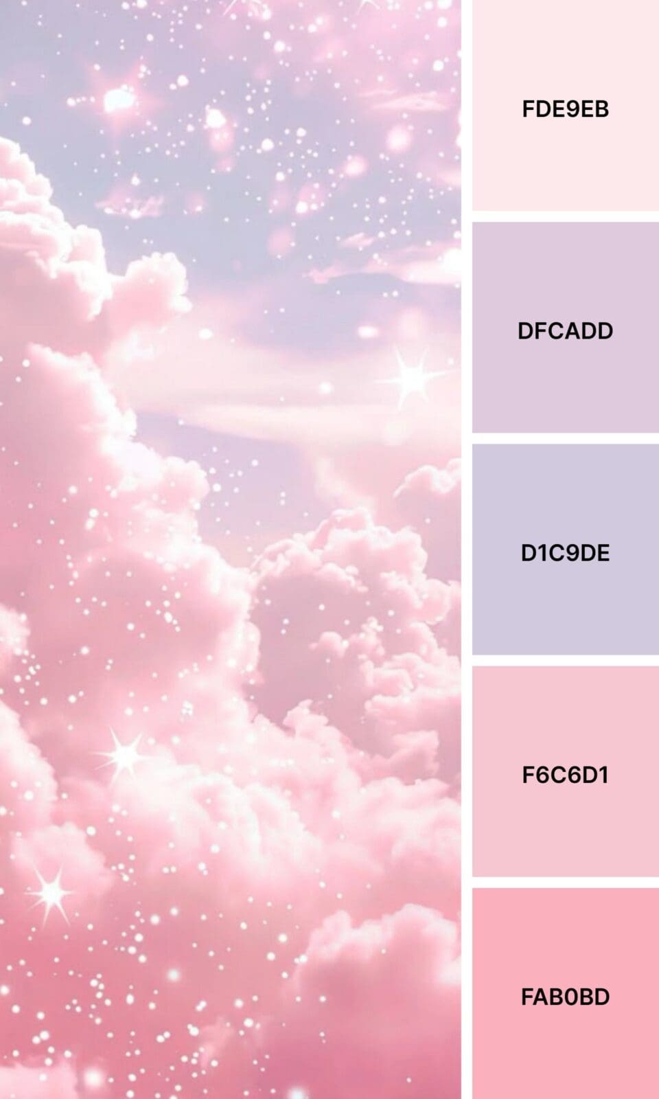
Light, soft pinks whisper “safe space” – they make people feel nurtured and cared for. Think about wellness coaches, therapists, or anyone in the self-care space. These gentle tones say, “You can trust me with your vulnerabilities.”
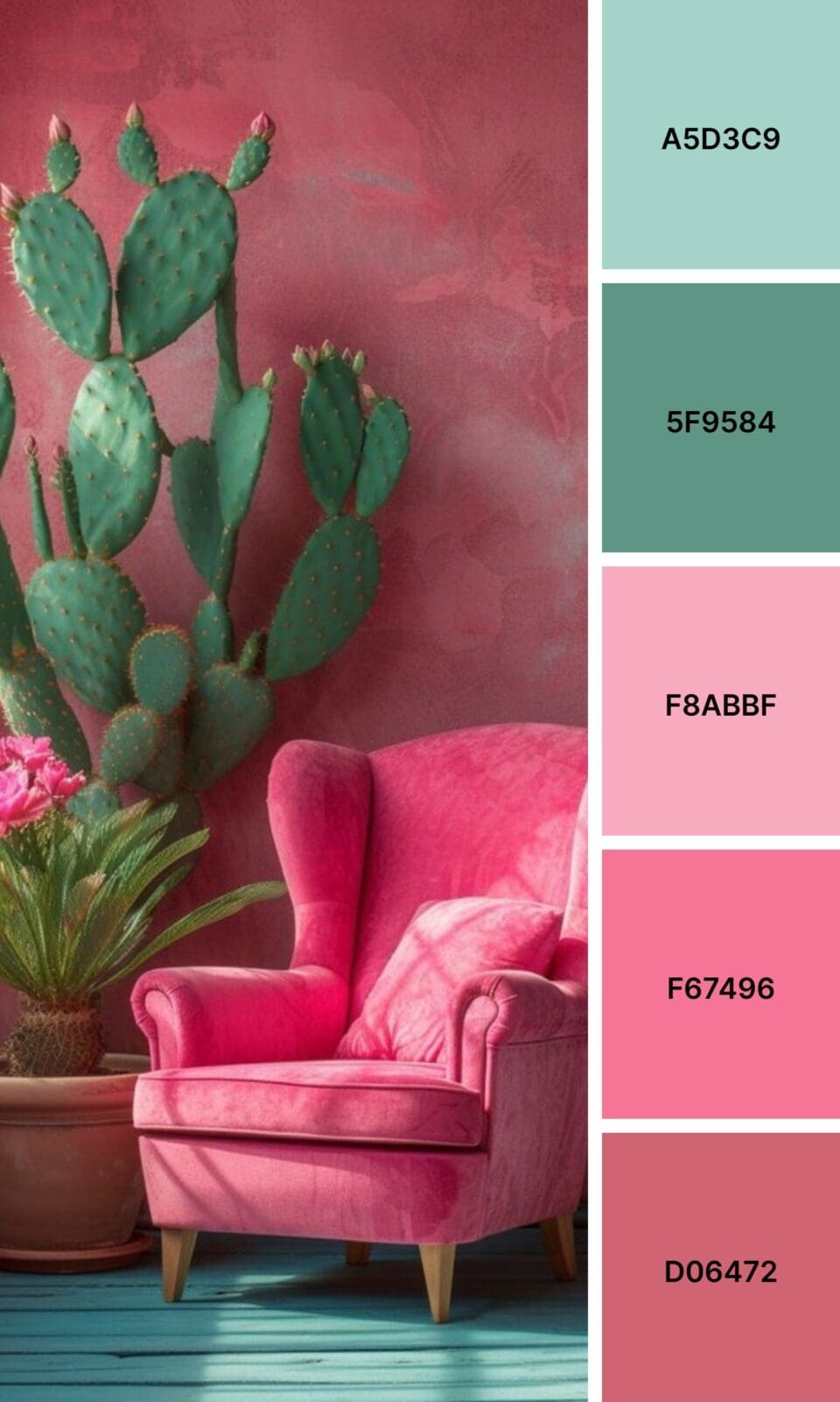
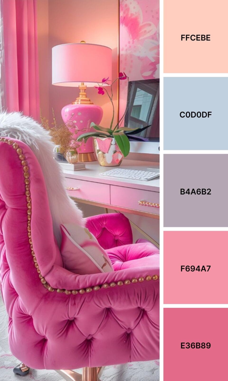
But flip the script to hot pink, and suddenly you’re shouting confidence and boldness. Fashion brands, fitness coaches, and anyone targeting ambitious women often gravitate toward these power pinks because they signal, “I’m here to help you level up!”
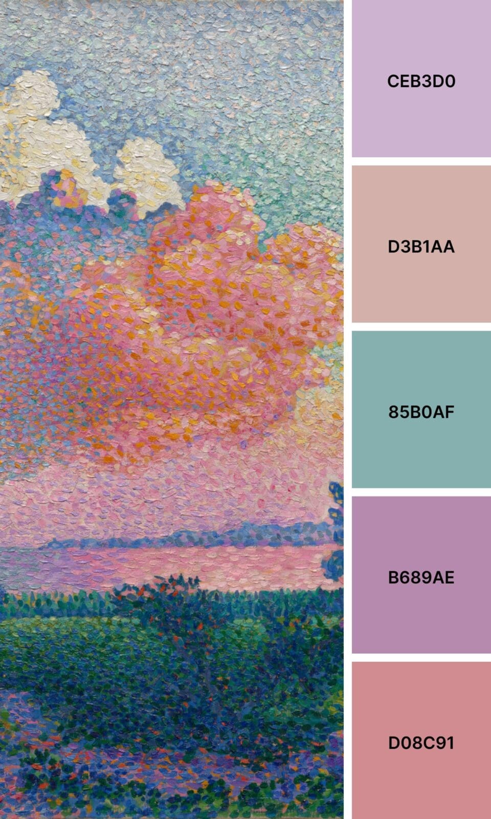
Then there are those sophisticated dusty pinks that practically ooze luxury and refinement. High-end service providers and premium brands love these because they suggest exclusivity without being intimidating.
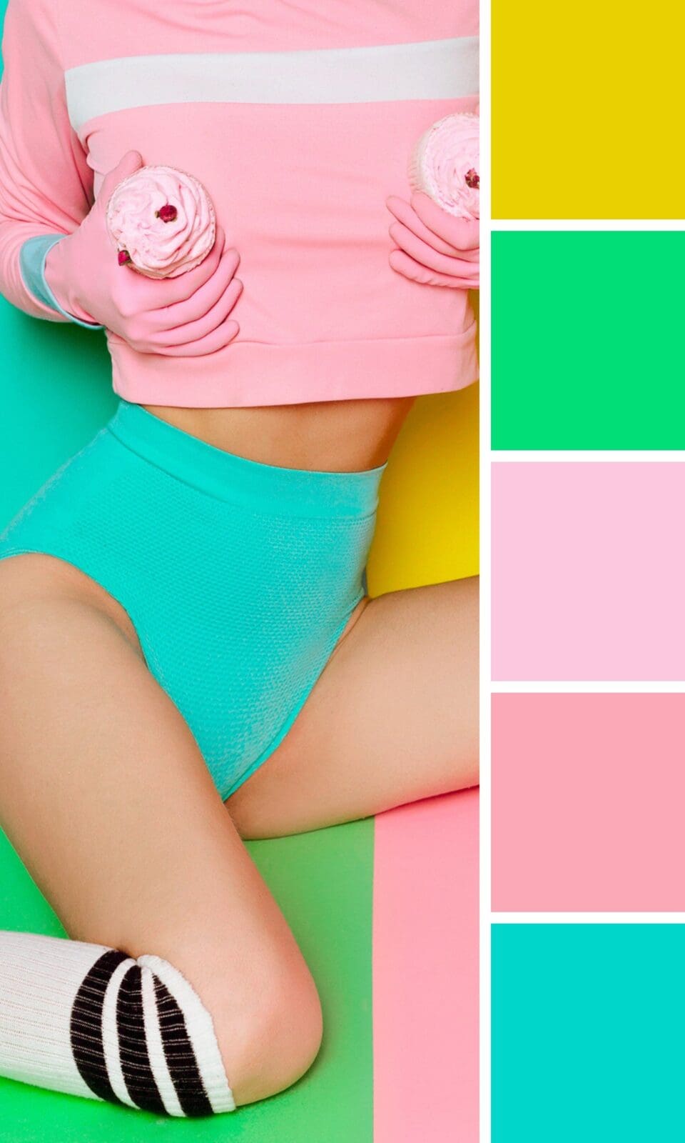
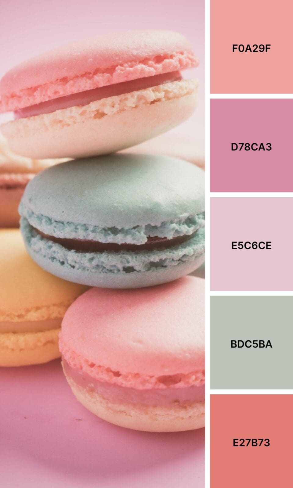
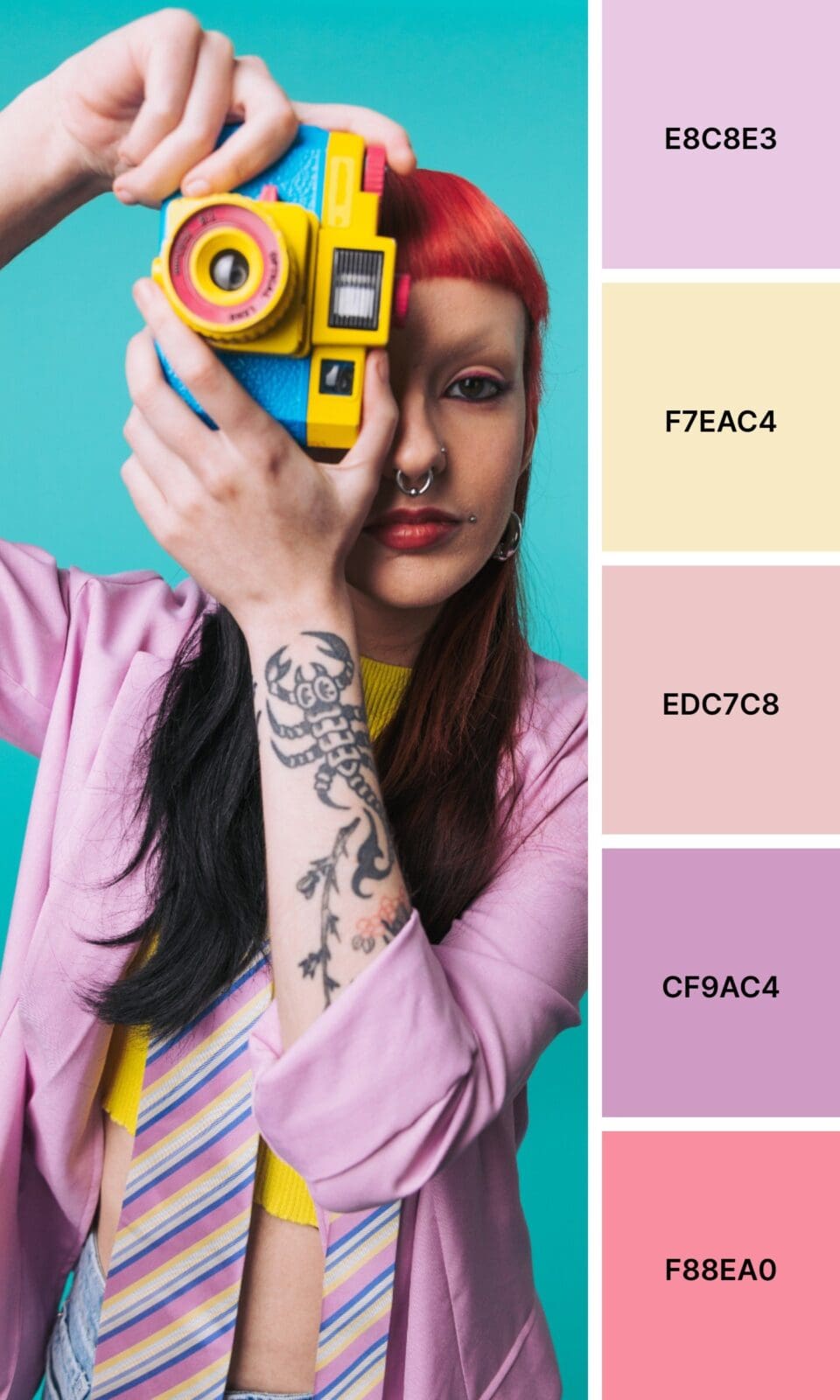
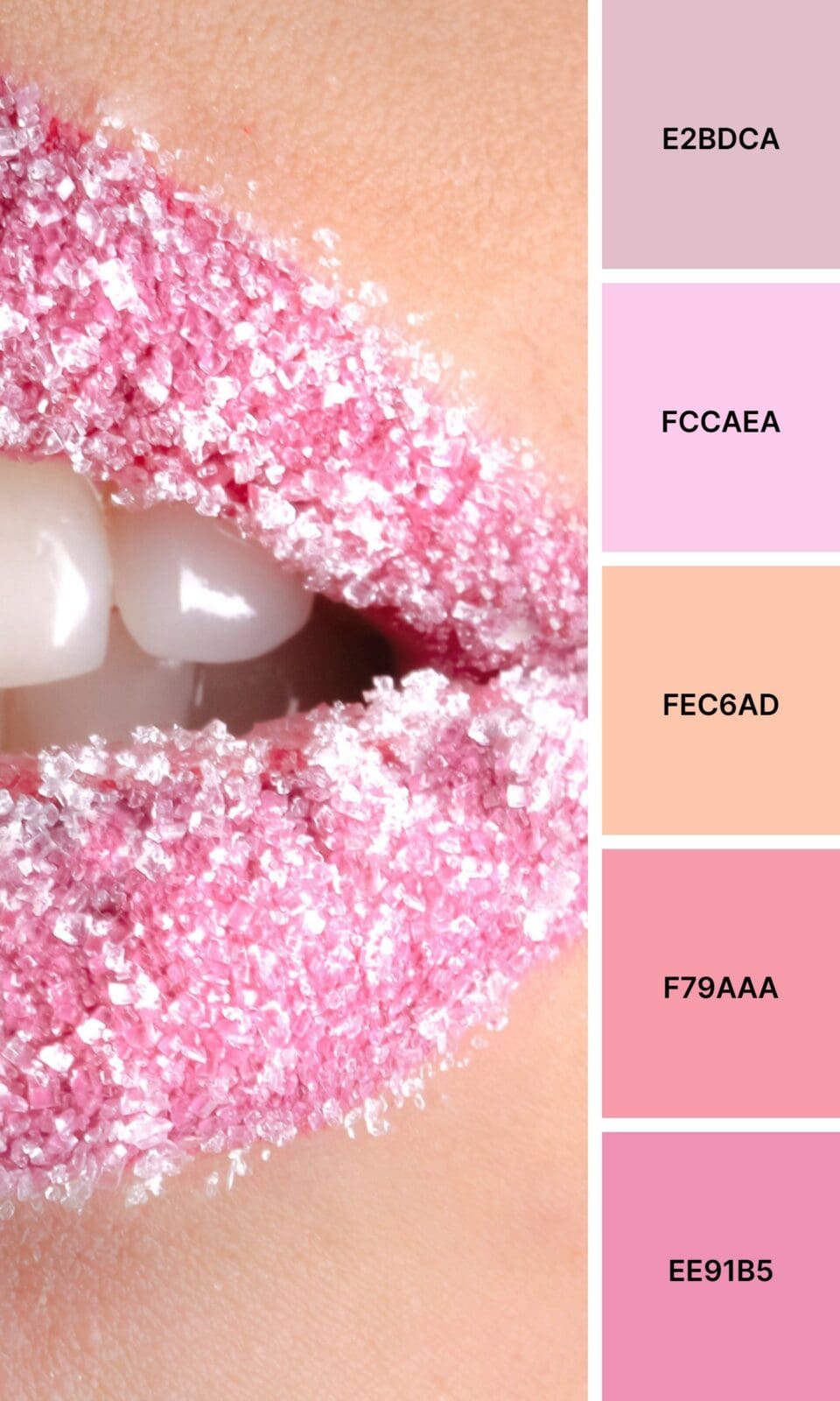
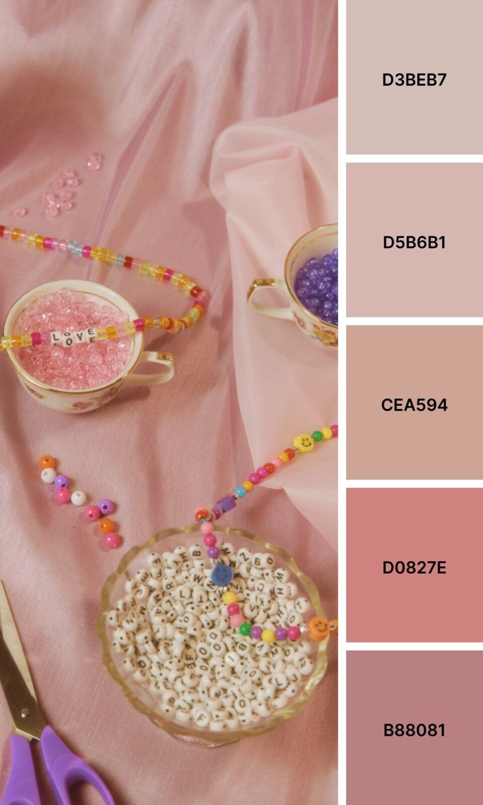
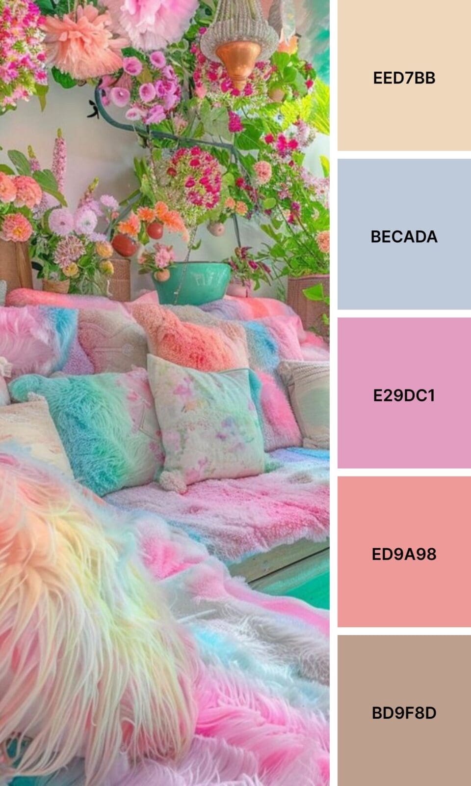
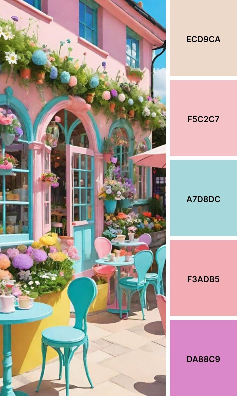
And don’t get me started on playful bubble gum pinks – these are pure joy in color form, perfect for creative businesses or anyone who wants to inject some fun into their industry.
Finding Your Perfect Pink Match
Not all pinks are created equal (trust me on this one). Here are the main players you should know about:
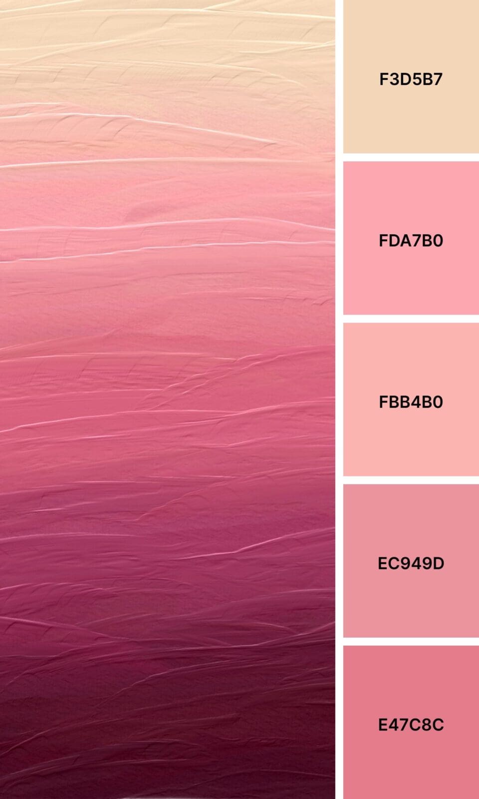
Blush Pink is your sophisticated friend who never raises her voice but commands respect anyway. Wellness brands love this because it feels both professional and nurturing.
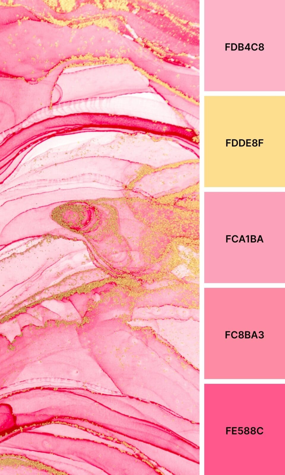
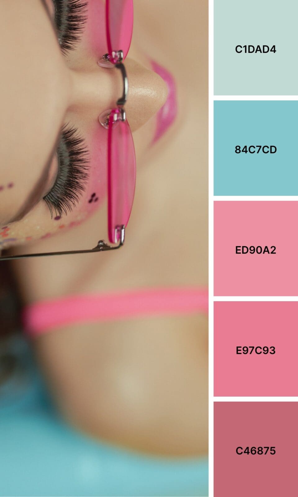
Hot Pink doesn’t apologize for taking up space. If you’re targeting ambitious women or work in beauty, this could be your secret weapon.
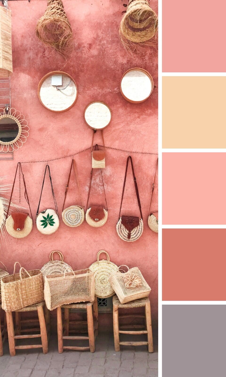
Dusty Pink has that “I’ve arrived” energy without being flashy. High-end service providers often gravitate toward this shade because it suggests experience.
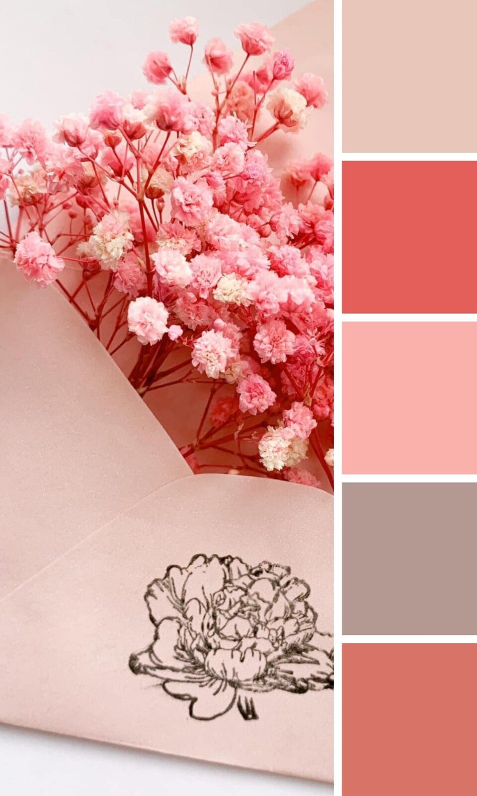
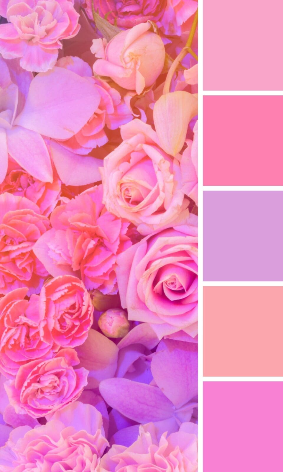
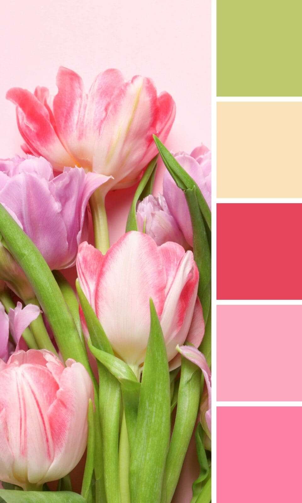
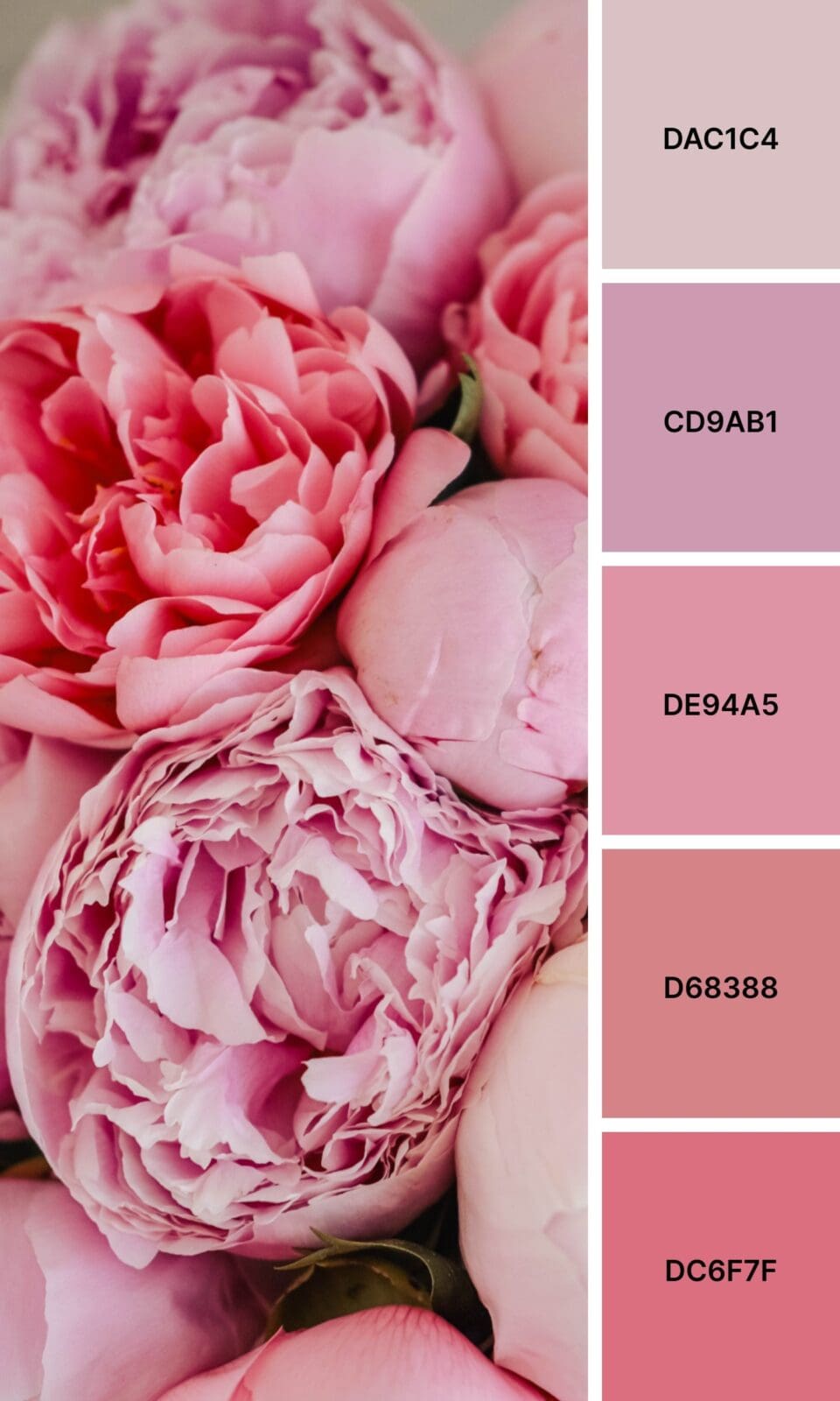
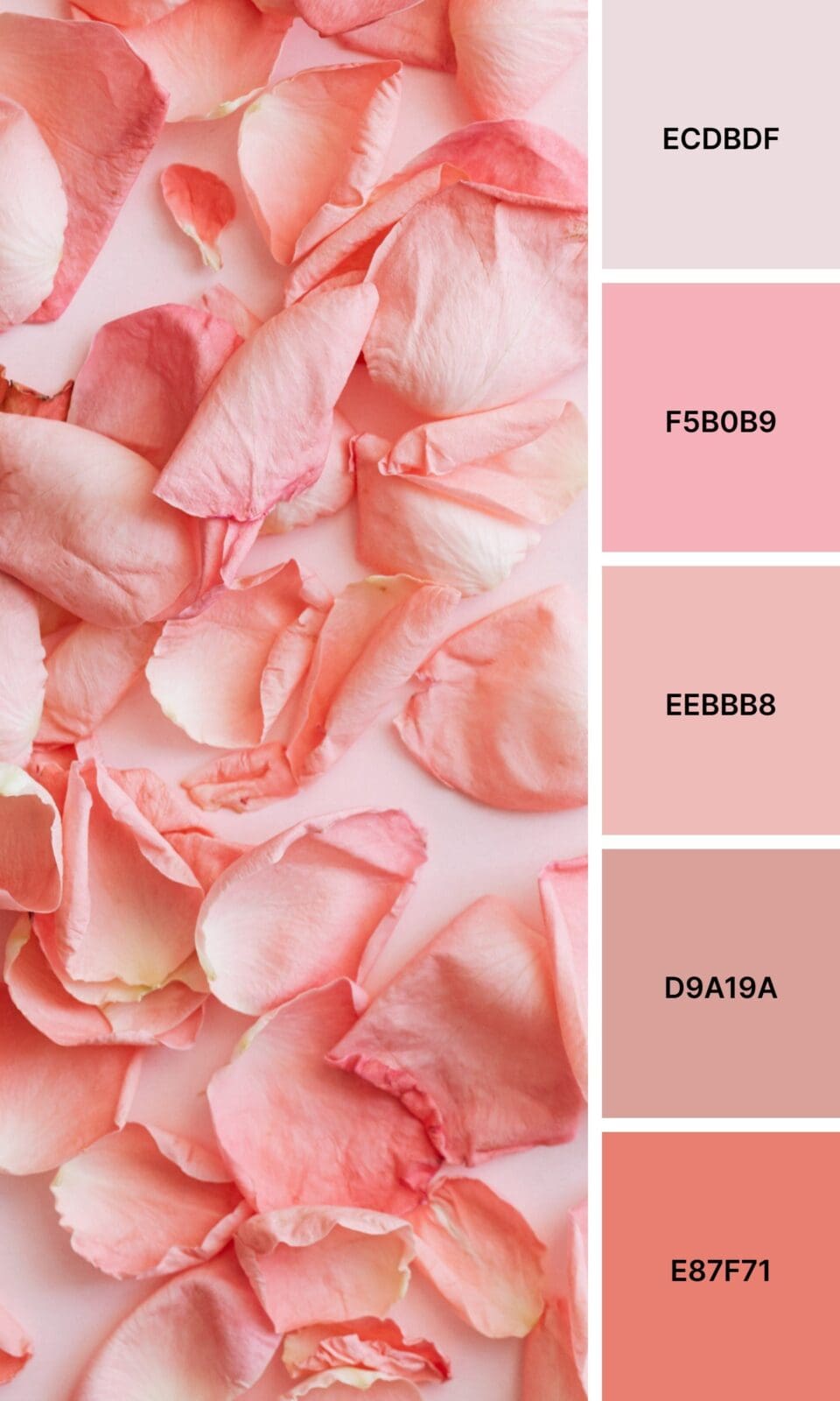
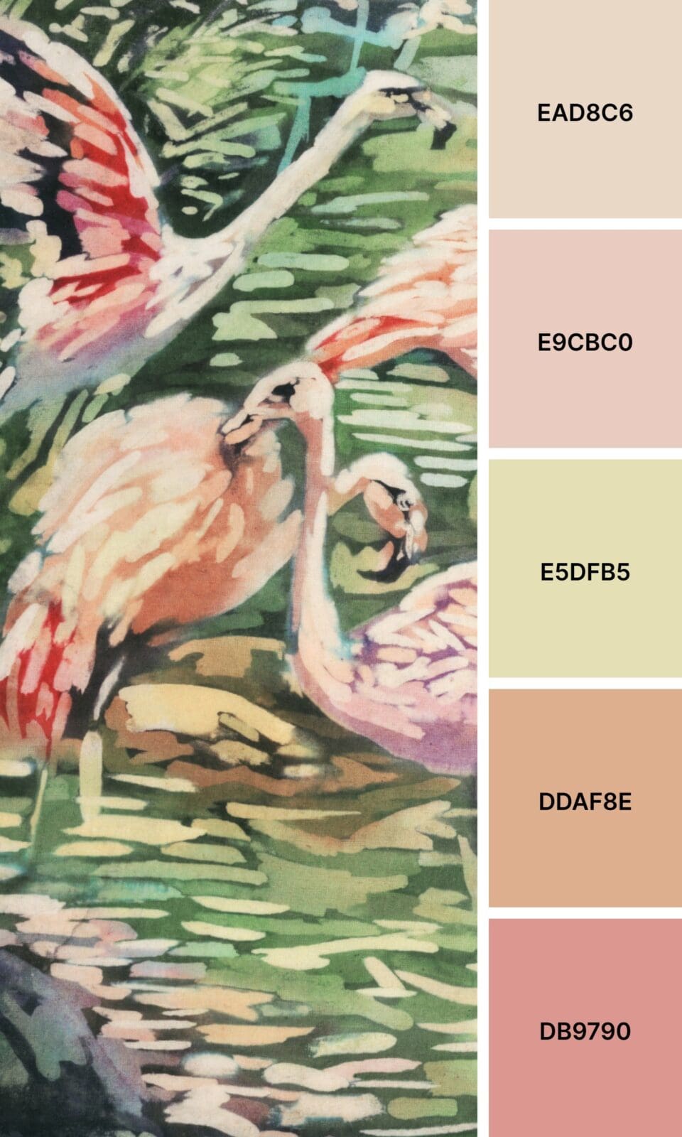
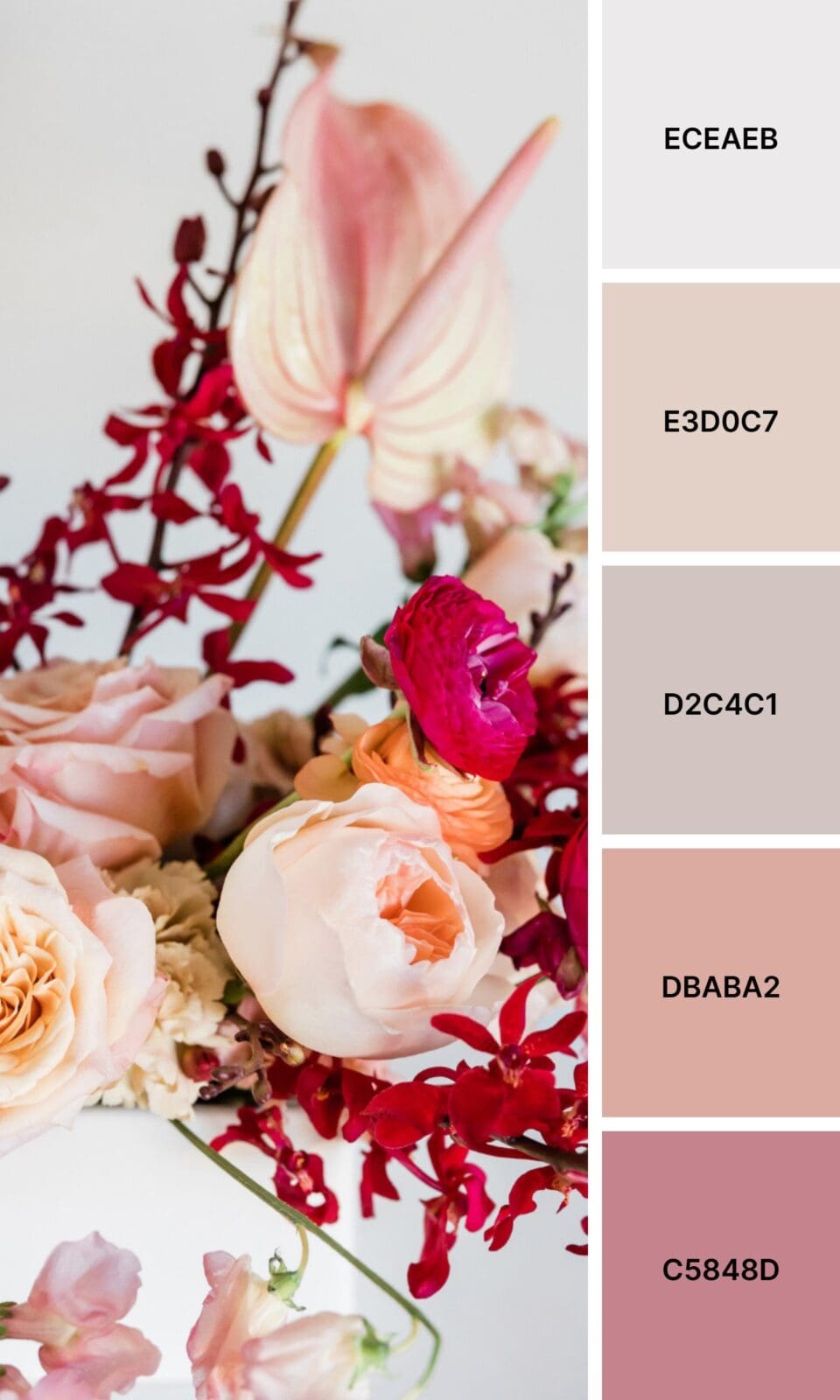
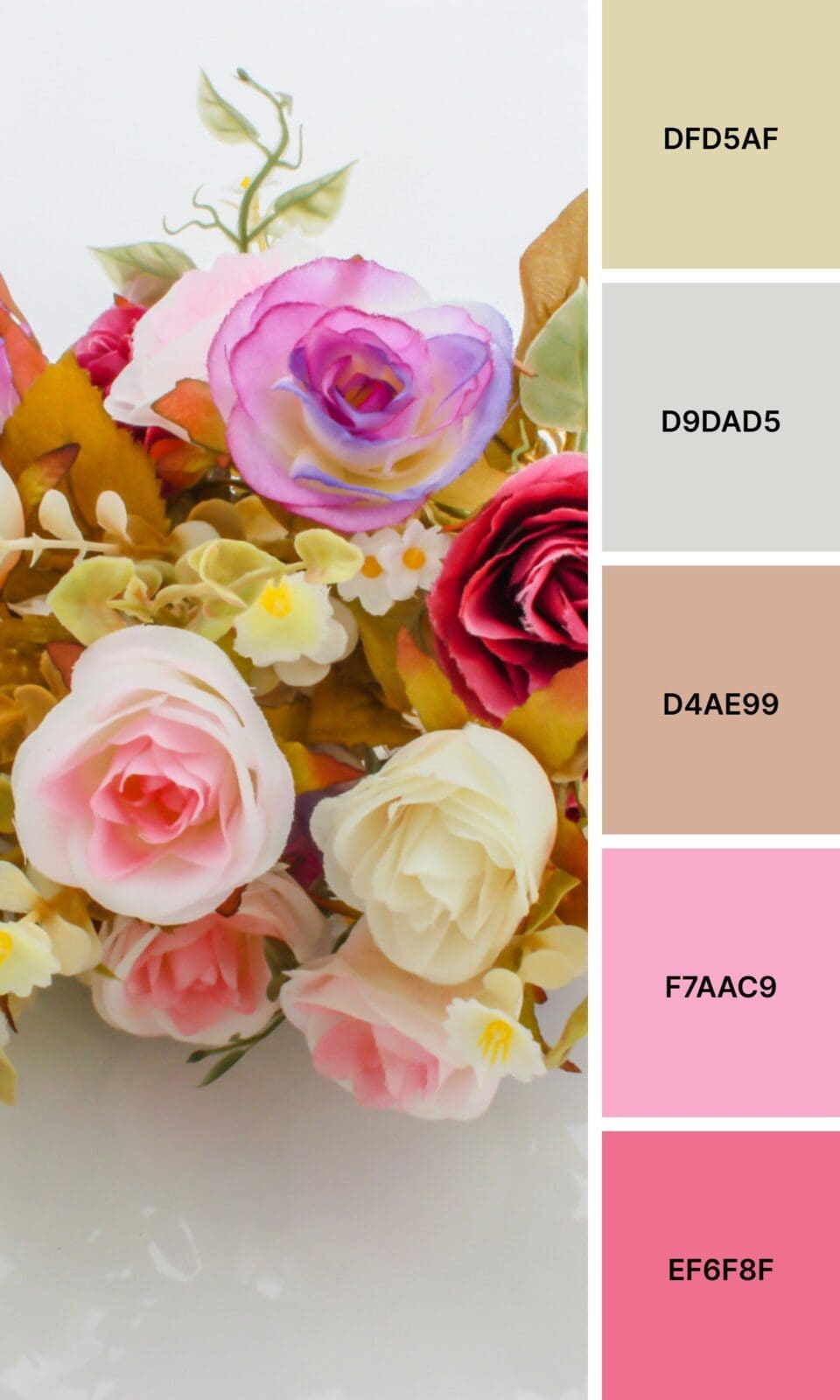
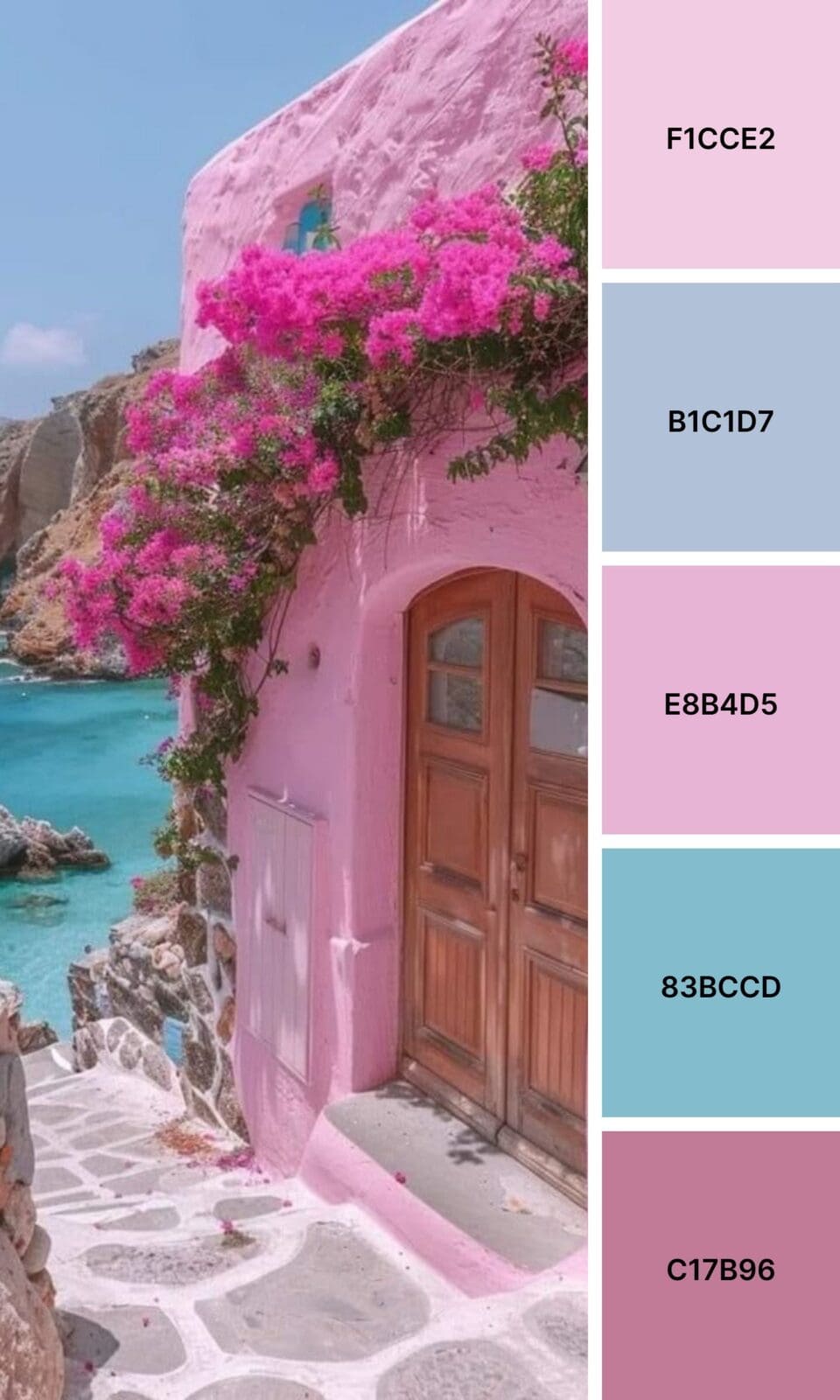
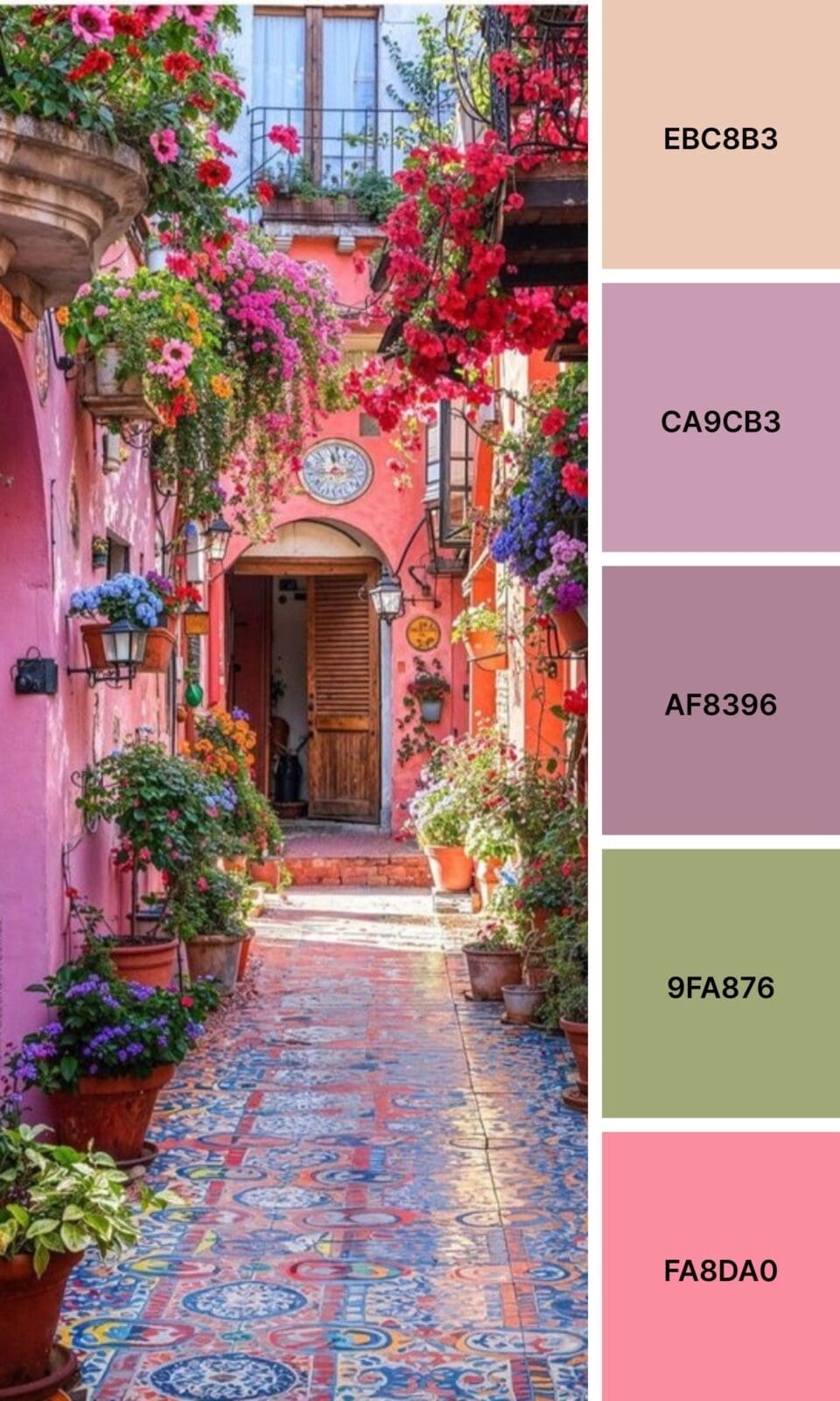
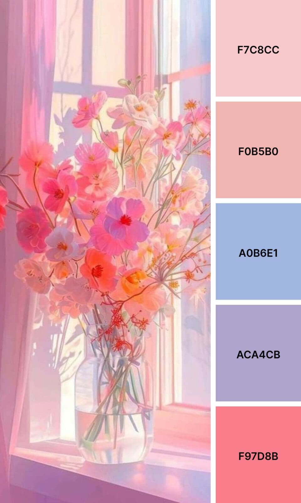
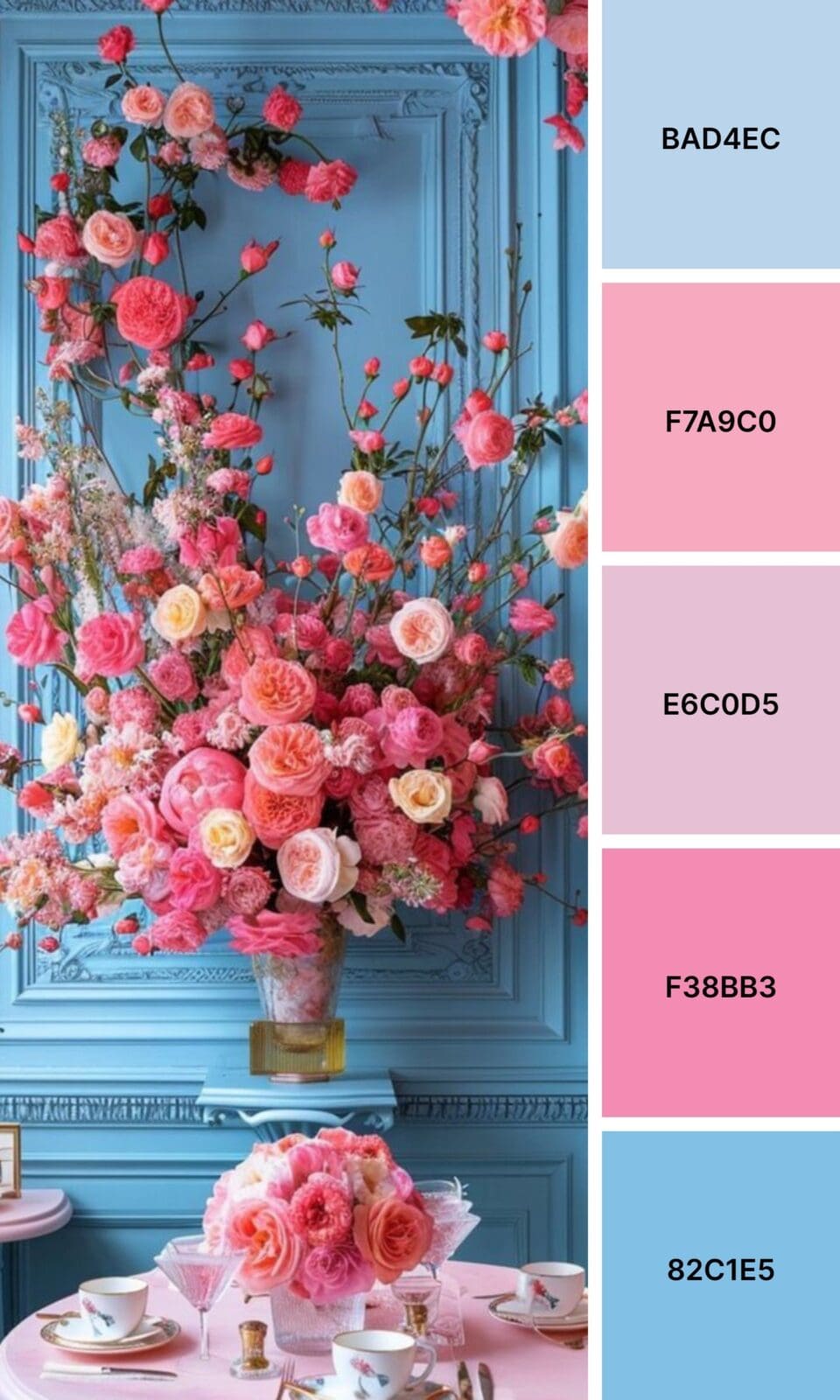
Rose Pink brings timeless, romantic vibes. Wedding planners and florists can’t get enough of this classic shade.
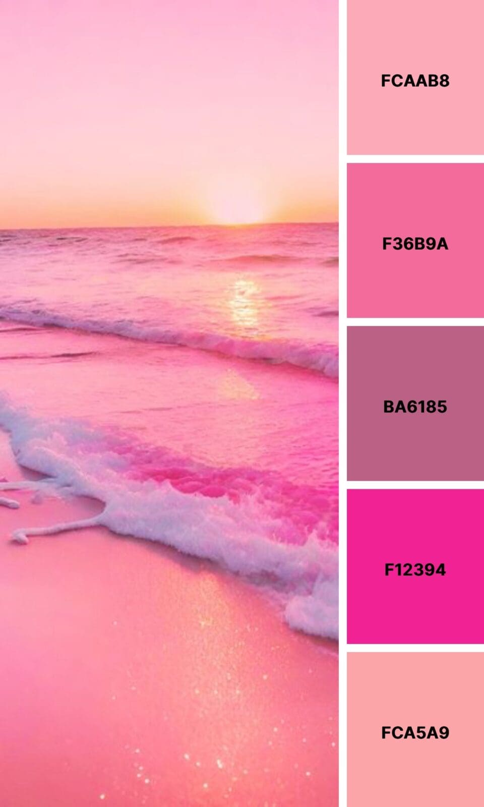
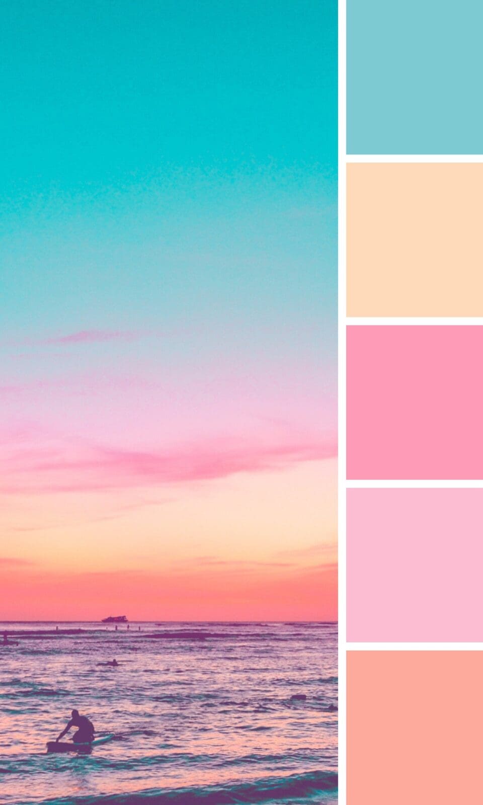
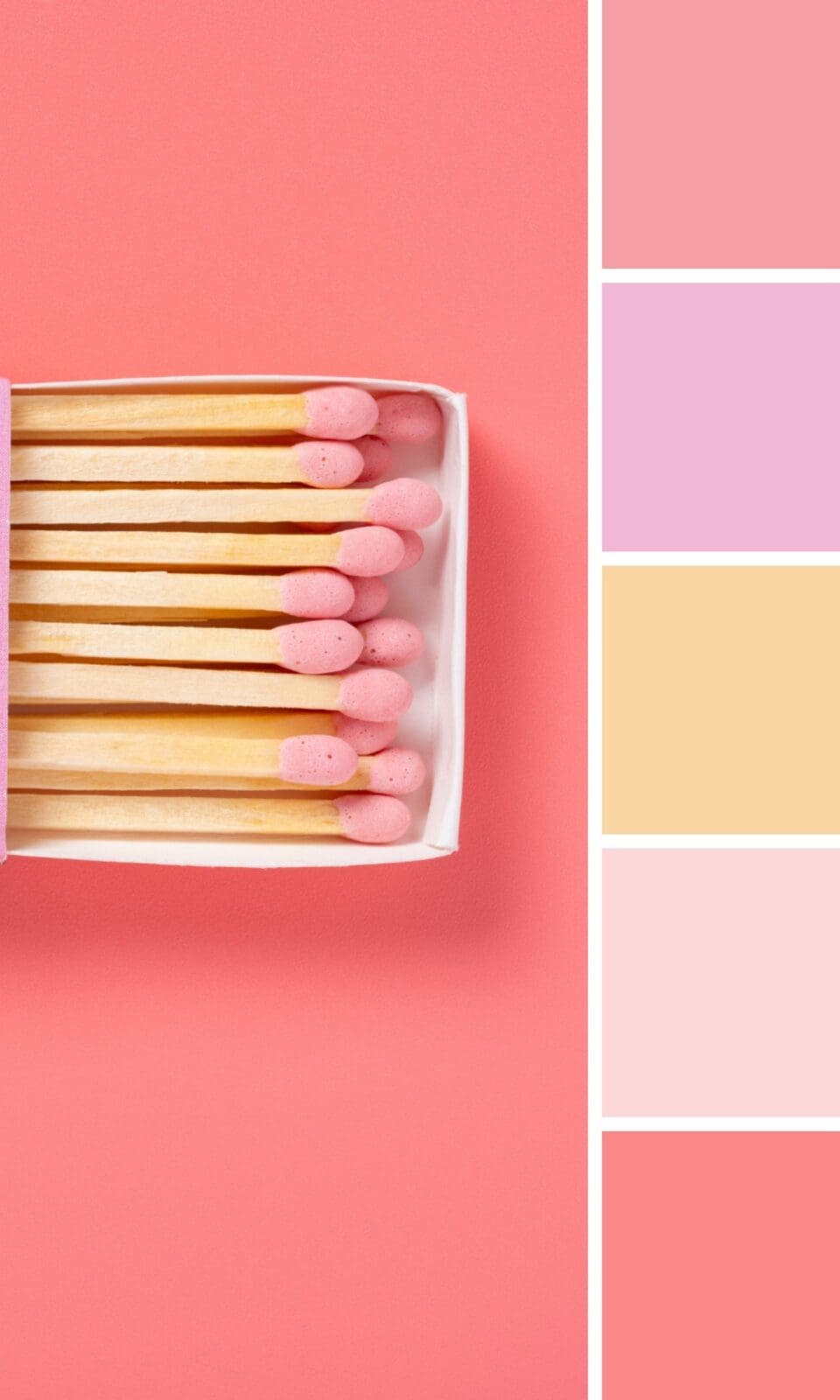
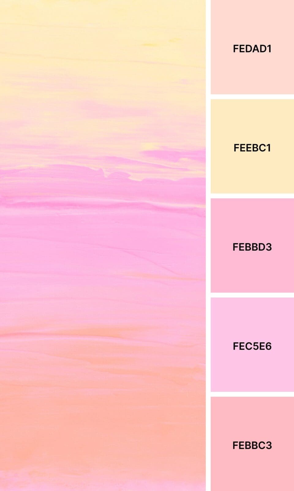
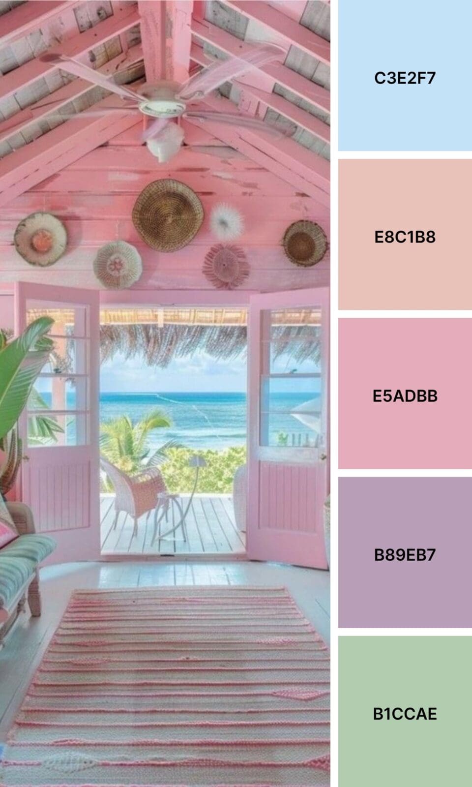
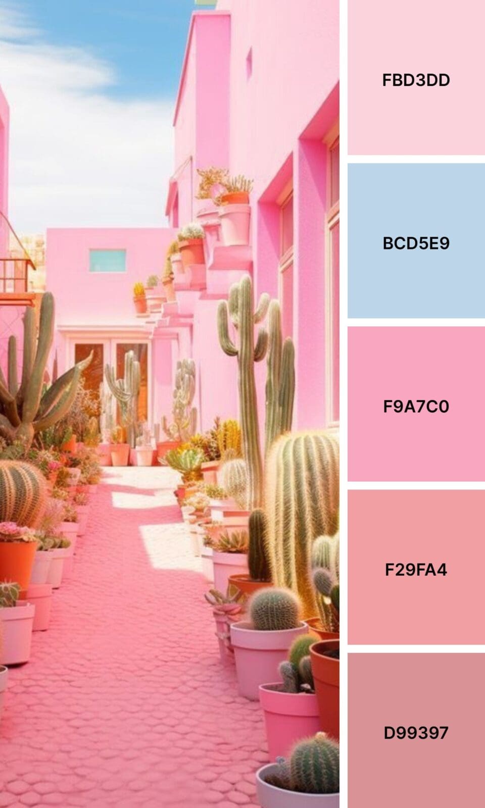
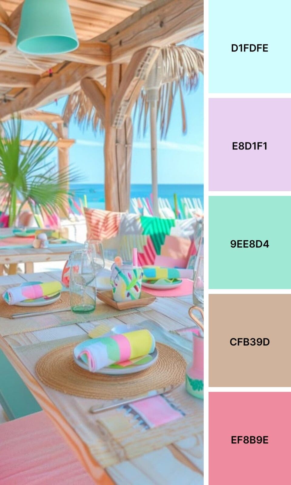
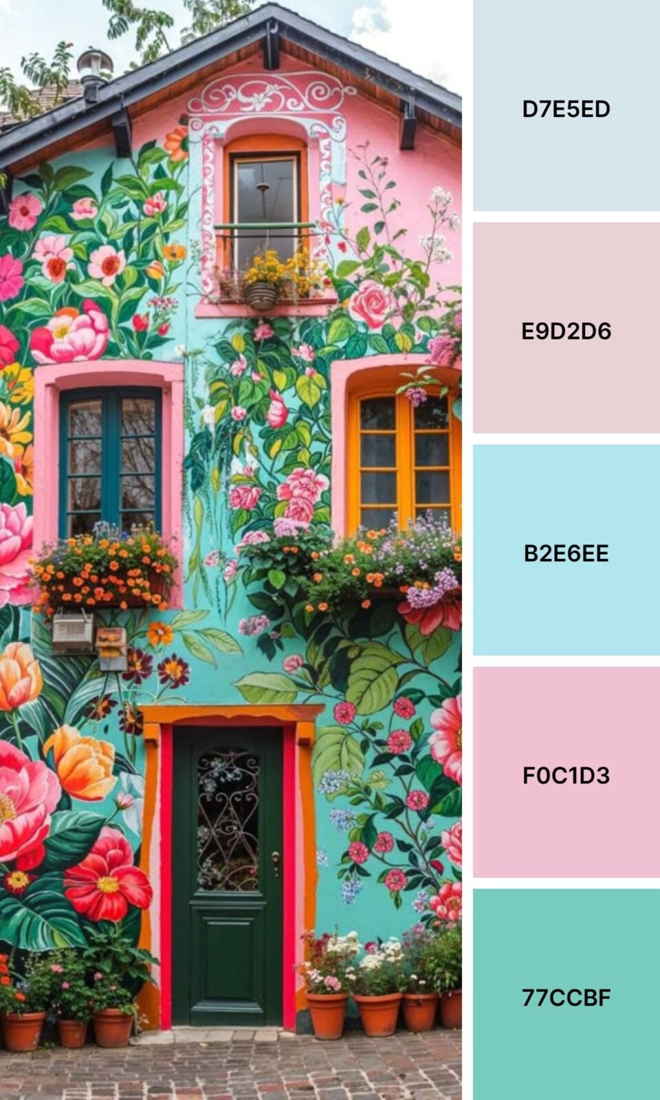
Coral Pink straddles the line between pink and orange, creating fresh energy that lifestyle brands find irresistible.
Starting with one dominant pink shade might not seem glamorous, but it’s exactly how every successful brand begins. You’ve got this!

Color Combinations That’ll Make People Stop and Stare
Here’s where things get really exciting! The magic happens when you pair your perfect pink with complementary colors that make both shades absolutely sing.
The Classic Combos (That Work Every Single Time)
Pink + Sage Green creates that fresh, “I have my life together” vibe that performs beautifully on social media. This works especially well if you’re in wellness or coaching, but don’t worry if you’re not – there’s an approach that will work for you too.
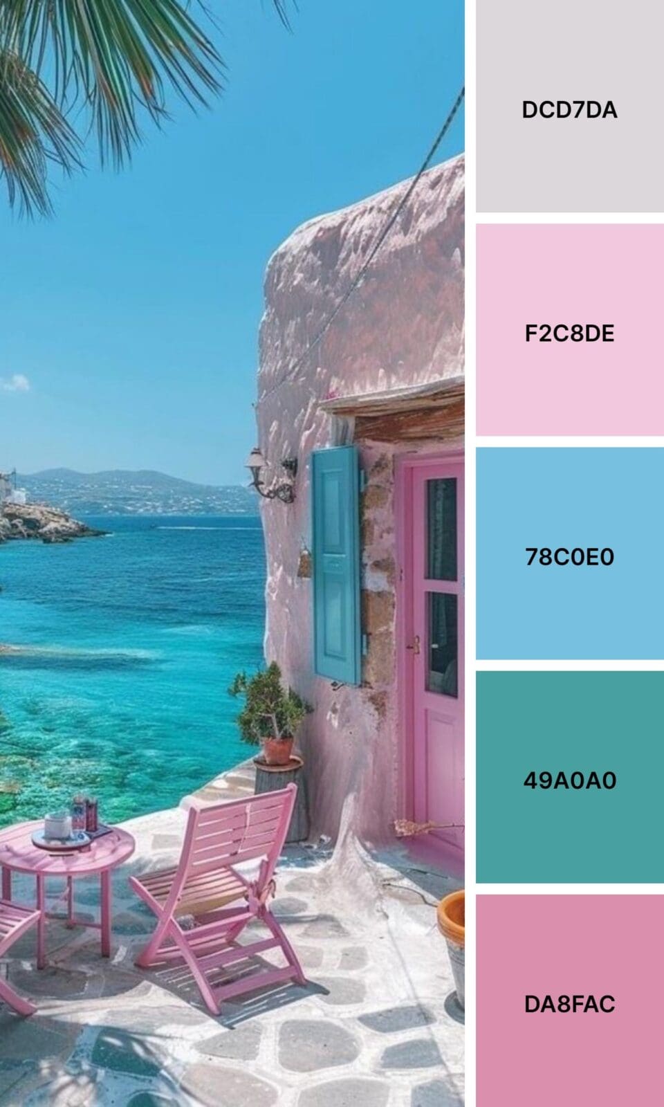
Pink + Navy Blue is trust and approachability rolled into one palette. Business coaches and consultants love this combo because it balances professionalism with warmth.
Pink + Gold screams premium without saying a word. If you’re positioning yourself as the go-to expert in your field, this combination does half the work for you.
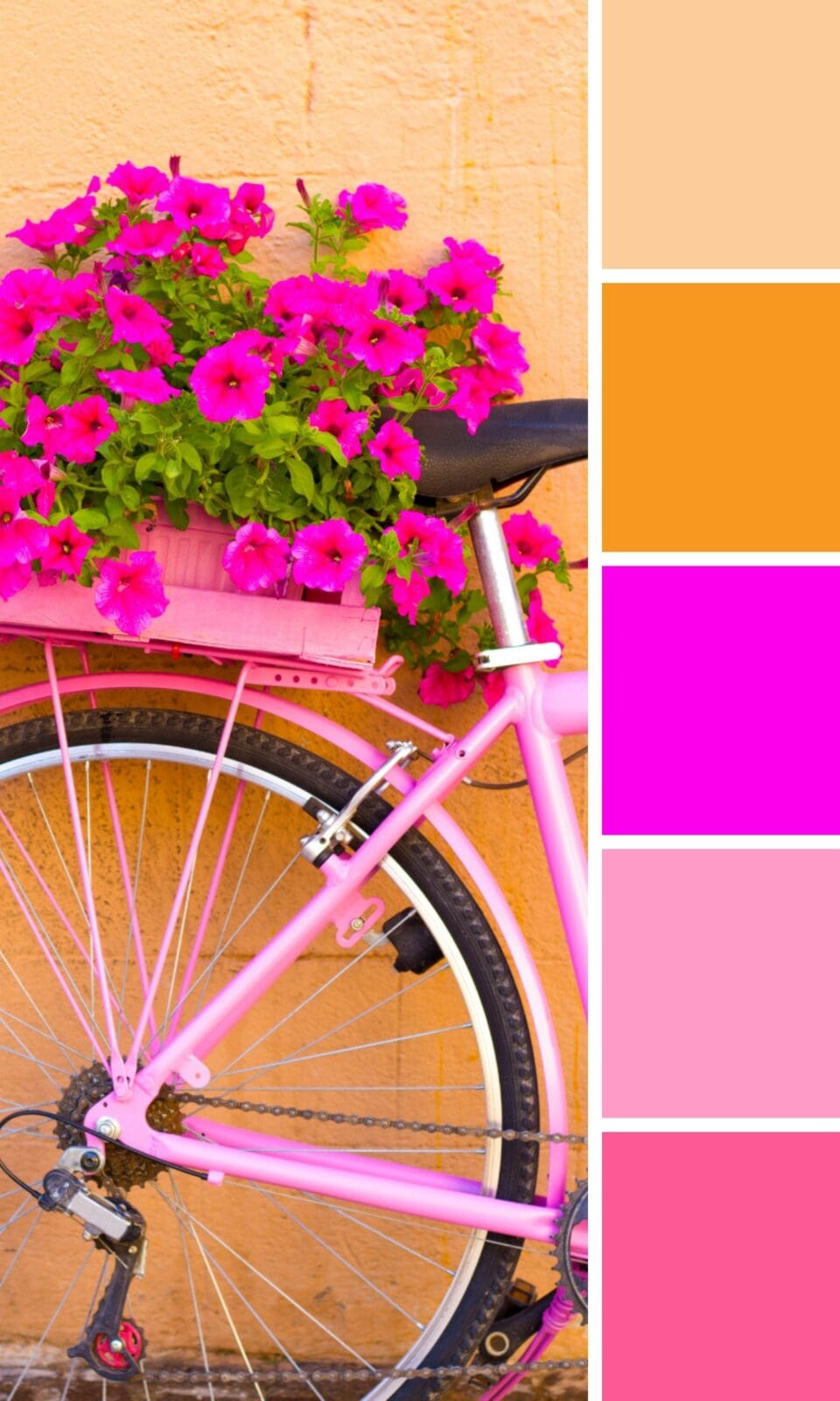
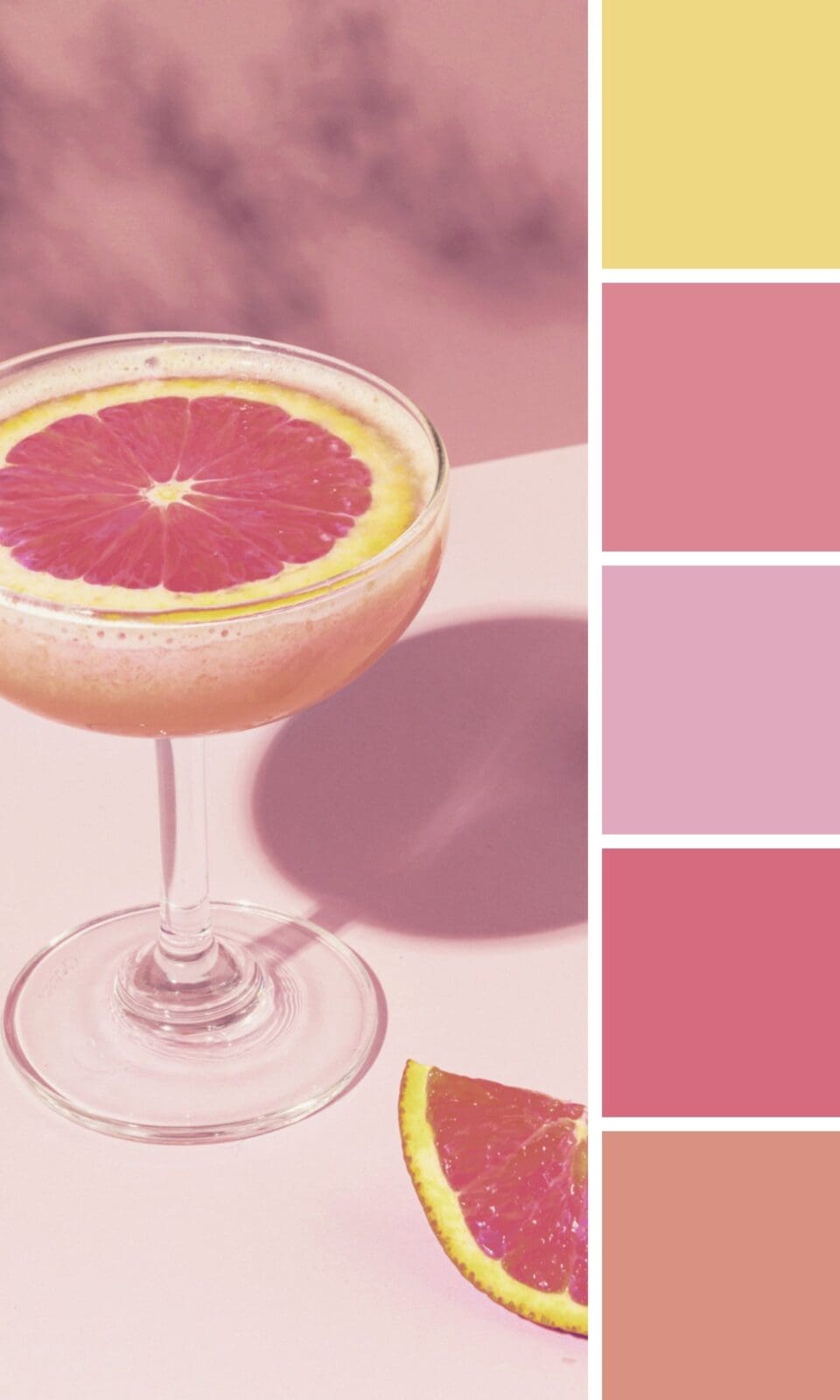
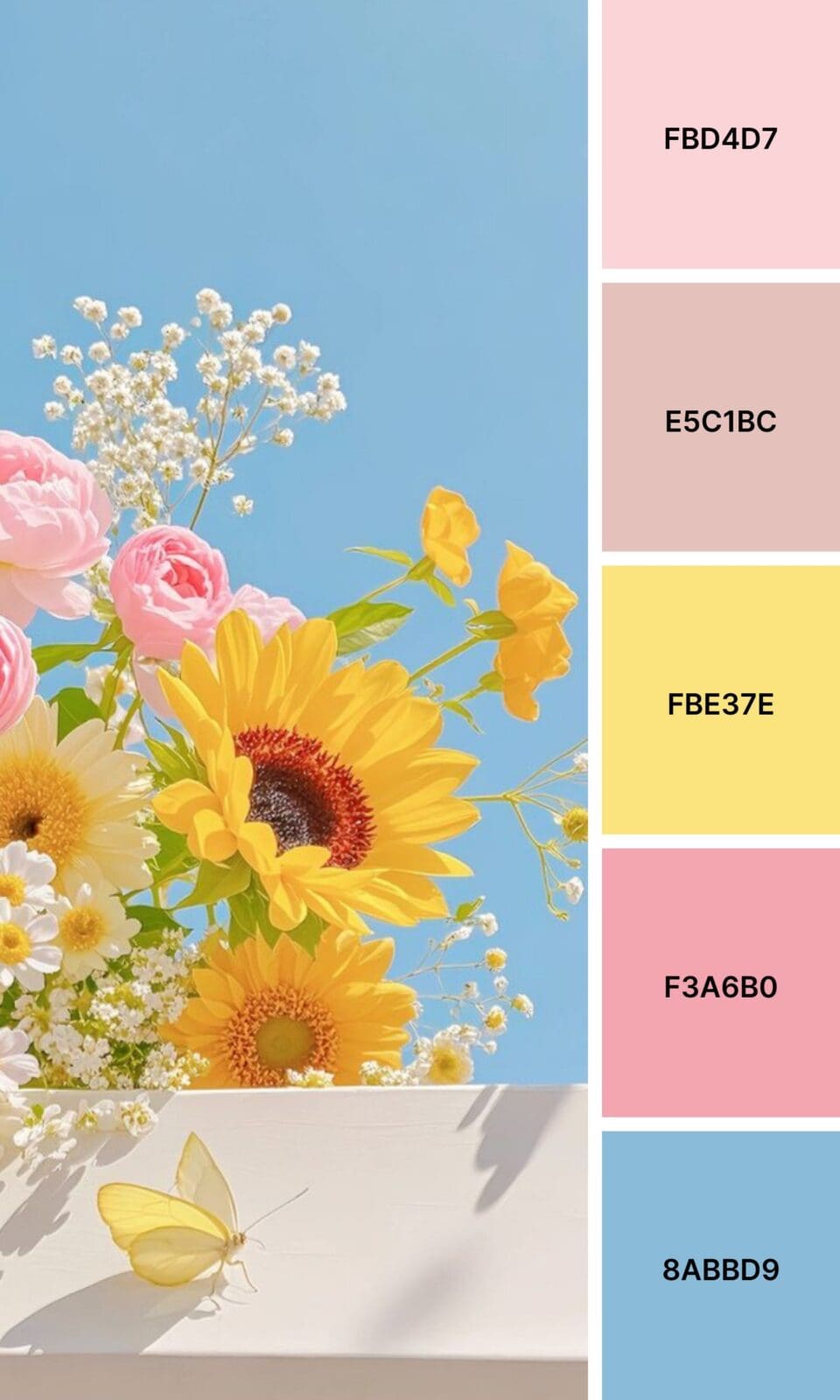
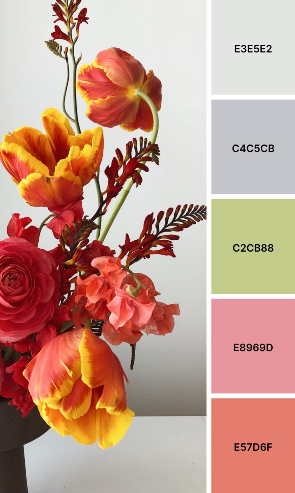
Pink + Yellow brings out everyone’s inner optimist. Creative entrepreneurs and anyone targeting a younger audience often find this sunny combo irresistible.
The Unexpected Combinations (That’ll Set You Apart)
Just between us, these combinations often outperform the classics because they’re memorable:
Pink + Burgundy creates rich depth that suggests both warmth and authority. Perfect for established businesses wanting to feel approachable yet expert.
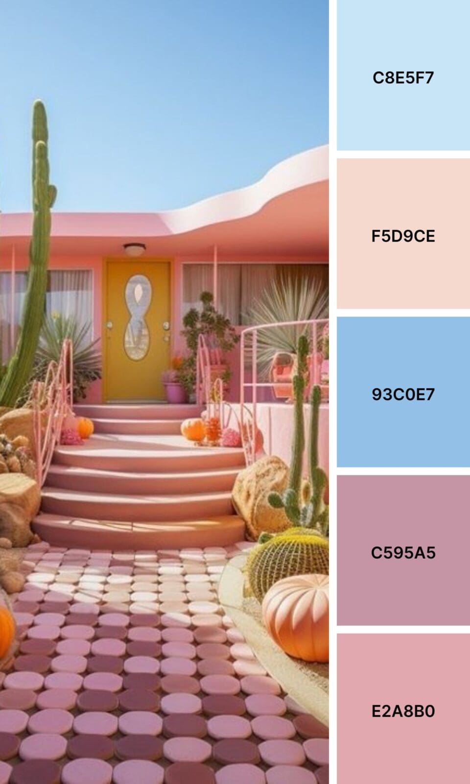
Pink + Terracotta brings earthy, grounded energy with a modern twist. Interior designers and lifestyle brands can’t get enough of this combo.
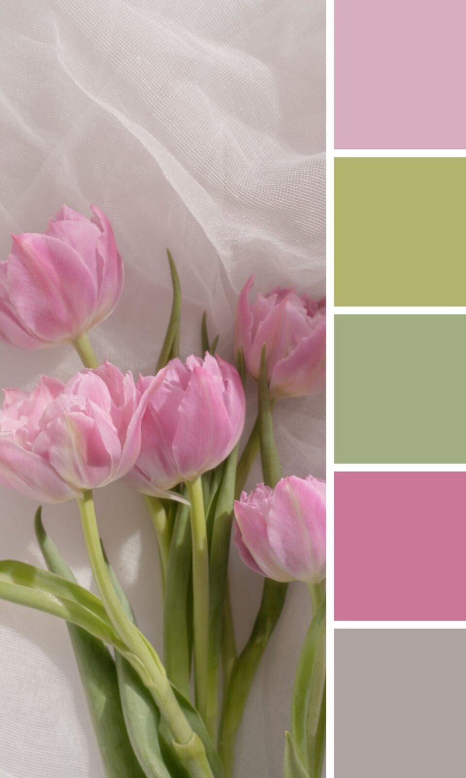
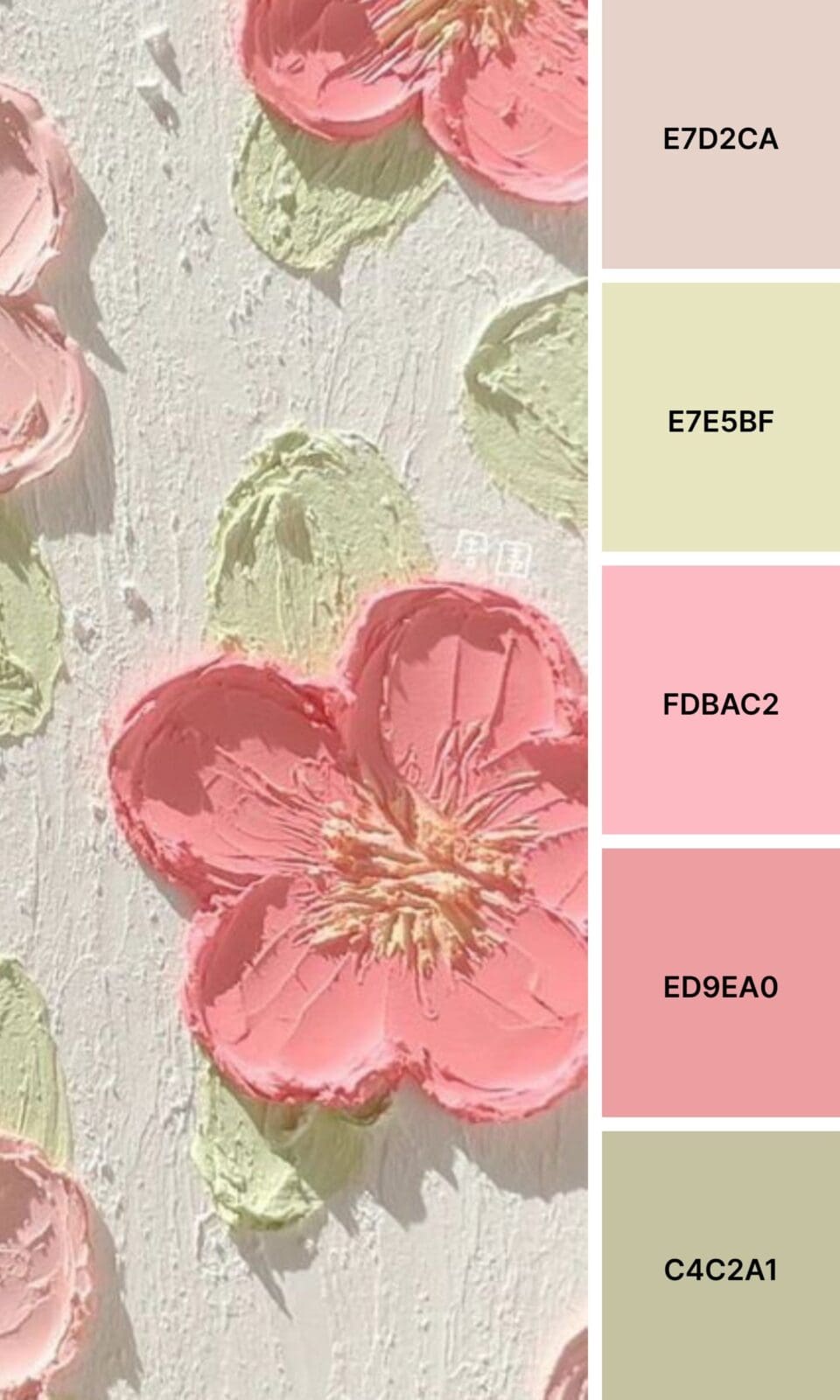
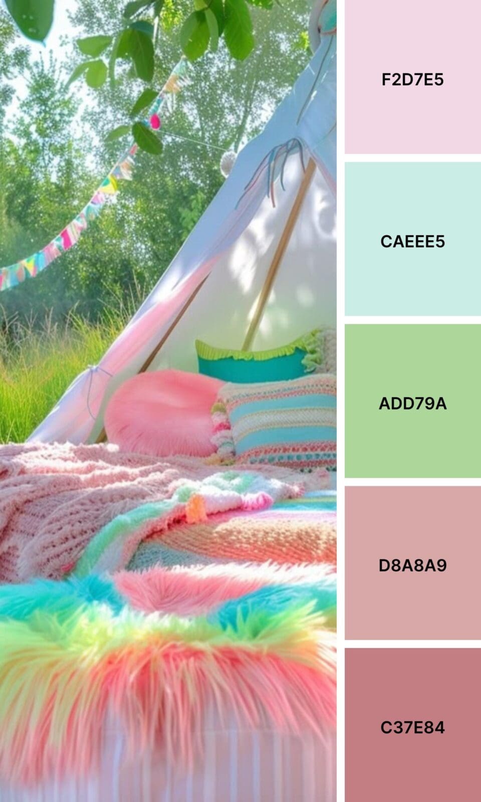
Pink + Olive offers natural balance that feels fresh and unexpected. It’s sophisticated without being stuffy.
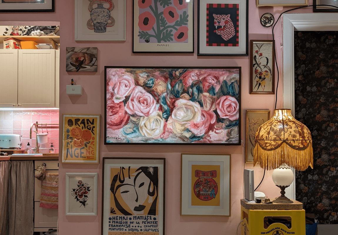
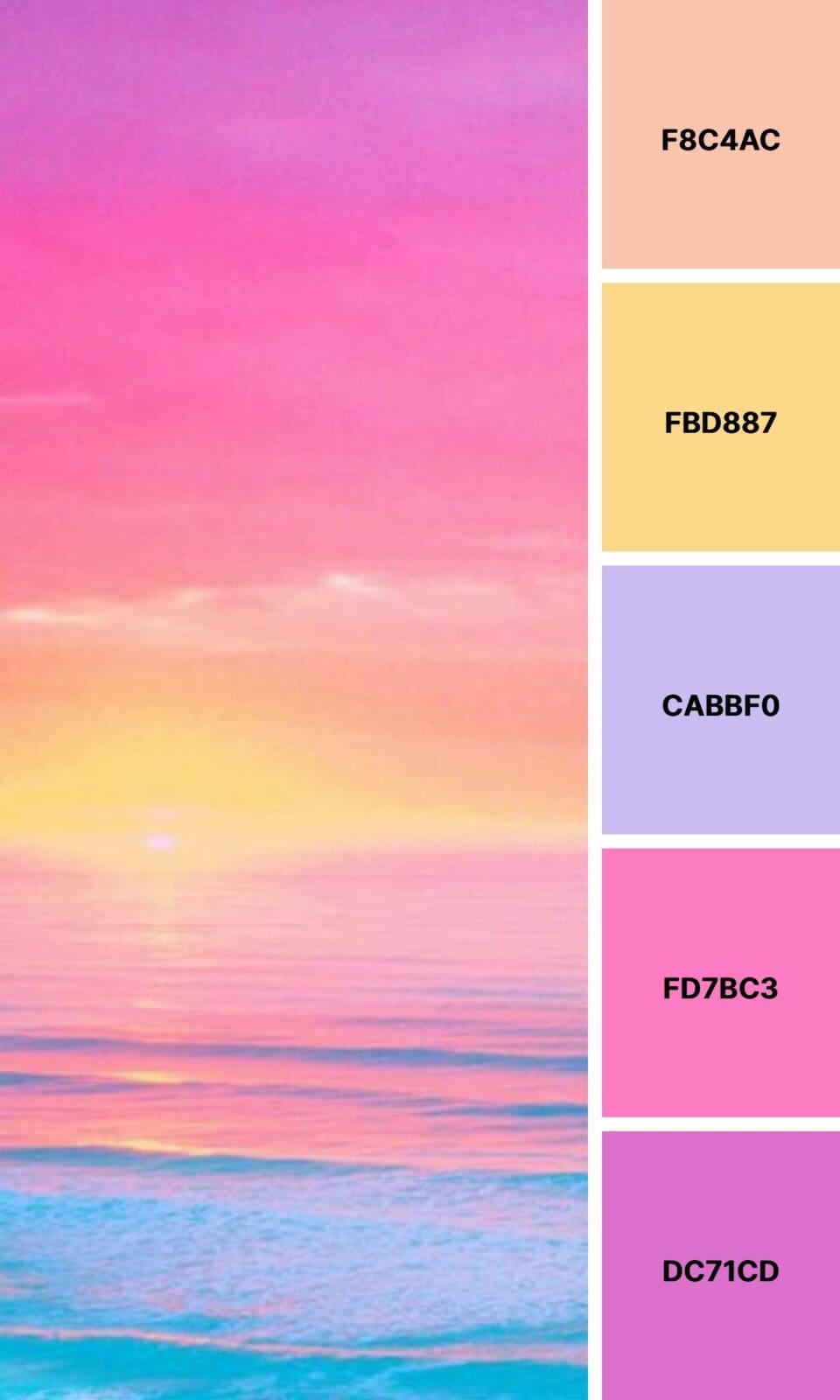
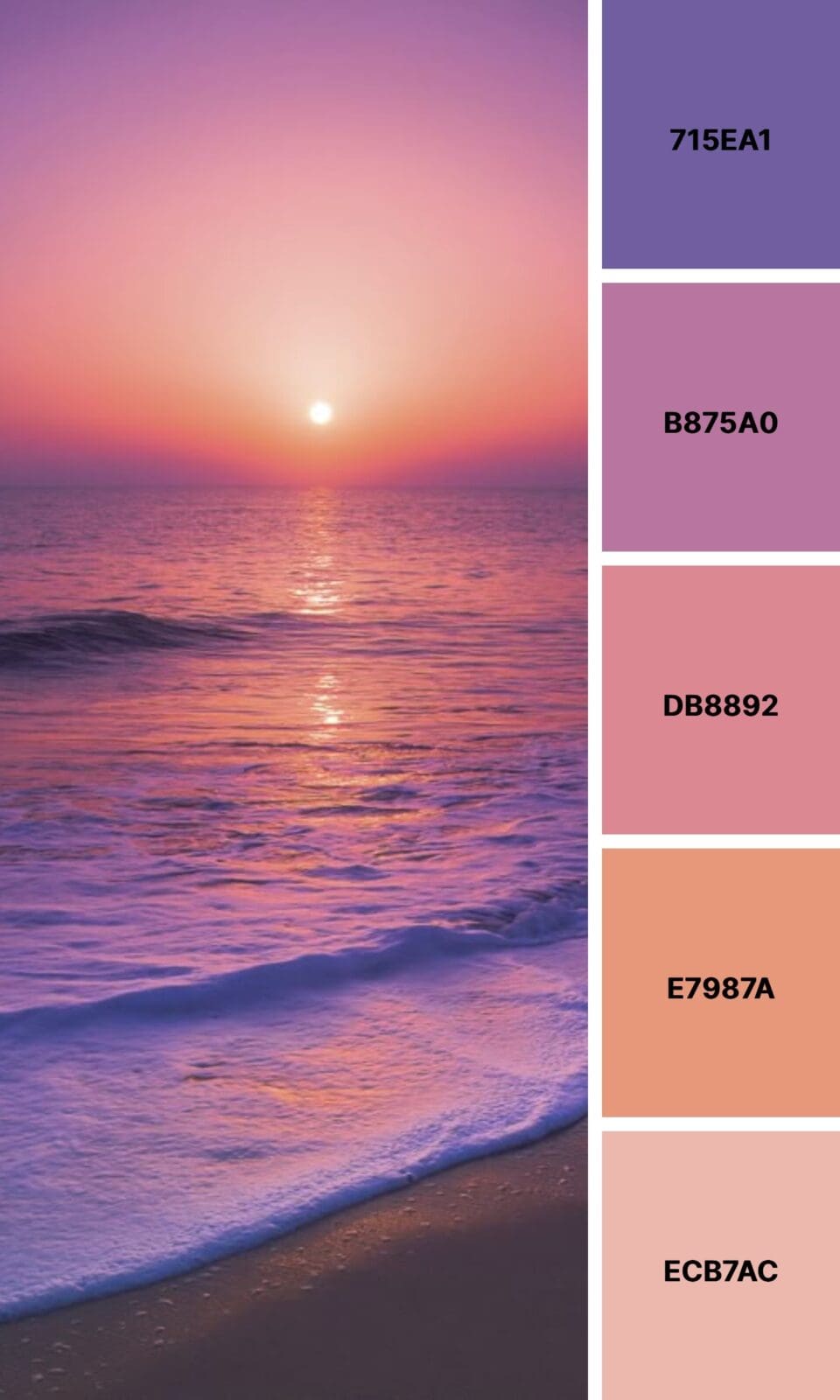
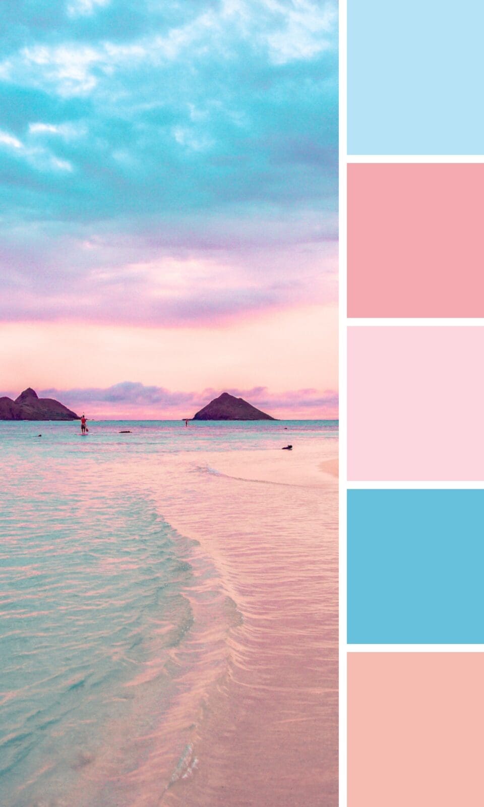
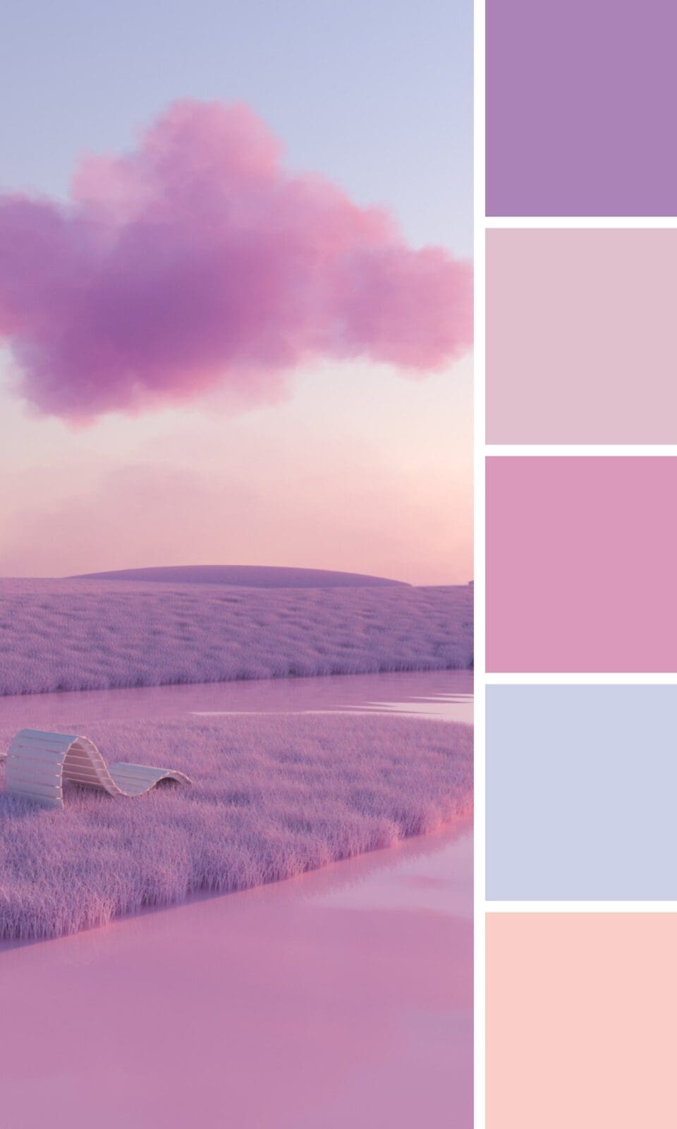
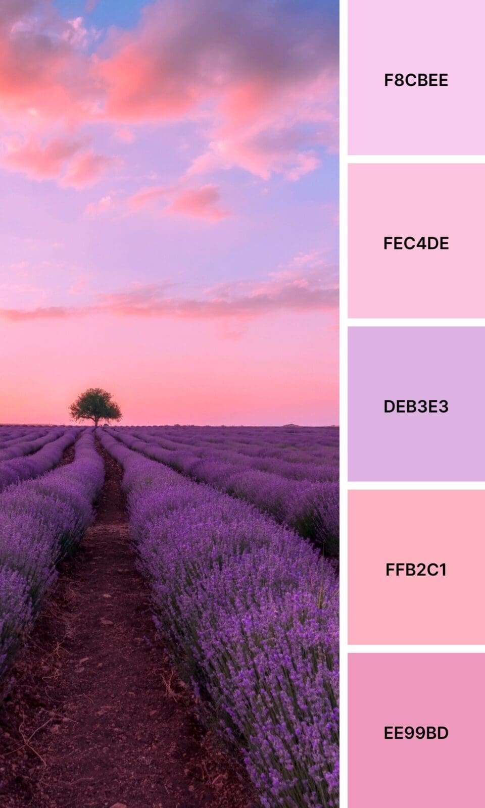
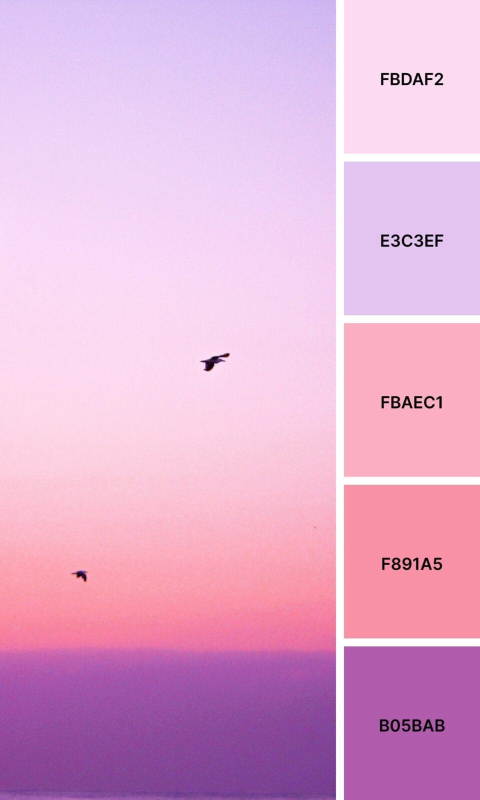
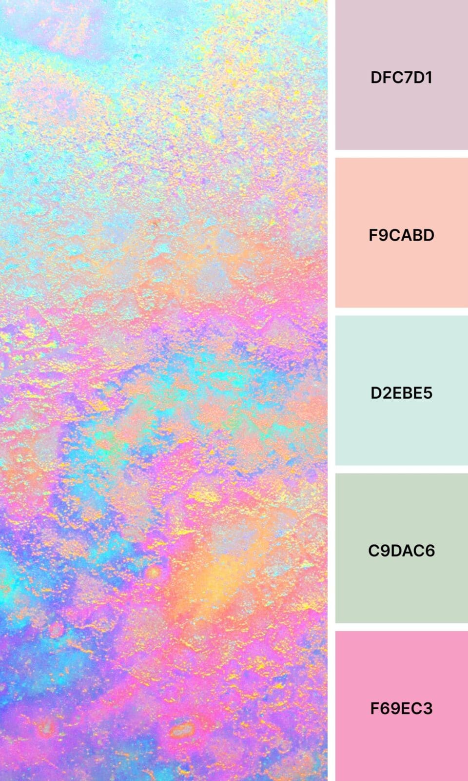
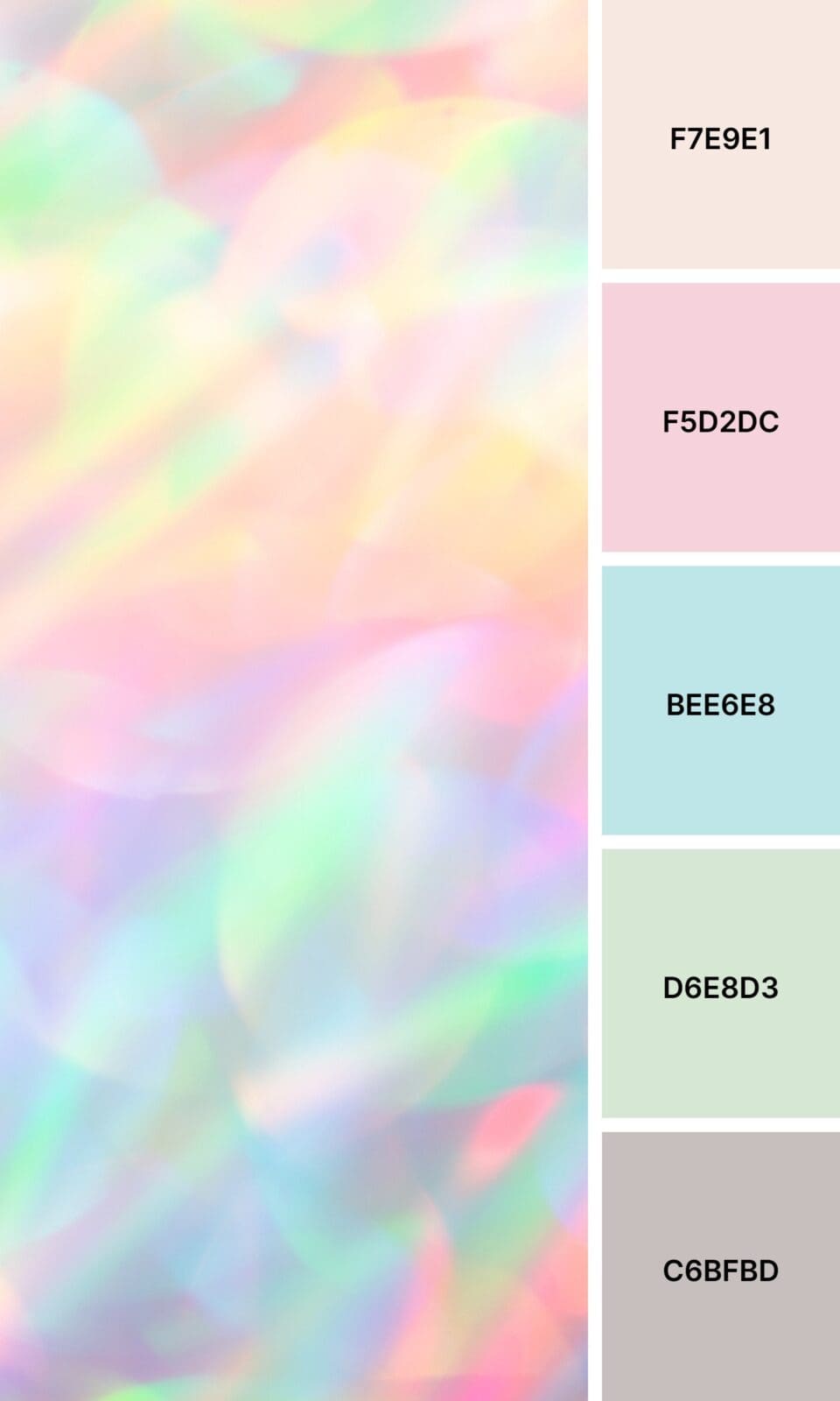
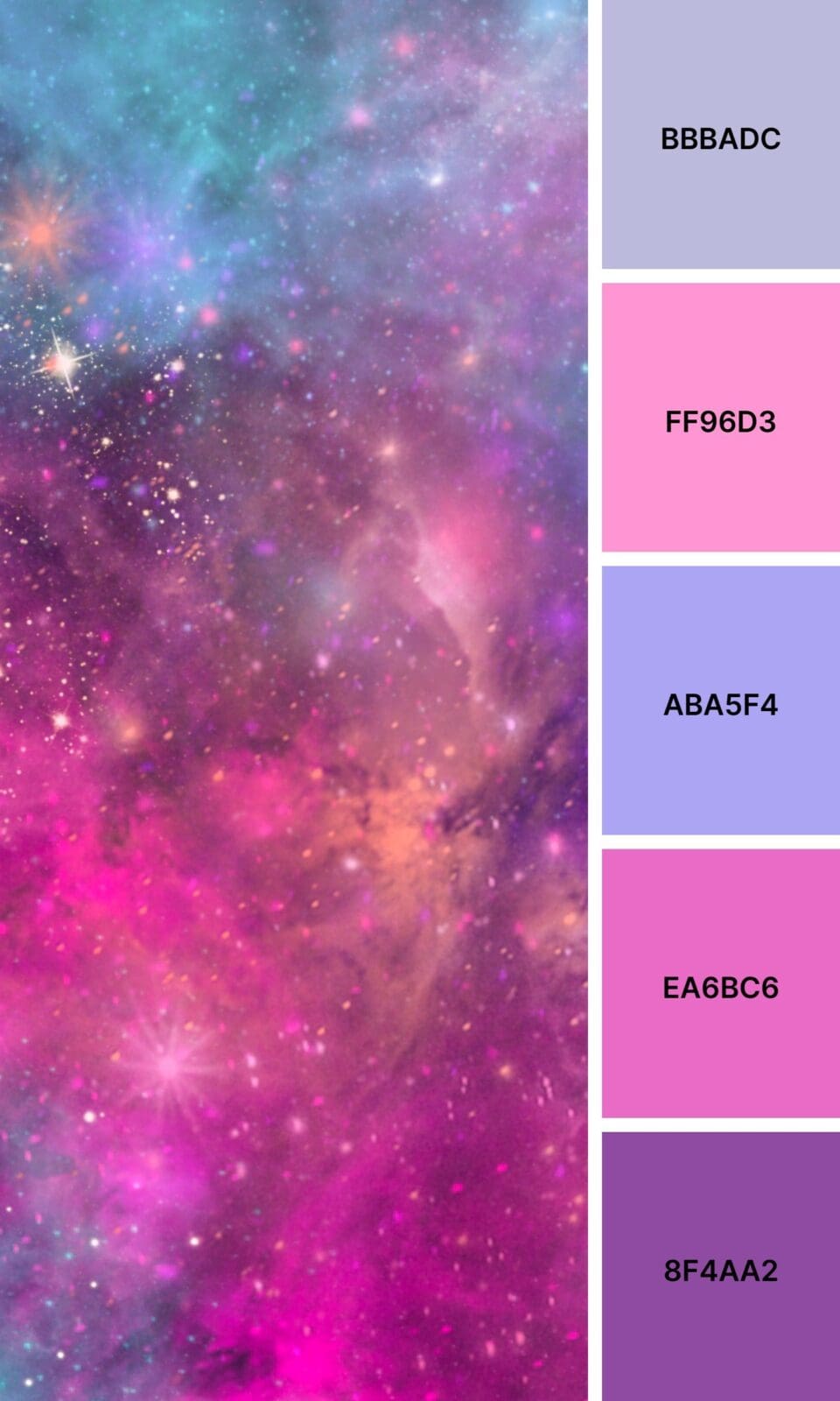
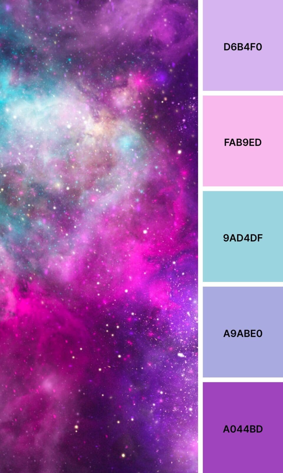
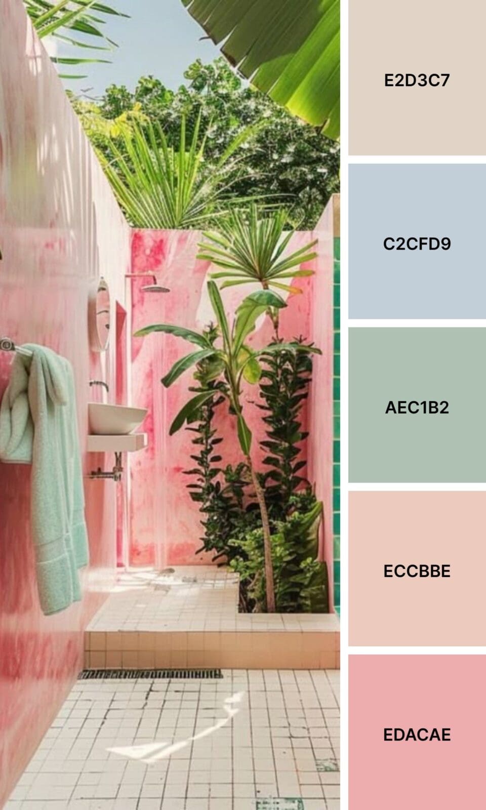
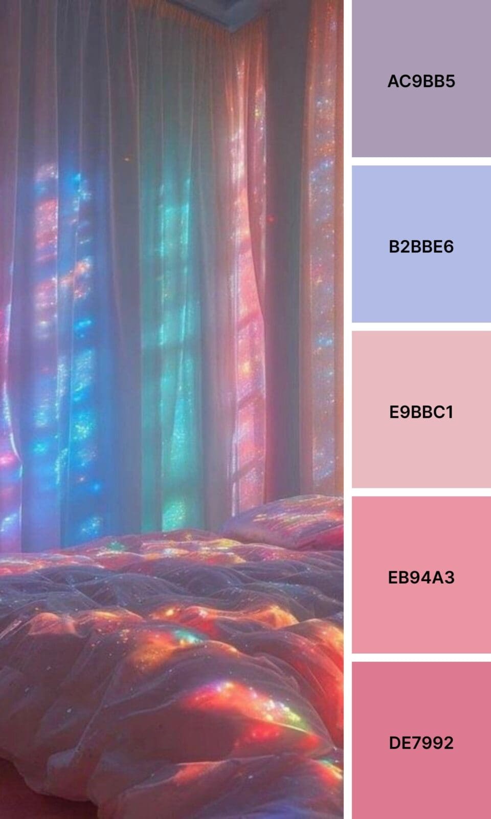
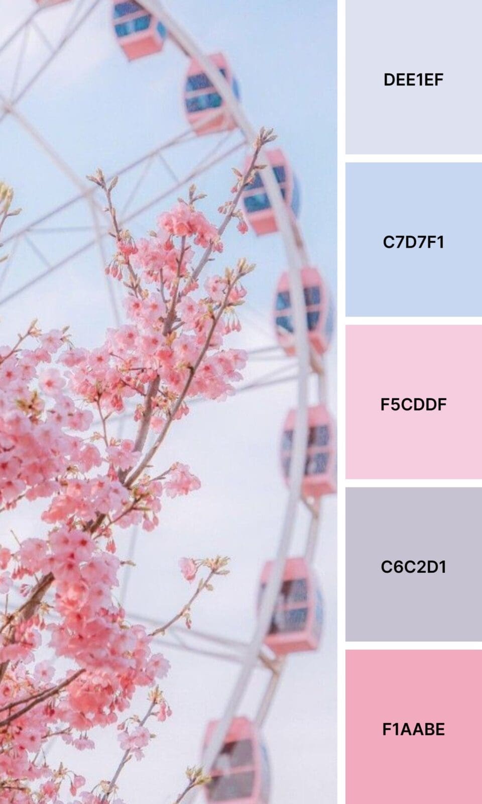
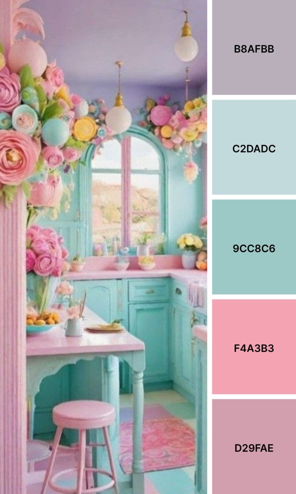
Pink + Lavender creates dreamy vibes that photograph beautifully (hello, Instagram!).

Creating Your Instagram-Worthy Color Palette
Your social media presence needs consistency, but that doesn’t mean boring! Here’s my tried-and-true formula for creating a palette that photographs beautifully and converts followers into clients:
- Pick one dominant pink that feels authentic to your brand personality
- Choose 2-3 supporting colors that enhance your pink without fighting it
- Add 1-2 neutrals for balance (your eyes need somewhere to rest)
- Test everything together before committing
Here’s a pro tip I wish someone had told me earlier: take photos of your palette in different lighting. That gorgeous dusty pink might look completely different on your phone versus your laptop.
The key is consistency across all your platforms. Your Instagram stories should feel connected to your feed posts, which should connect to your website colors.
Industries Where Pink Really Shines
Pink isn’t just for beauty brands (though it certainly works there too!). I’ve seen it work magic in coaching and consulting, where it suggests both expertise and approachability. Wedding planners obviously love it, but so do female-focused tech companies wanting to break industry stereotypes.
Personal brands, especially those built by women entrepreneurs, often find pink helps them stand out in crowded markets while still feeling authentic to who they are.
Bring Your Brand to Life in Pink
Ready to test drive some pink in your brand? Start small – maybe update your Instagram story highlights or create one post using your chosen palette. See how it feels, how your audience responds, and whether it aligns with your gut instincts about your brand.
Remember, you don’t need to overhaul everything overnight. The most important thing is to start experimenting and pay attention to how different combinations make you (and your audience) feel.
What if this time next month, you had a color palette that made people instantly recognize your content in their feed? These possibilities are absolutely within your reach – you just need to take that first colorful step!

-high fidelity-3x")


")
