")


There’s a reason some brands feel instantly calming and trustworthy – it’s not just great messaging or perfect product shots. It’s color. Specifically, green.
When used with intention, green can make your brand feel like a breath of fresh air in whatever industry you’re in.
Green isn’t just nature’s favorite color. When used strategically, it becomes one of your most powerful branding tools for building trust and conveying growth.
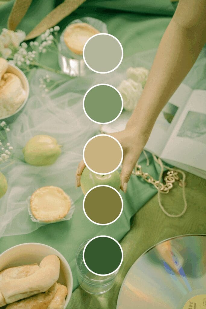
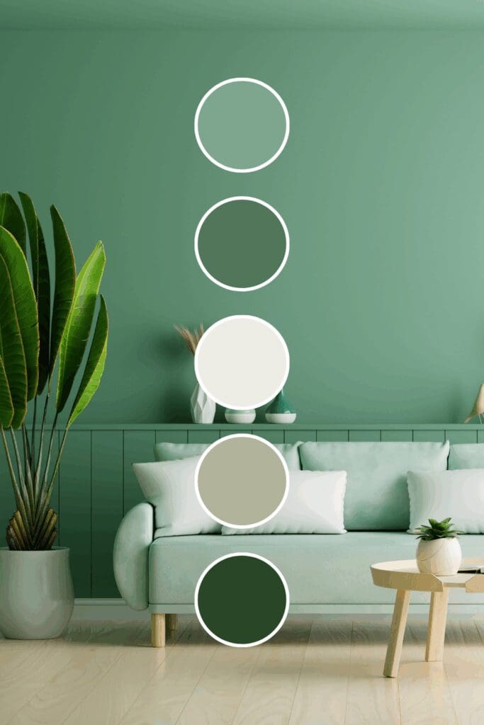
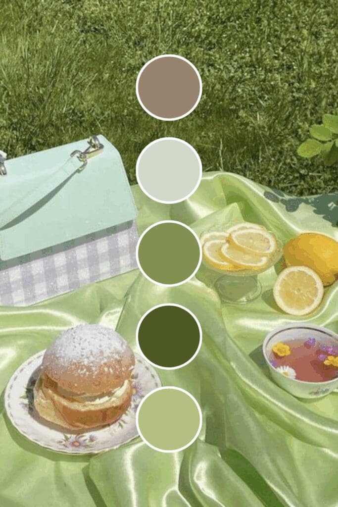
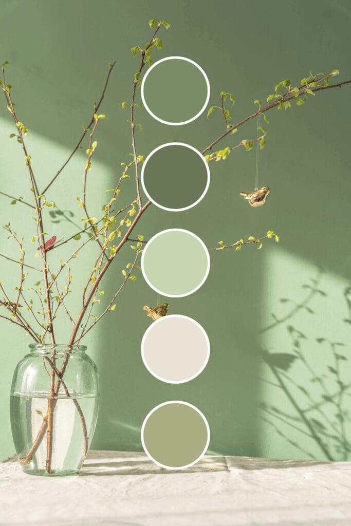
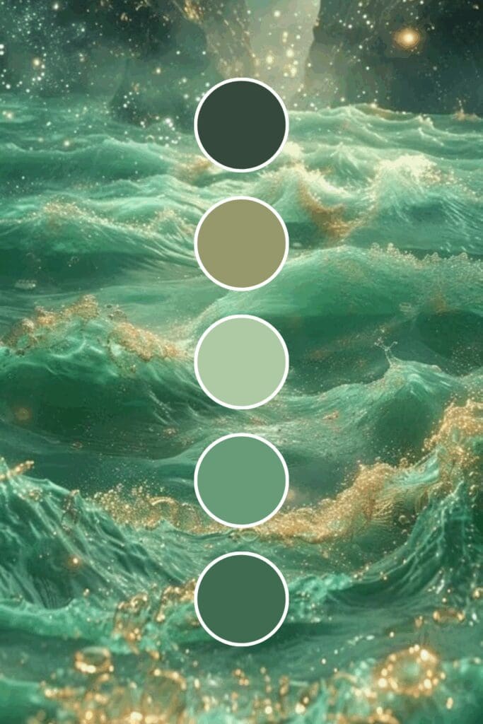
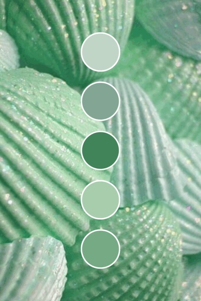
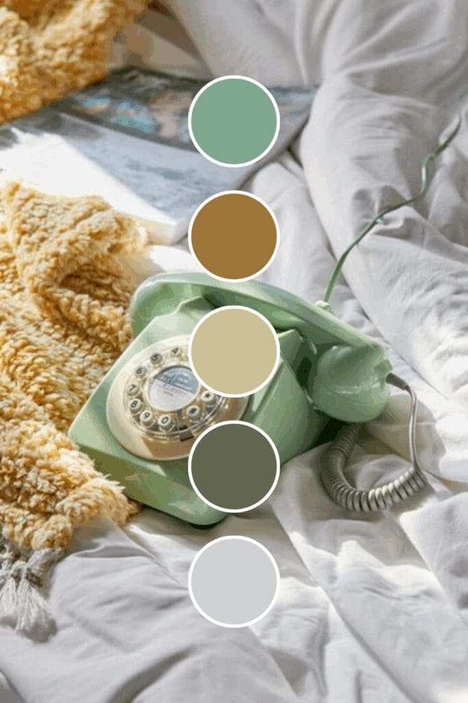
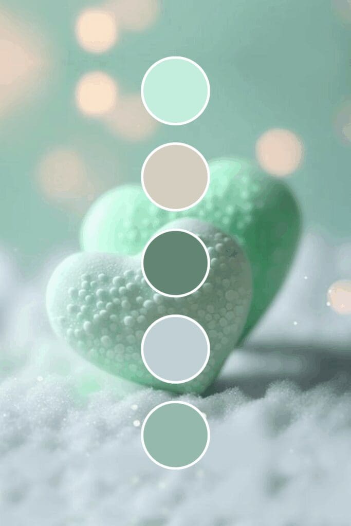
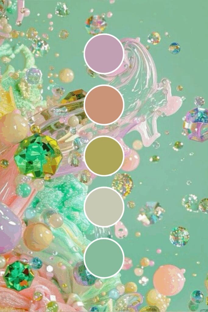
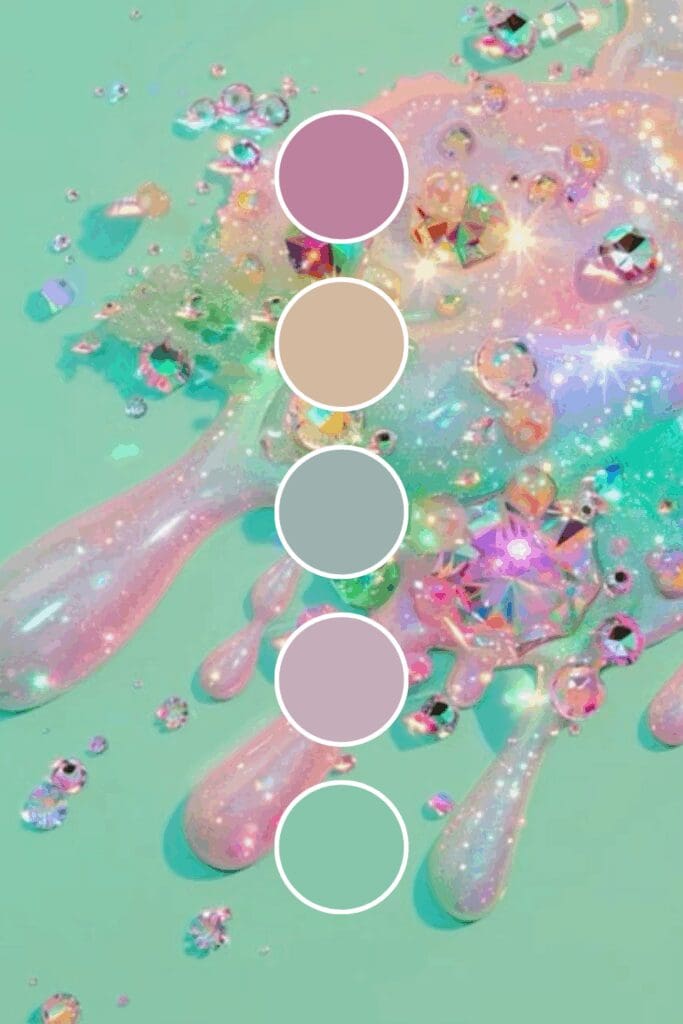
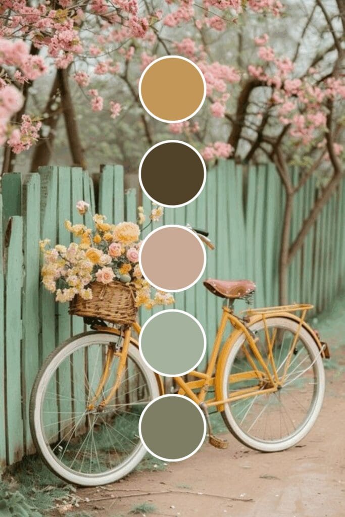
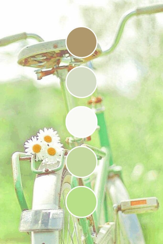
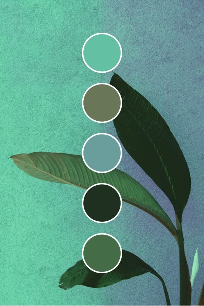
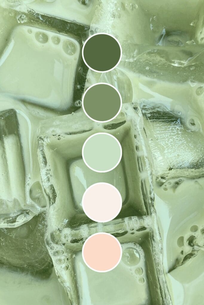
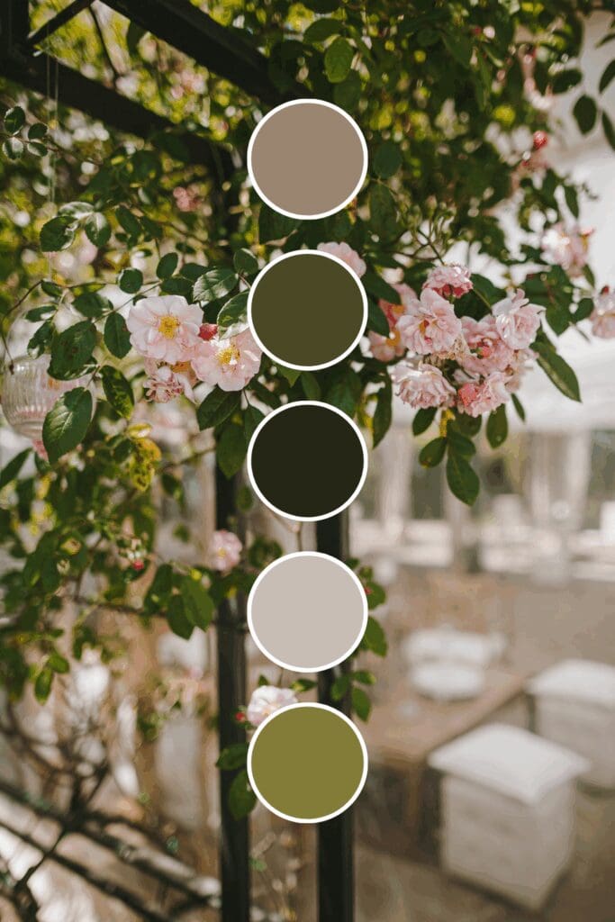
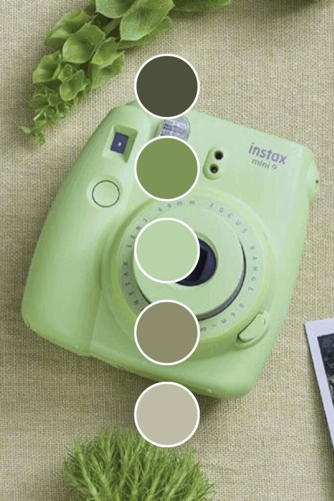
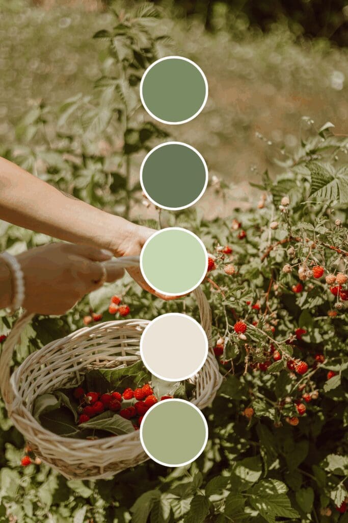
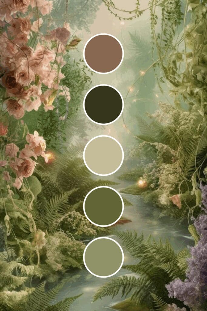
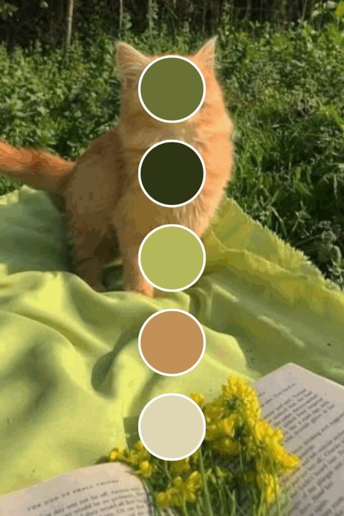
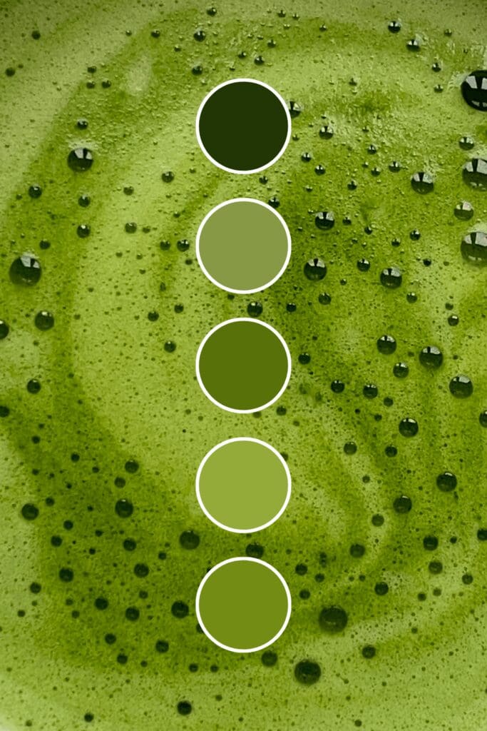
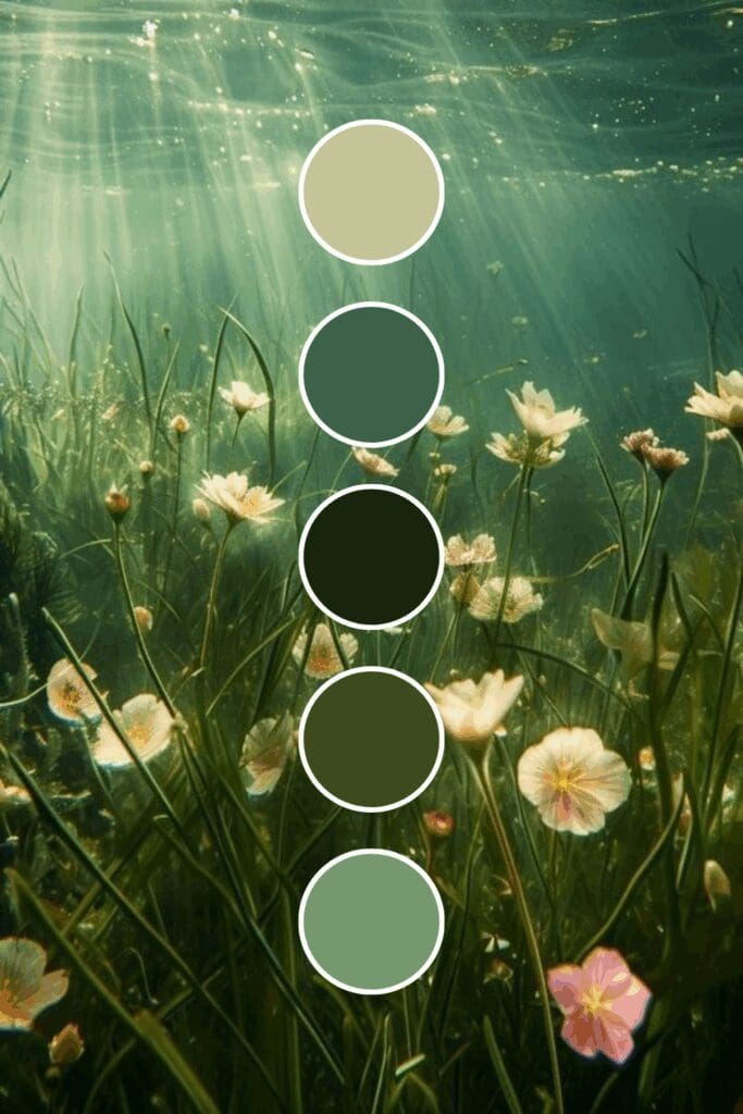
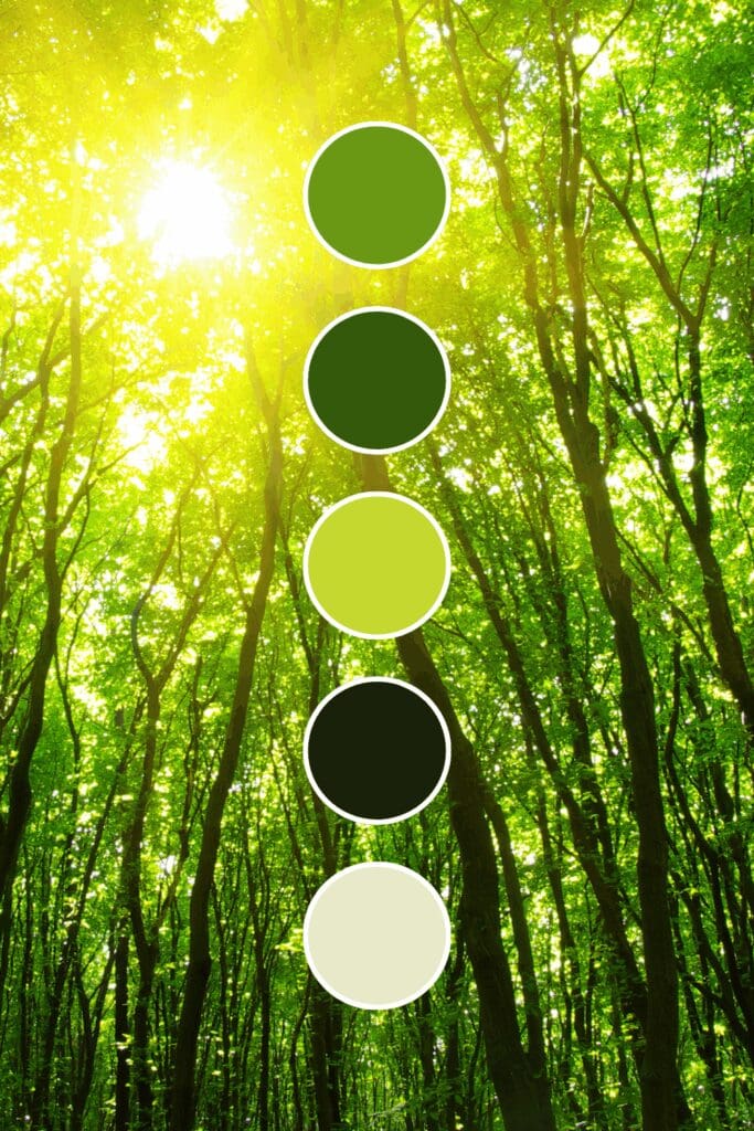
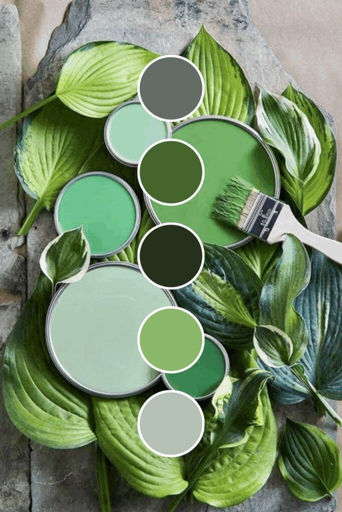
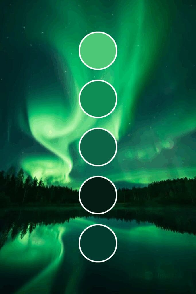
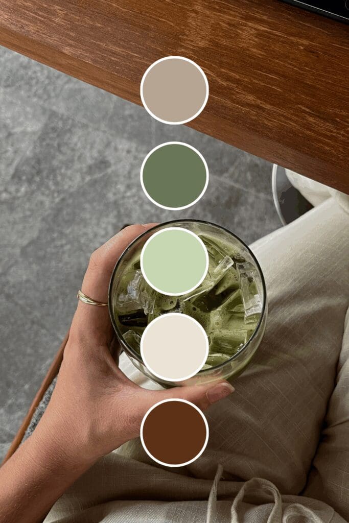
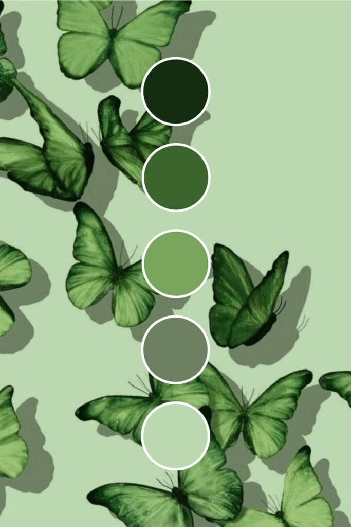
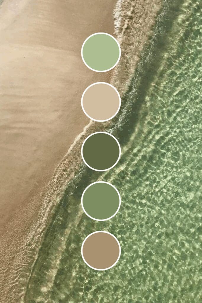
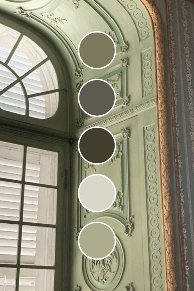
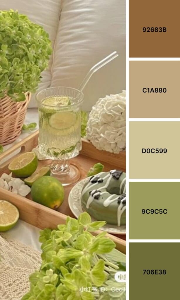
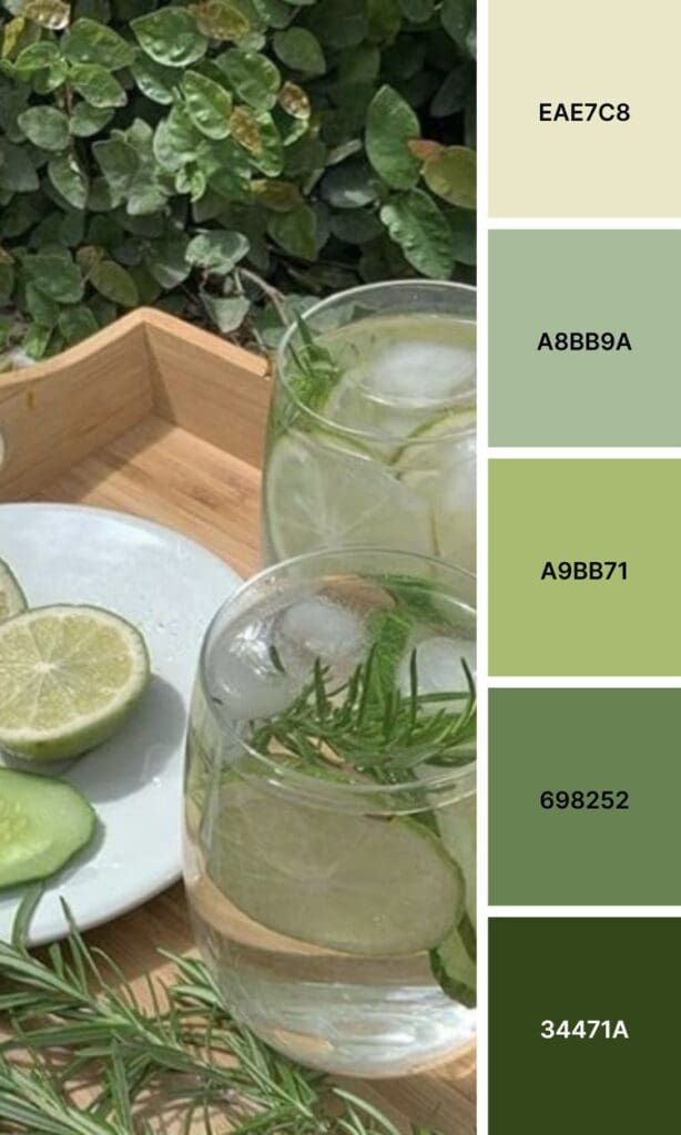
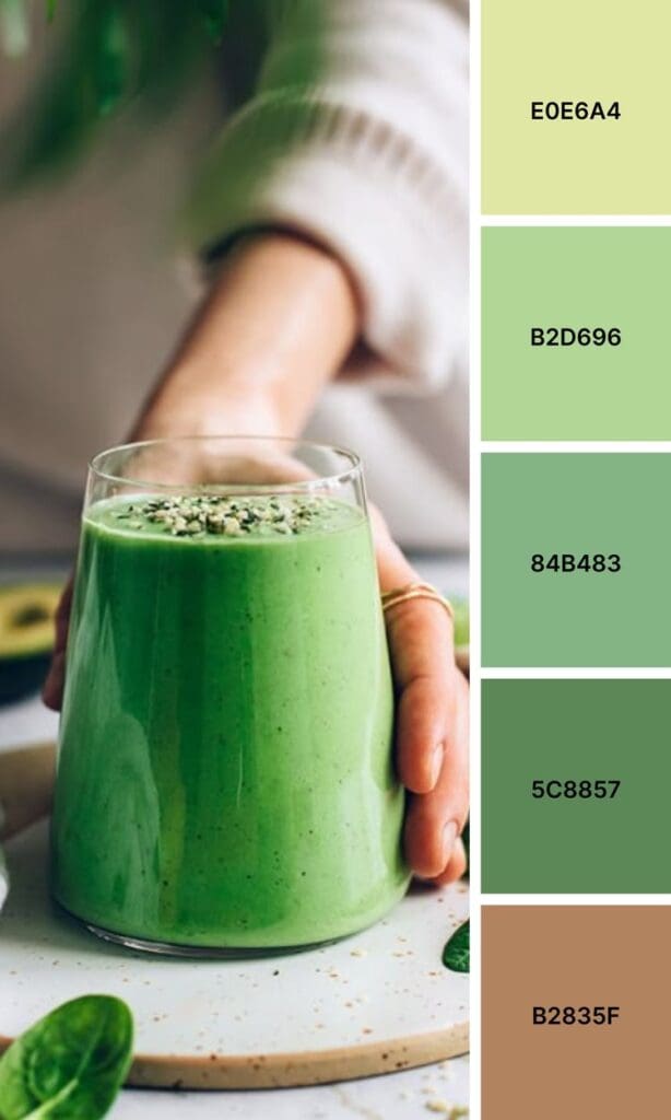
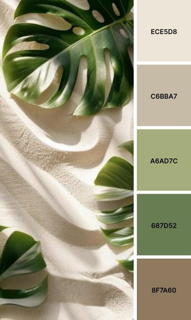
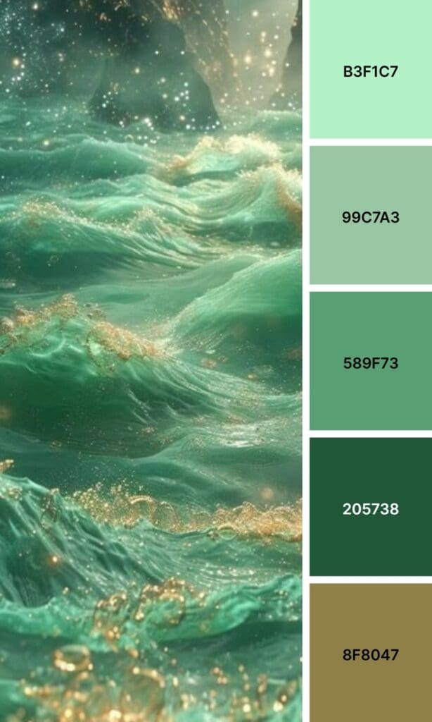
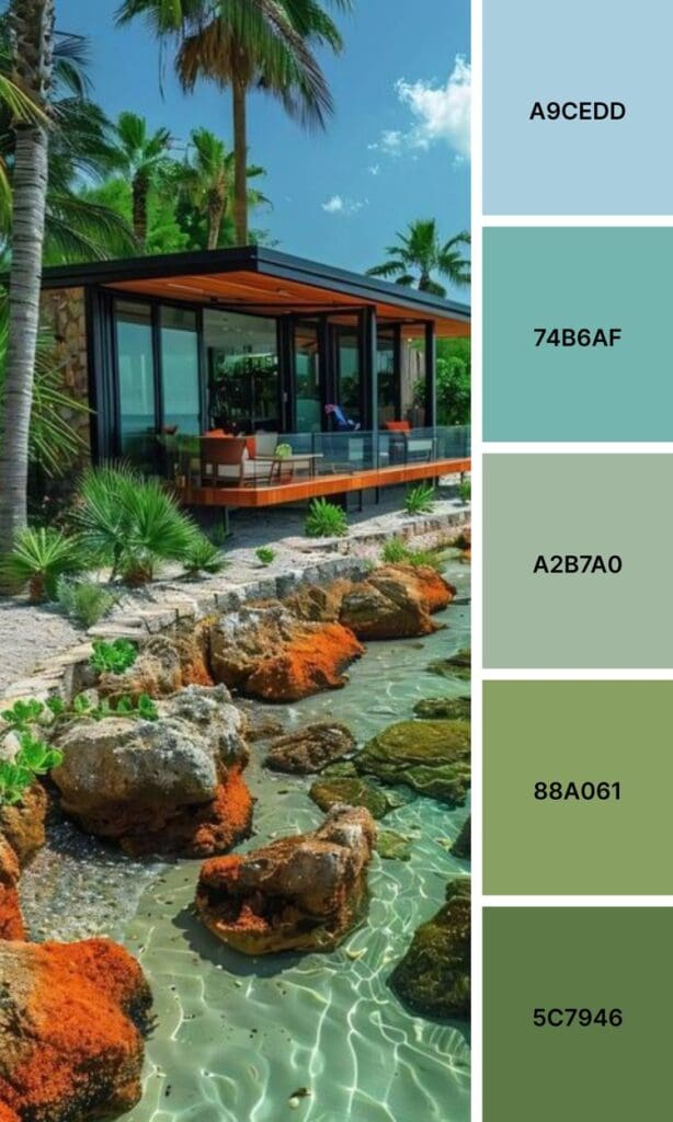
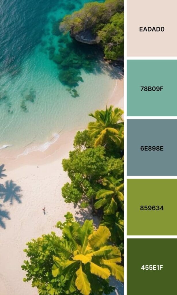
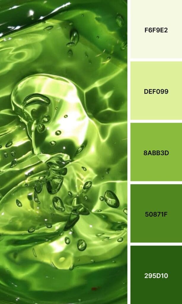
Whether you’re launching a new business or giving your current brand a refresh, these 100 green color palettes will help you find that perfect combination that feels authentically you.


The Psychology Behind Green’s Brand Power
Using green in your color palette is like having a whole emotional toolkit at your fingertips, and understanding this can completely transform how your audience connects with your brand.
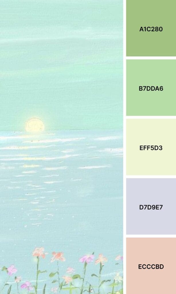
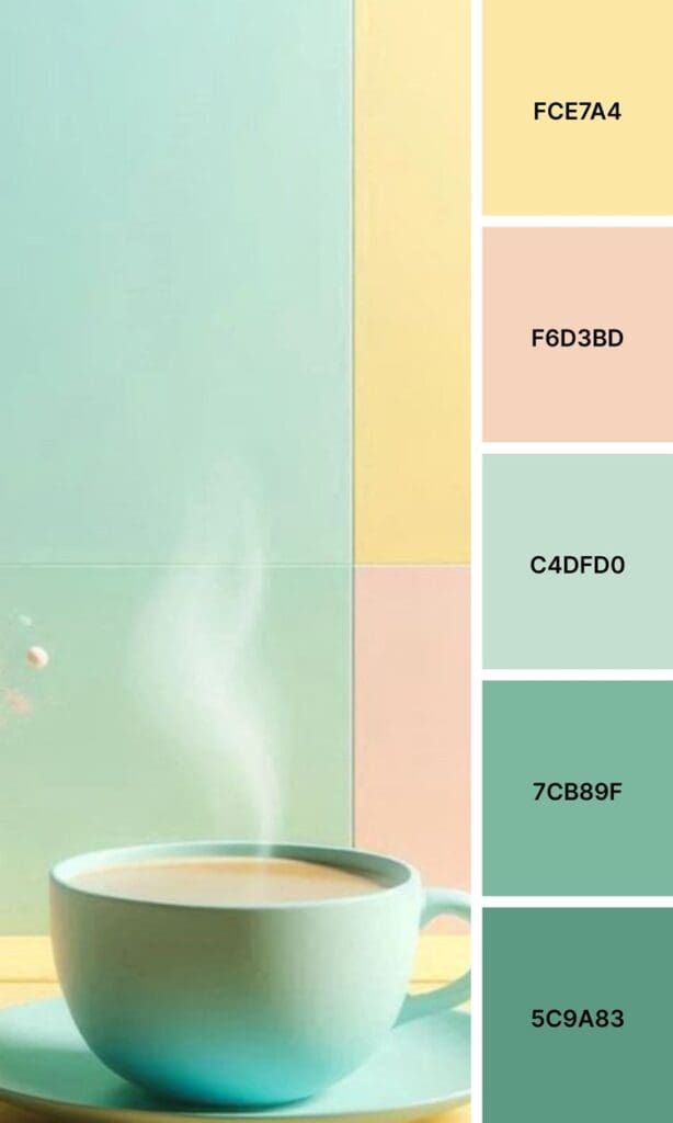
Soft, sage greens whisper “balance and calm” – they make people feel grounded and peaceful. Think about wellness coaches, therapists, or anyone in the mindfulness space. These gentle tones say, “You can exhale here.”
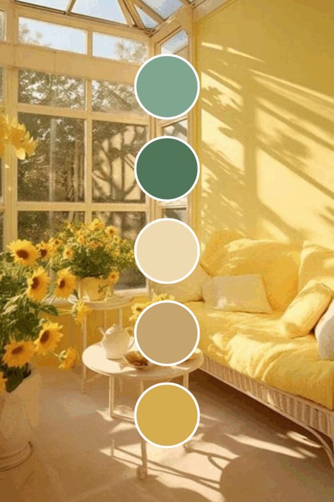
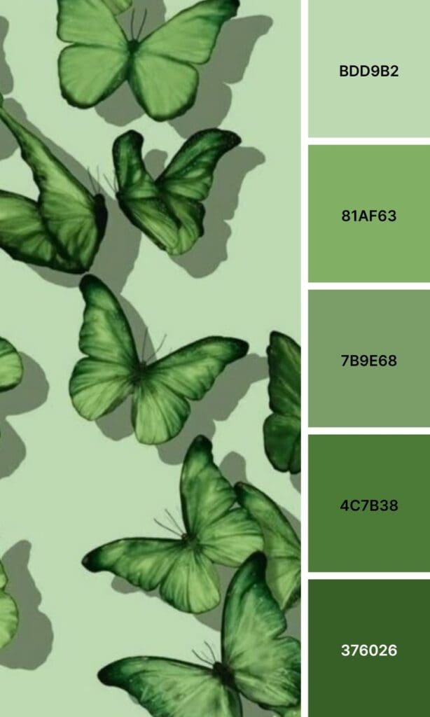
But switch to emerald green, and suddenly you’re communicating luxury and sophistication. High-end service providers and premium brands love these rich tones because they suggest success and exclusivity without feeling cold.
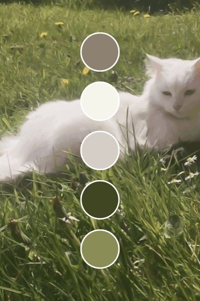
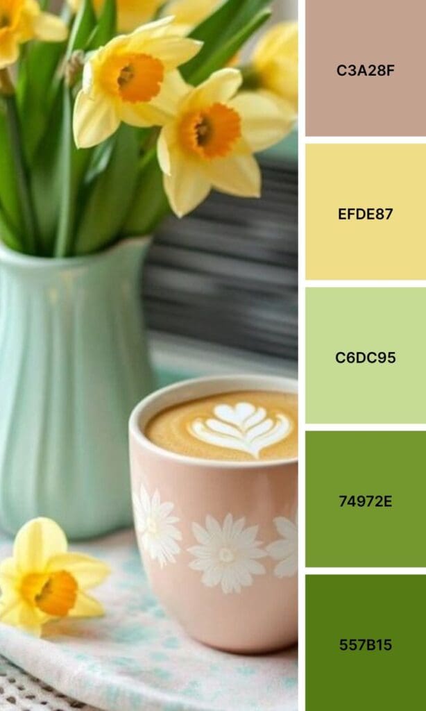
Then there are those fresh lime greens that practically burst with energy and innovation. Tech startups, fitness brands, and anyone targeting ambitious go-getters often gravitate toward these vibrant shades because they signal, “We’re here to shake things up!”
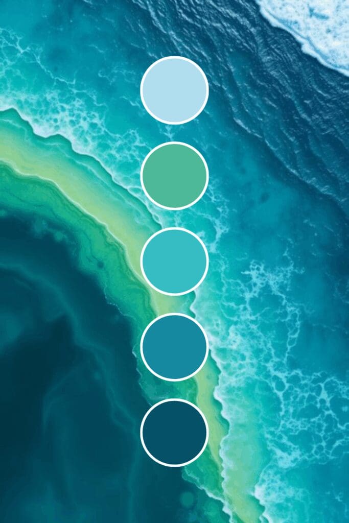
And those deep forest greens? They’re pure stability and trustworthiness in color form, perfect for financial advisors or anyone who needs to convey reliability and experience.
Which Green Is Right for You?
Not all greens are created equal (trust me on this one). Here are the main players you should know about:
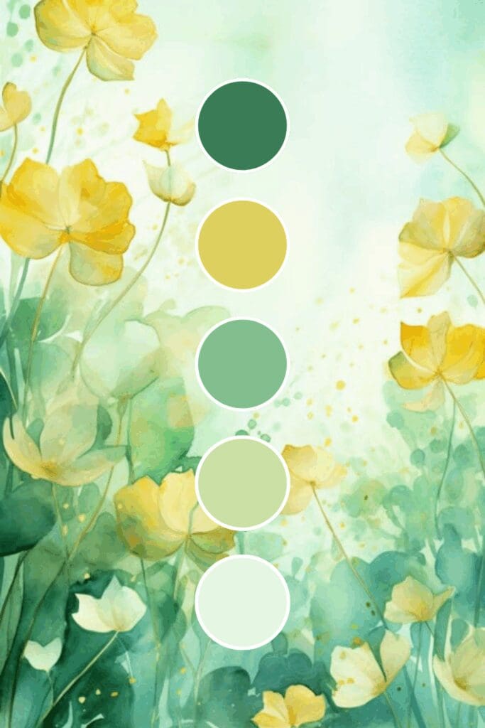
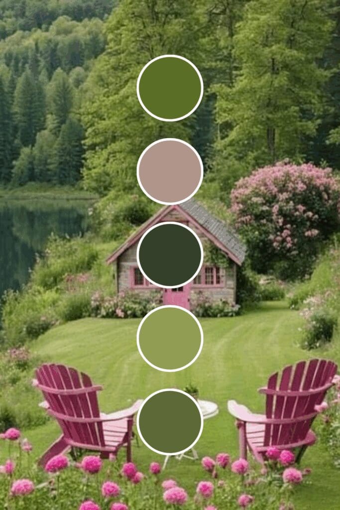
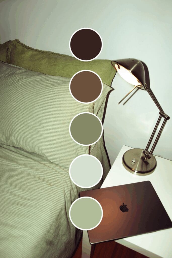
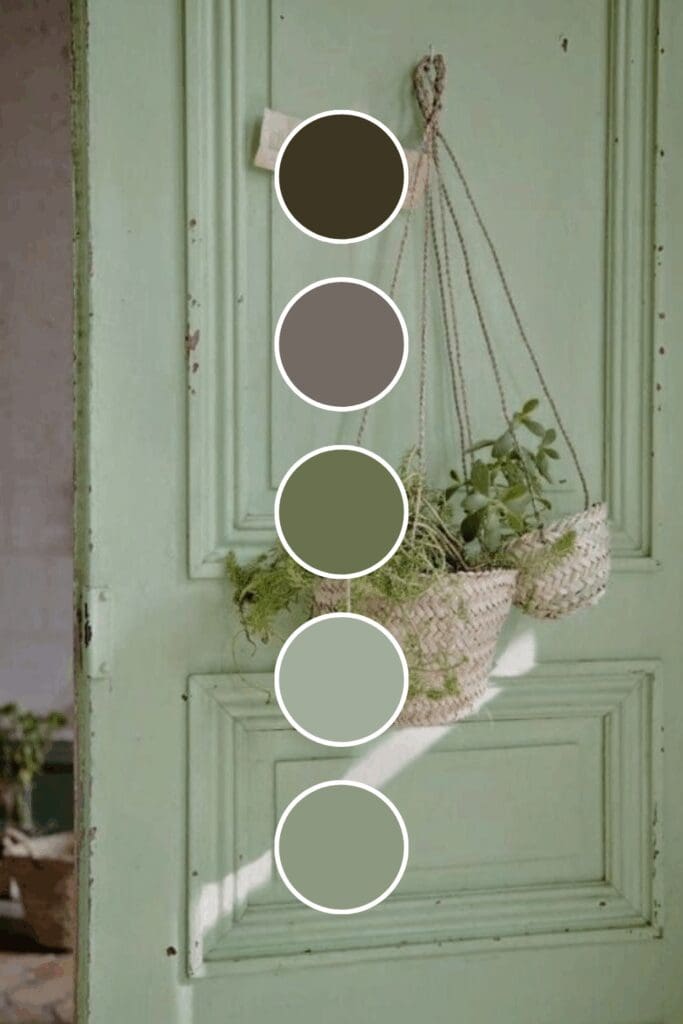
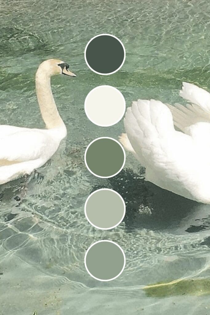
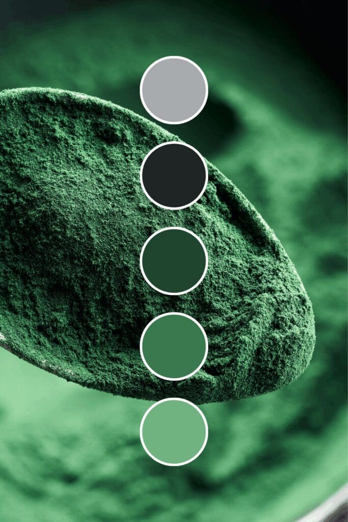
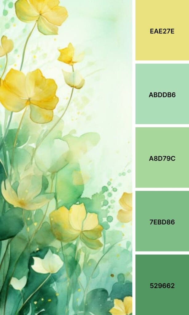
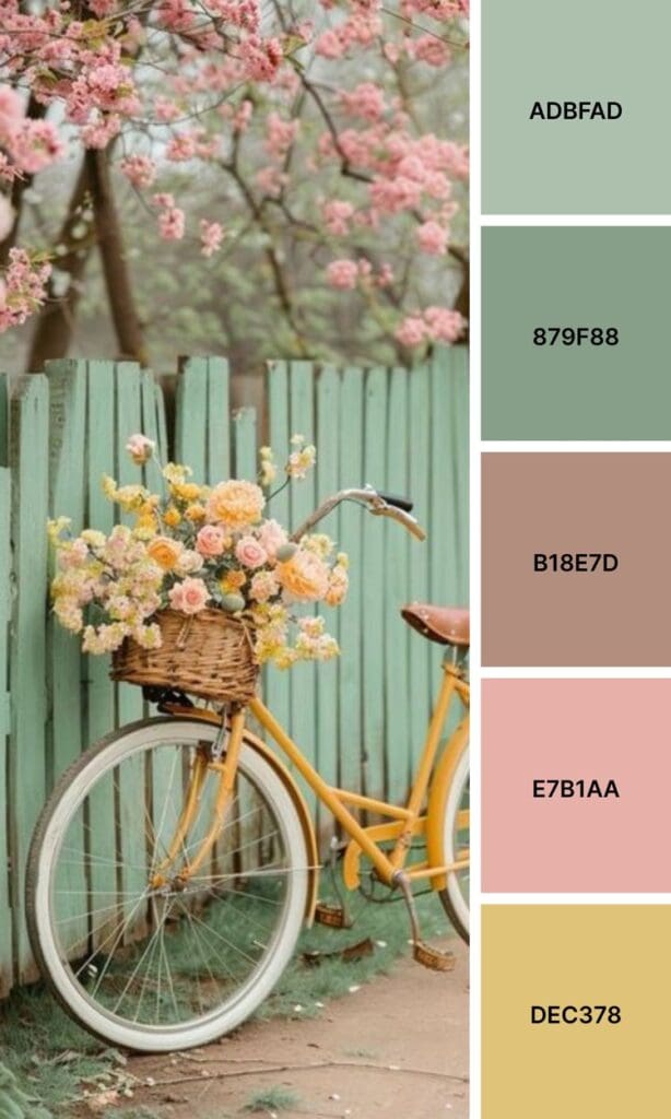
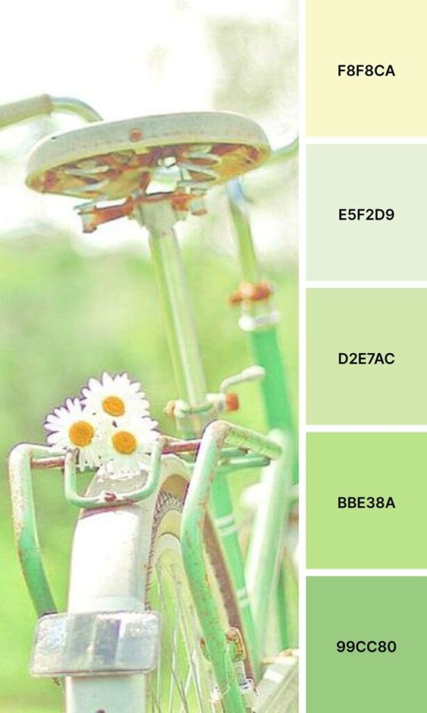
Sage Green is your zen friend who makes everyone feel instantly calm. Wellness brands love this because it feels both professional and nurturing – like a warm hug in color form.
Emerald Green doesn’t whisper; it confidently states its presence. If you’re positioning yourself as a premium service provider or luxury brand, this could be your secret weapon.
Forest Green has that “I’ve been here forever and I’m not going anywhere” energy. Financial advisors and established service providers often gravitate toward this shade because it suggests deep roots and reliability.
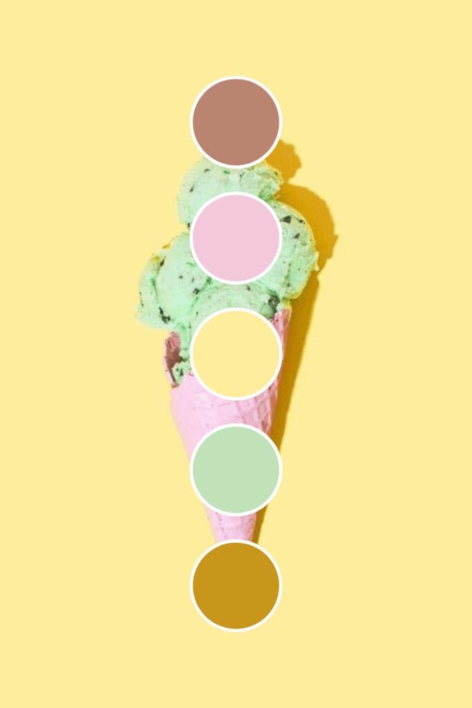
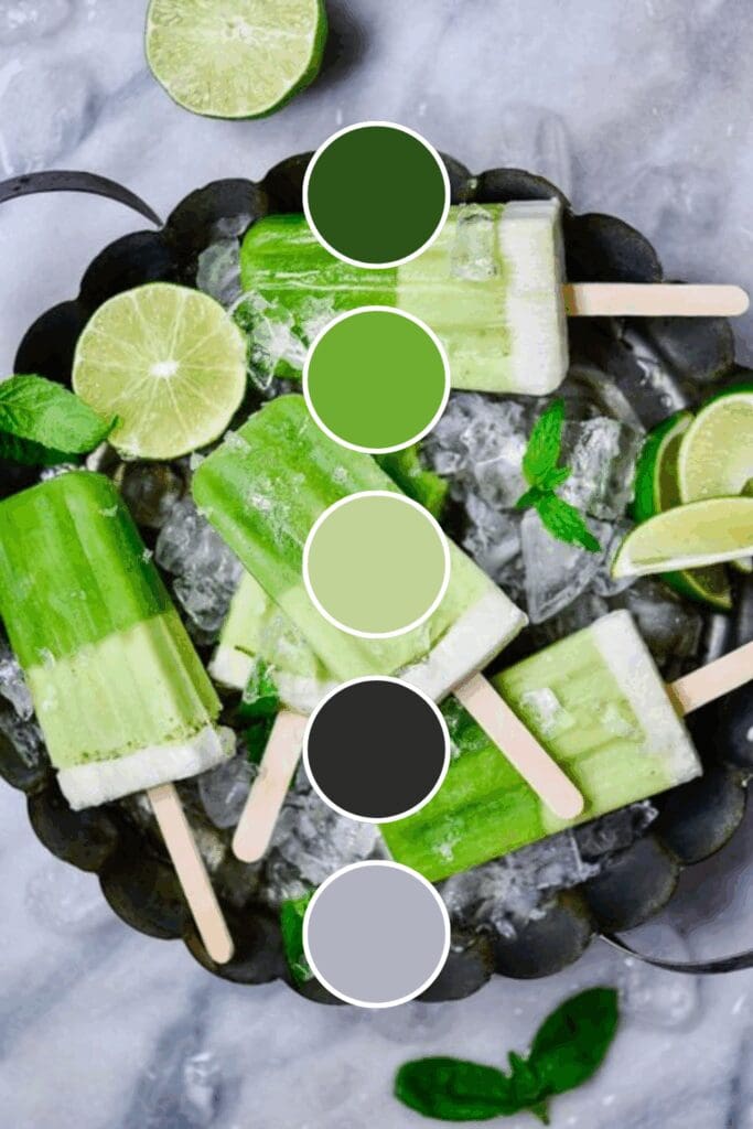
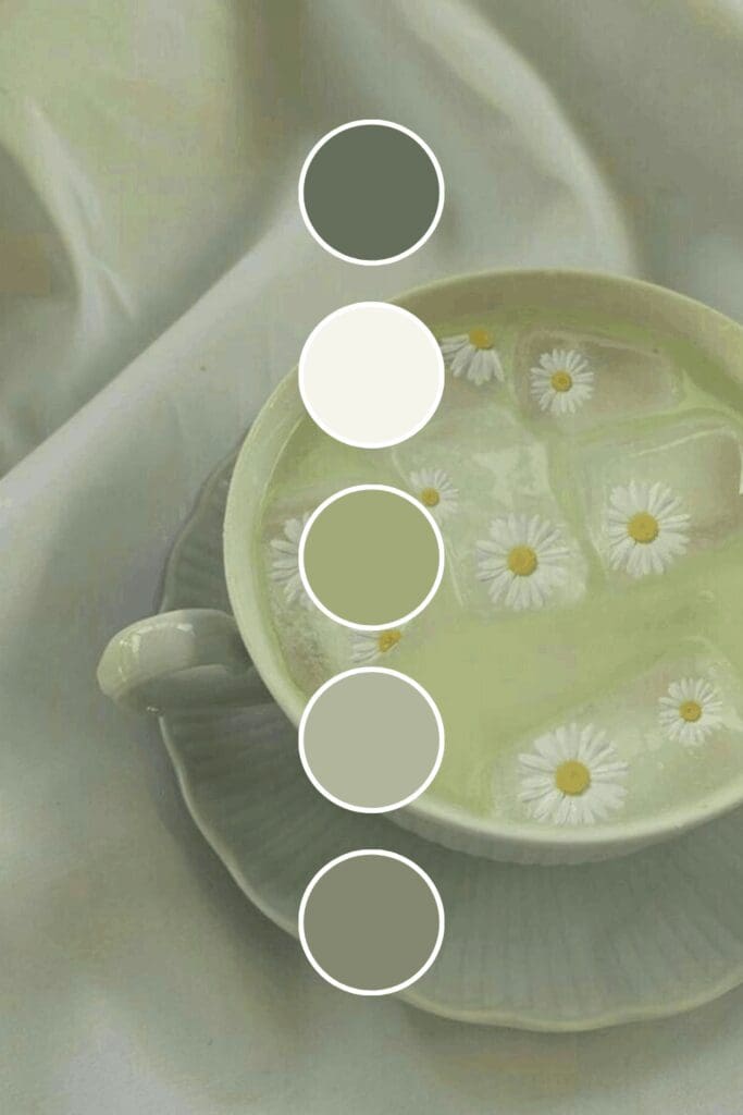
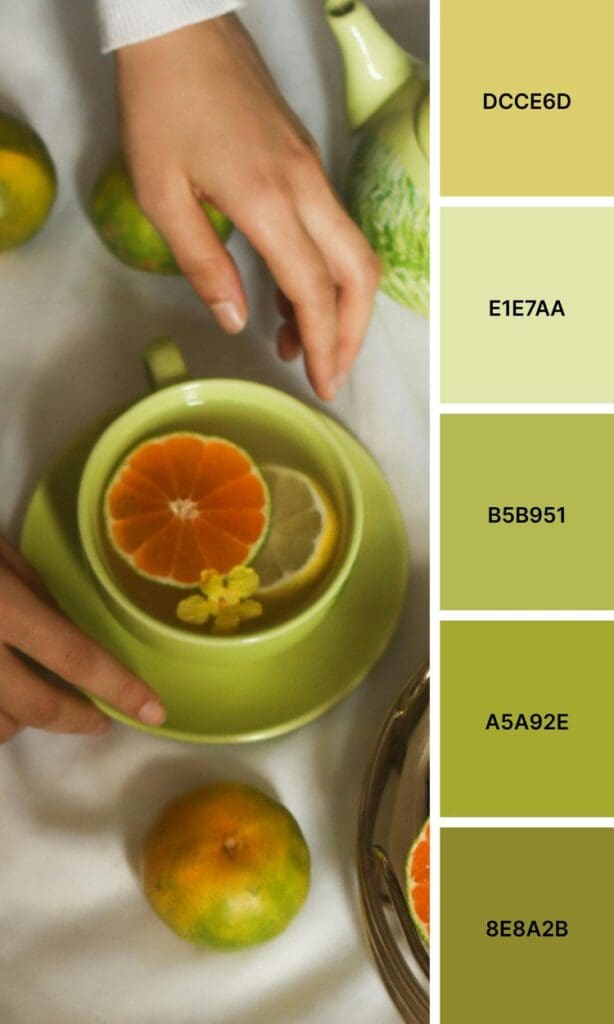
Mint Green brings fresh, clean energy that photographs beautifully. Beauty brands and lifestyle coaches can’t get enough of this refreshing shade.
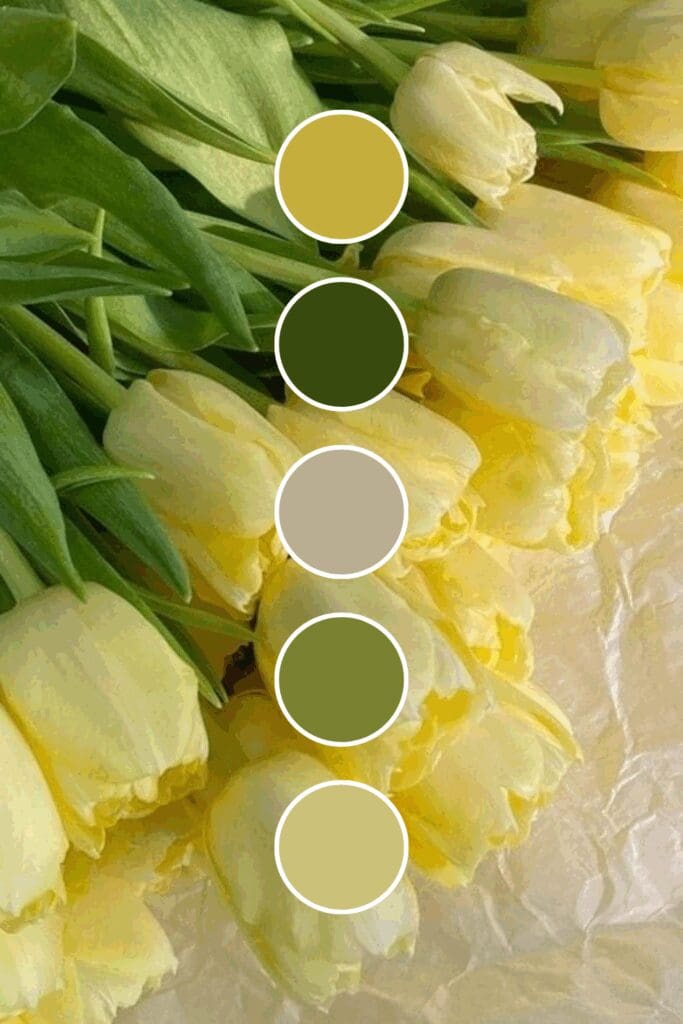
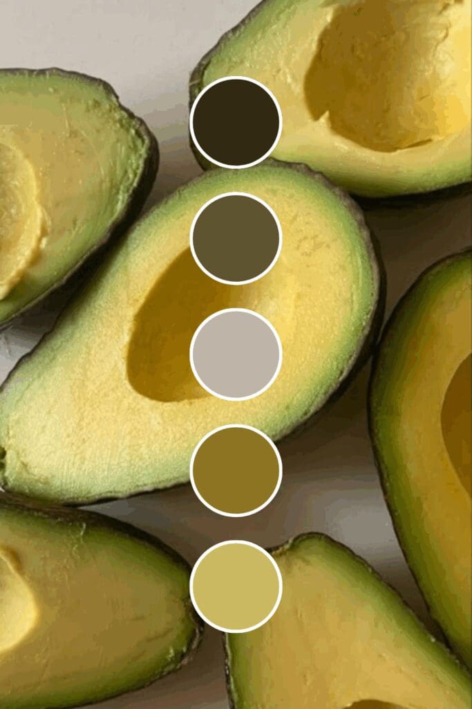
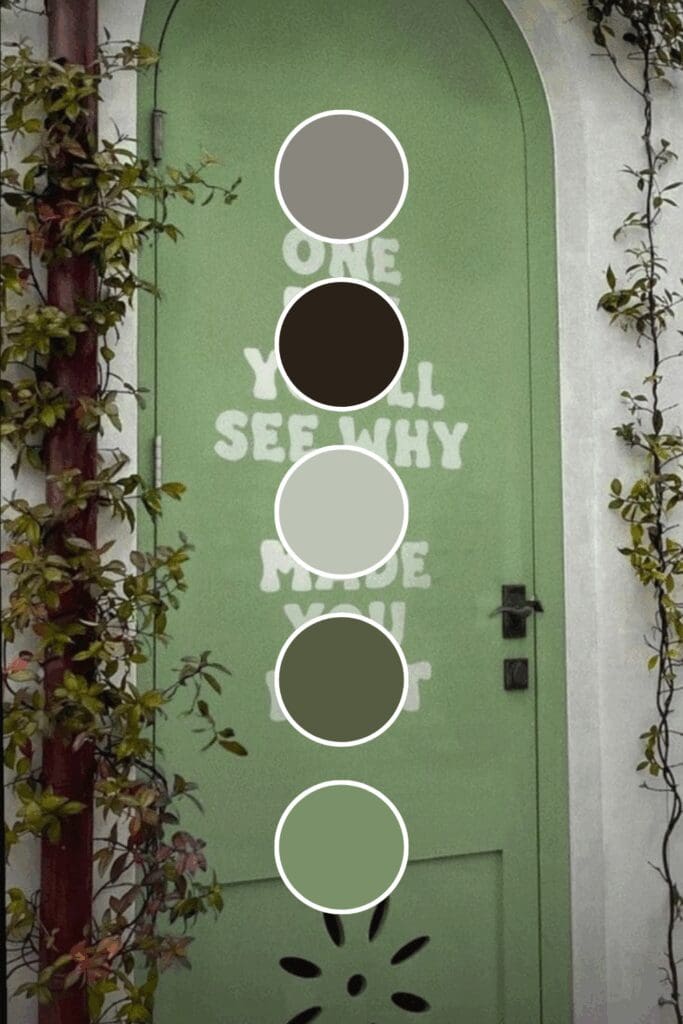
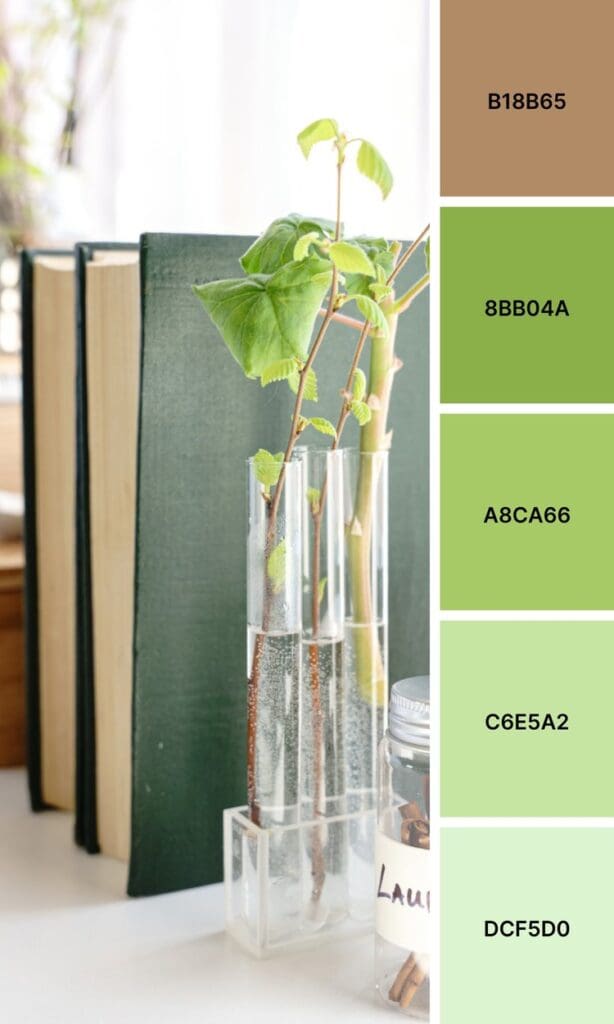
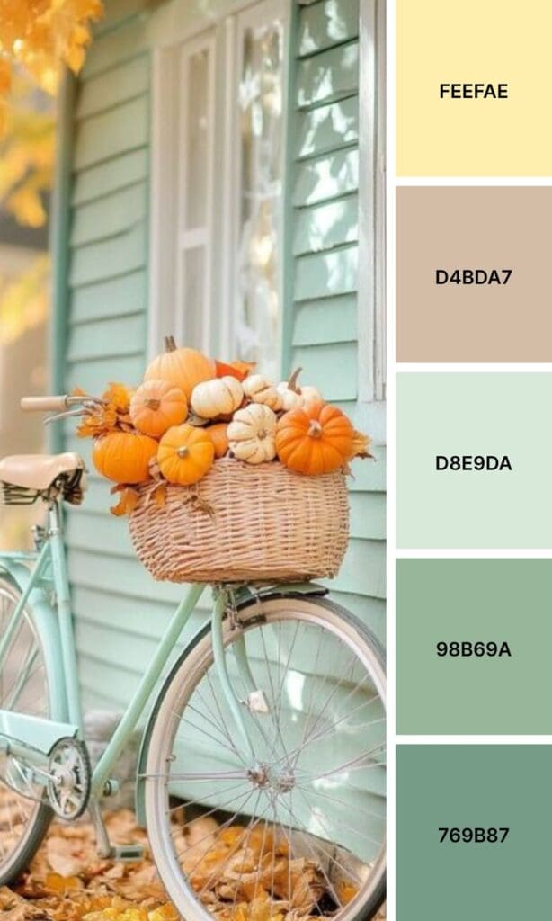
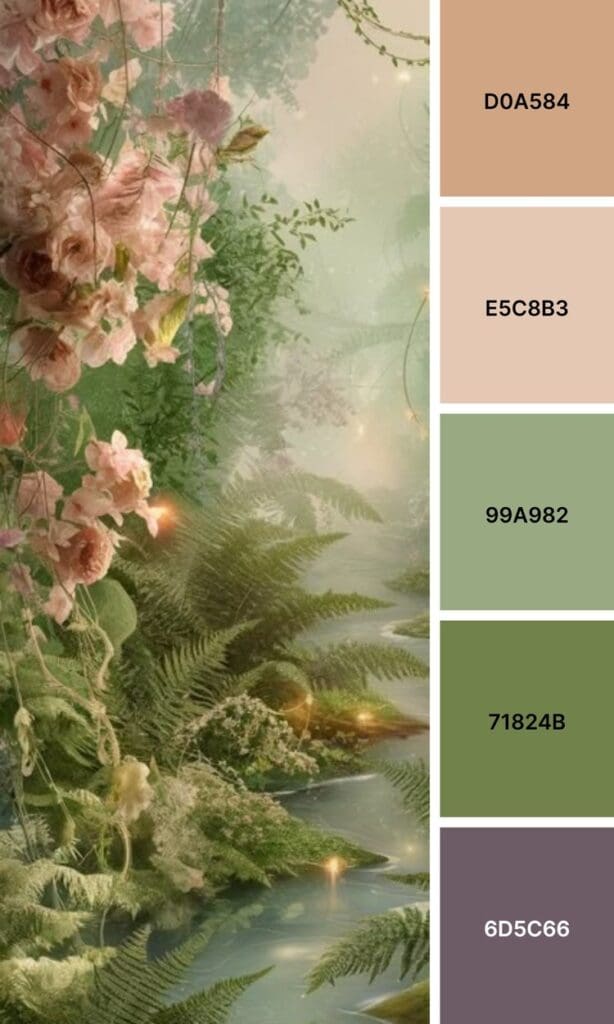
Olive Green straddles the line between green and brown, creating earthy sophistication that feels both modern and timeless.
Starting with one dominant green shade might not seem glamorous, but it’s exactly how every successful brand begins. You’ve got this!
Pairing Green Like a Pro Designer
Here’s where things get really exciting! The magic happens when you pair your perfect green with complementary colors that make both shades absolutely pop.
Time-Tested Combinations
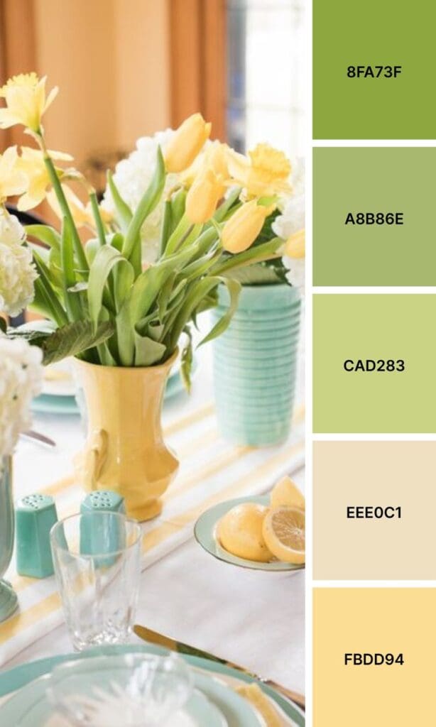
Green + Cream creates that fresh, “I have my life together” vibe that performs beautifully everywhere from business cards to social media. This works especially well if you’re in wellness or consulting, but don’t worry if you’re not – there’s an approach that will work for you too.
Green + Navy Blue is trust and growth rolled into one palette. Business coaches and financial advisors love this combo because it balances professionalism with approachability.
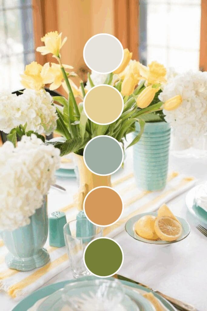
Green + Gold screams premium without being flashy. If you’re positioning yourself as the go-to expert in your field, this combination does half the work for you (and photographs like a dream).
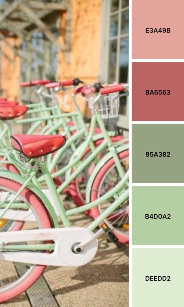
Green + Coral brings unexpected warmth that makes your brand feel both fresh and approachable. Creative entrepreneurs often find this combo irresistible because it’s memorable without being overwhelming.
Bold Pairings That Turn Heads
Just between us, these combinations often outperform the classics because they’re so memorable:
Green + Burgundy creates rich depth that suggests both growth and luxury. Perfect for established businesses wanting to feel approachable yet expert.
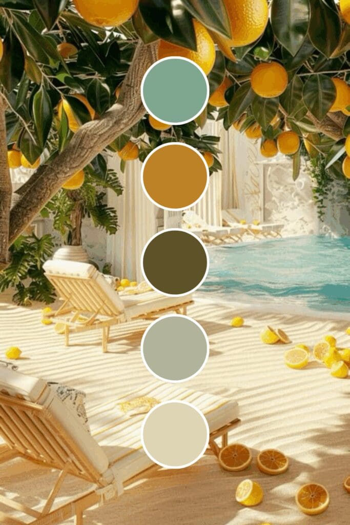
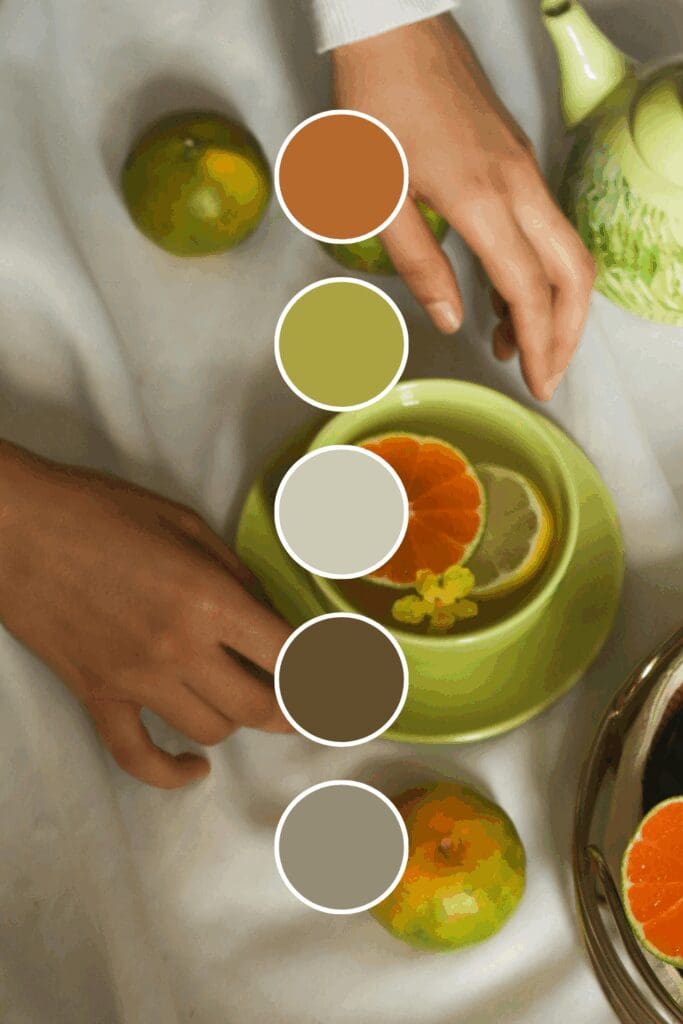
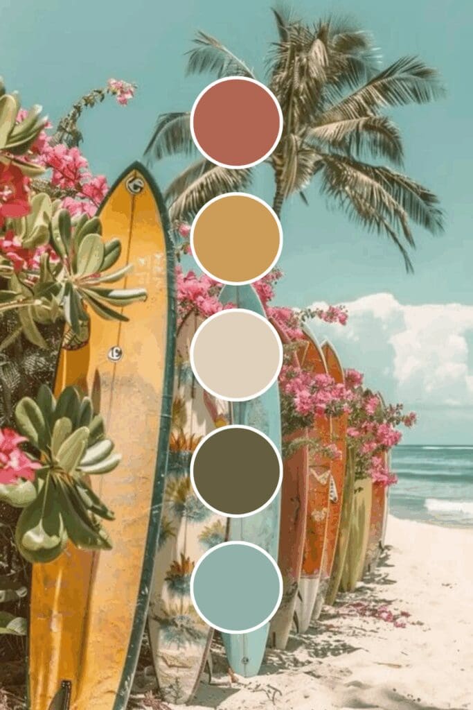
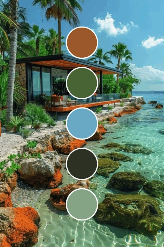
Green + Terracotta brings earthy, grounded energy with serious style. Interior designers and lifestyle brands can’t get enough of this sophisticated combo.
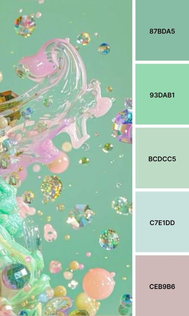
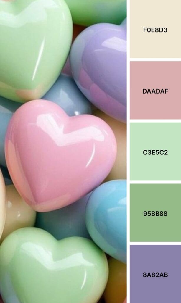
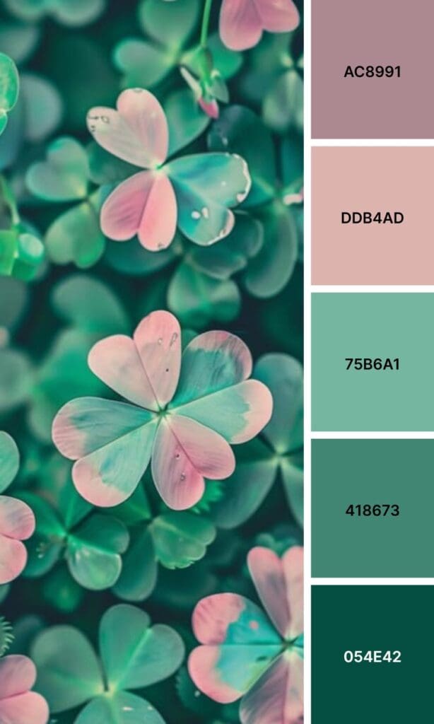
Green + Lavender offers unexpected balance that feels fresh and calming. It’s sophisticated without being stuffy – like a spa day in color form.
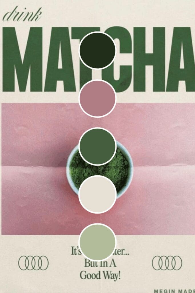
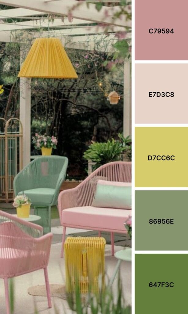
Green + Blush Pink creates gentle contrast that photographs beautifully and appeals to a wide audience (hello, Instagram engagement!).


Building Your Cohesive Brand Palette
Your online presence needs consistency, but that doesn’t mean boring! Here’s my tried-and-true formula for creating a palette that converts followers into clients:
- Pick one dominant green that feels authentic to your brand personality
- Choose 2-3 supporting colors that enhance your green without competing with it
- Add 1-2 neutrals for balance (your audience’s eyes need somewhere to rest)
- Test everything together in different contexts before fully committing
Here’s a pro tip I wish someone had told me earlier: take screenshots of your palette in different apps and lighting. That gorgeous sage green might look completely different on Instagram versus LinkedIn versus your website.
The key is consistency across all your touchpoints. Your Instagram stories should feel connected to your feed posts, which should connect to your website colors, which should match your email templates.
When everything flows together, people start recognizing your brand instantly – and that’s when the magic happens.
Where Green Makes the Biggest Impact
Green isn’t just for environmental brands (though it certainly works there too!). I’ve seen it work magic in coaching and consulting, where it suggests both growth and stability. Financial advisors obviously love it for the trust factor, but so do tech companies wanting to feel more approachable and less intimidating.
Personal brands, especially those focused on helping others grow or find balance, often find green helps them stand out while still feeling authentic to their mission.
Health and wellness brands are natural fits, but don’t overlook how powerful green can be for educational businesses, sustainable fashion, or even B2B services that want to convey reliability with a fresh twist.
Ready to Go Green? Start Small.
Maybe update your Instagram story highlights or create one post using your chosen palette. See how it feels, how your audience responds, and whether it gives you that “yes, this is me!” feeling in your gut.
You don’t need to overhaul everything overnight to see results. The most important thing is to start experimenting and pay attention to how different combinations make you (and your audience) feel.
What if this time next month, you had a color palette that made people instantly think “growth, trust, and fresh energy” when they saw your content? What if your ideal clients started reaching out because your brand just felt right to them?
These possibilities are absolutely within your reach – you just need to take that first step. Remember, the perfect palette is out there waiting for you, and sometimes the best way to find it is simply to start exploring.
Your brand deserves colors that make both you and your audience feel excited about what’s possible. Now go make it happen!

-high fidelity-3x")


")
