")

If you’ve been wondering how some brands instantly feel more energetic and approachable than others, here’s something that might surprise you: it often comes down to orange.
Not the bright, construction-cone orange you’re probably thinking of – I’m talking about those warm, sophisticated oranges that say “we’re confident and results-driven” without being overwhelming.
Orange has this incredible ability to suggest both warmth and success at the same time.
Whether you’re a coach wanting to position yourself as the energizing catalyst or a service provider ready to attract action-oriented clients, these 100 orange color palettes will help you find that perfect combination that makes everything you do feel more dynamic and trustworthy.
Why Orange Gives Your Brand Instant Energy
Orange is like having a confidence boost built right into your branding. It communicates approachability and results in ways other colors simply can’t.
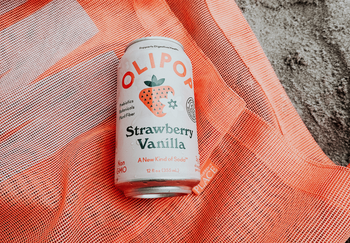
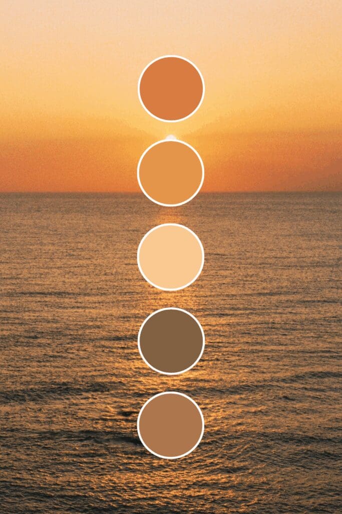
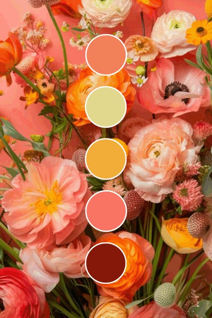
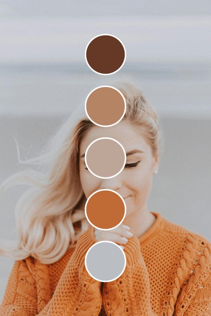
Soft oranges feel warm and nurturing. They’re perfect if you’re in coaching, consulting, or any field where building relationships and trust is part of your service offering.
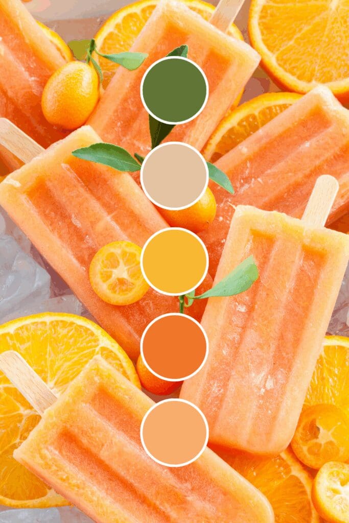
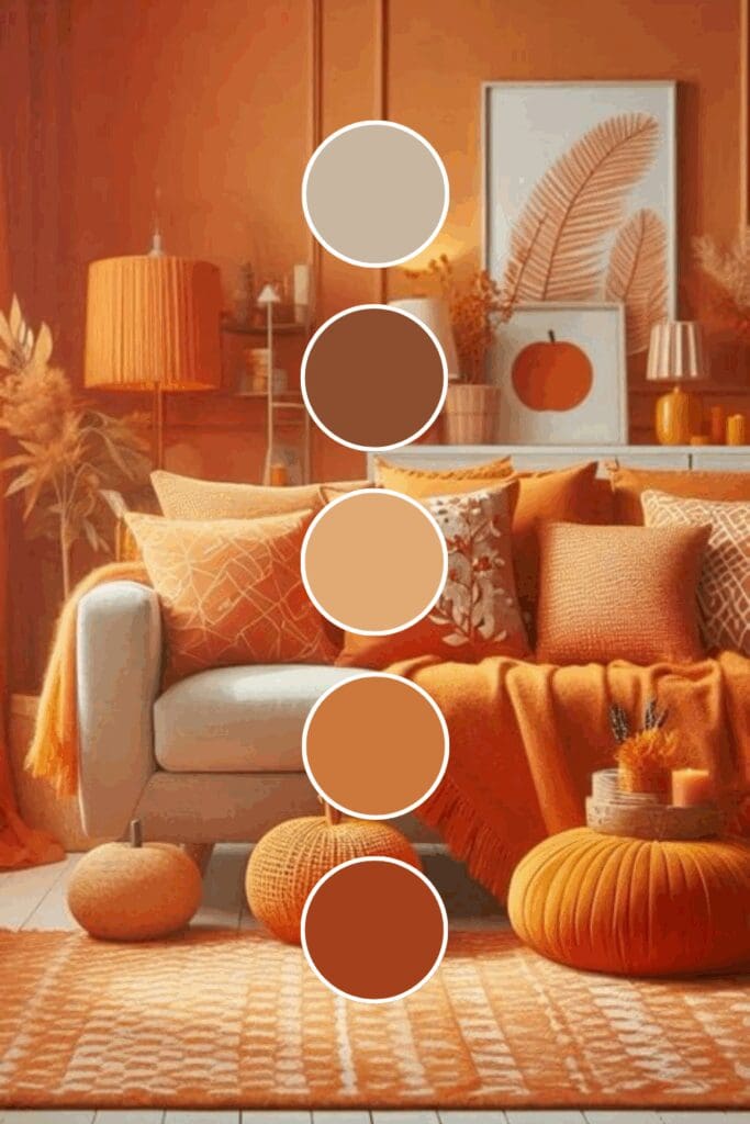
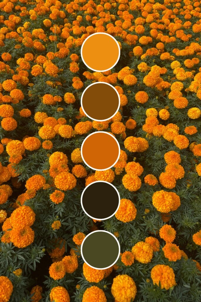
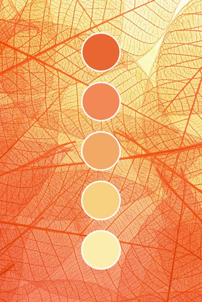
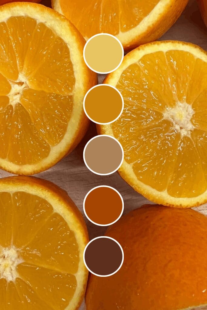
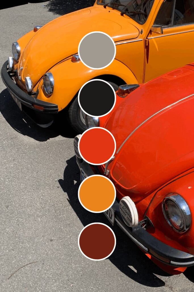
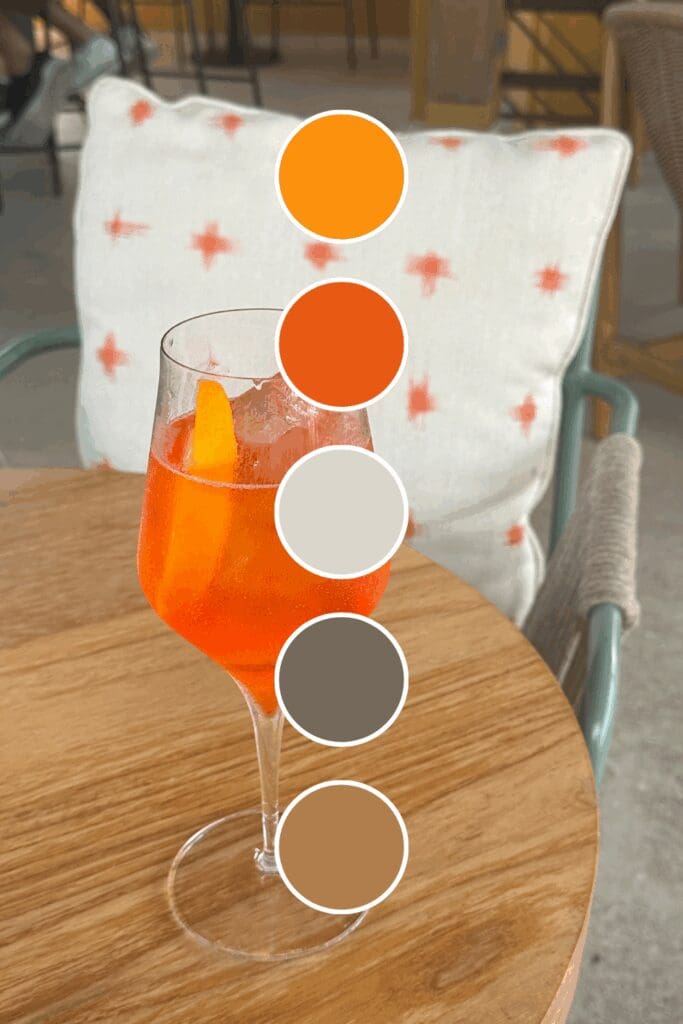
Vibrant oranges radiate energy and action. Business coaches and productivity experts love these because they immediately suggest “let’s get things done together.”
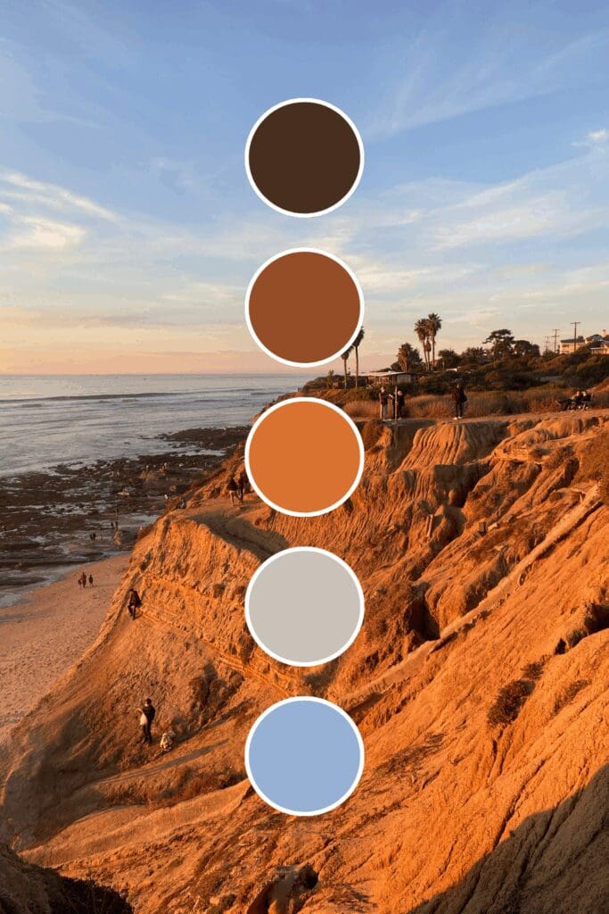
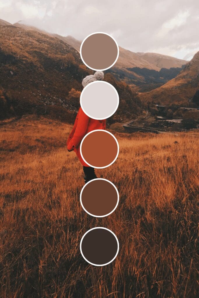
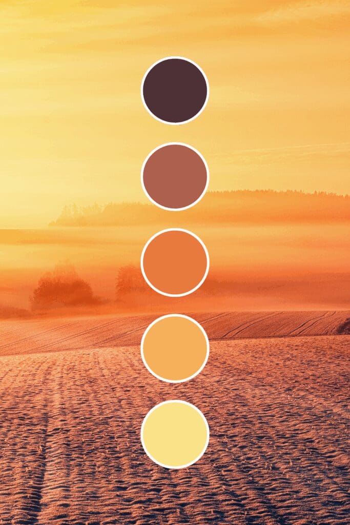
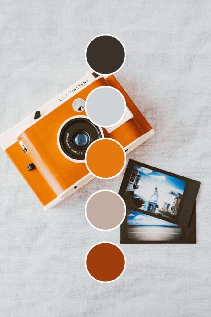
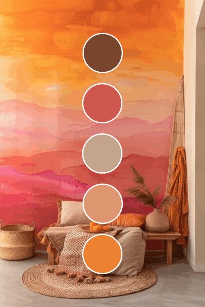
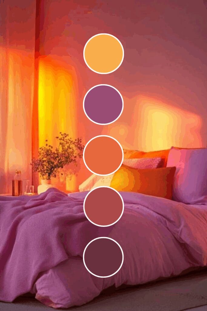
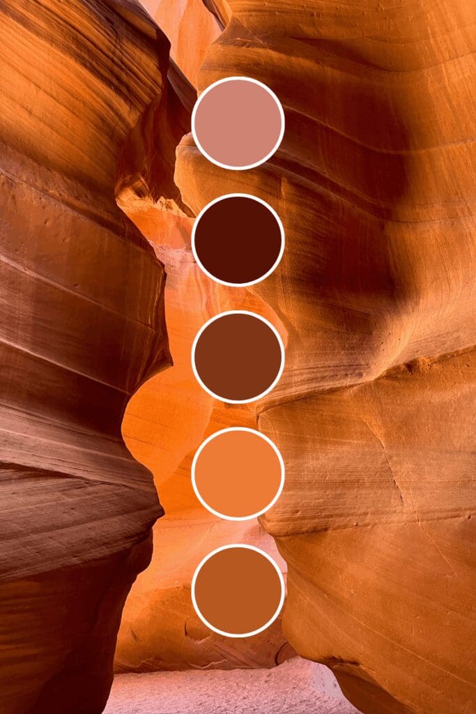
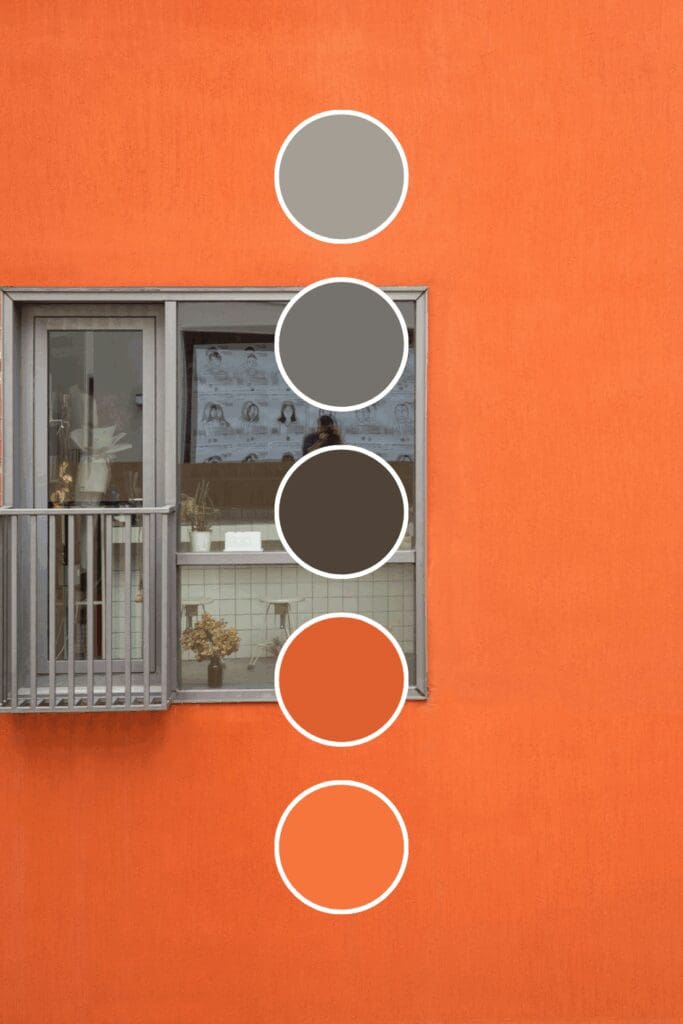
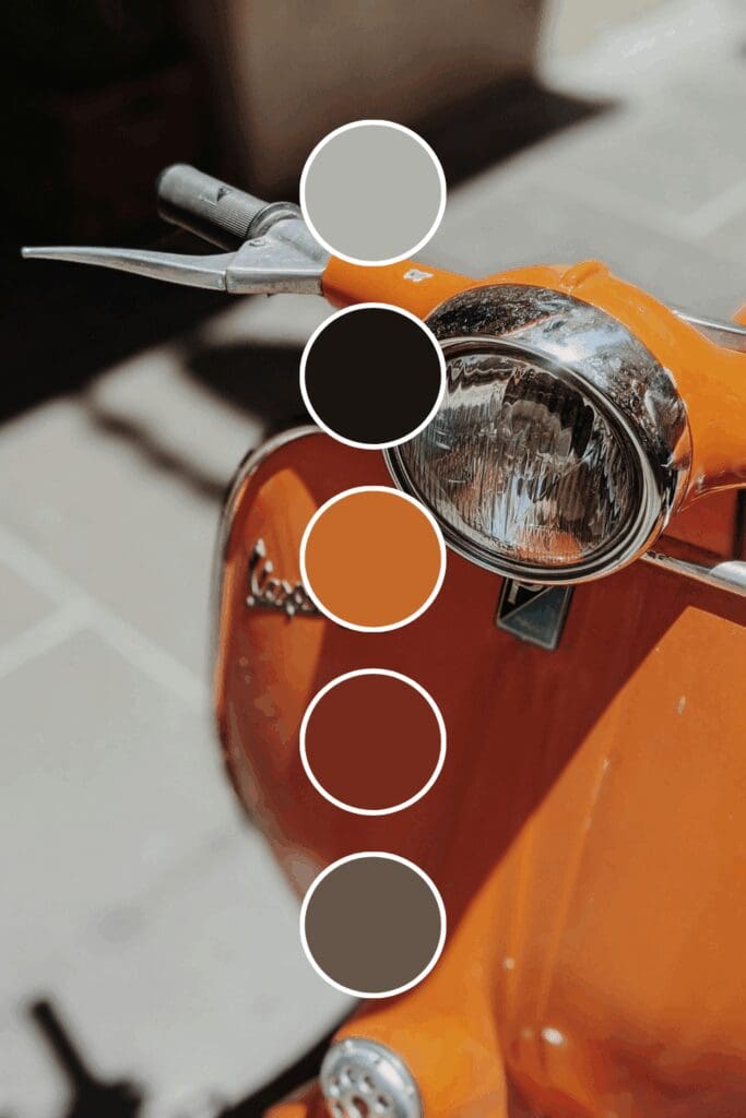
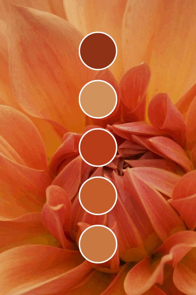
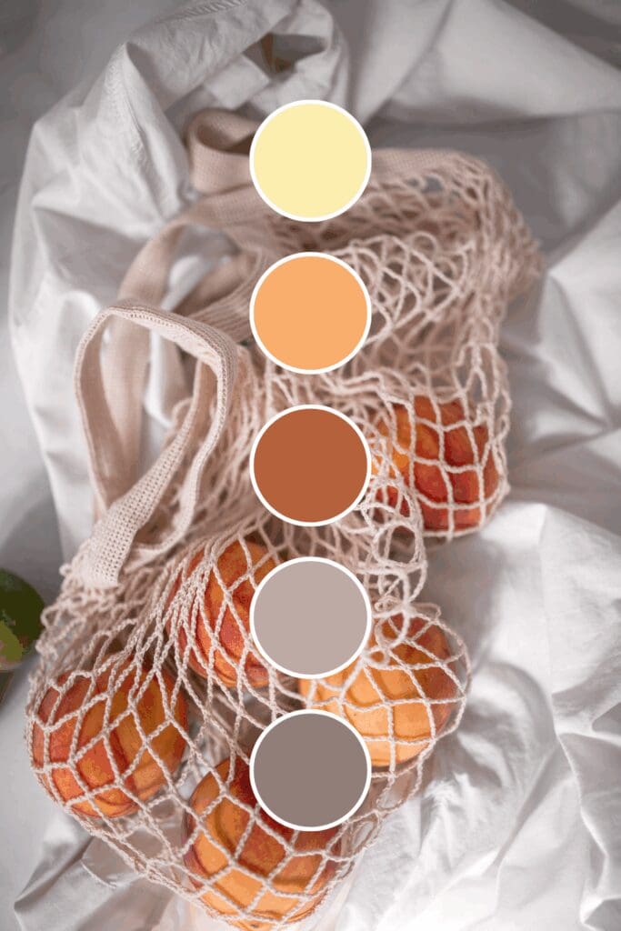
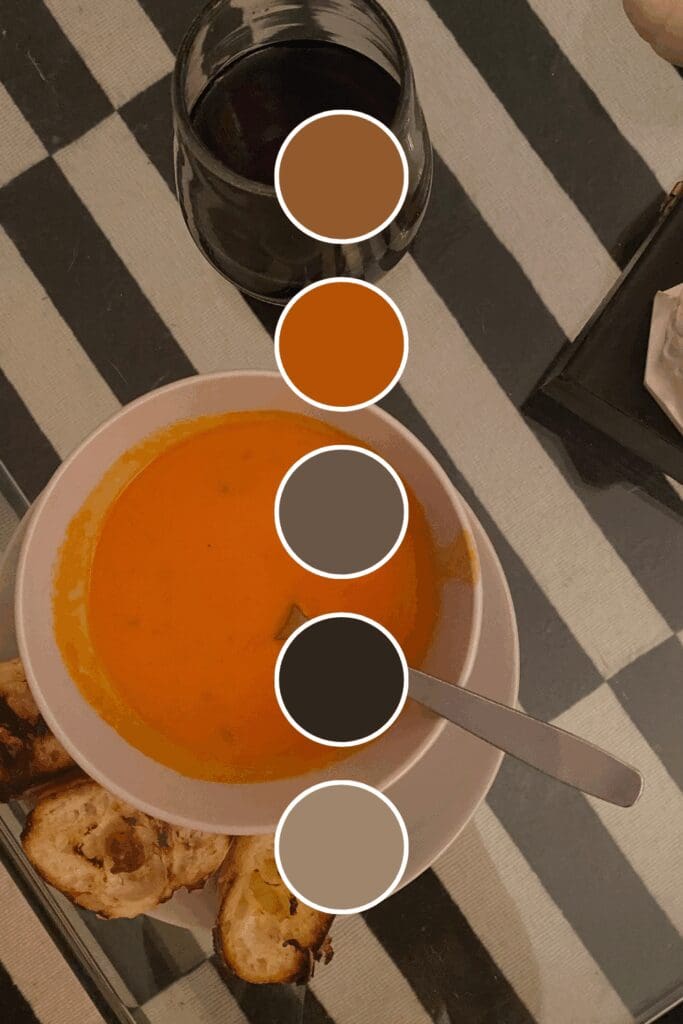
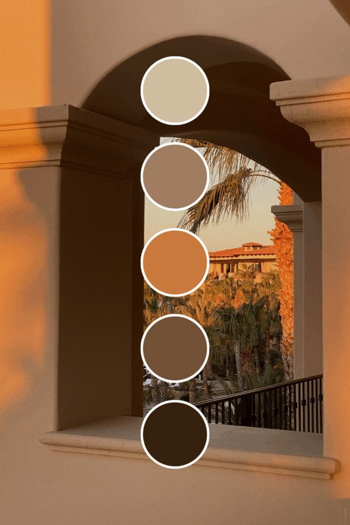
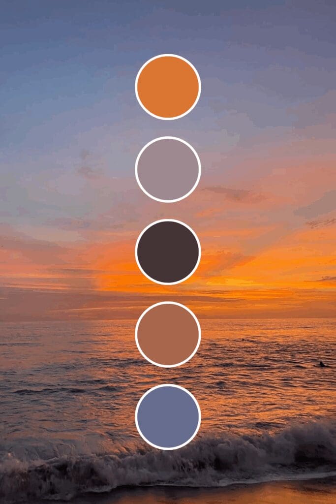
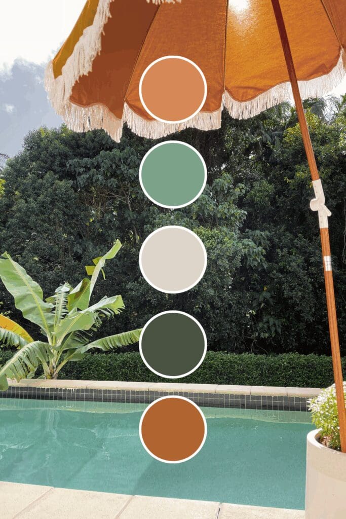
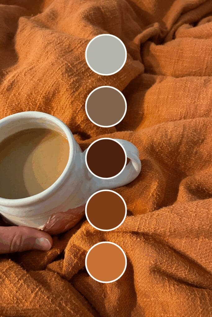
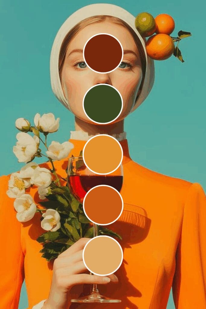
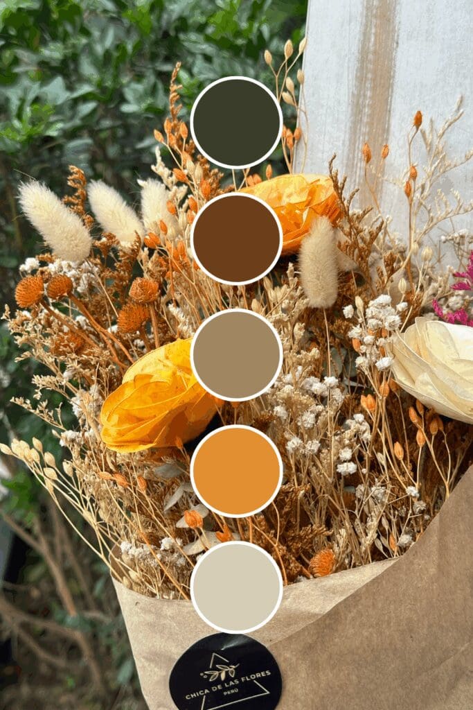
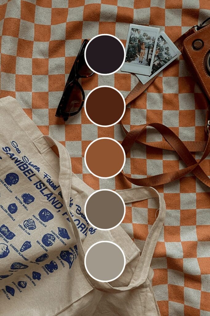
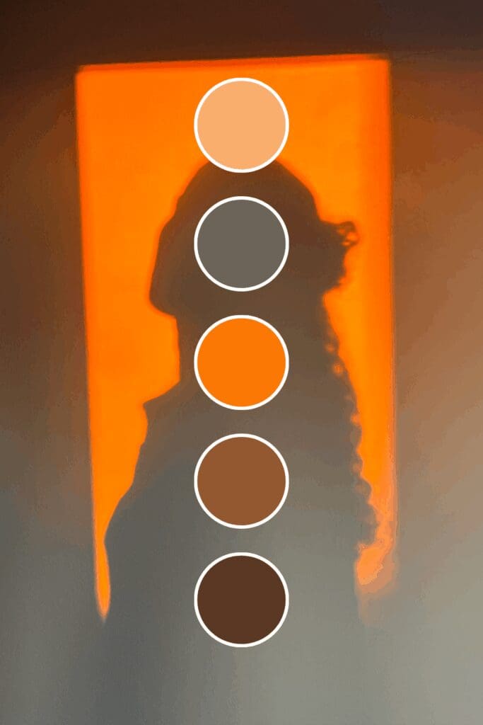
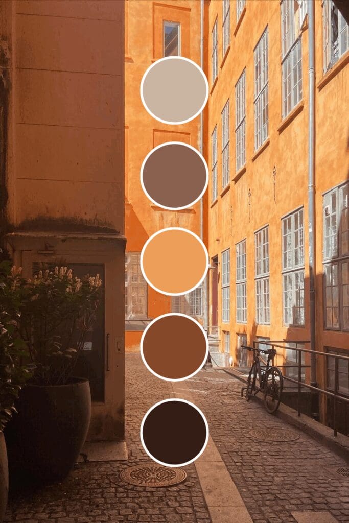
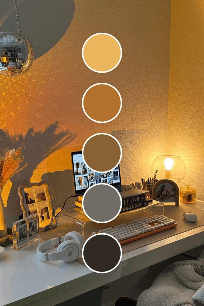
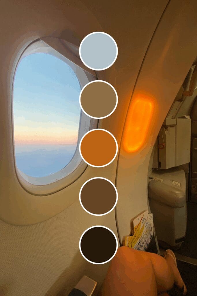
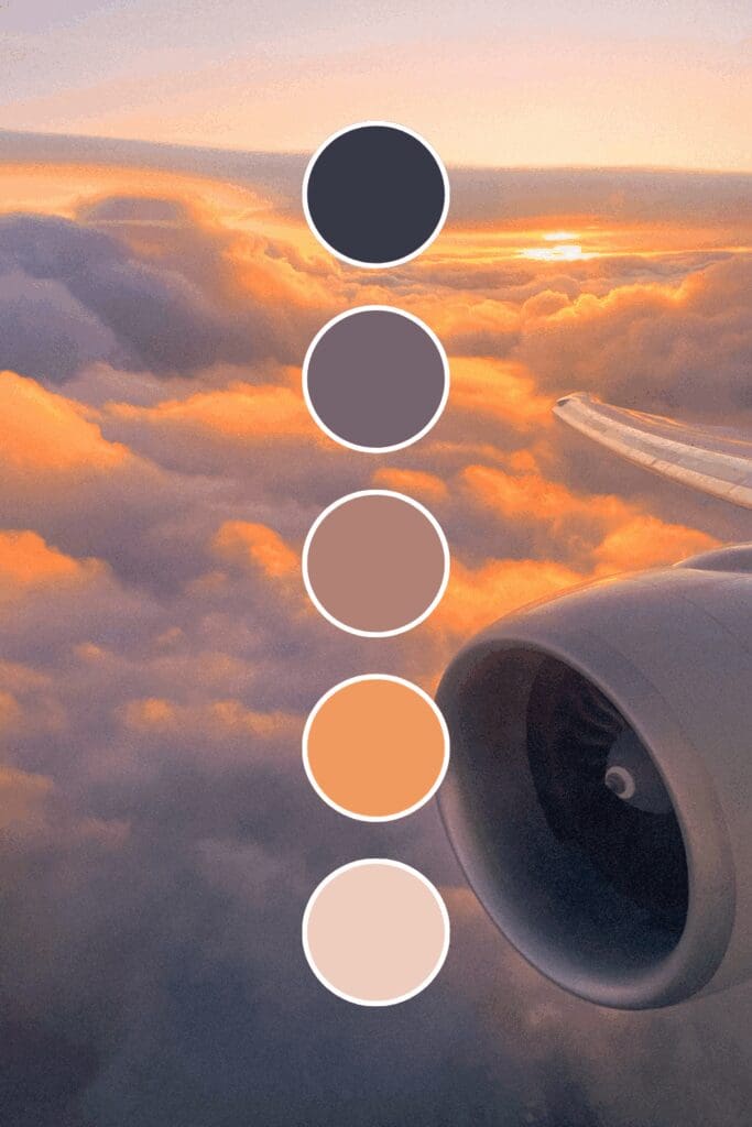
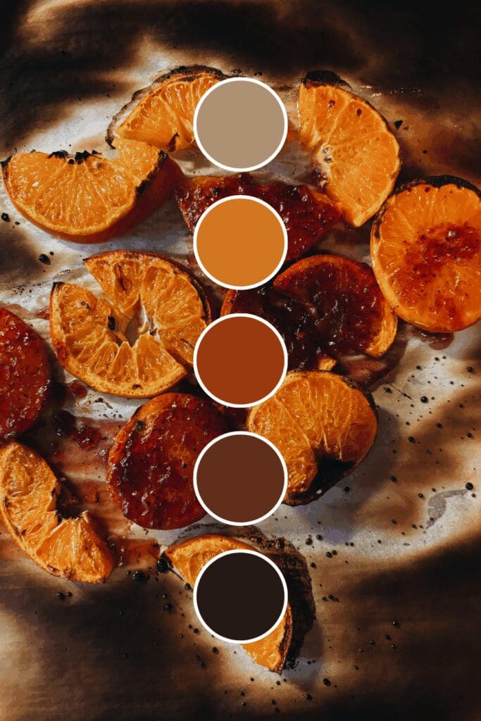
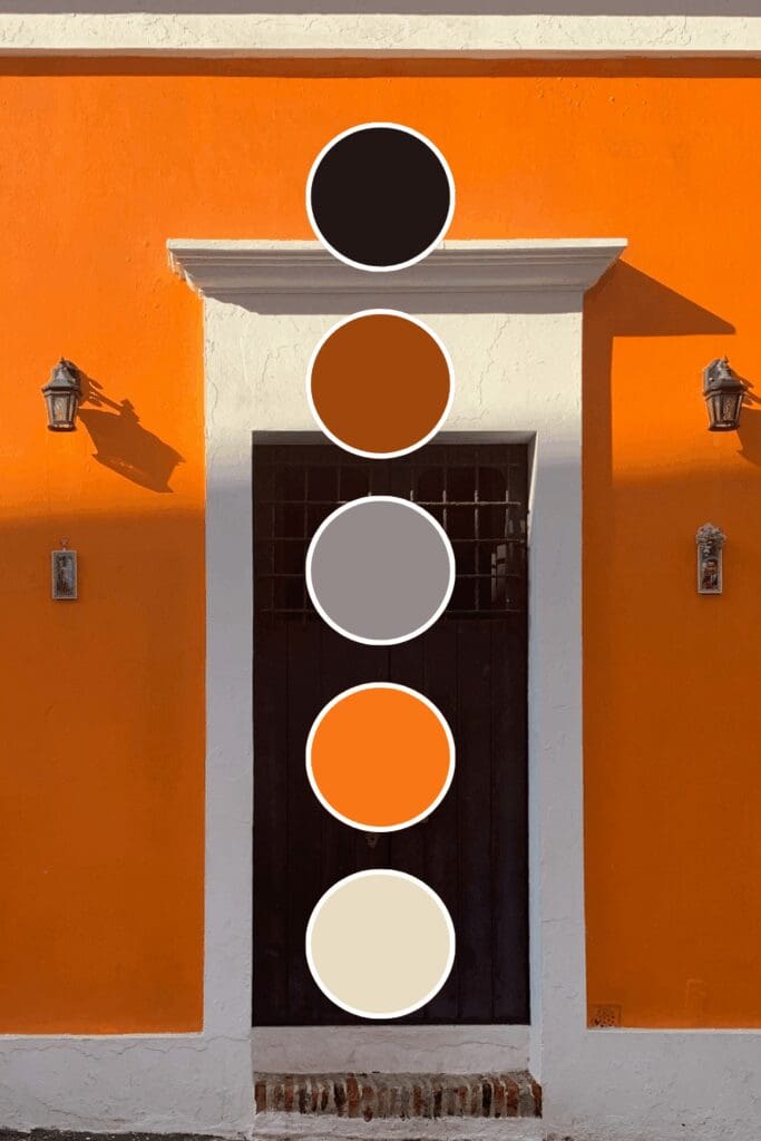
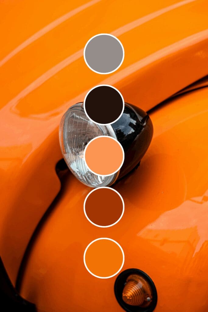
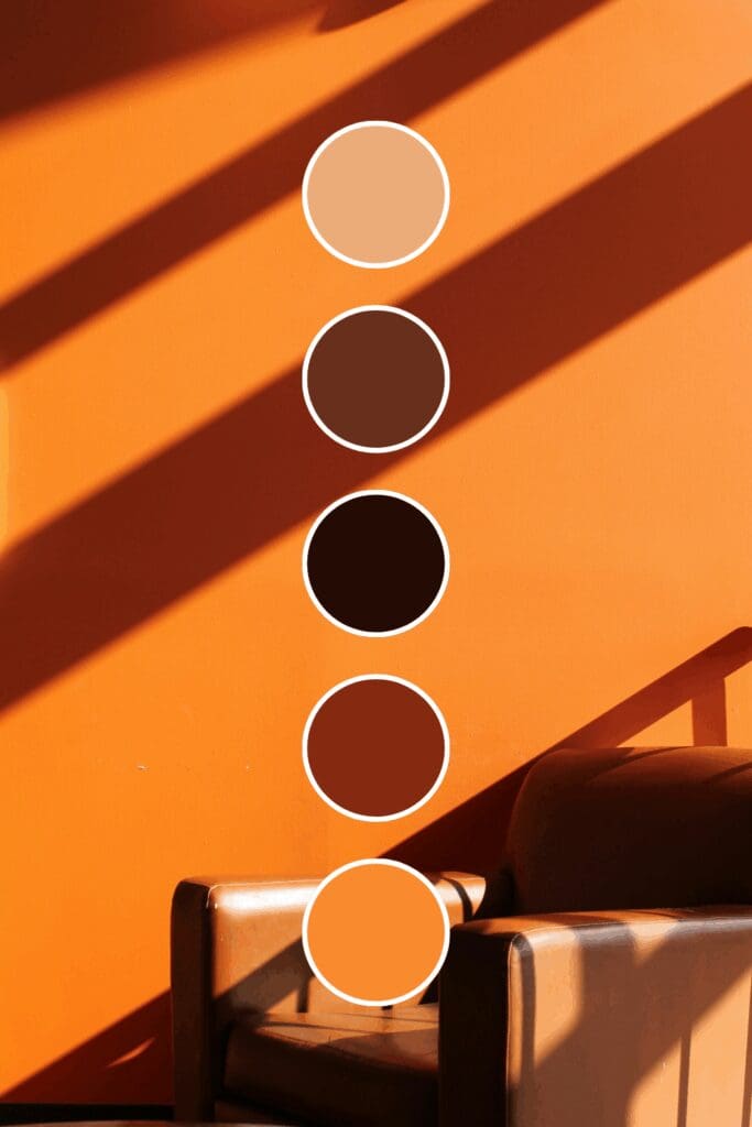
Burnt oranges bring sophistication and grounded confidence. Established consultants and thought leaders often choose these because they suggest experience without being intimidating.
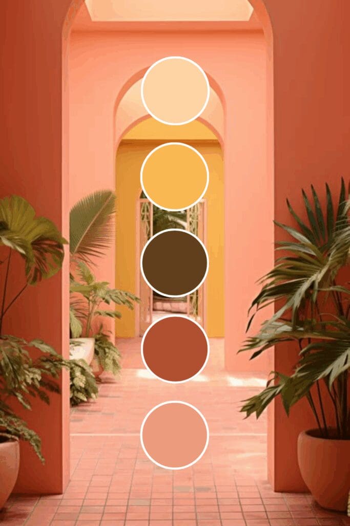
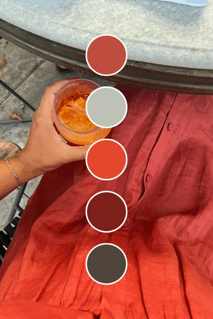
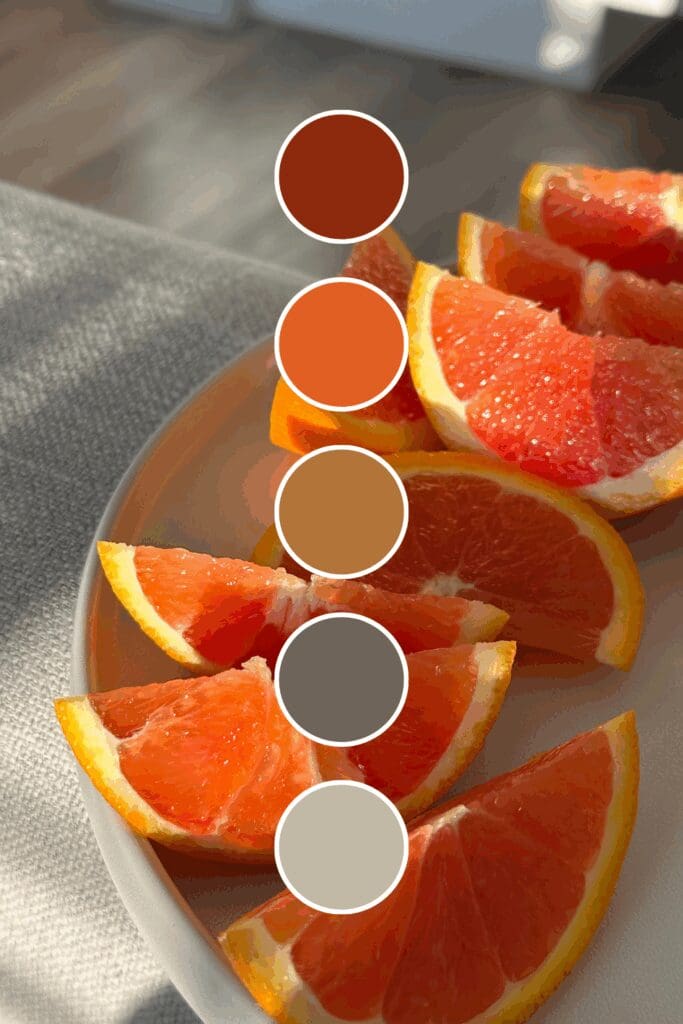
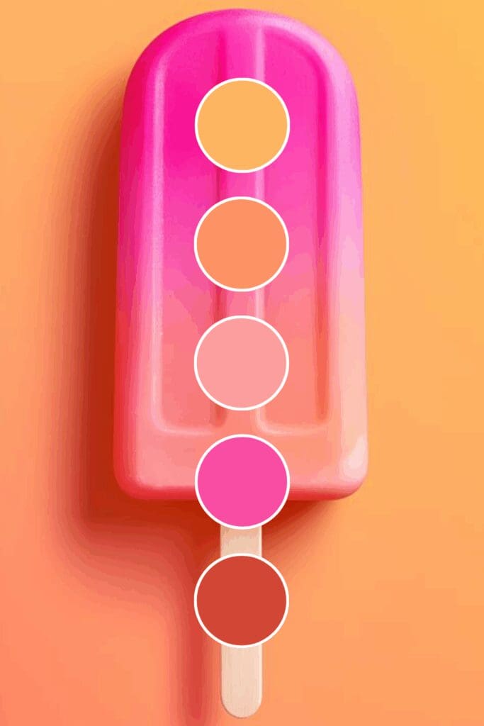
Coral oranges spark creativity and innovation. Marketing agencies and creative entrepreneurs gravitate toward these because they say “we bring fresh ideas” in the most inviting way.
Orange might feel bold at first, but I promise it’s one of the most versatile and memorable choices you can make for your brand.
Finding Your Signature Orange Shade
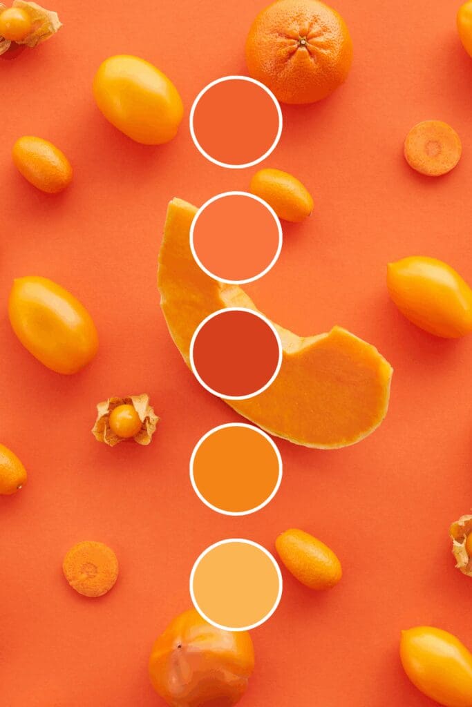
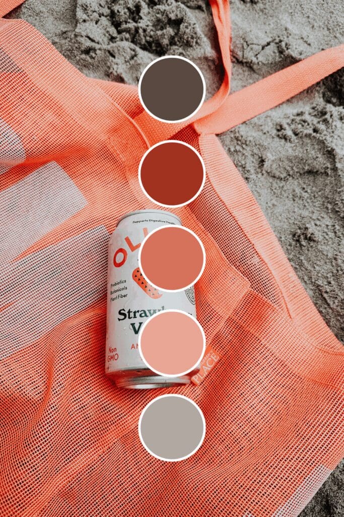
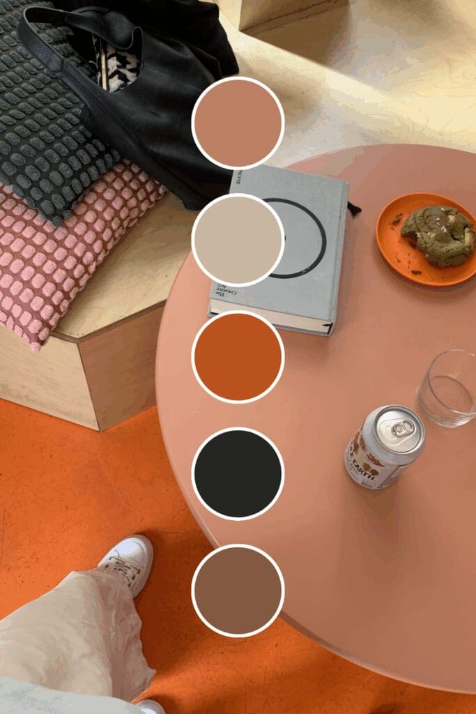
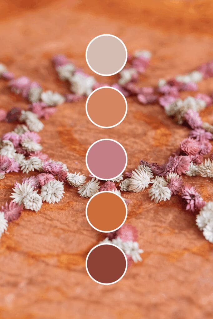
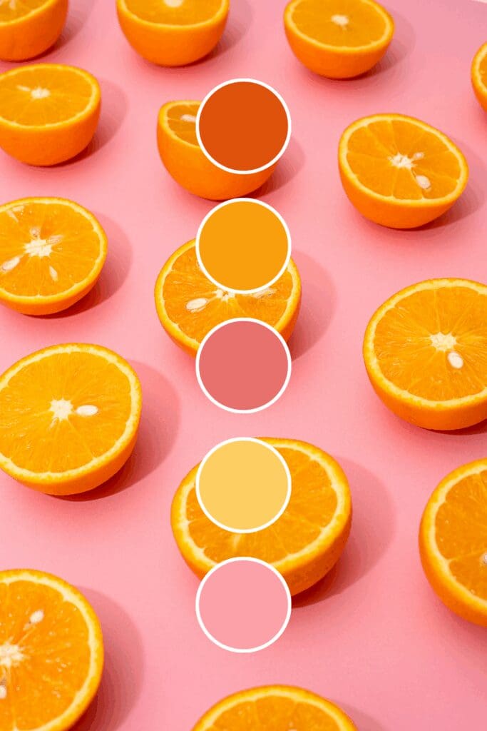
Orange isn’t a one-size-fits-all color, and that’s actually great news for your brand. Each shade tells its own story:
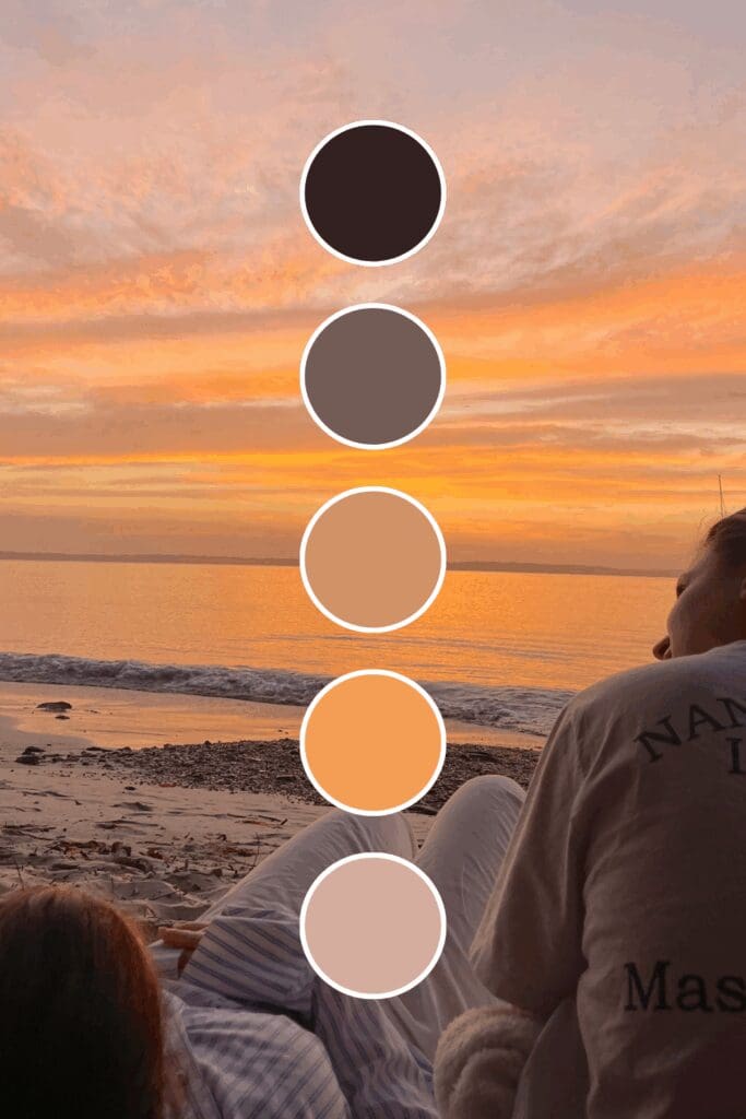
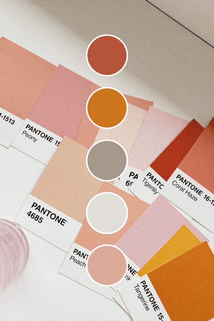
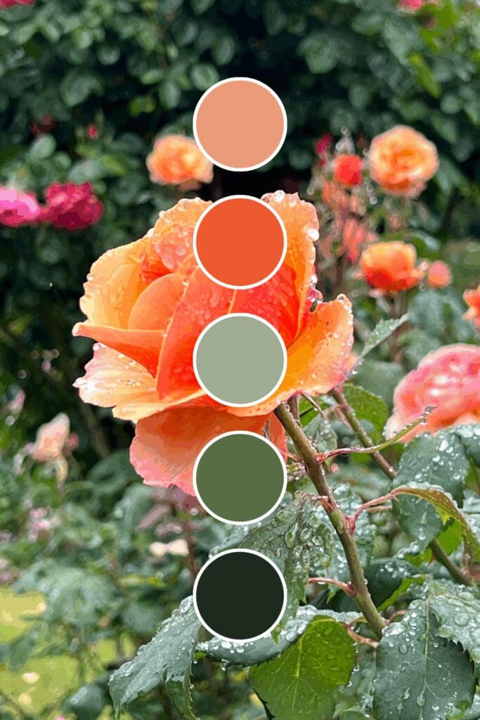
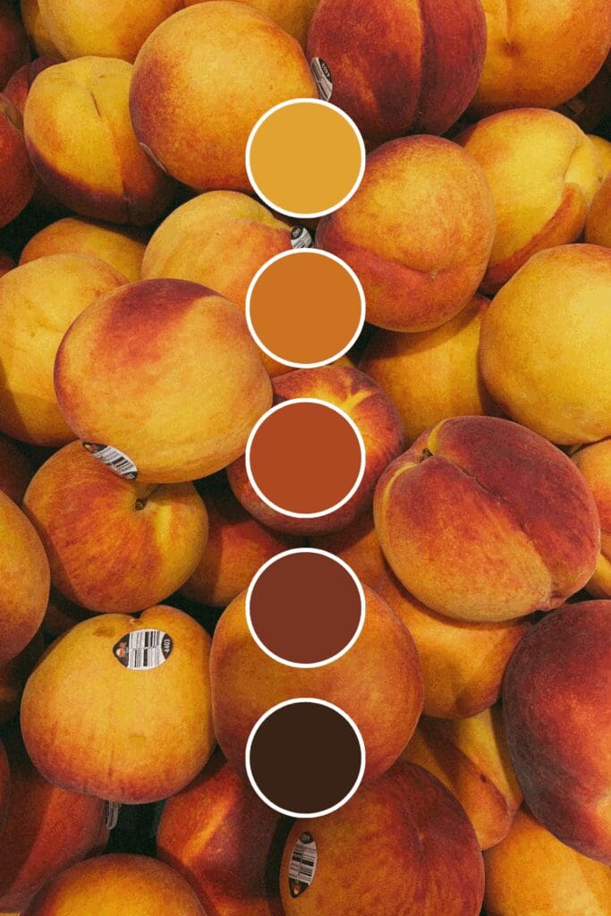
Peach feels approachable and optimistic. Life coaches and wellness professionals love this because it draws people in while suggesting positive transformation.
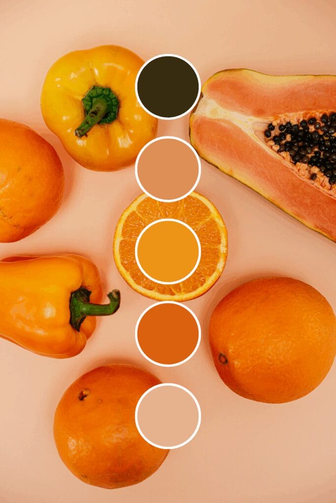
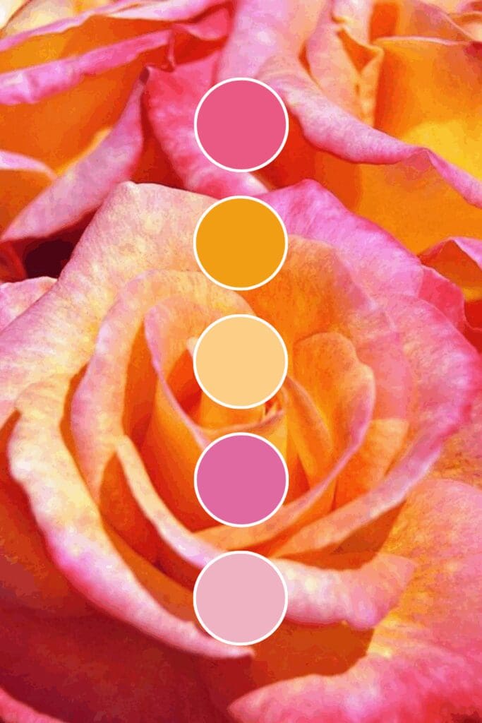
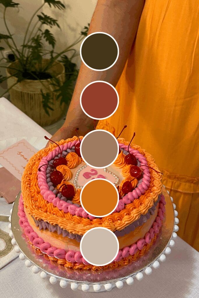
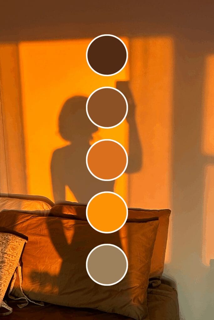
Tangerine brings playful energy and premium positioning. Creative entrepreneurs and consultants often choose this when they want to attract clients ready for innovative solutions.
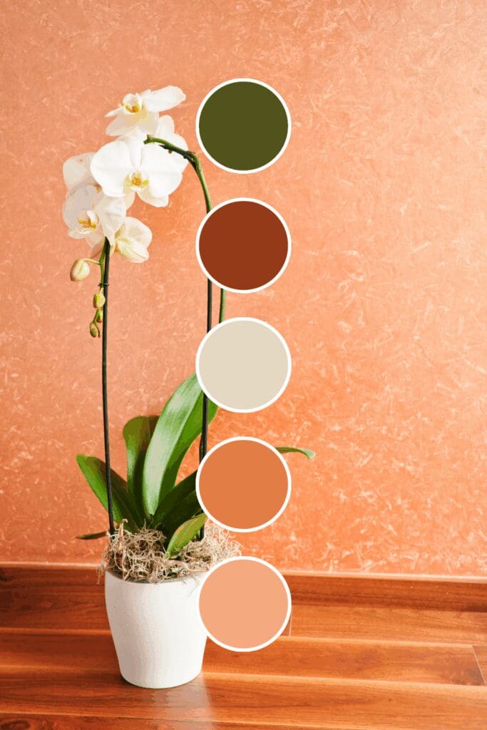
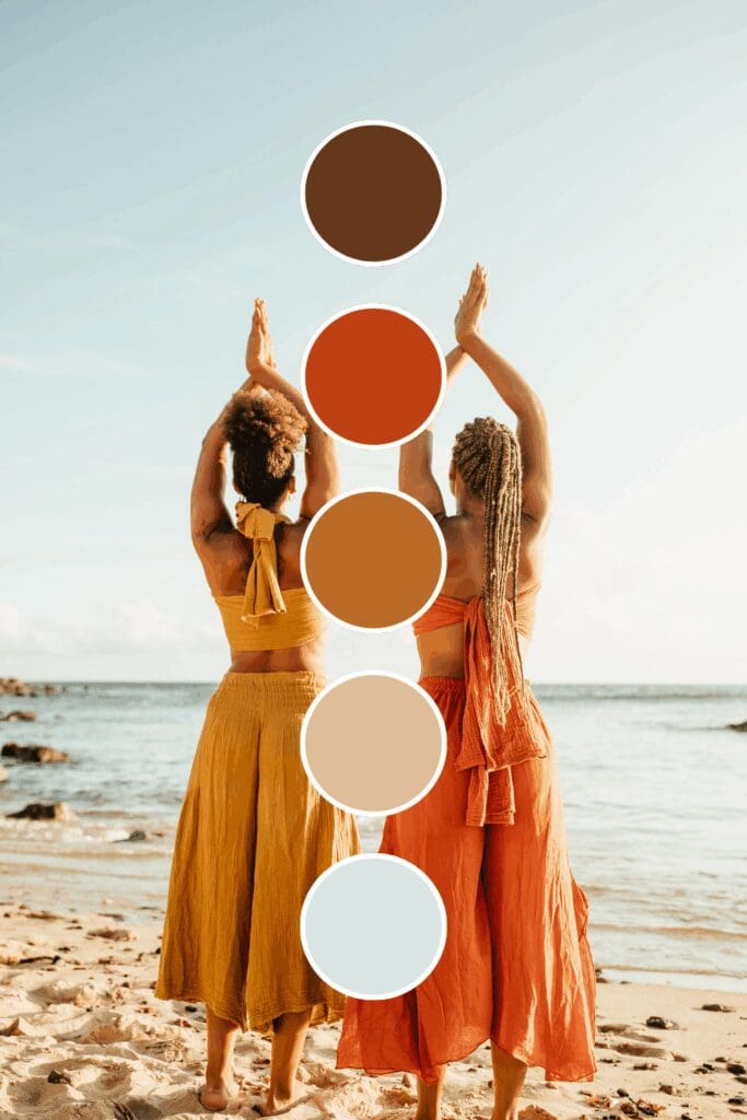
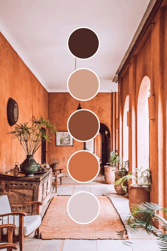
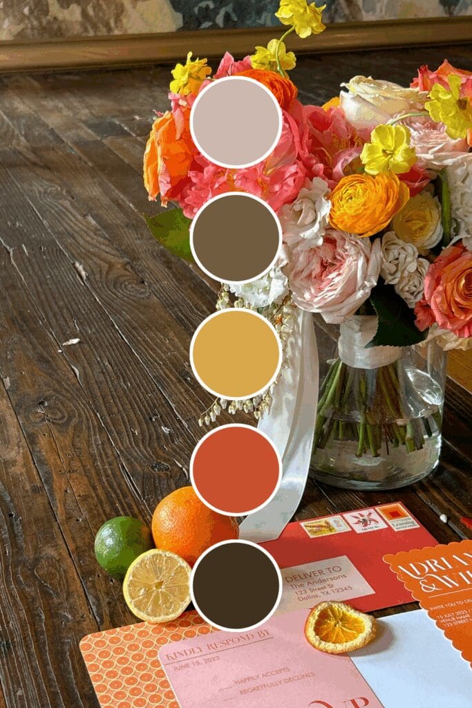
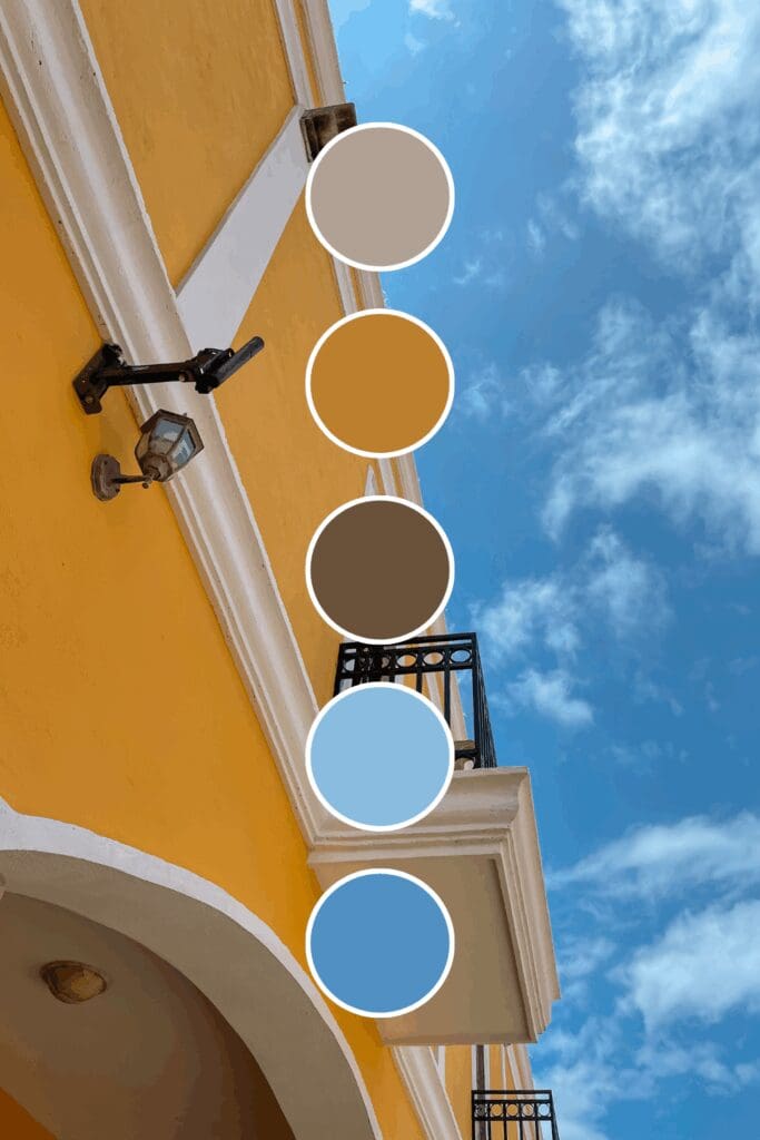
Terracotta suggests established warmth and reliability. Business advisors and service providers gravitate toward this because it feels both professional and uniquely inviting.
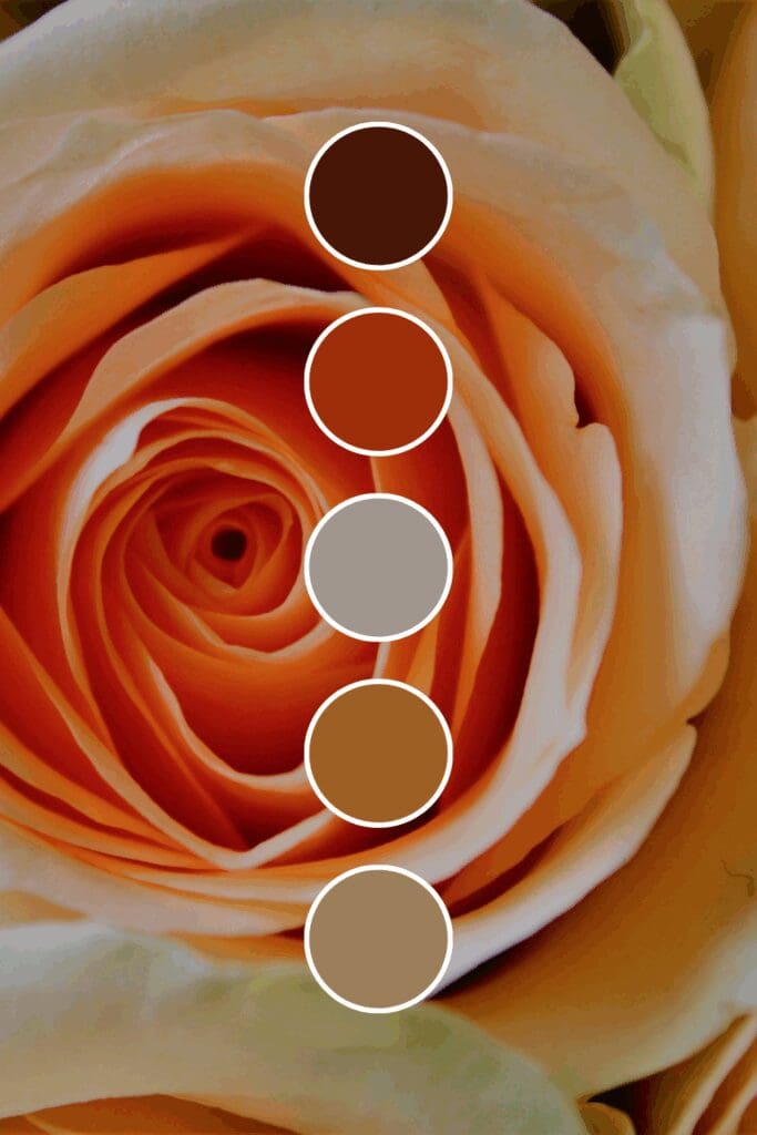
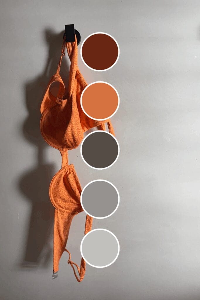
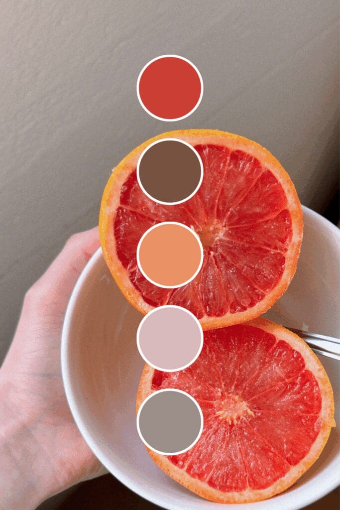
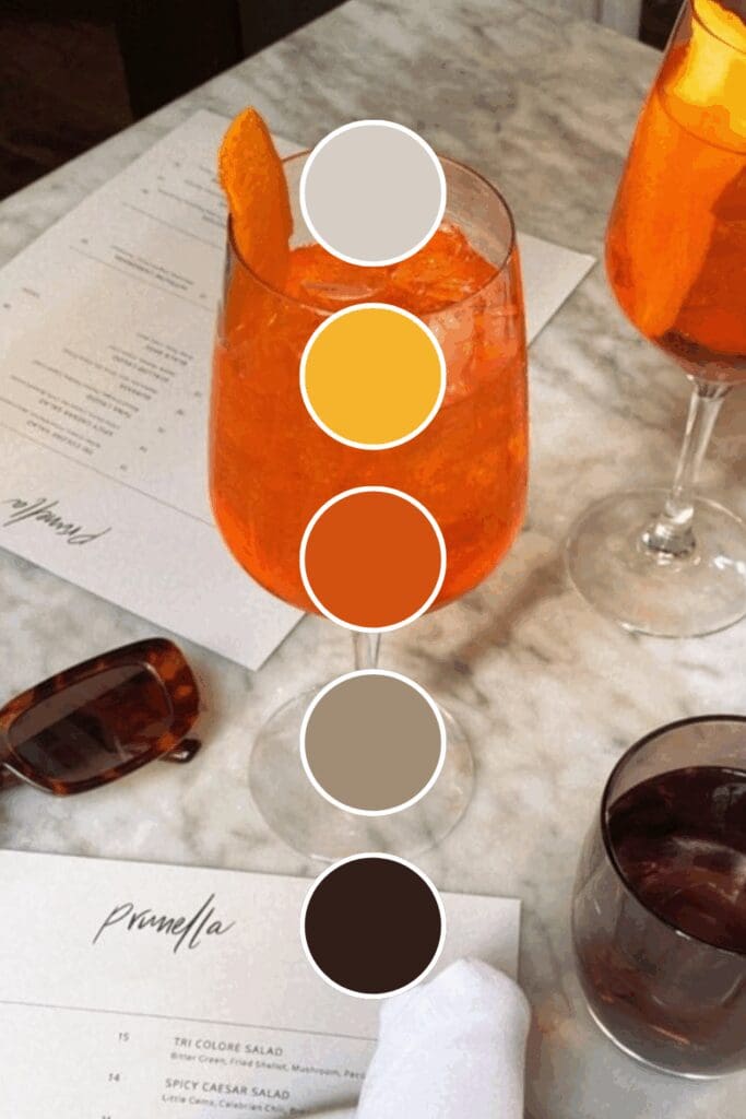
Coral adds sophisticated energy without being overwhelming. Female entrepreneurs often choose this when they want to stand out while maintaining approachability.
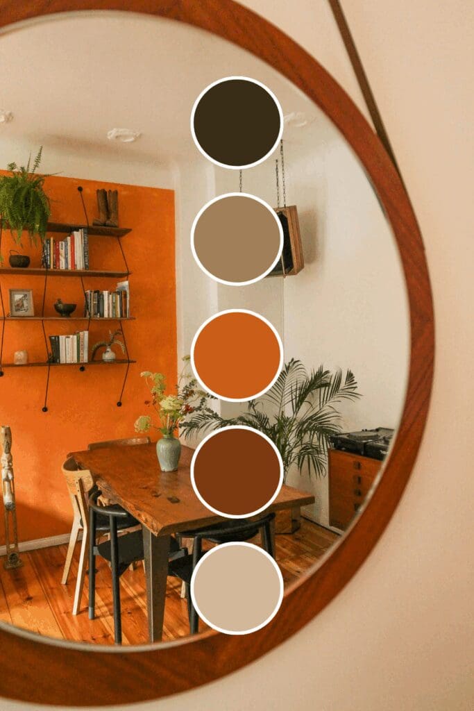
Burnt Orange doesn’t apologize for being different. Industry experts and thought leaders love this because it commands attention while feeling grounded and trustworthy.
Starting with one powerful orange foundation might feel adventurous, but it’s exactly how the most memorable successful brands begin. You’ve got this!
Color Combinations That Drive Results
This is where orange really shows its versatility. The right combinations can make your orange work for any industry:
The Professional Powerhouses
These combinations have been proven by successful growth-focused brands:
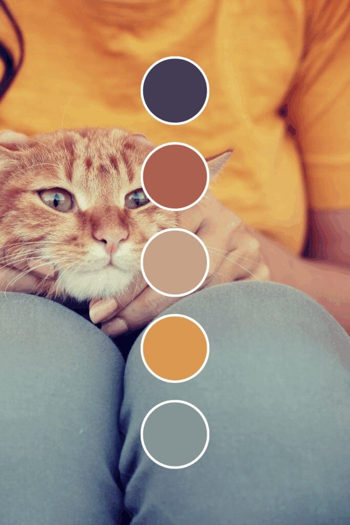
• Orange + Navy Blue creates trustworthy energy that’s impossible to ignore.
• Orange + Cream brings warm sophistication that photographs beautifully.
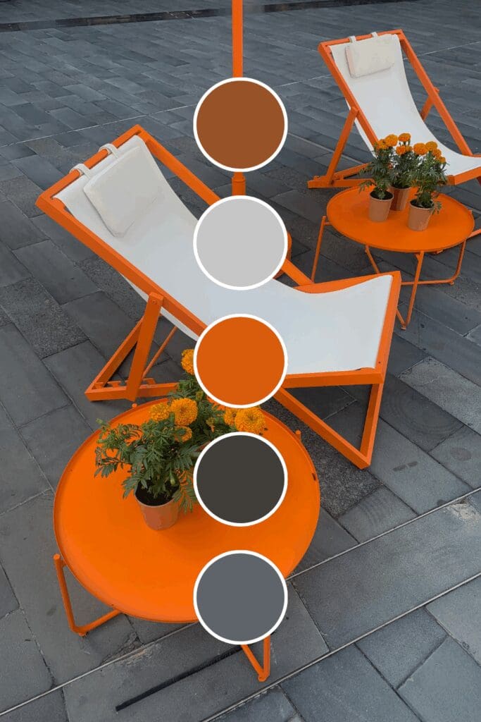
• Orange + Charcoal Gray suggests innovation and professional confidence.
• Orange + White feels clean and energetic (perfect for coaching and consulting).
The Unexpected Winners
Here’s where you can really set yourself apart (and these often convert better because they’re memorable):
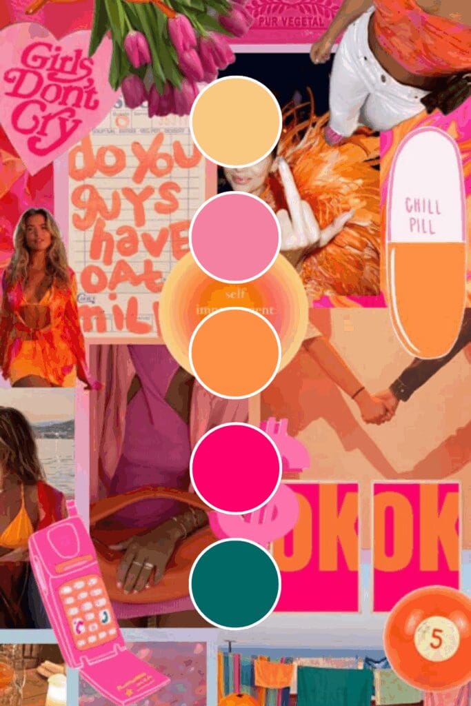
• Orange + Sage Green creates natural confidence that feels both grounded and dynamic.
• Orange + Soft Pink brings approachable sophistication that’s both warm and professional.
• Orange + Deep Purple offers creative elegance that works across industries.
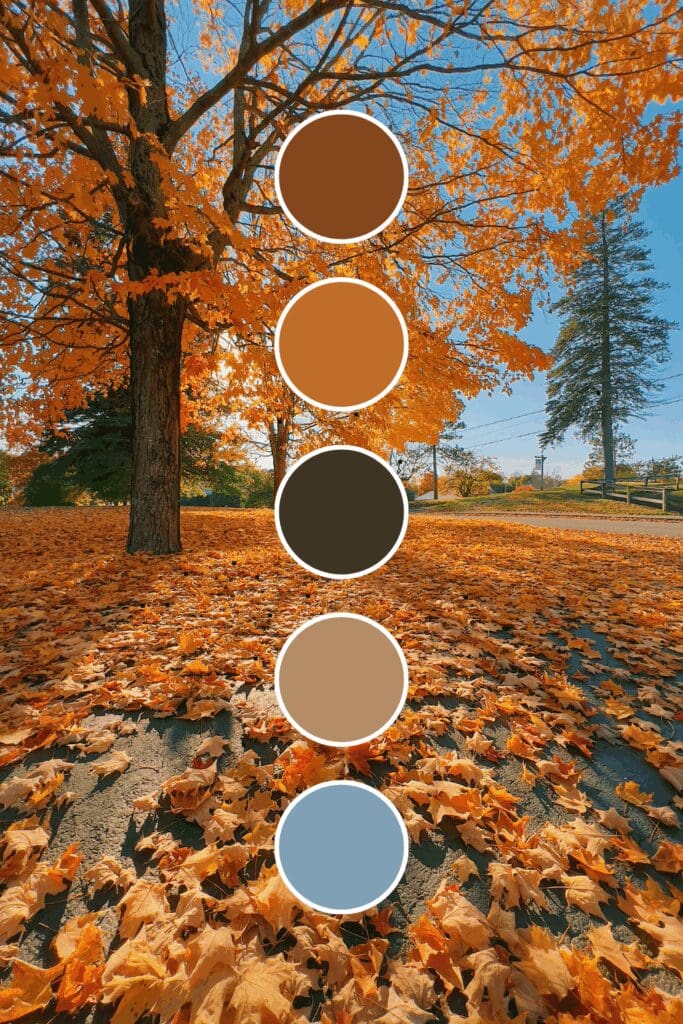
• Orange + Warm Taupe creates accessible energy that doesn’t overwhelm potential clients.
Just between us, these unexpected combinations often perform better than the obvious choices because they create that “I need to know more about this brand” feeling.

Creating Your Dynamic Color System
Your brand needs to feel intentional and energizing. Here’s my proven formula for orange palettes that work:
- Select your main orange – choose one that matches your energy and positioning
- Pick 1-2 complementary colors that enhance orange’s approachability
- Include neutral grounding colors (cream, white, or soft gray work perfectly)
- Test everything together across all your brand touchpoints
Orange can appear different on various screens and in different lighting. Always check your colors on multiple devices and in different environments before making your final decision.
Consistency is everything. Your website should feel seamlessly connected to your social media, which should align with your proposals and business cards.
Where Orange Creates the Most Impact
Orange isn’t just for creative businesses (though it certainly shines there). I’ve seen it transform:
• Results-focused coaching where energy and action are essential
• Marketing agencies that need to showcase both creativity and reliability
• Productivity brands targeting clients ready to make real changes
• Consulting services where approachability needs to be obvious immediately
• Personal brands for entrepreneurs wanting to stand out while building trust
This works especially well if you’re ready to move from blending in to standing out confidently. Orange helps you attract the right clients who appreciate both warmth and results.
Addressing Orange Concerns (Because I Know You Have Them)
Let me tackle the most common hesitations I hear about orange:
“Won’t it look too casual?” – Pair with navy or charcoal for instant professional credibility.
“Is it too bold for my industry?” – Start with deeper, more muted oranges like terracotta that feel sophisticated rather than bright.
“What if it doesn’t feel trustworthy?” – Orange is actually one of the most trustworthy colors because it suggests transparency and warmth.
Remember, you’re not trying to appeal to everyone. You’re trying to attract clients who value energy, results, and authentic connection.
Your Orange Brand Transformation Starts Now
Ready to explore orange in your brand? Here’s how to test the waters without diving in completely:
Week 1: Add orange accents to your social media templates.
Week 2: Create one marketing piece using your orange palette.
Week 3: Update your email signature with orange elements.
Week 4: Get honest feedback from colleagues and trusted clients.
You don’t need to overhaul everything immediately. The most important thing is to start experimenting and notice how orange makes you feel about your own brand – and how others respond to it.
Here’s something exciting to think about:
What if this time next year, people associated your brand with positive energy, trusted expertise, and the kind of results-driven approach that gets things done?
These possibilities are absolutely within your reach. Sometimes the most confident move is the one that feels slightly outside your comfort zone – and that’s exactly where the breakthrough happens!

-high fidelity-3x")


")
