")

If you’ve been watching other entrepreneurs command attention while your brand gets lost in the crowd, here’s something to consider: maybe it’s time to embrace the power of red.
I know red feels intense, but that’s exactly why it works so incredibly well for ambitious business owners.
Red speaks with confidence and conviction. Whether you’re launching a bold new venture or ready to position yourself as the leader in your field, these 100 red color palettes will help you find that perfect combination that demands attention and respect.


Why Red Is the Ultimate Power Move for Your Brand
Red is like instant confidence in color form. It tells people you’re serious about what you do before you even open your mouth.
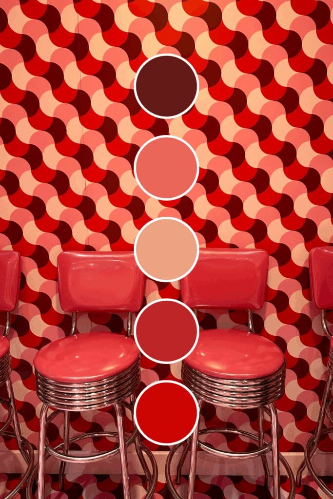
Bright reds pulse with energy and urgency. They’re perfect if you’re in fitness, motivation, or any field where action and results are everything you offer.
Deep reds suggest power and established authority. Lawyers, business strategists, and high-level consultants often choose these because they communicate “I win” without being aggressive about it.
Warm reds bring passion and approachability together. Creative entrepreneurs and personal brands love these because they show personality while maintaining professionalism.
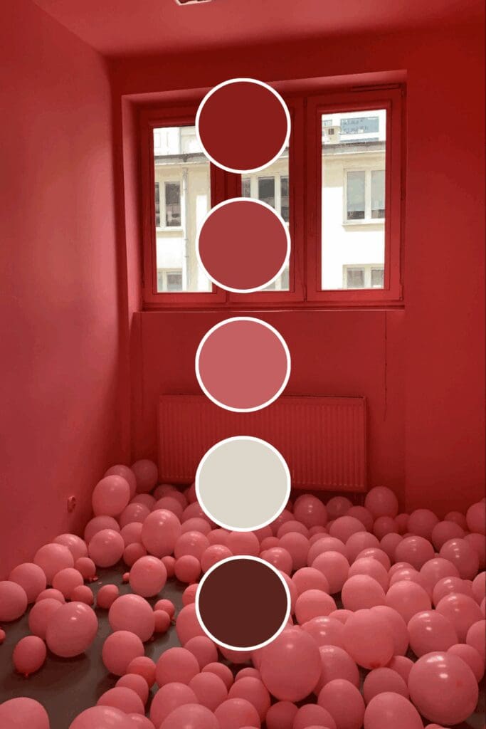
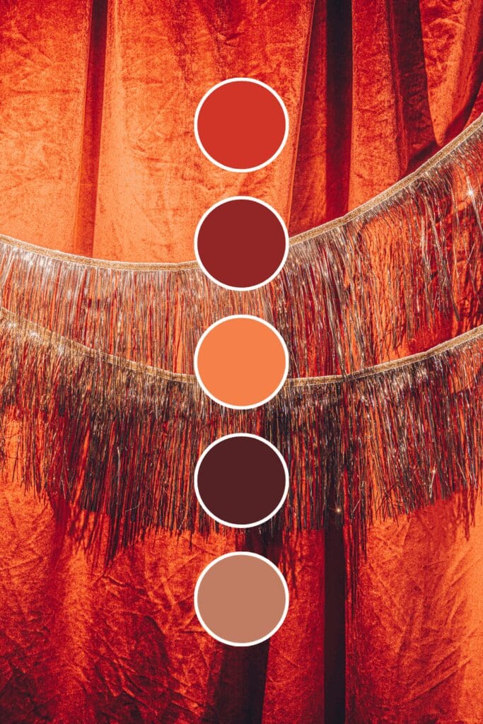
Dark reds whisper luxury and exclusivity. Premium service providers and established businesses gravitate toward these because they suggest quality that’s worth paying for.
Red might feel intimidating at first, but I promise it’s one of the most powerful tools you have for making your brand impossible to ignore.
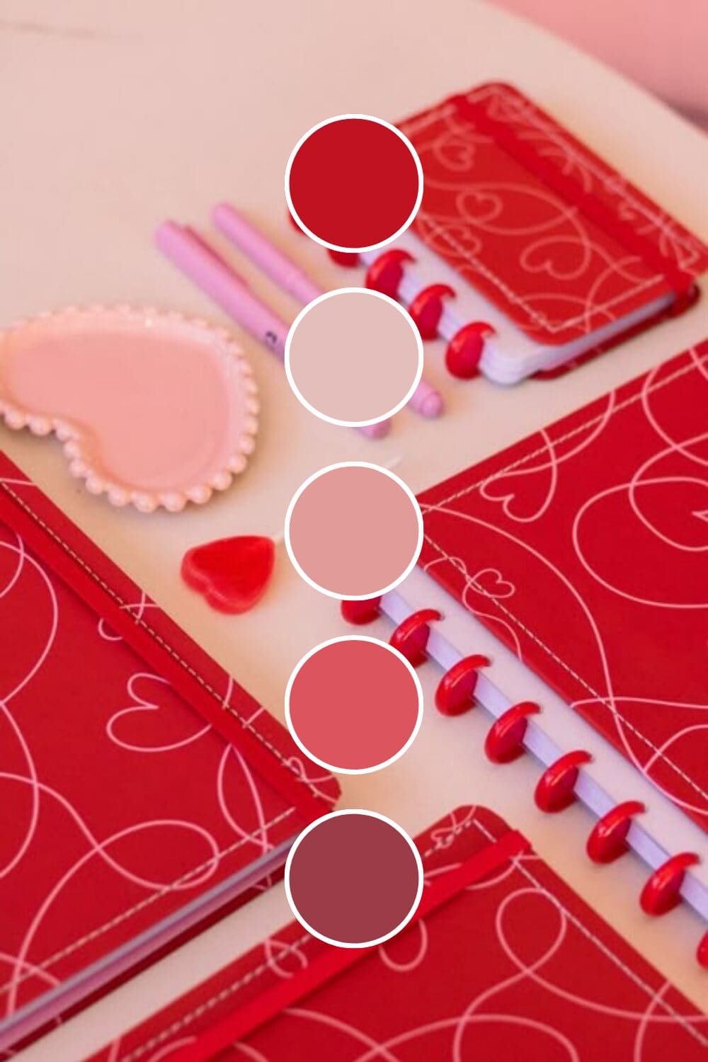
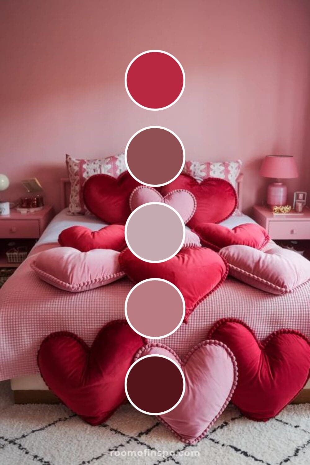
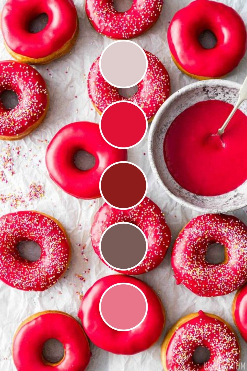
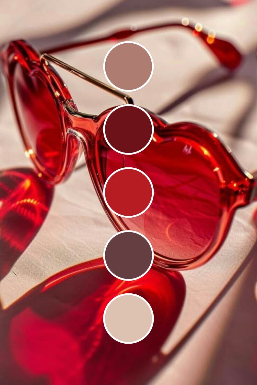
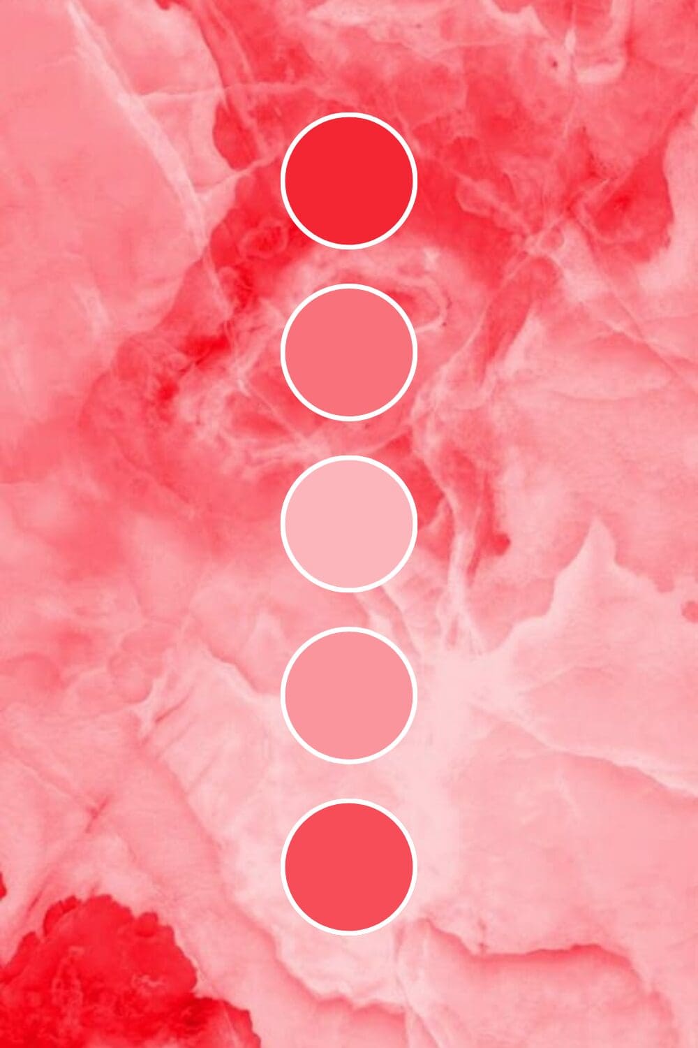
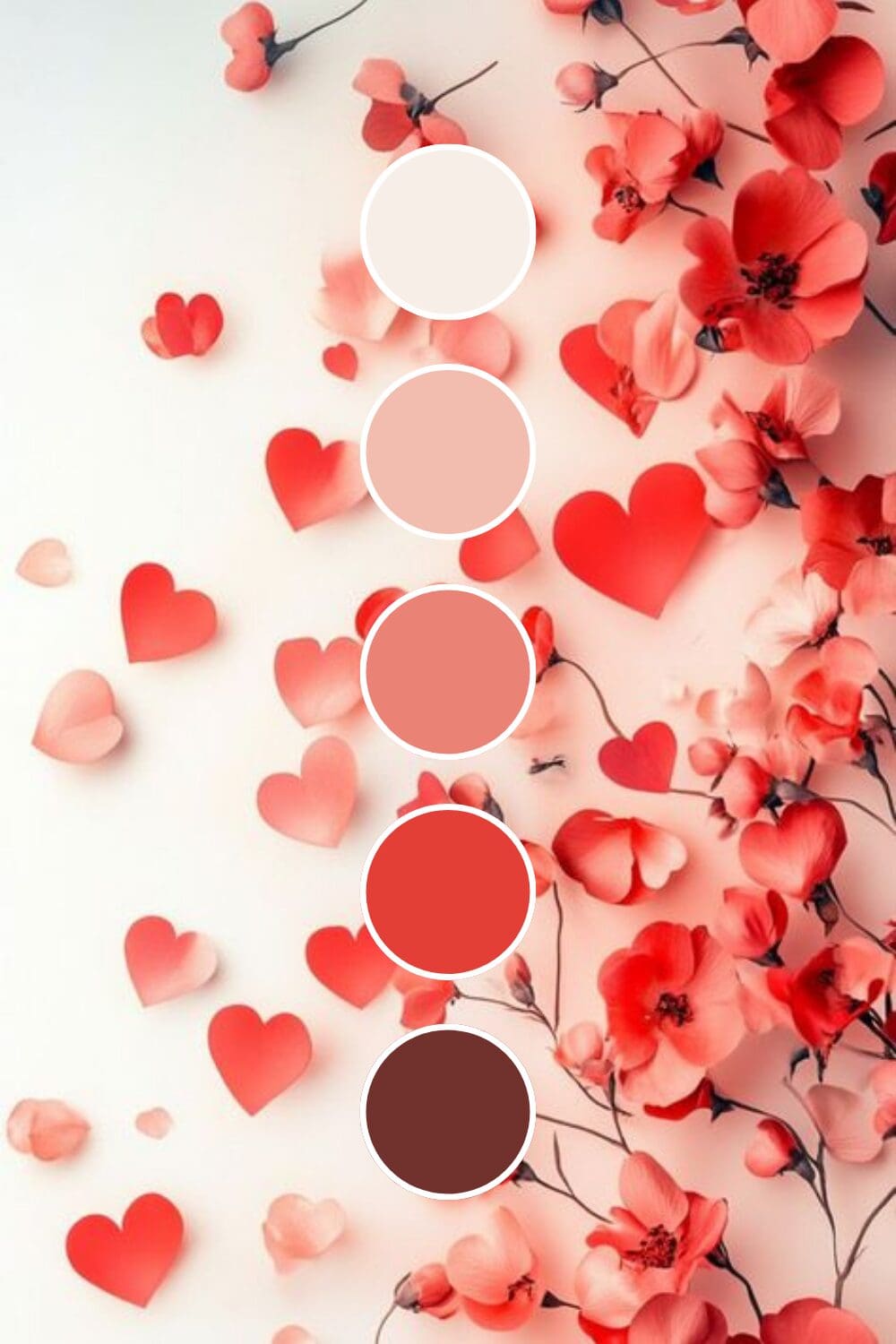
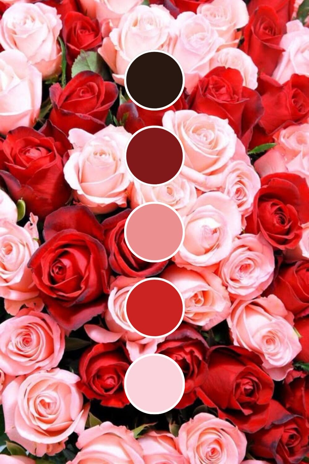
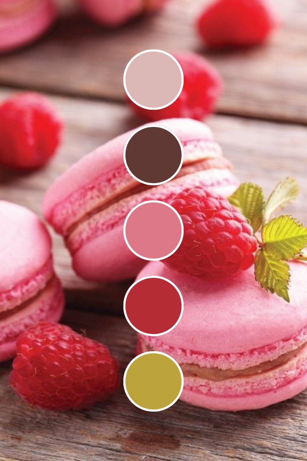
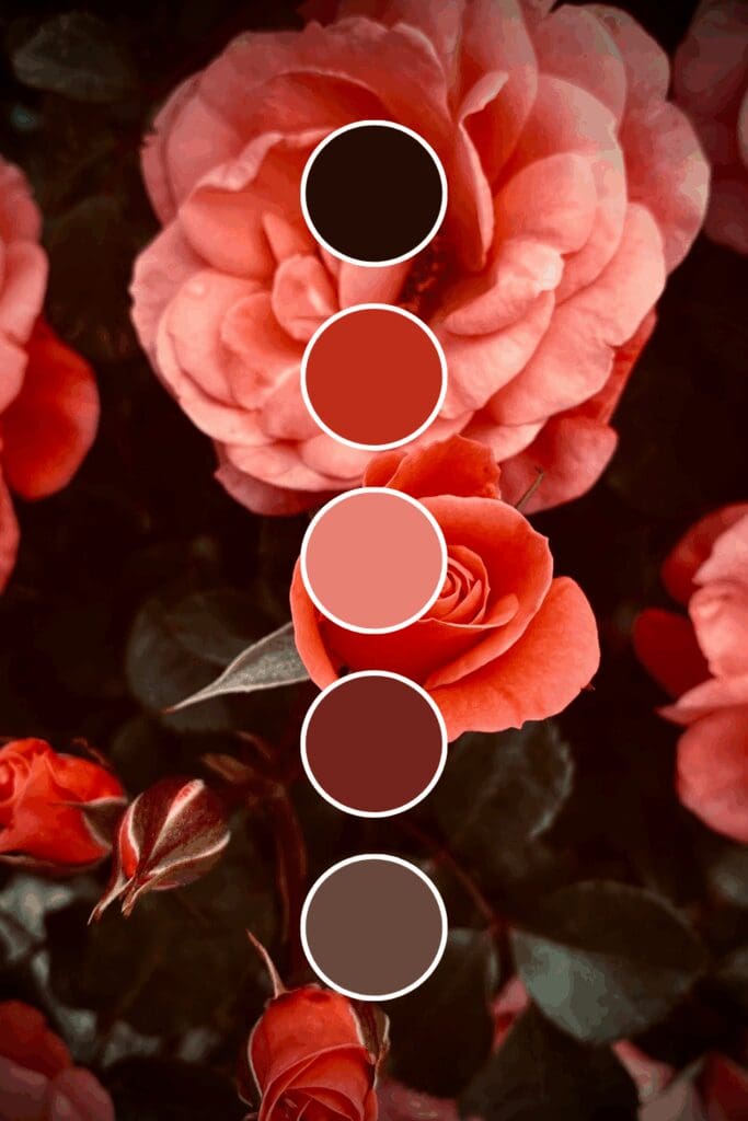
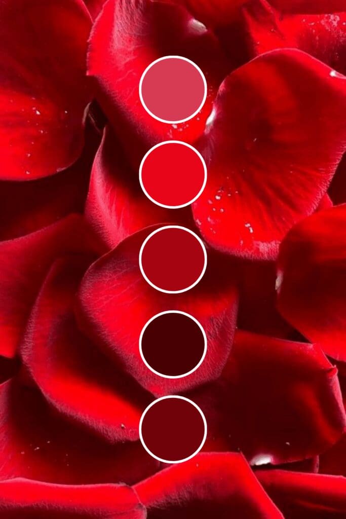
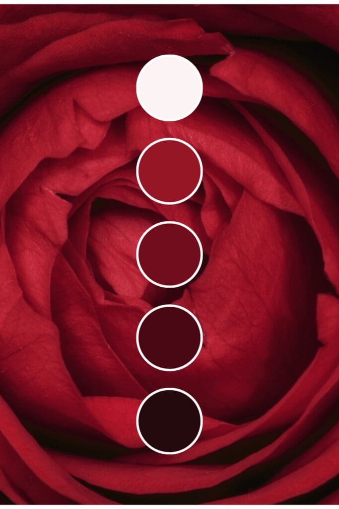
Discovering Your Perfect Red Shade
Red comes in more personalities than most people realize, and choosing the right one can completely transform how people perceive your business:
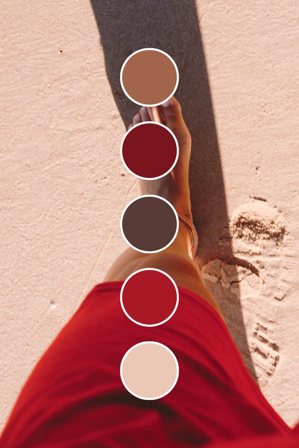
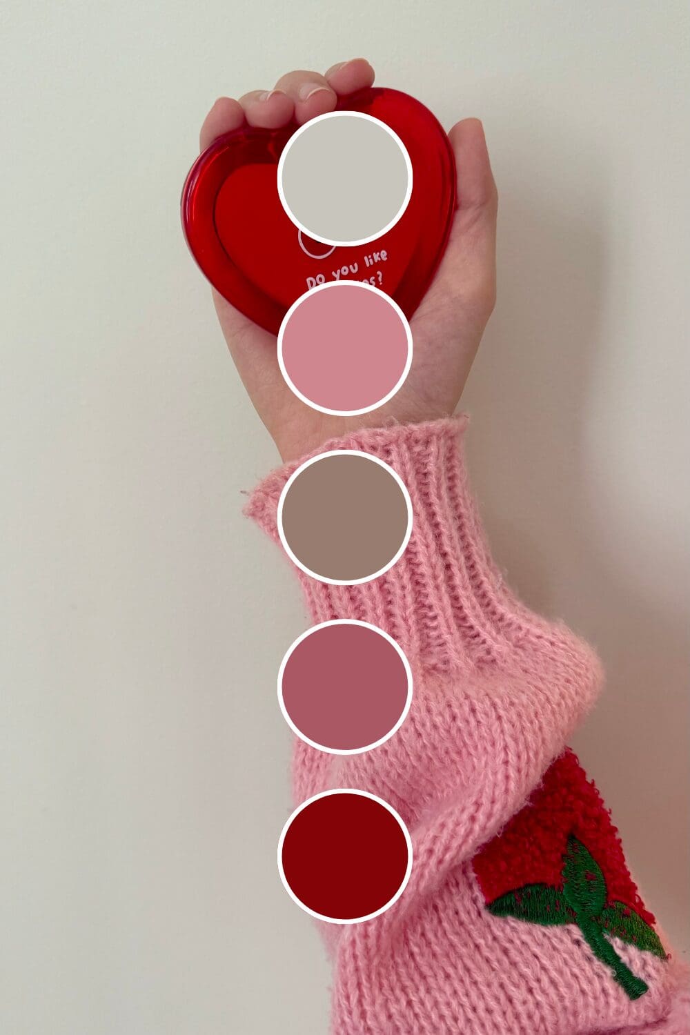
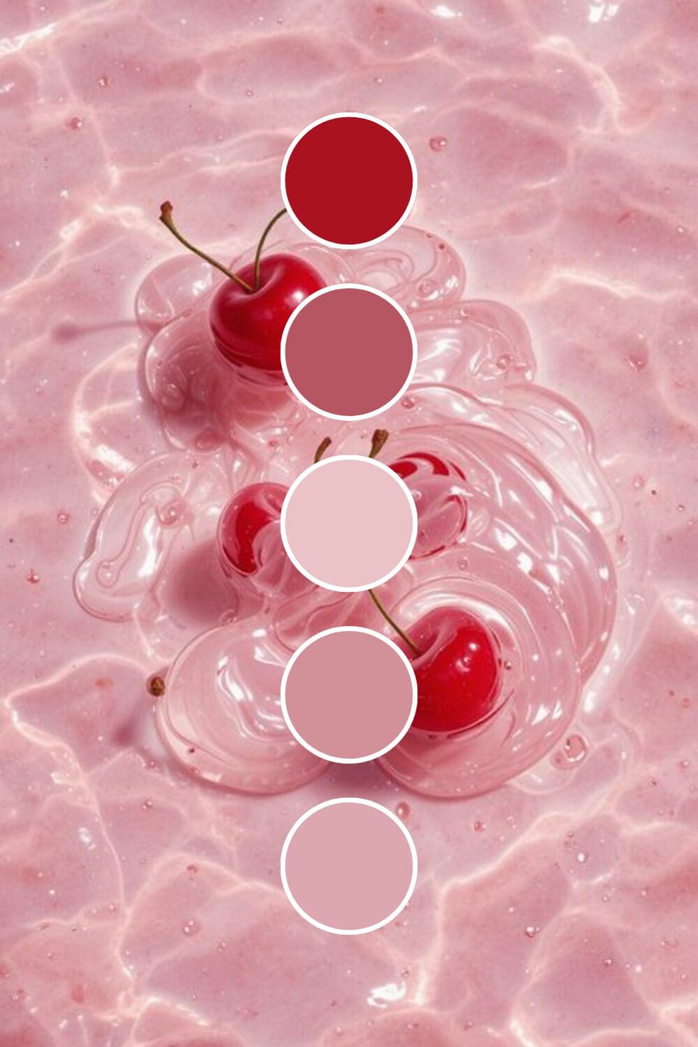
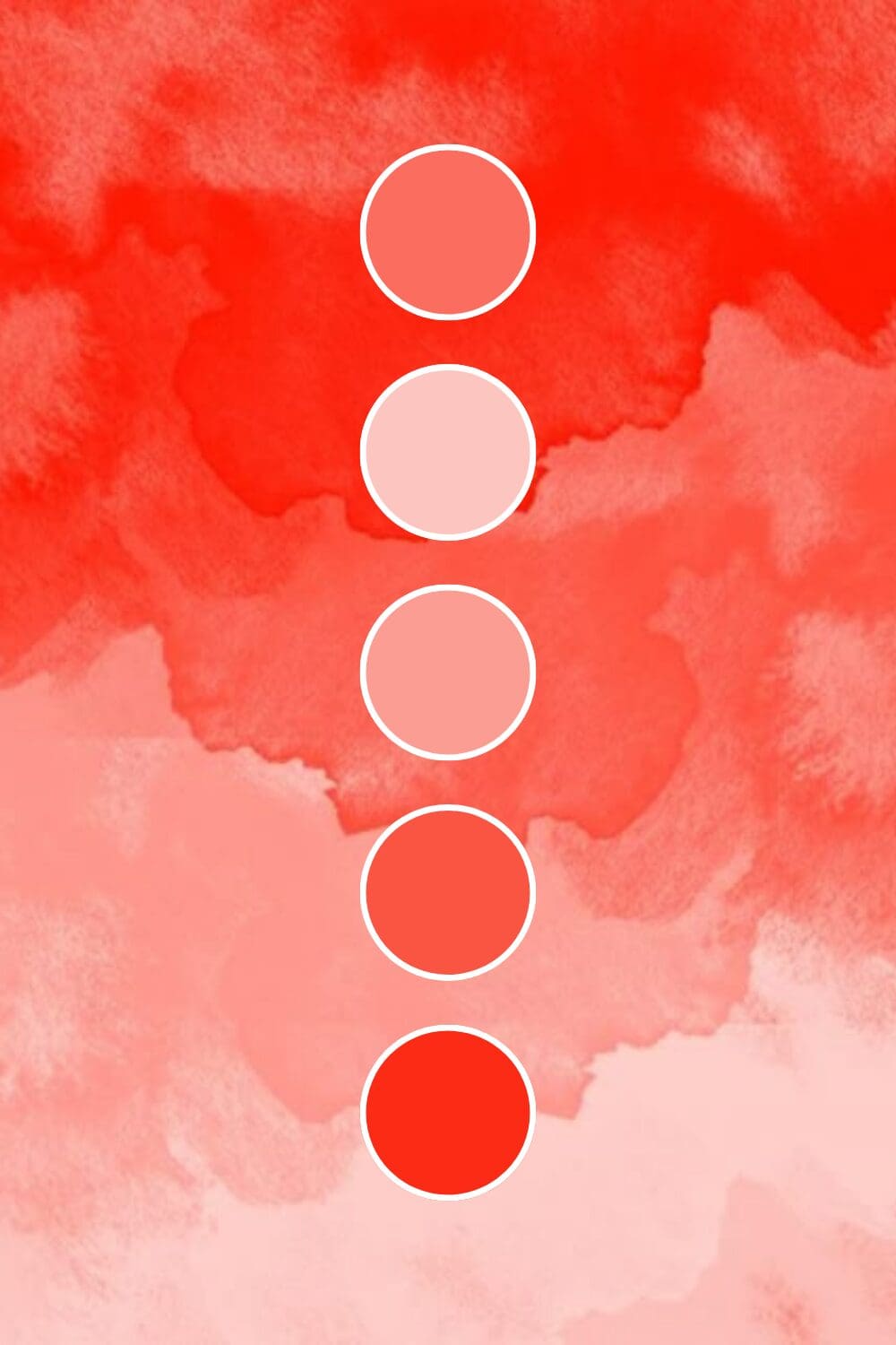
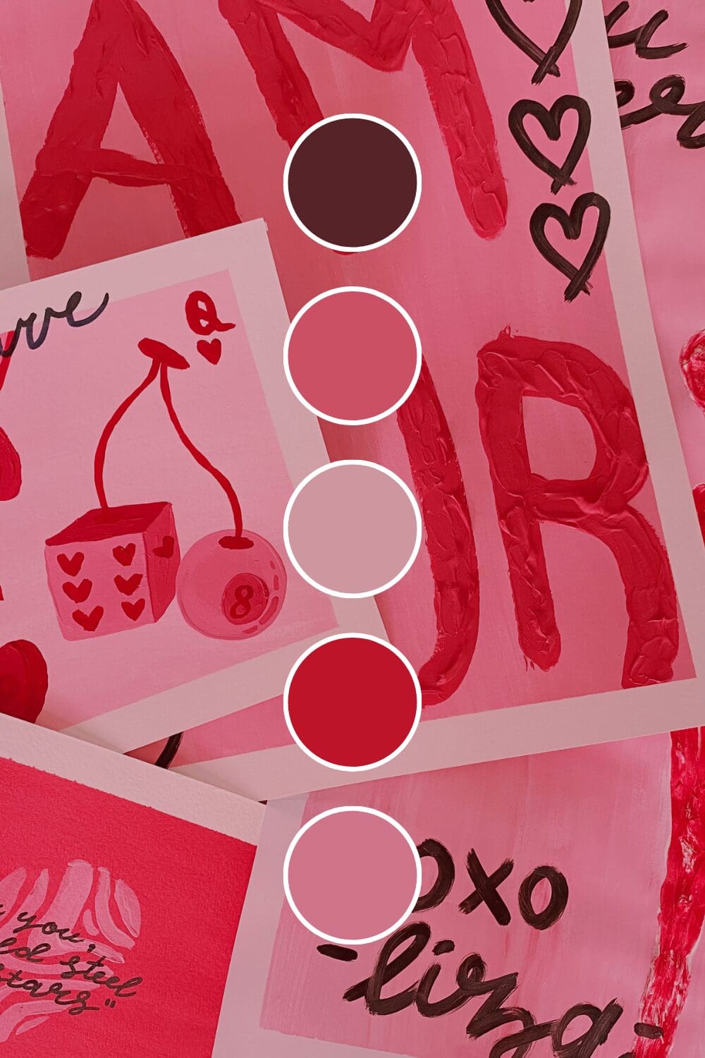
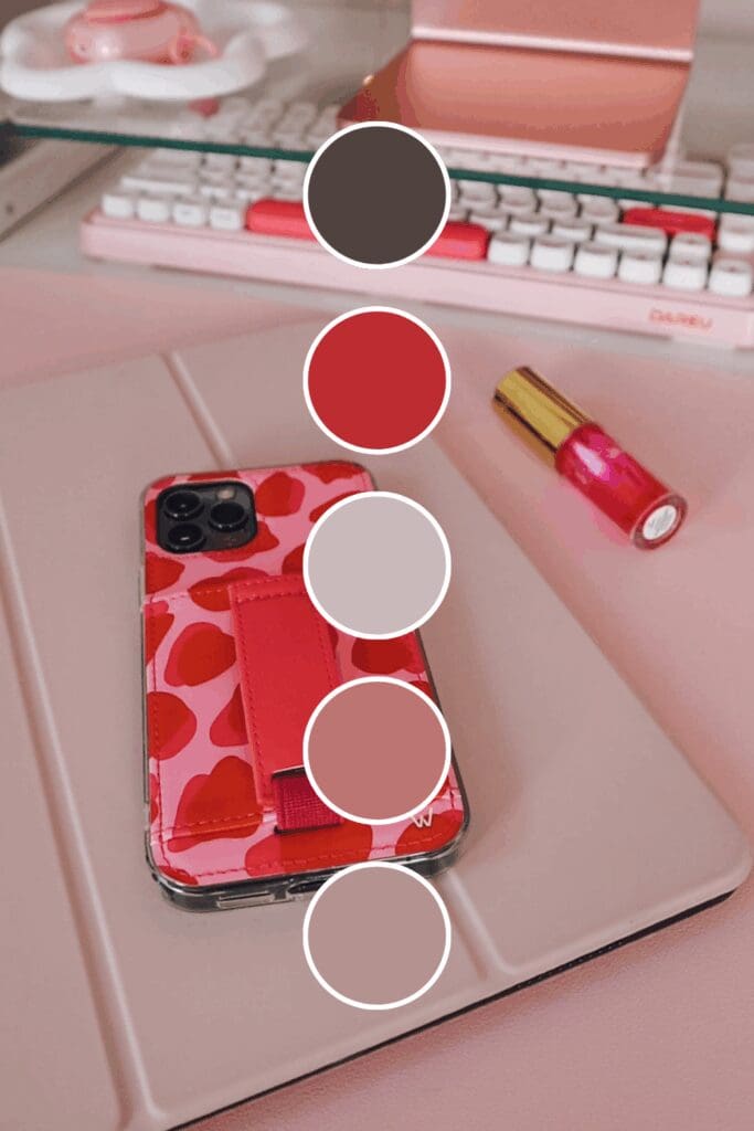
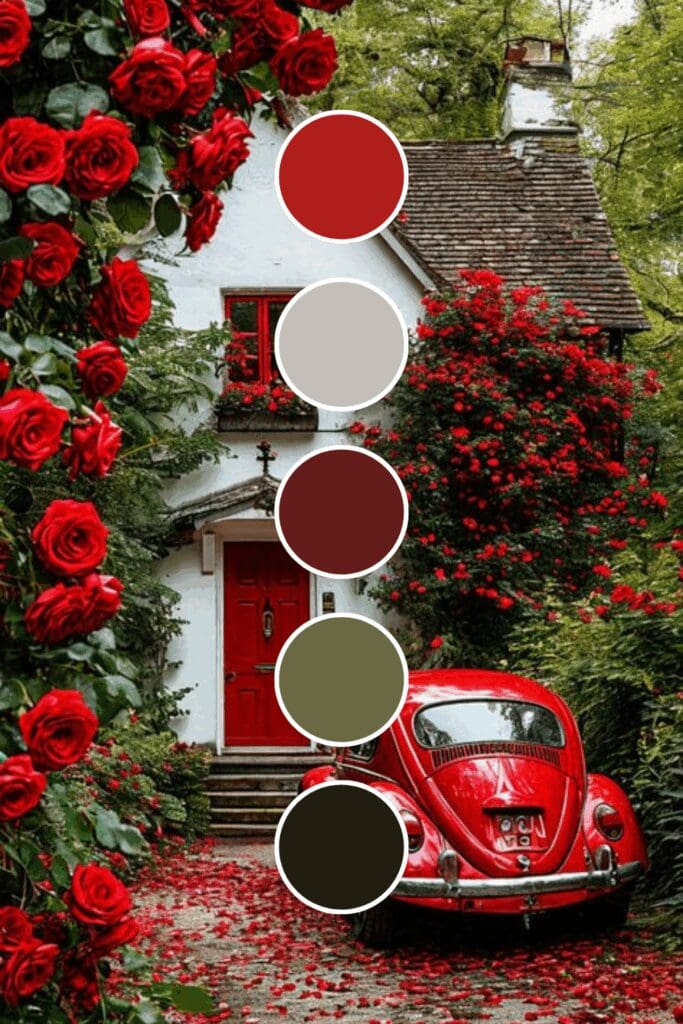
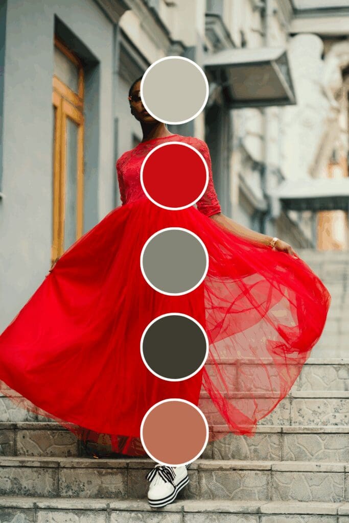
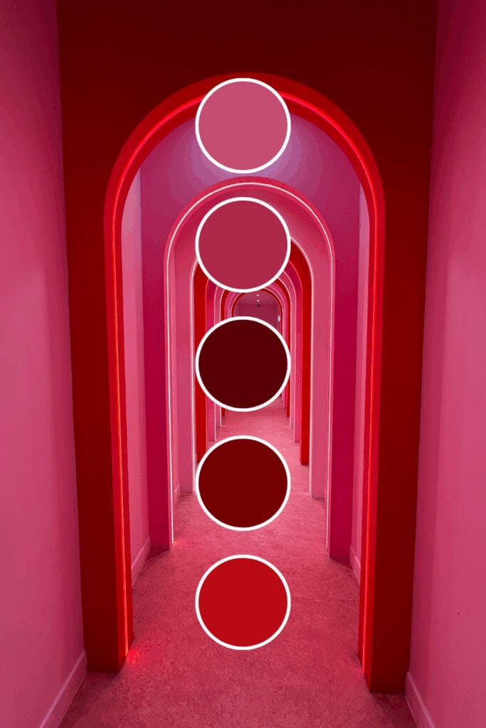
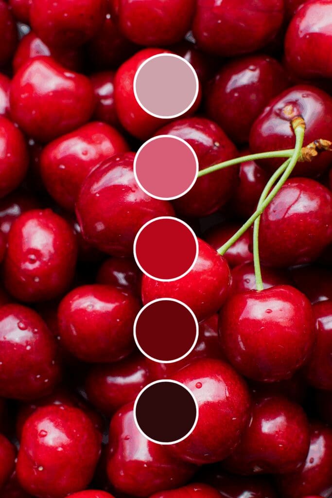
Cherry Red is pure confidence and energy. Sales coaches and motivational speakers love this because it practically vibrates with “let’s make things happen” energy.
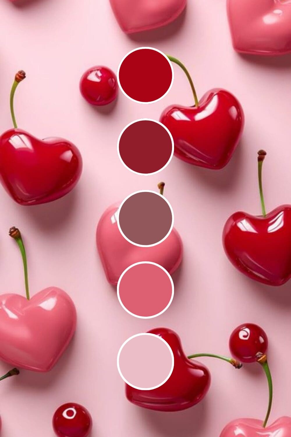
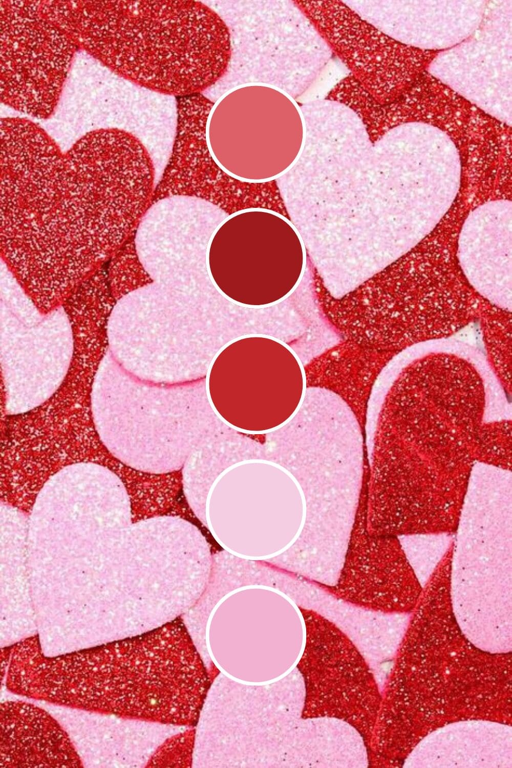
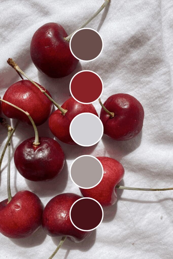
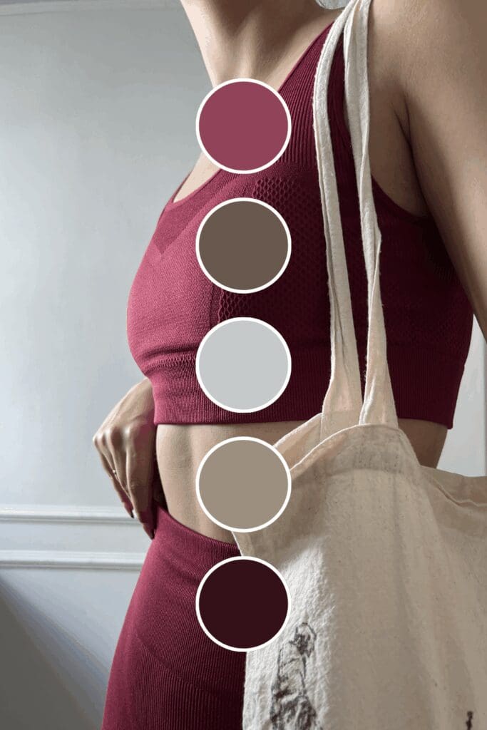
Burgundy Red brings sophisticated power to the table. Executive coaches and business consultants often choose this when they want to suggest years of successful experience.
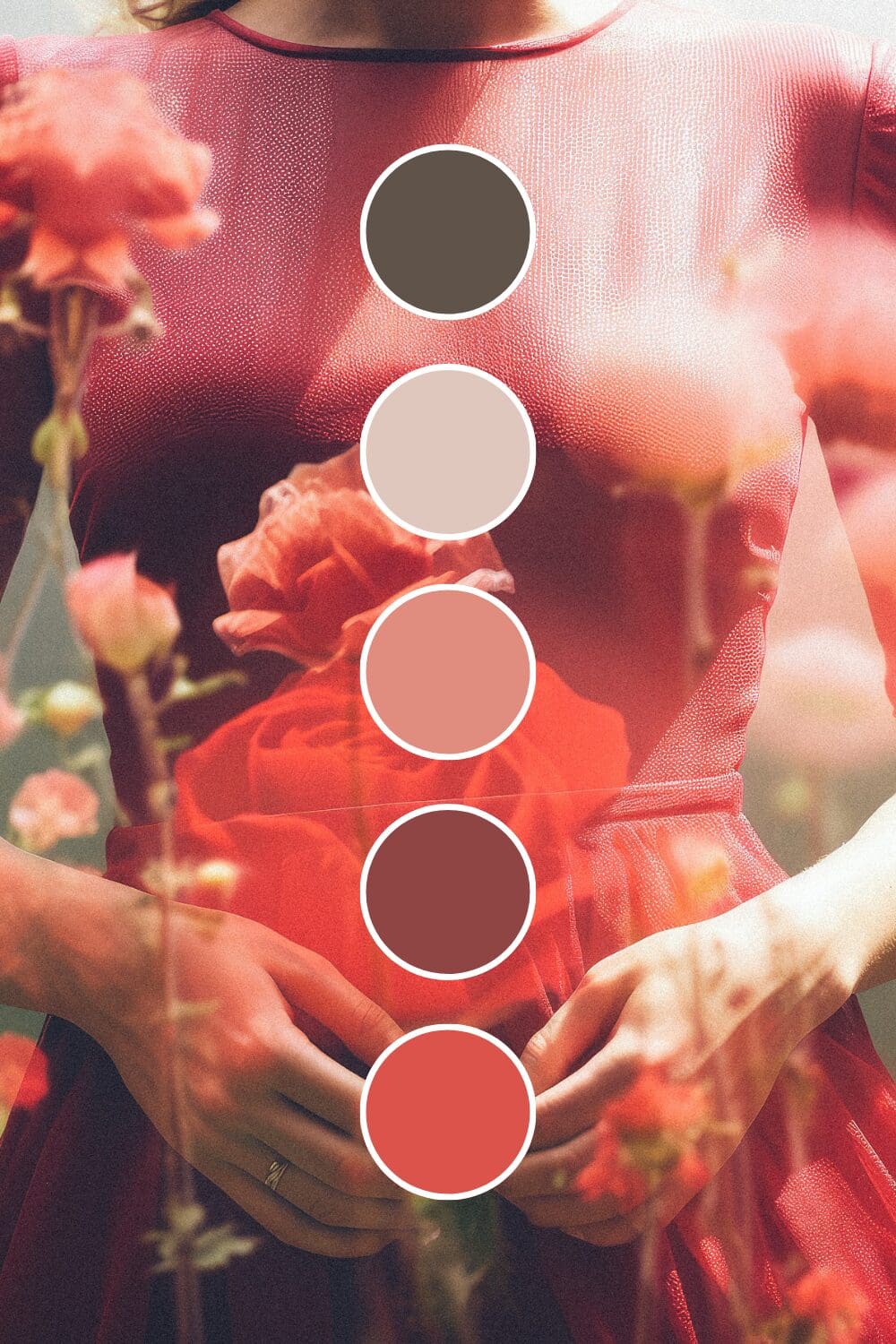
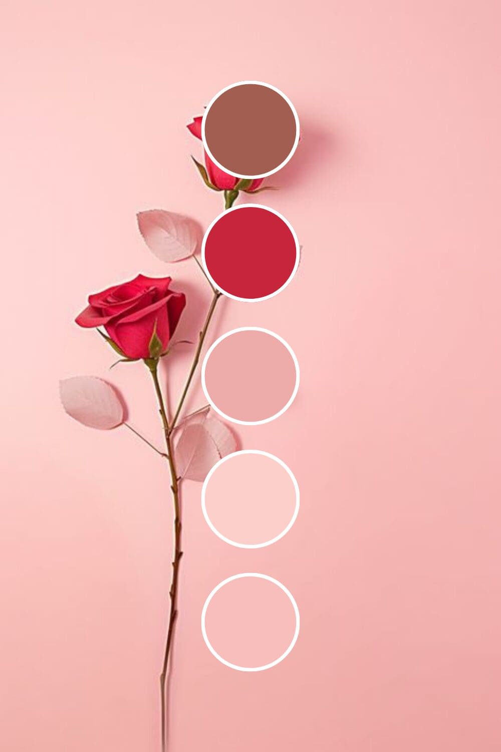
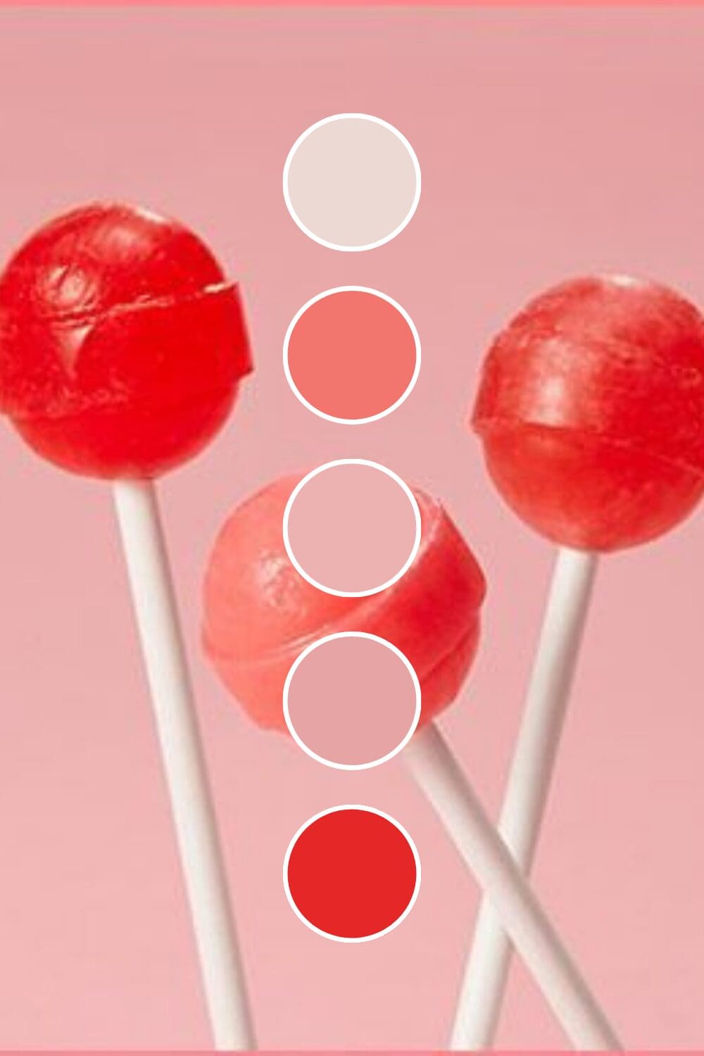
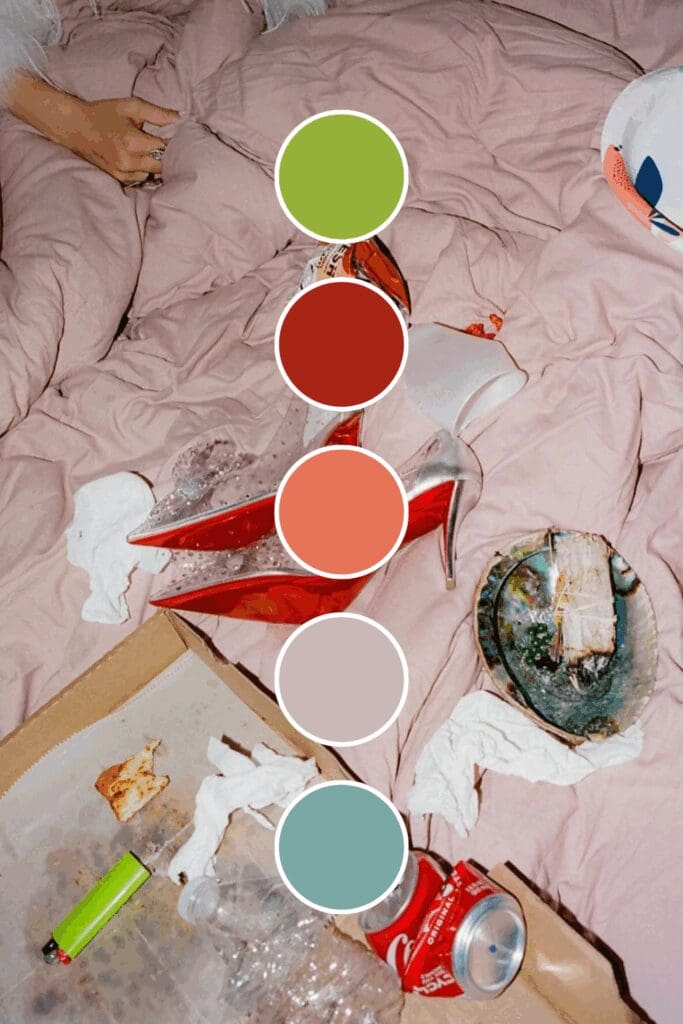
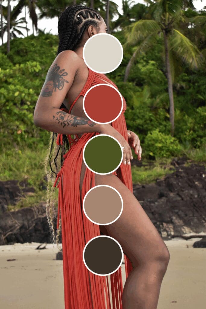
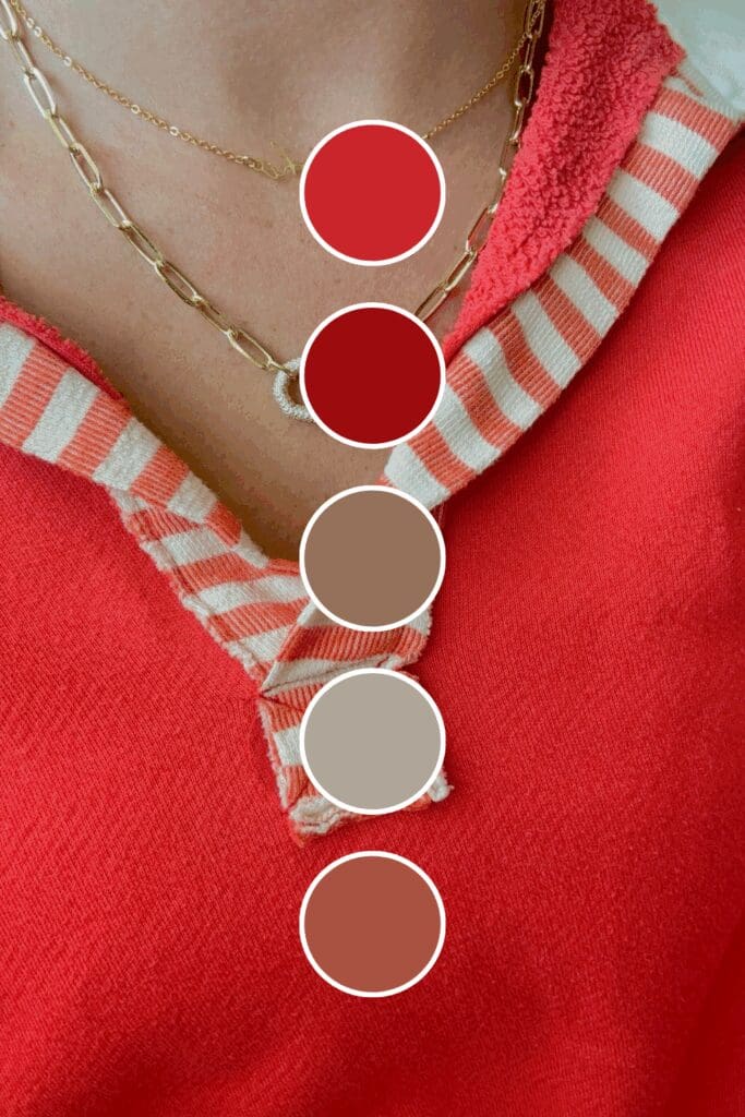
Coral Red adds warmth without losing impact. Female entrepreneurs often gravitate toward this because it’s powerful yet approachable.
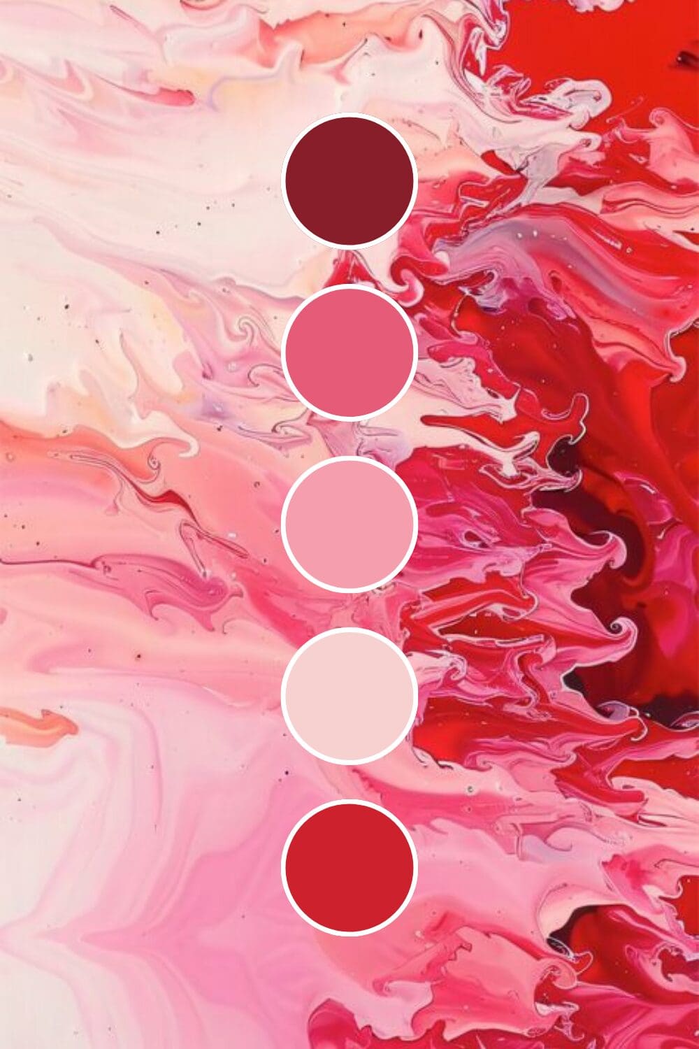
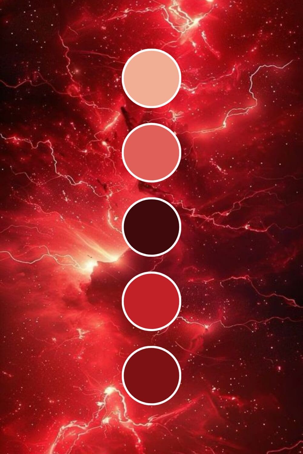
Crimson Red doesn’t back down from anything. Thought leaders and industry disruptors choose this when they want to signal that they’re here to change the game.
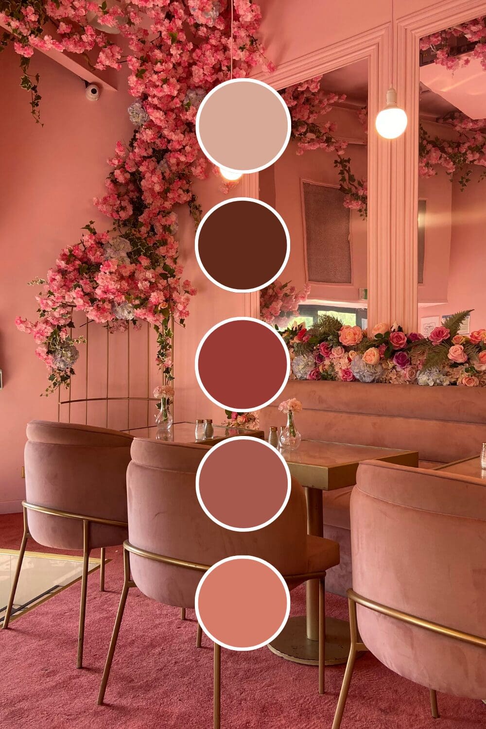
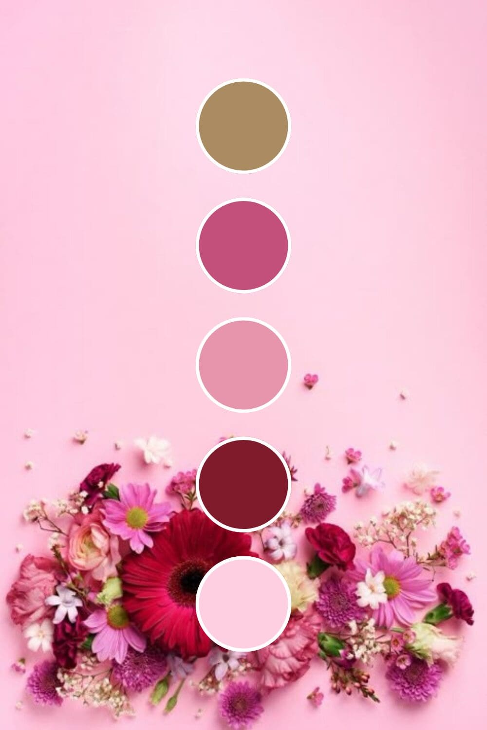
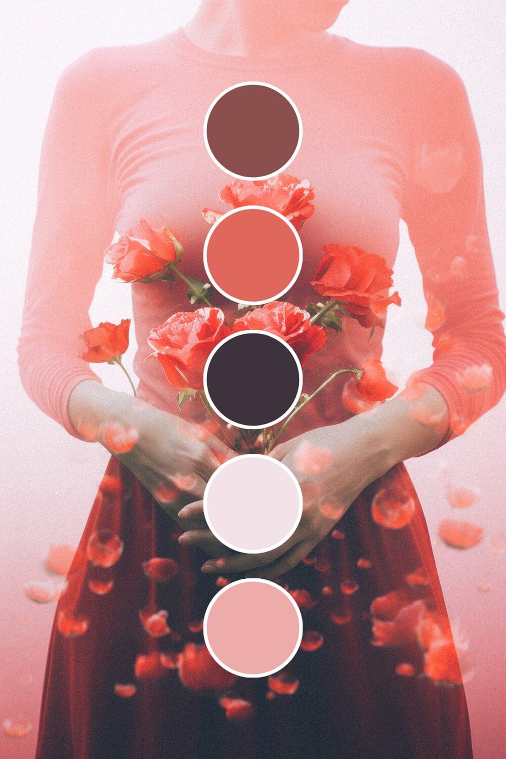
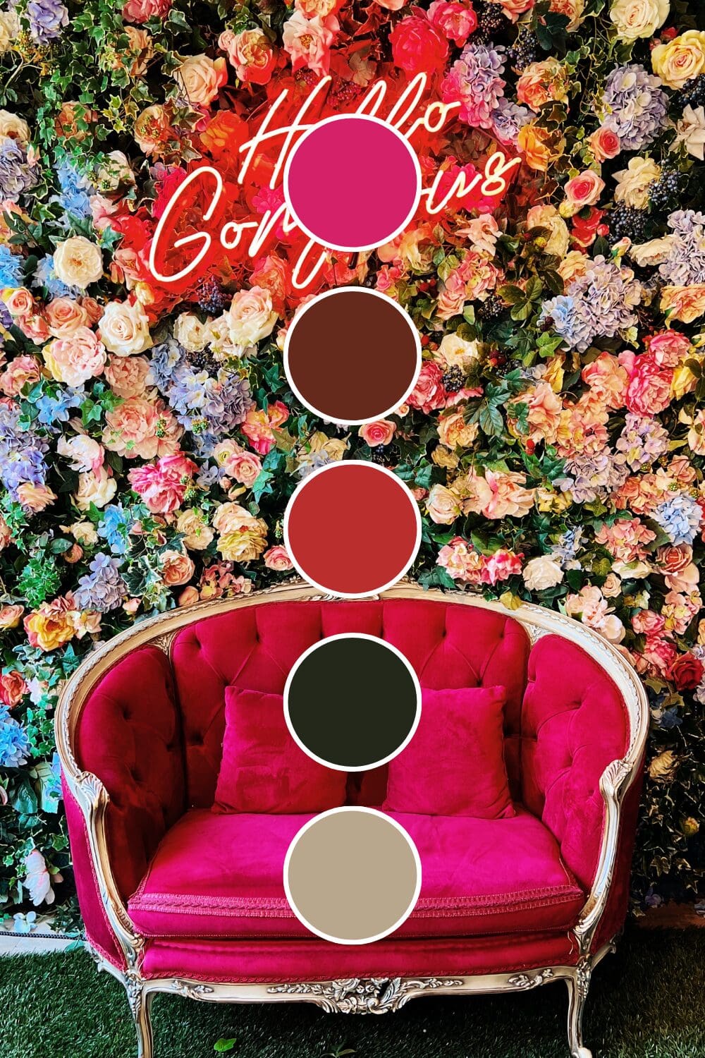
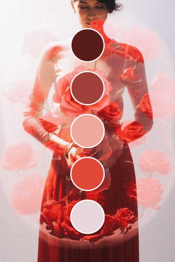
Rose Red balances strength with elegance. It’s perfect if you want red’s power but need something that feels a bit more refined.
Starting with one strong red foundation might feel bold, but it’s exactly how the most commanding brands establish their presence. You’ve got this!

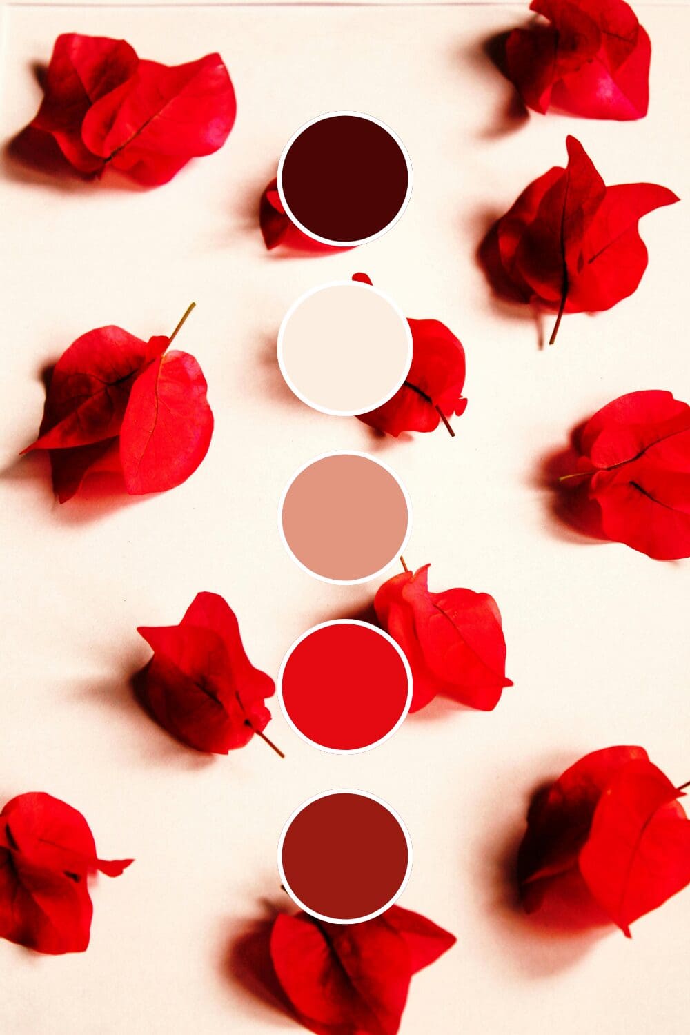

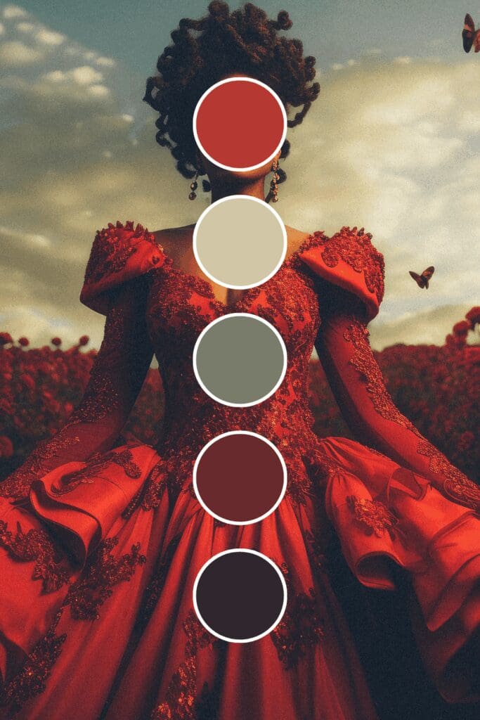
Color Combinations That Create Instant Impact
This is where red really flexes its muscles. The right combinations can harness red’s power without overwhelming your audience:
The Classic Power Plays
These combinations have been tested by successful leaders across industries:
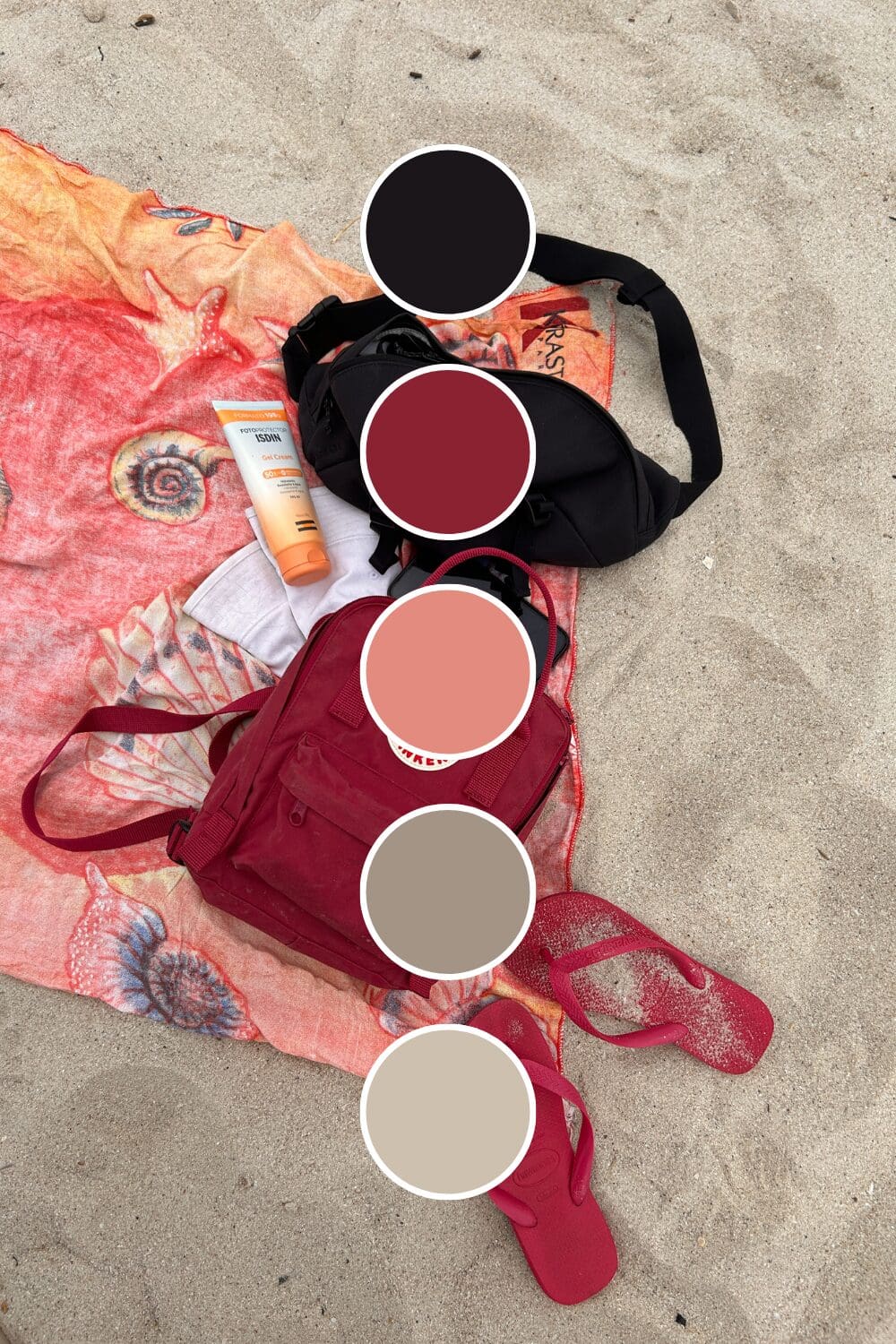
• Red + Black creates ultimate authority and sophistication (think luxury and power).
• Red + White brings clean energy that photographs beautifully on every platform.
• Red + Navy Blue balances passion with trust – perfect for professional services.
• Red + Gold suggests success and prosperity without being flashy about it.
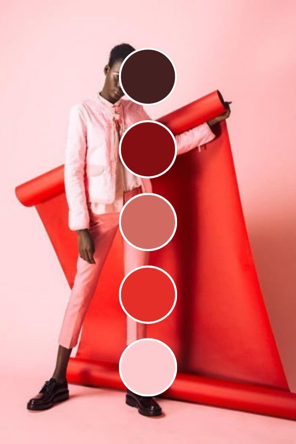
The Strategic Standouts
Here’s where you can really differentiate yourself (and these often perform better because they’re unexpected):
• Red + Sage Green creates sophisticated contrast that feels both bold and grounded.
• Red + Cream brings approachable elegance that works especially well for premium personal brands.
• Red + Charcoal Gray offers modern authority that’s powerful but not intimidating.
• Red + Soft Taupe creates warm professionalism that balances red’s intensity perfectly.
Just between us, these unexpected combinations often convert better than the obvious choices because they show strategic thinking.

Building Your Red Brand System
Your brand needs to feel intentional and commanding. Here’s my proven approach for red palettes that work:
- Choose your primary red – select one that matches your energy and market position
- Add 1-2 balancing colors that enhance red’s power without competing
- Include grounding neutrals (white, cream, or charcoal work beautifully)
- Test across all your touchpoints before making it official
Red can look completely different depending on the medium. Always check your colors on digital platforms, in print, and under various lighting conditions.
The goal is consistent impact. Your website should feel seamlessly connected to your social media, which should align with your presentations and business materials.
Where Red Makes the Most Difference
Red isn’t just for aggressive industries (though it certainly excels there). I’ve watched it transform:
- Sales and business development where results and confidence are everything.
- Fitness and wellness coaching targeting people ready for serious transformation.
- Legal and consulting services where authority needs to be immediately obvious.
- Creative agencies that want to showcase bold thinking and innovative solutions.
- Personal brands for entrepreneurs ready to position themselves as industry leaders.
This works especially well if you’re tired of blending in and ready to be seen as the expert you actually are.

Handling Red Concerns Like a Pro
Let me address the most common worries I hear about using red in business:
“Won’t it look too aggressive?” – Pair with softer neutrals to balance red’s intensity.
“Is it too bold for my industry?” – Deeper reds like burgundy can work in even the most conservative fields.
“What if it turns people off?” – The wrong people maybe, but your ideal clients will be drawn to your confidence.
Remember, you’re not trying to appeal to everyone. You’re trying to attract clients who appreciate confidence and are ready to invest in quality results.
Your Red Brand Revolution Starts Here
Ready to explore red’s power in your brand? Here’s how to test it without completely overhauling everything:
Week 1: Add red accents to your social media graphics and see how engagement changes.
Week 2: Create one piece of marketing material using your red palette.
Week 3: Update your email signature with red elements.
Week 4: Pay attention to how you feel about your brand and gather feedback from trusted sources.
You don’t need to transform everything overnight. The most important thing is to start somewhere and notice how red changes the energy around your business.
Here’s something powerful to consider:
What if six months from now, people immediately thought of you when they needed an expert in your field?
These possibilities are absolutely within your reach. Sometimes the boldest move is exactly what your business needs to finally claim the authority and recognition you deserve!

-high fidelity-3x")


")
