")

If you’ve been wondering how some brands instantly feel more premium and sophisticated than others, here’s something that might surprise you: it often comes down to purple.
Not the bright, Halloween purple you’re probably thinking of – I’m talking about those rich, nuanced purples that whisper “high-end” without screaming it.
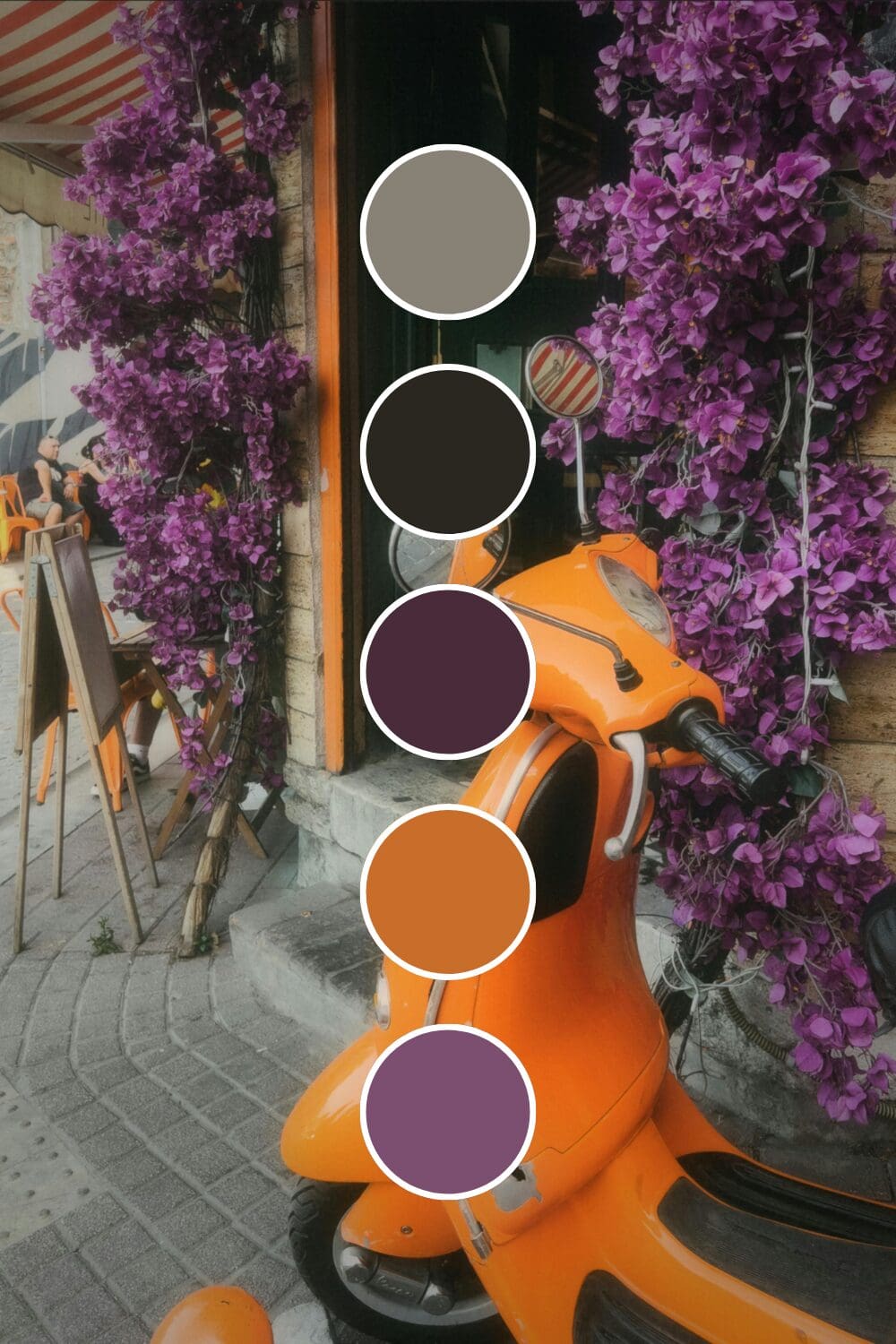
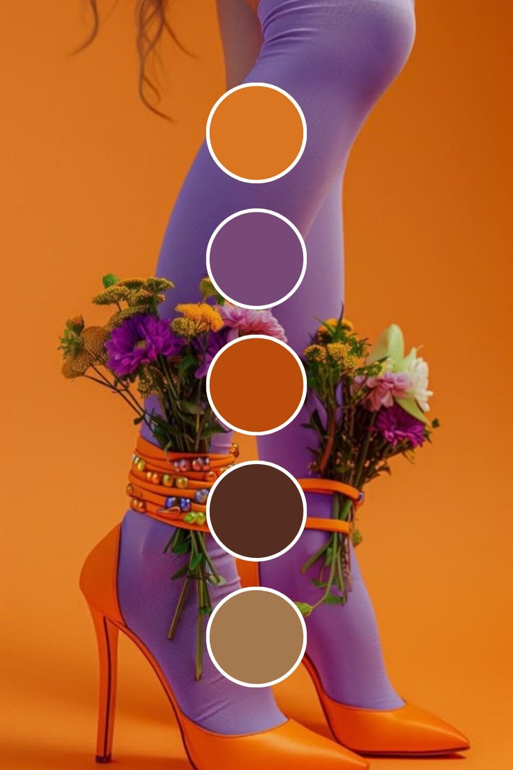
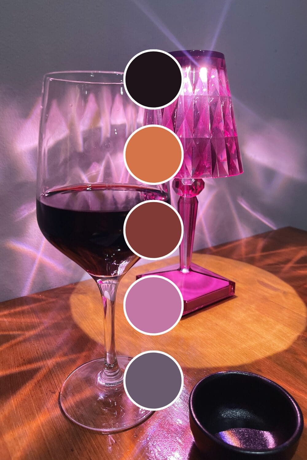
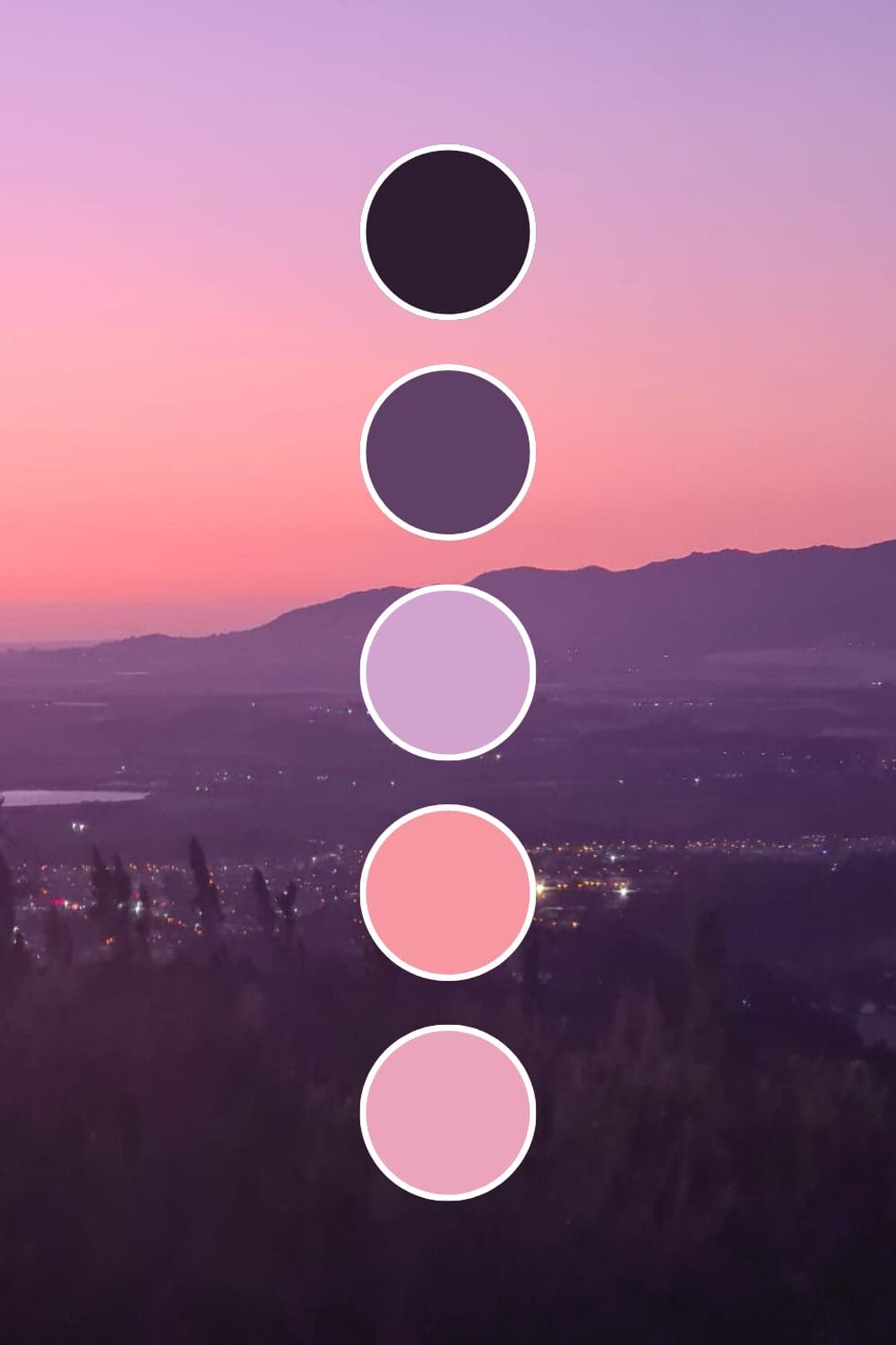
Purple has this unique ability to suggest both creativity and luxury at the same time. Whether you’re a coach wanting to position yourself as the go-to expert or a creative entrepreneur ready to charge premium prices, these 100 purple color palettes will help you find that perfect combination that elevates everything you do.
Why Purple Gives Your Brand Instant Authority
Purple is like having a secret weapon in your branding toolkit. It communicates value in ways other colors simply can’t.
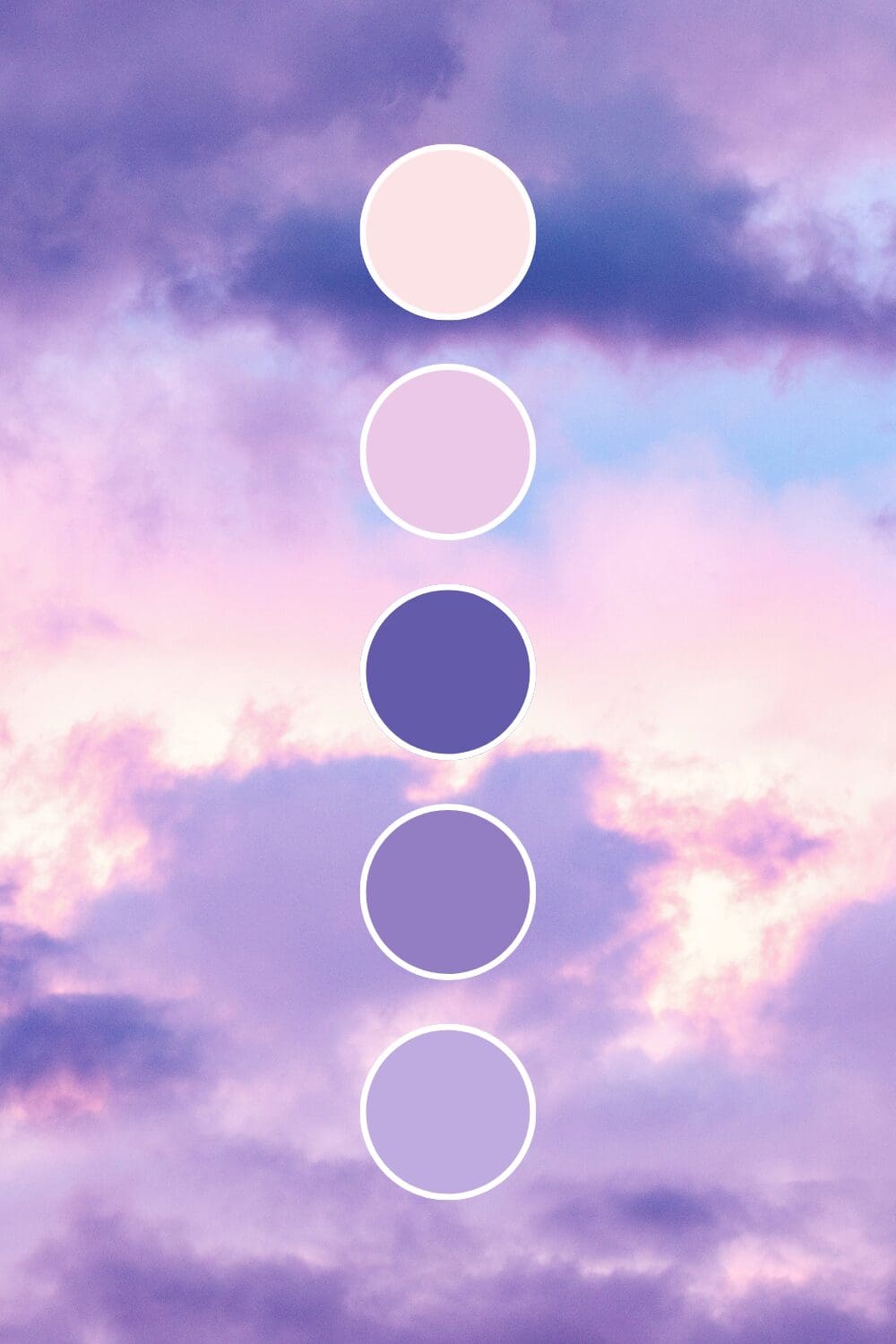
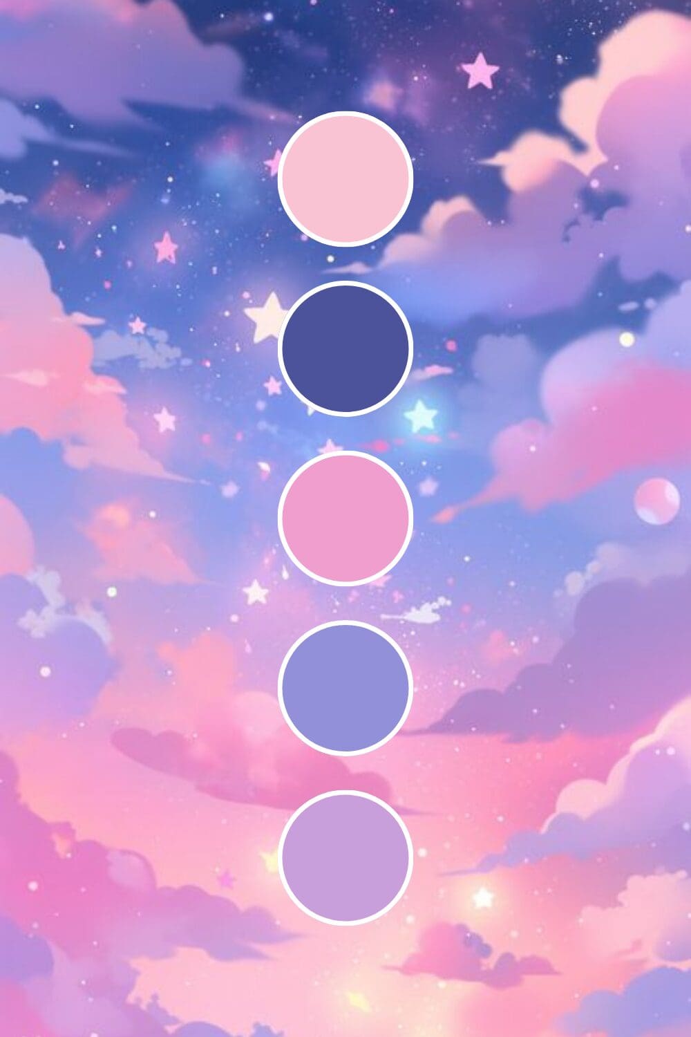
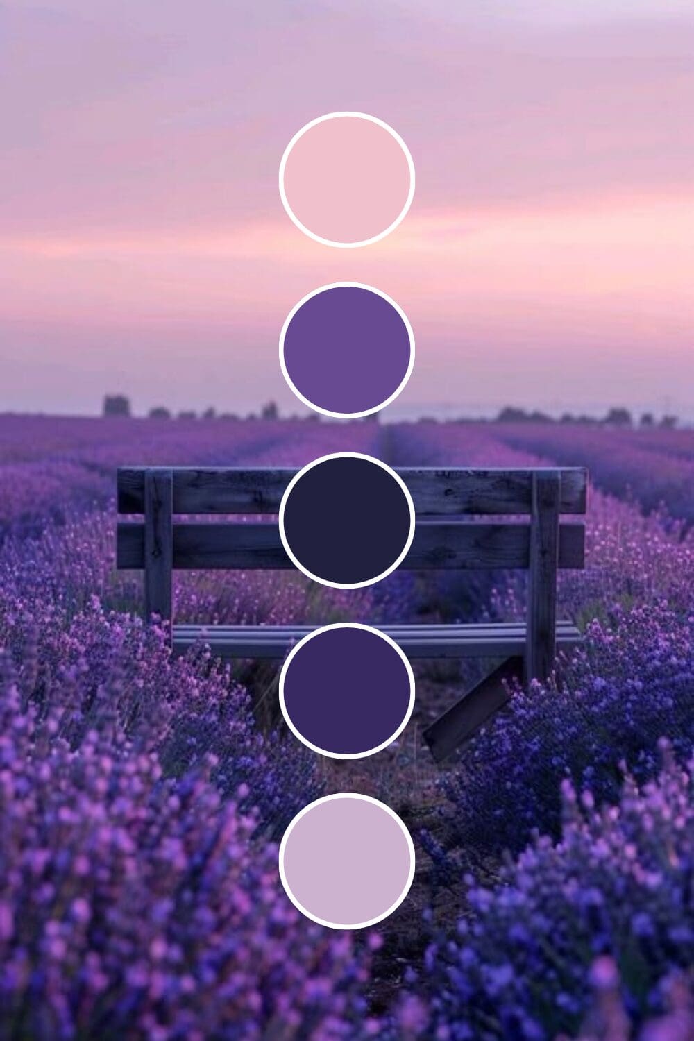
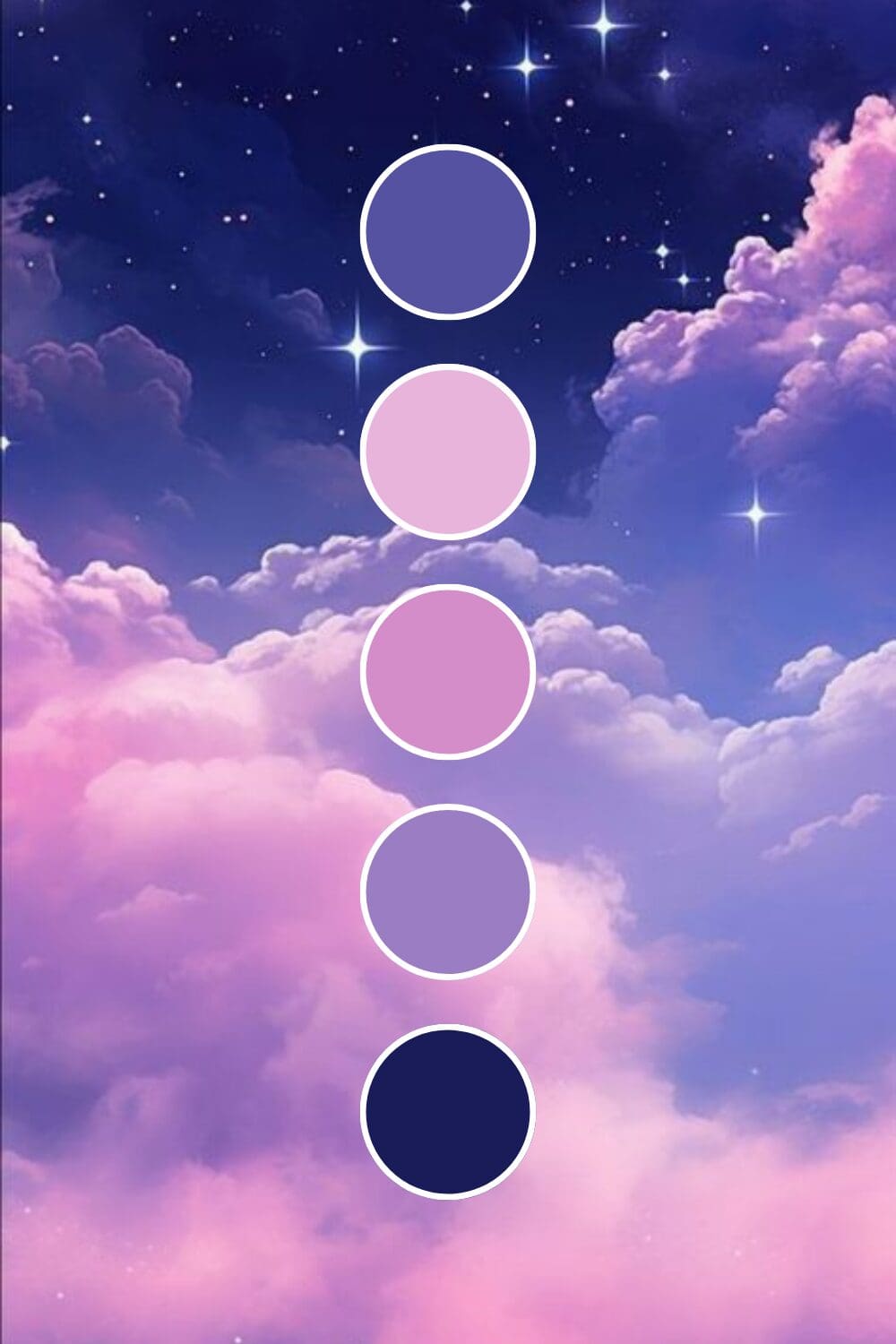
Light purples feel mystical and nurturing. They’re perfect if you’re in spiritual coaching, wellness, or any field where transformation is part of your service offering.
Rich purples scream luxury and exclusivity. High-ticket coaches and premium service providers love these because they immediately suggest “this is an investment, not an expense.”
Deep purples bring wisdom and authority together beautifully. Consultants and thought leaders often choose these because they suggest years of expertise without being intimidating.
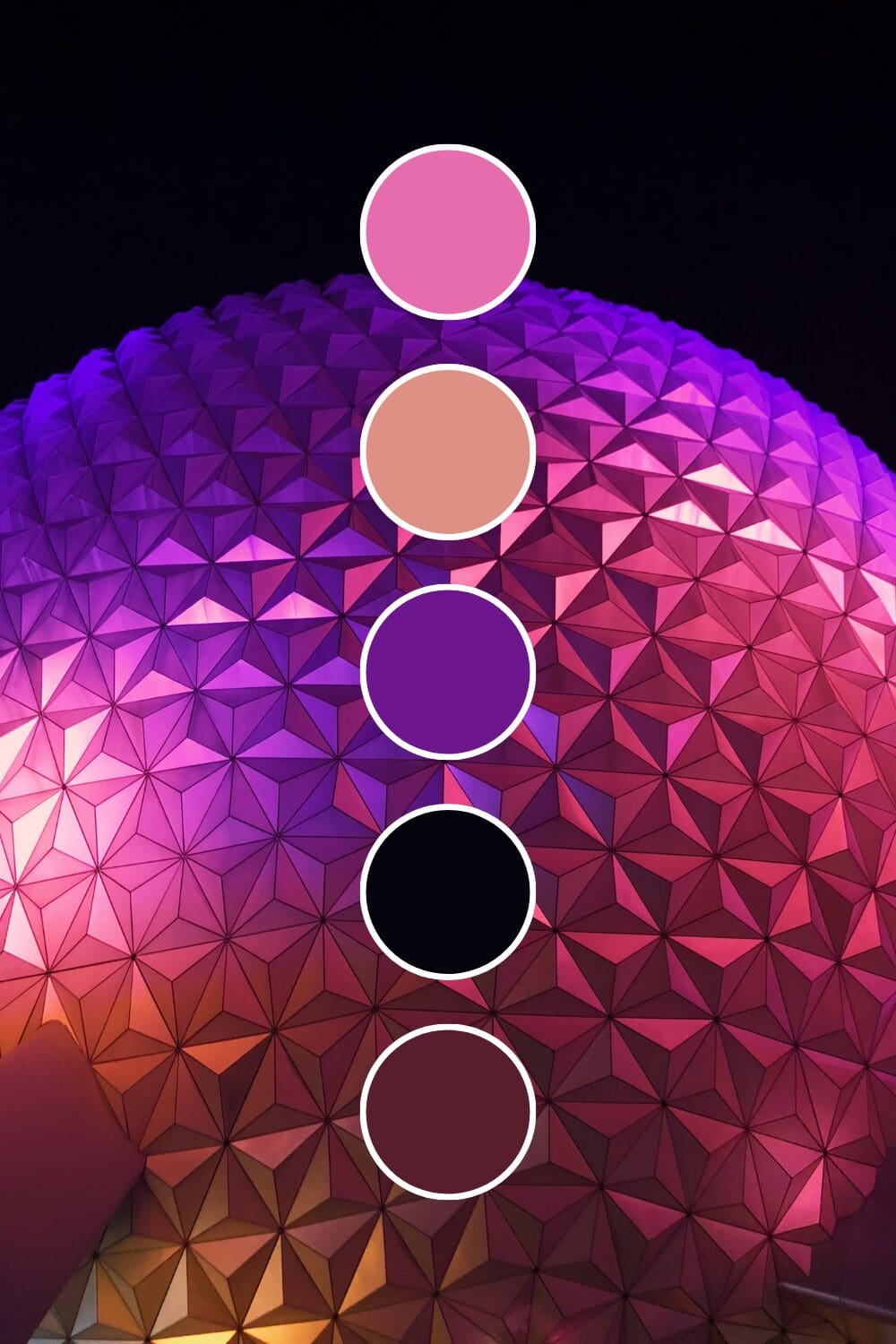
Violet purples spark creativity and innovation. Design agencies and artistic entrepreneurs gravitate toward these because they say “we see things differently” in the best possible way.
Purple might feel unconventional at first, but I promise it’s one of the most sophisticated choices you can make for your brand.
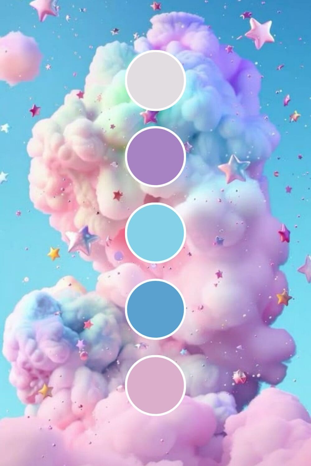
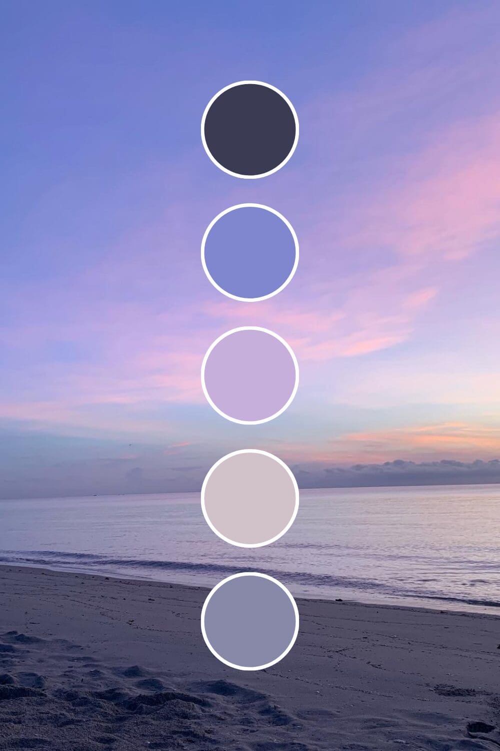
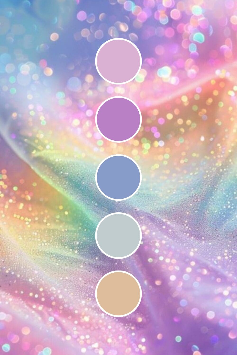
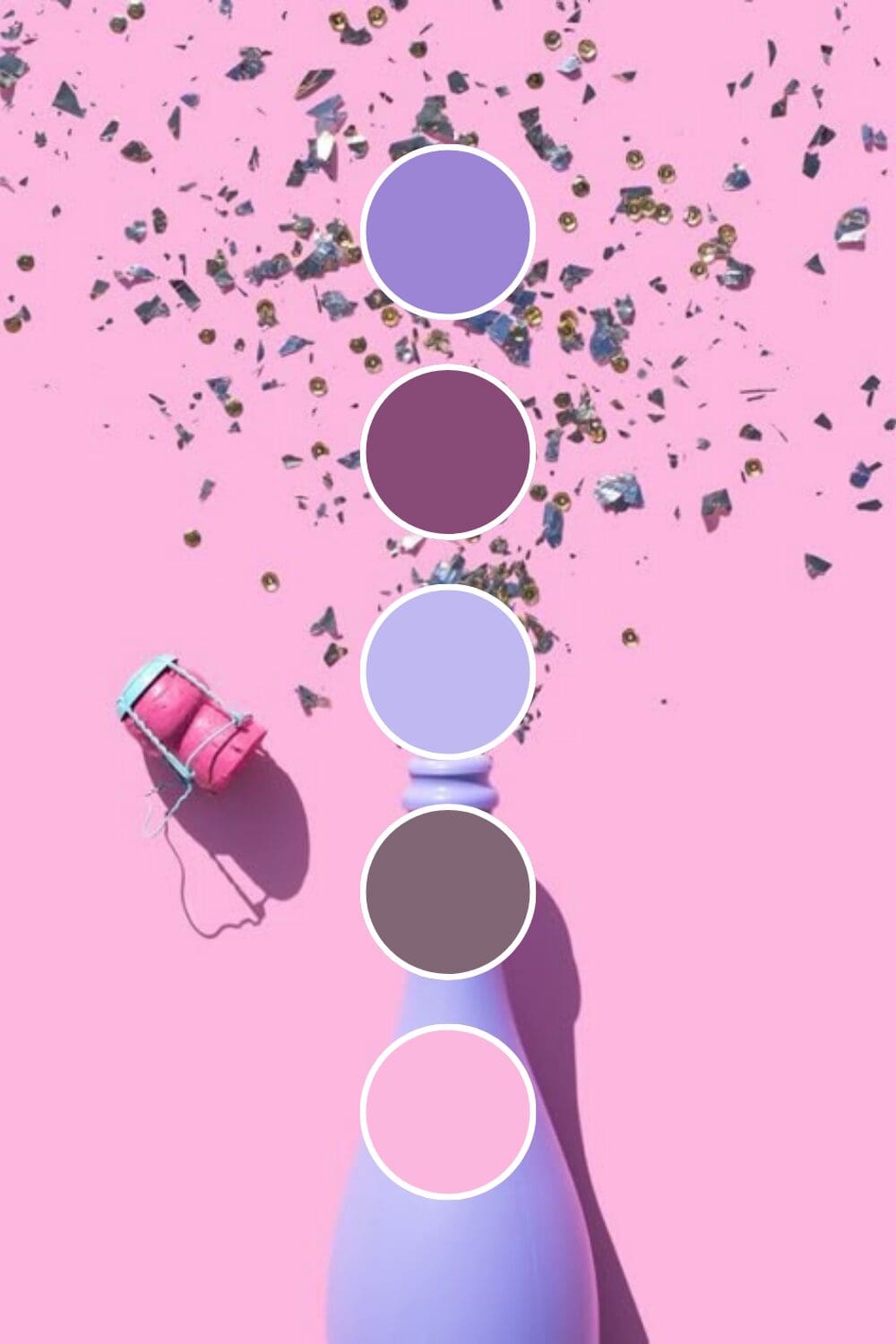
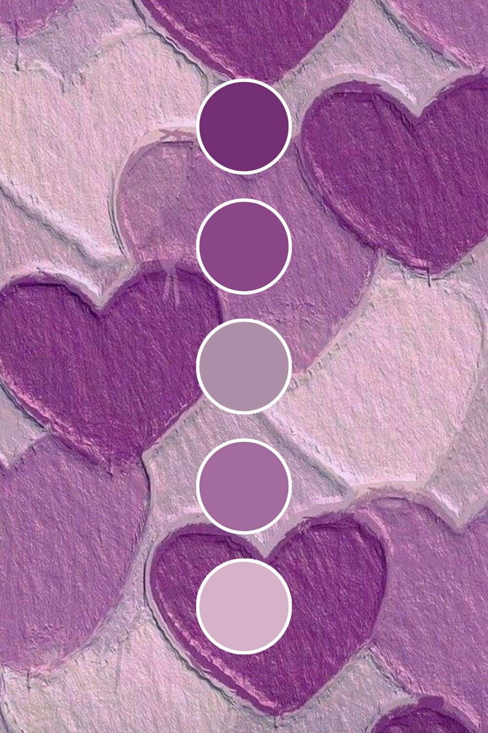
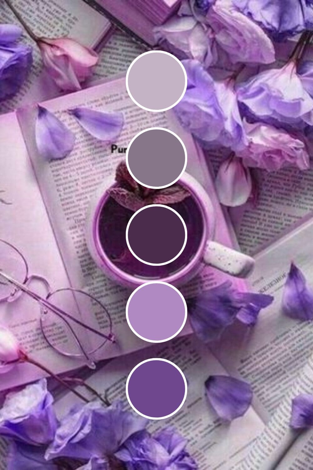
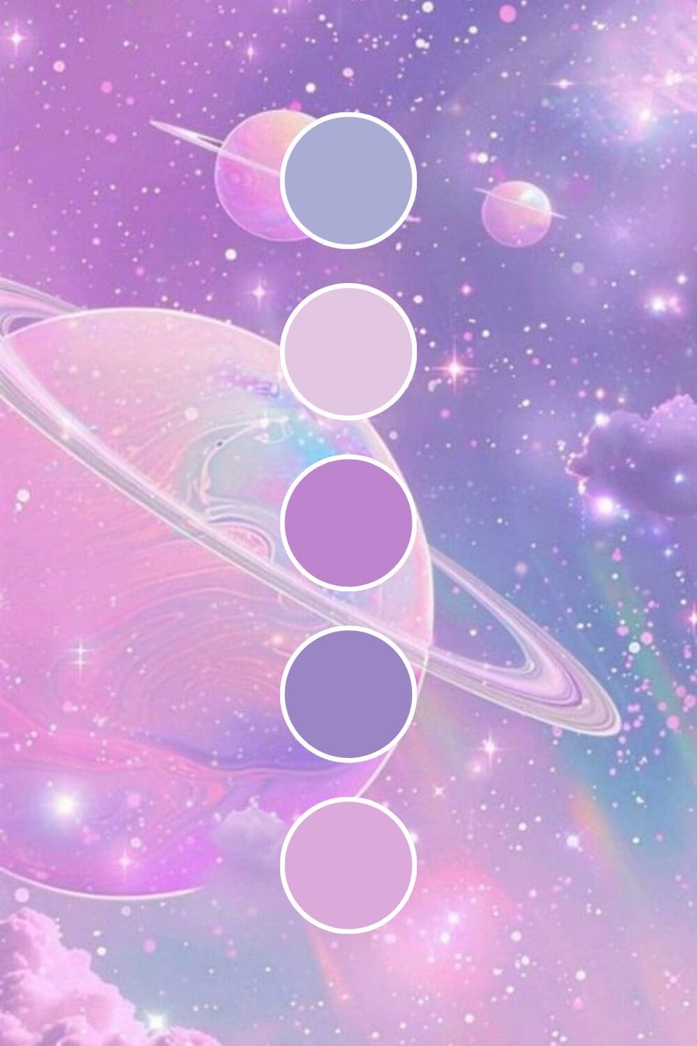
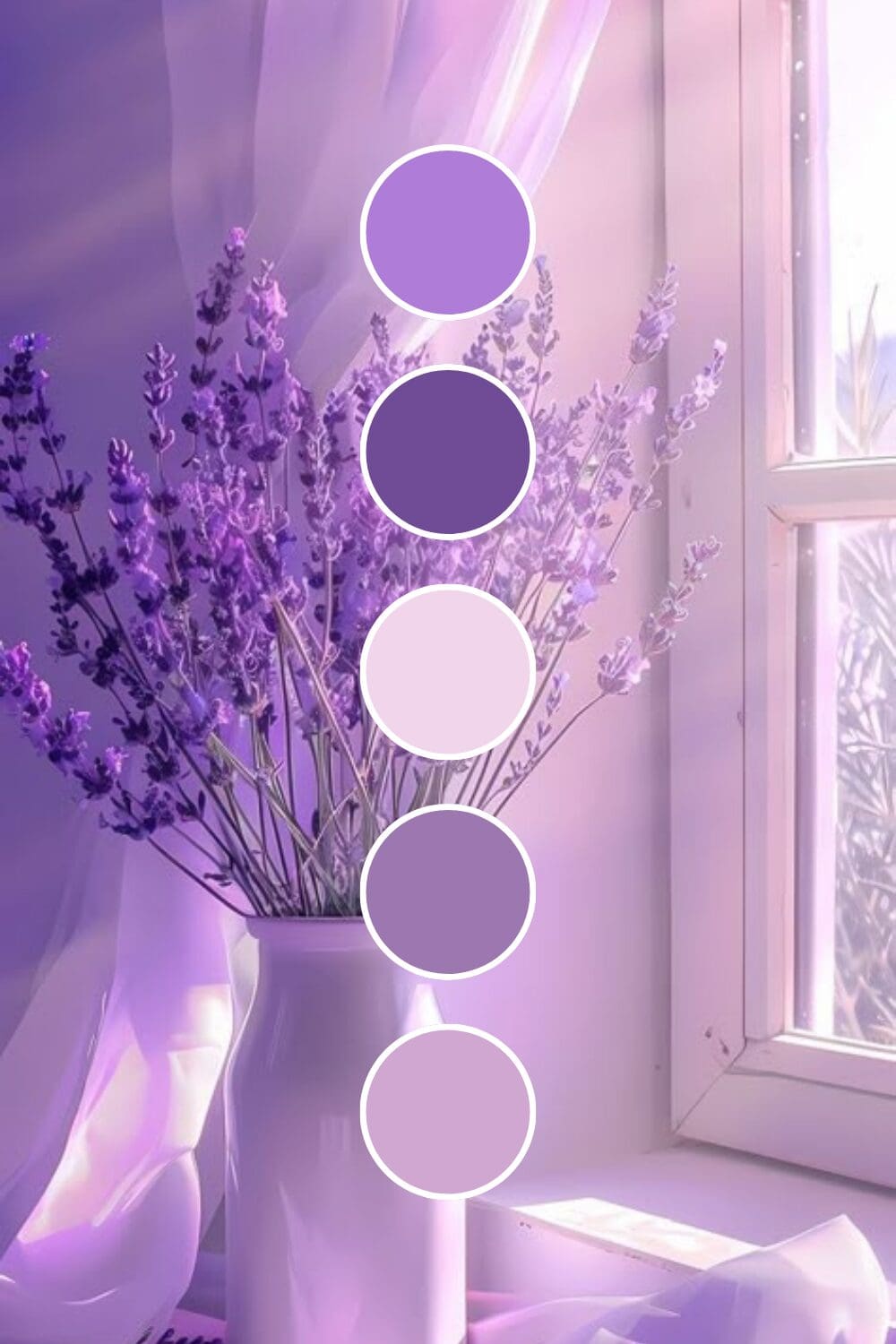
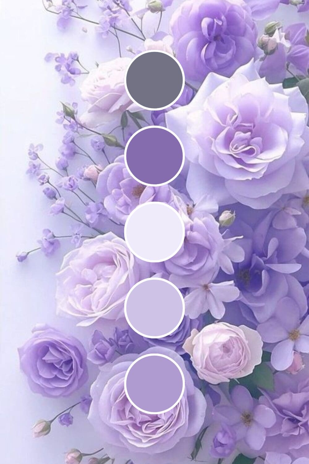
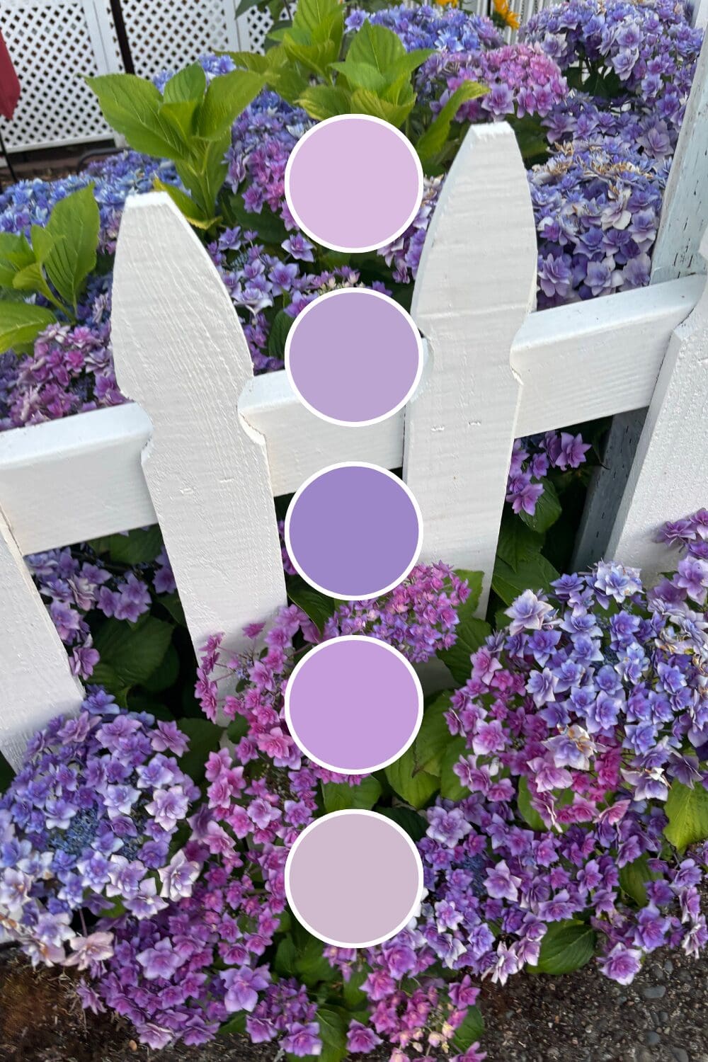
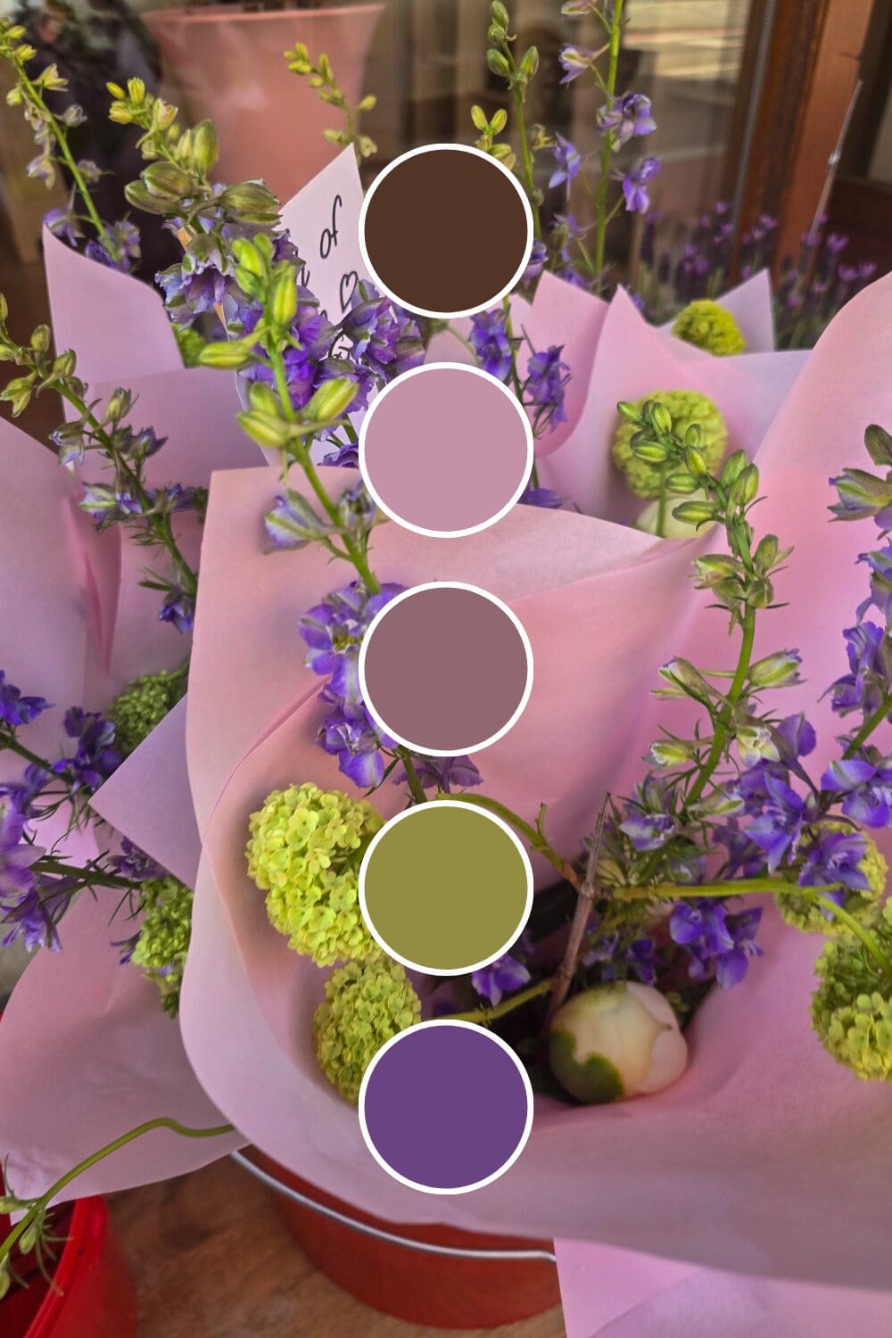
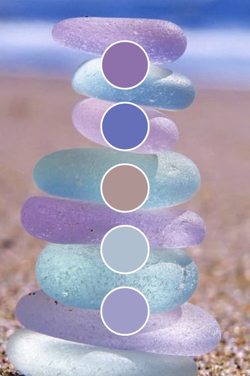
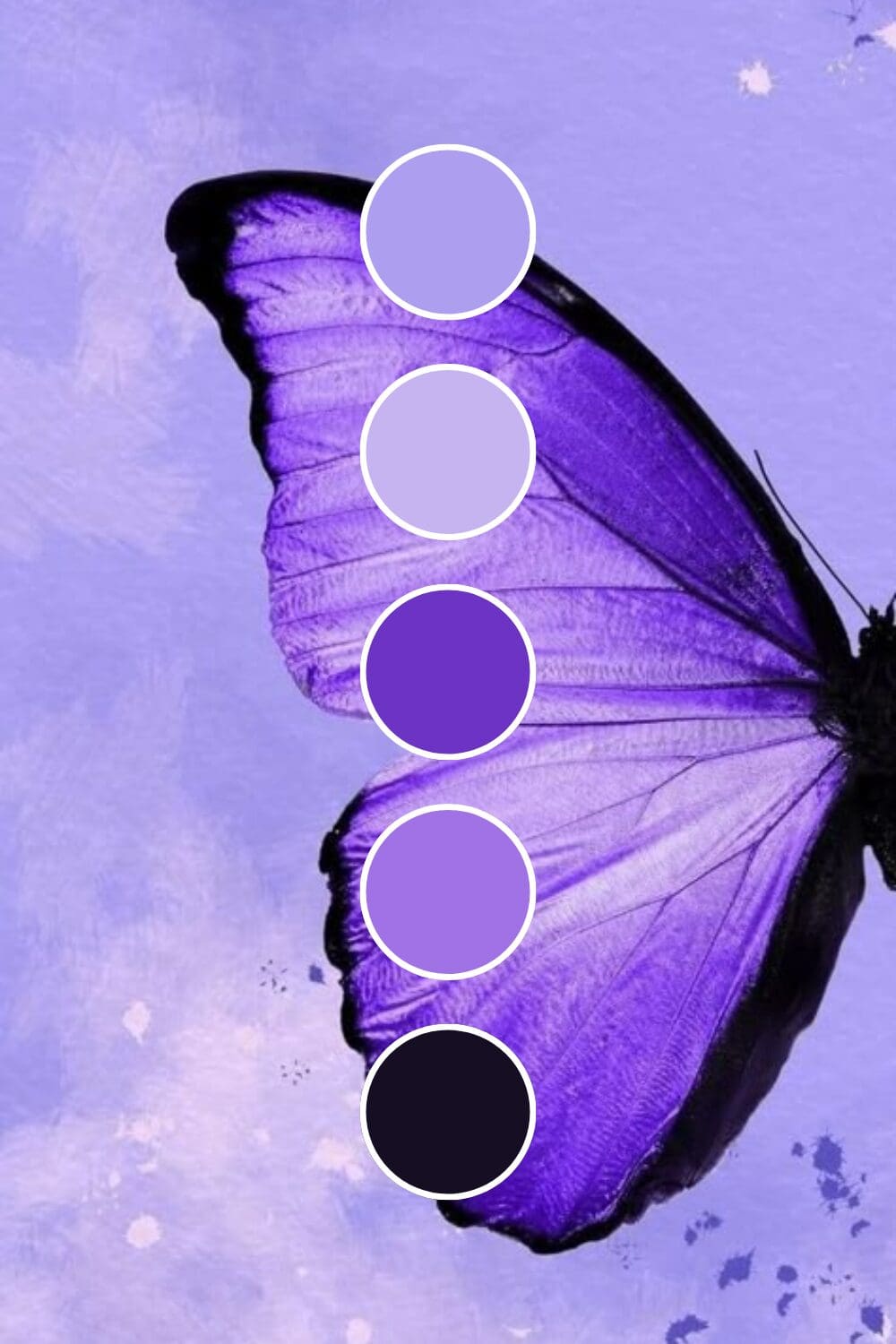
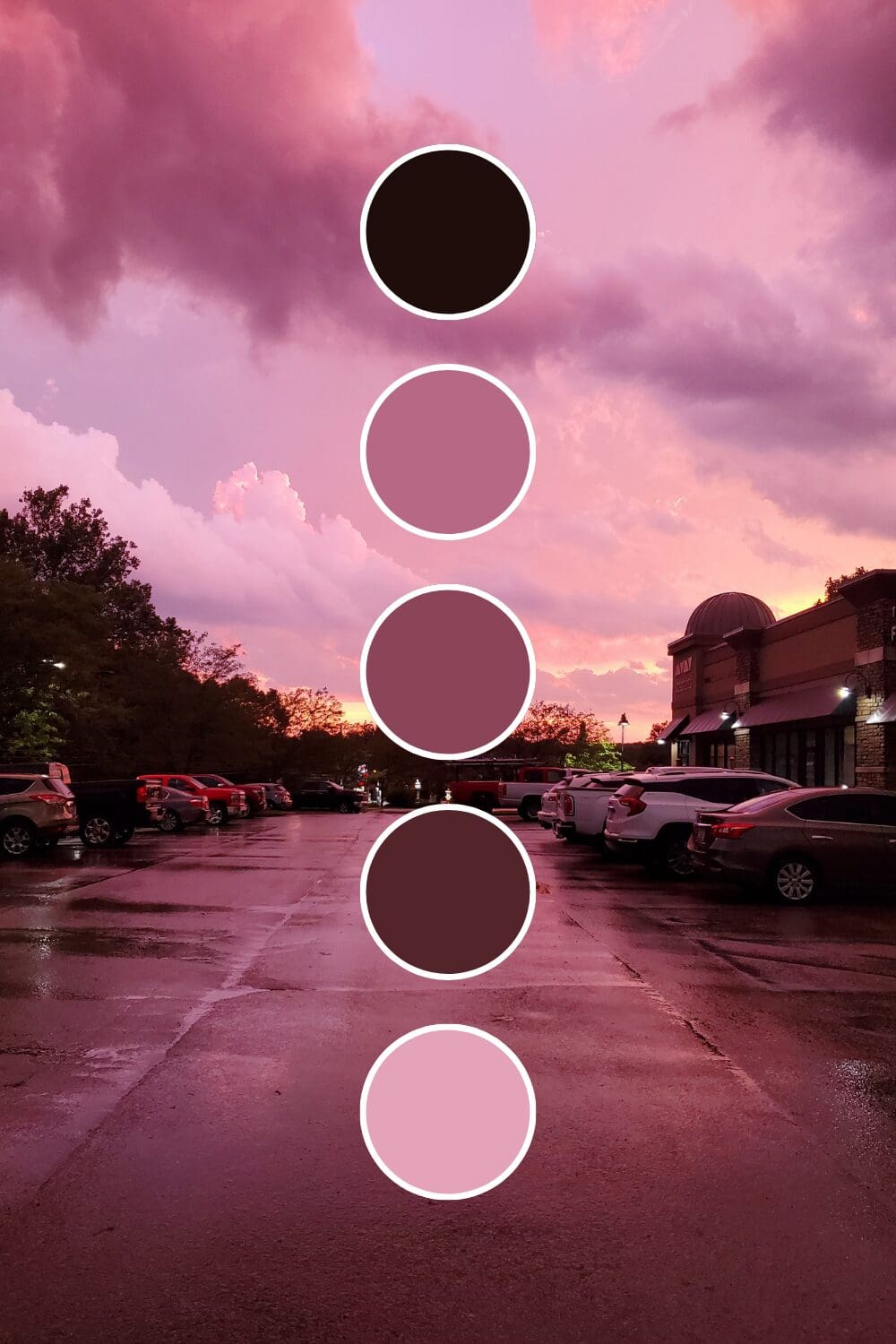
Finding Your Signature Purple Shade
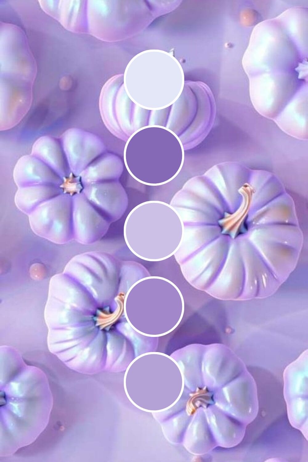
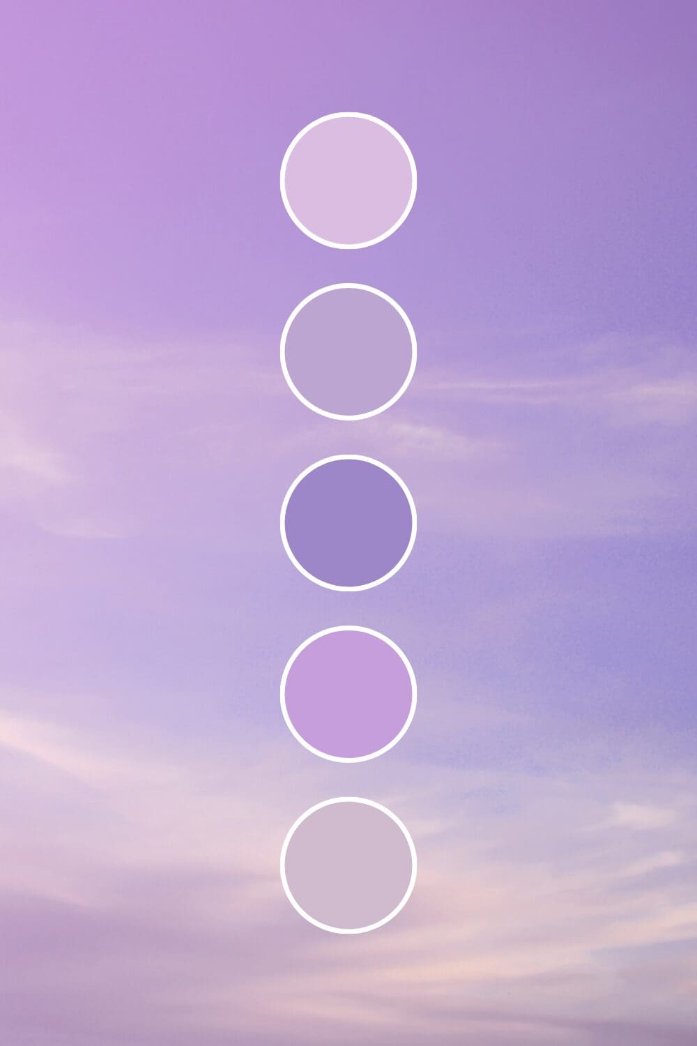
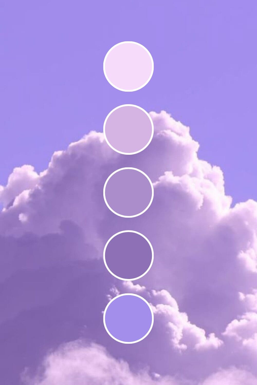
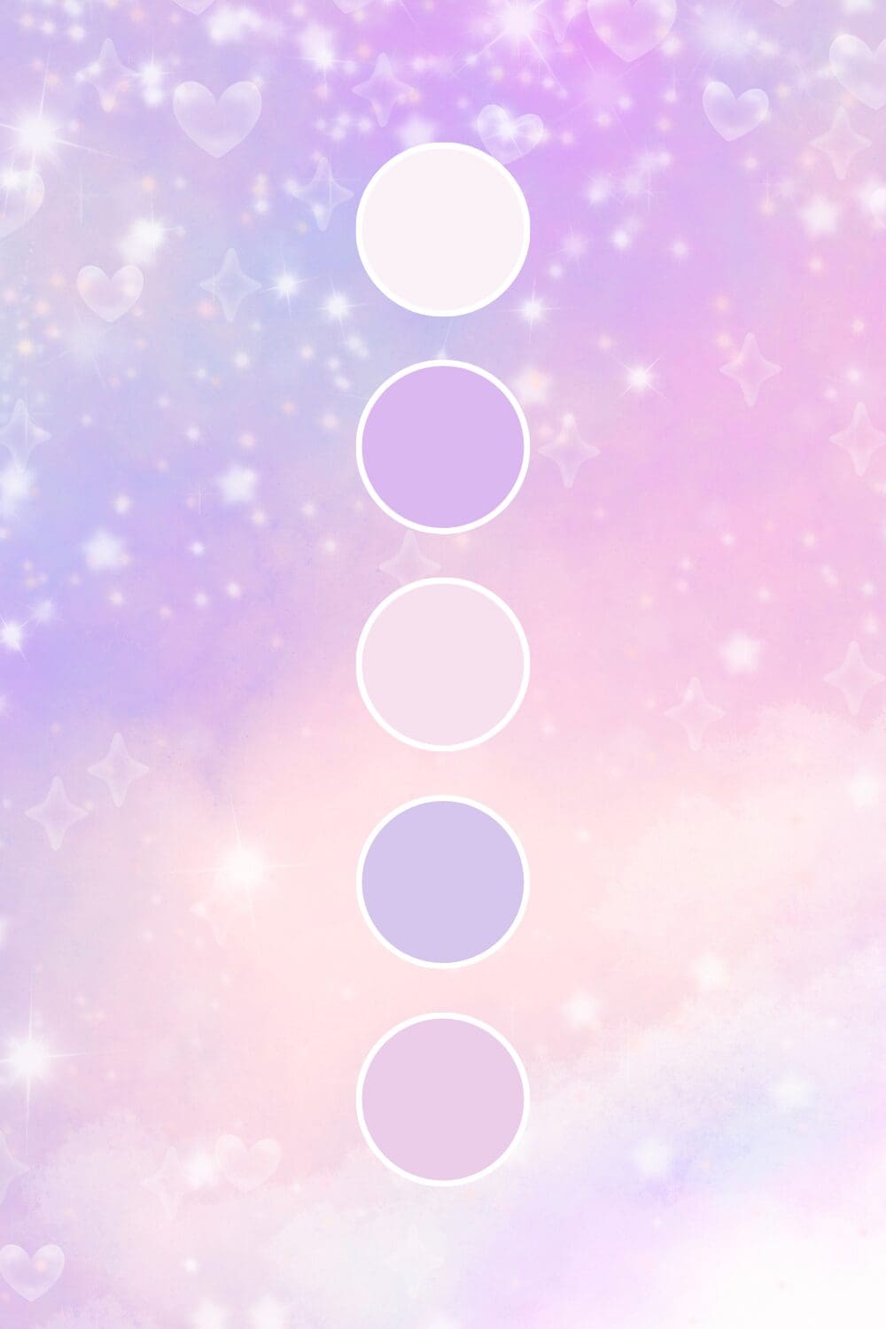
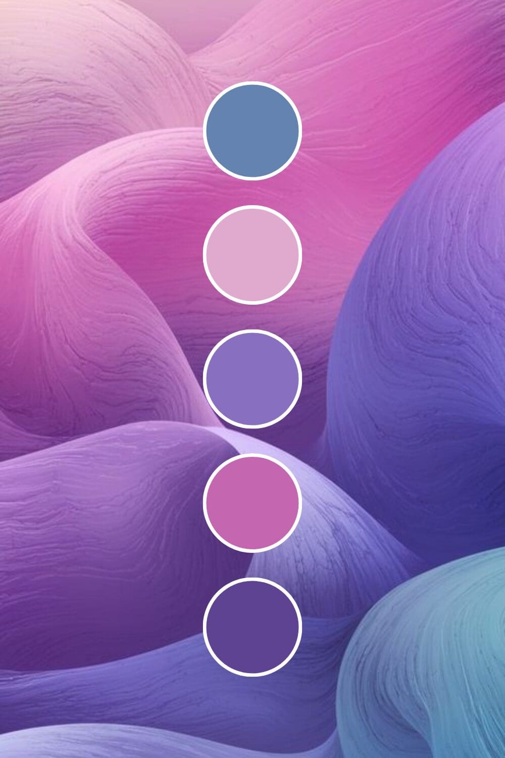
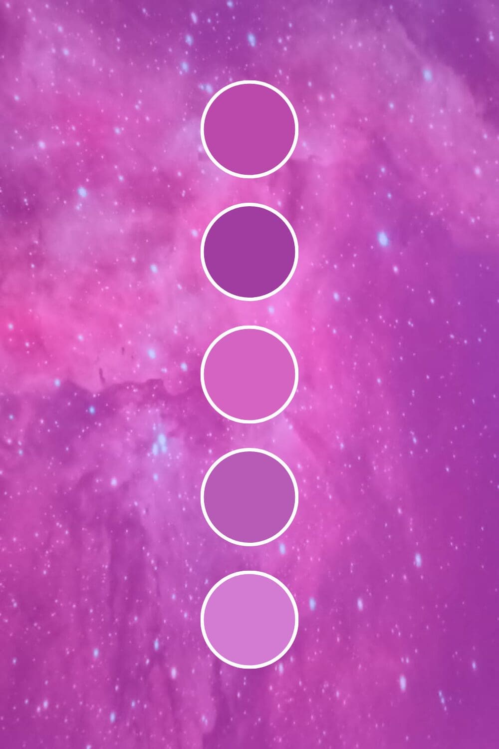
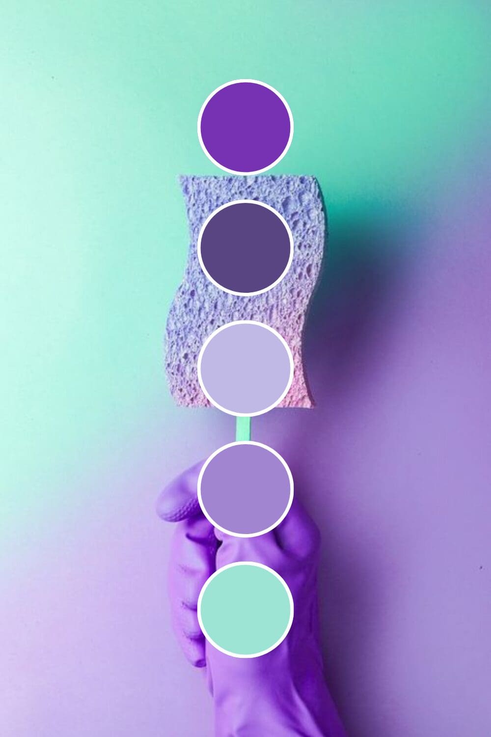
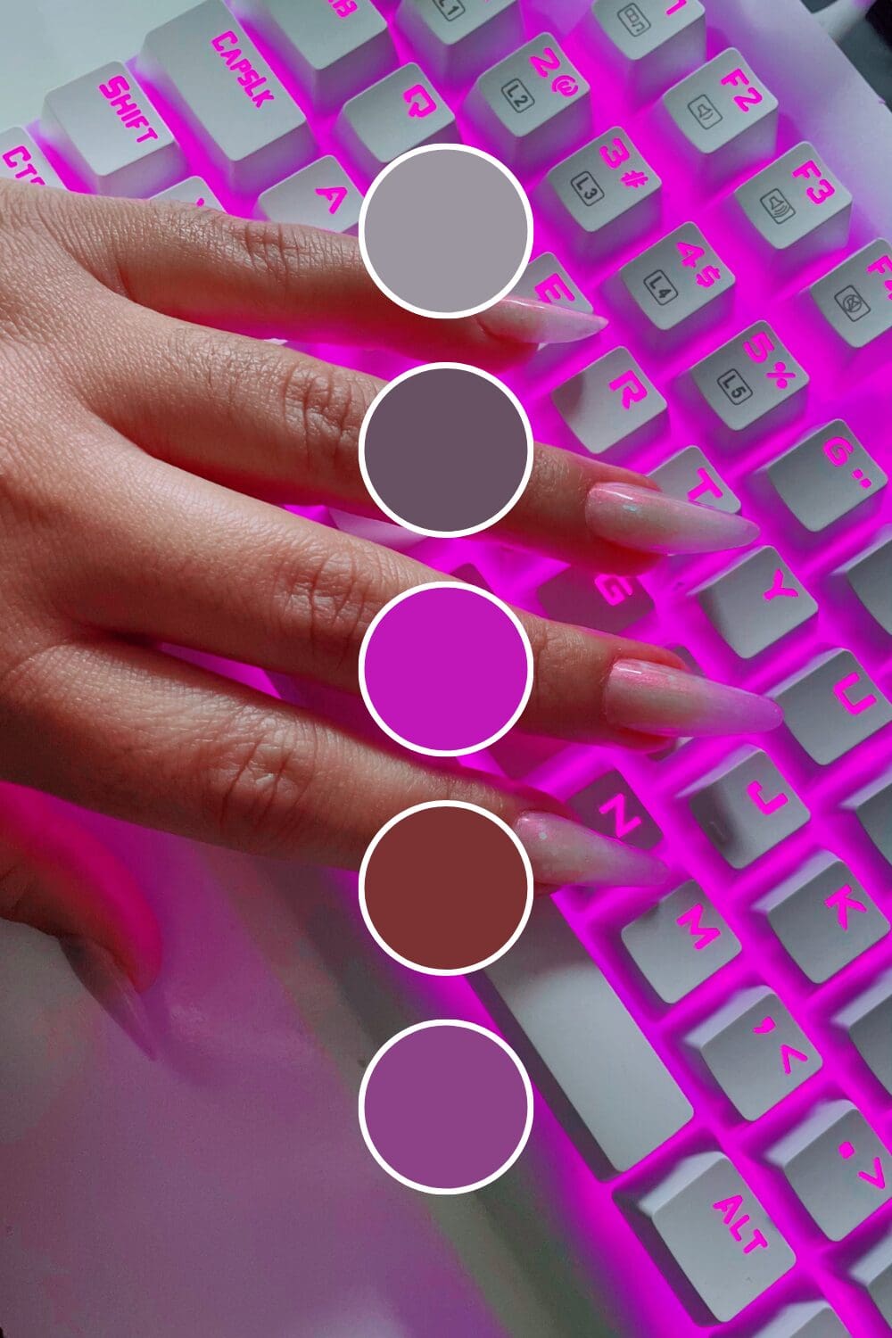
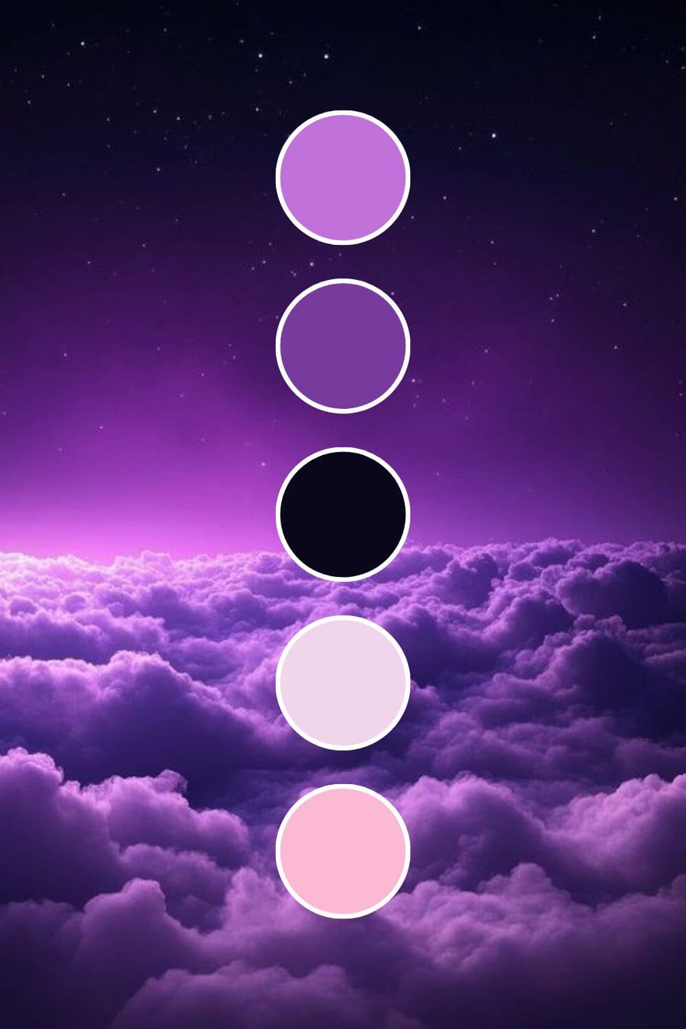
Purple isn’t a one-size-fits-all color, and that’s actually great news for your brand. Each shade tells its own story:
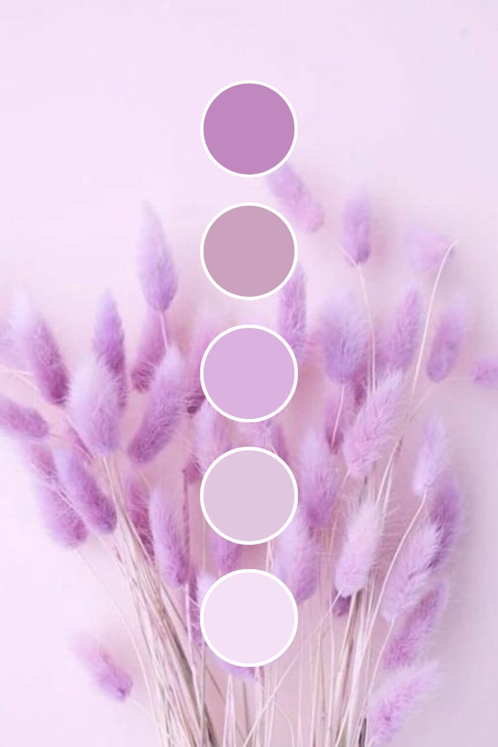
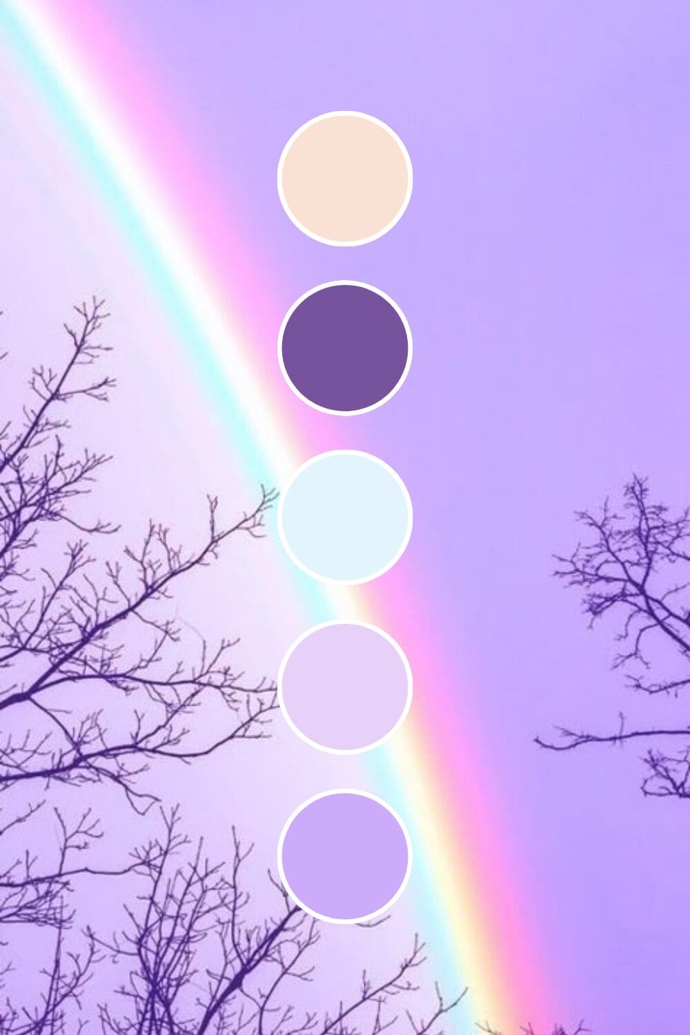
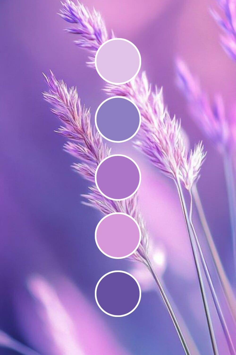
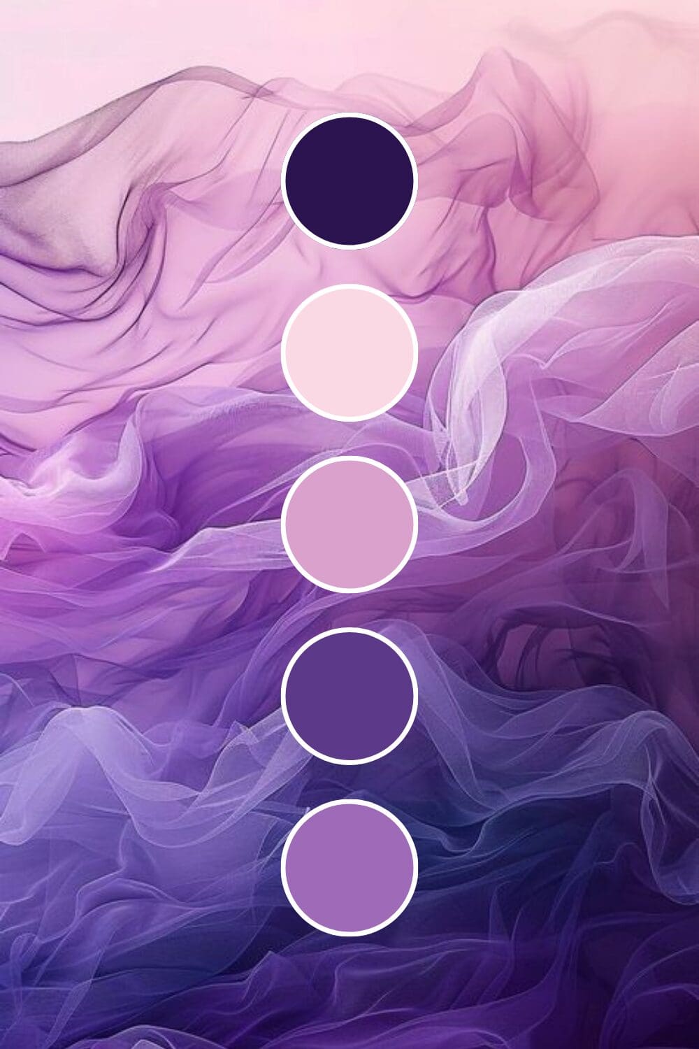
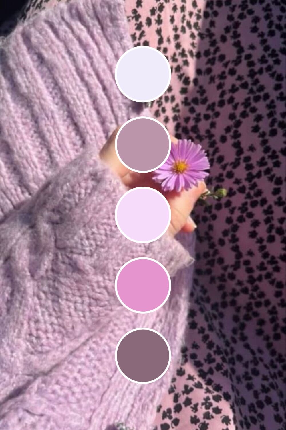
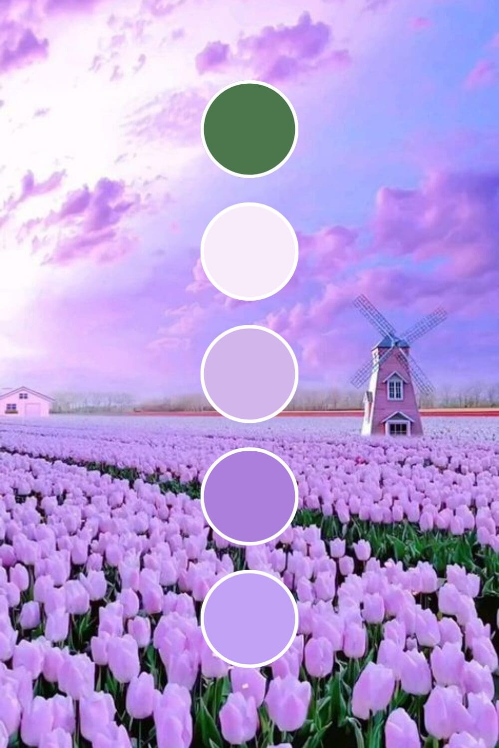
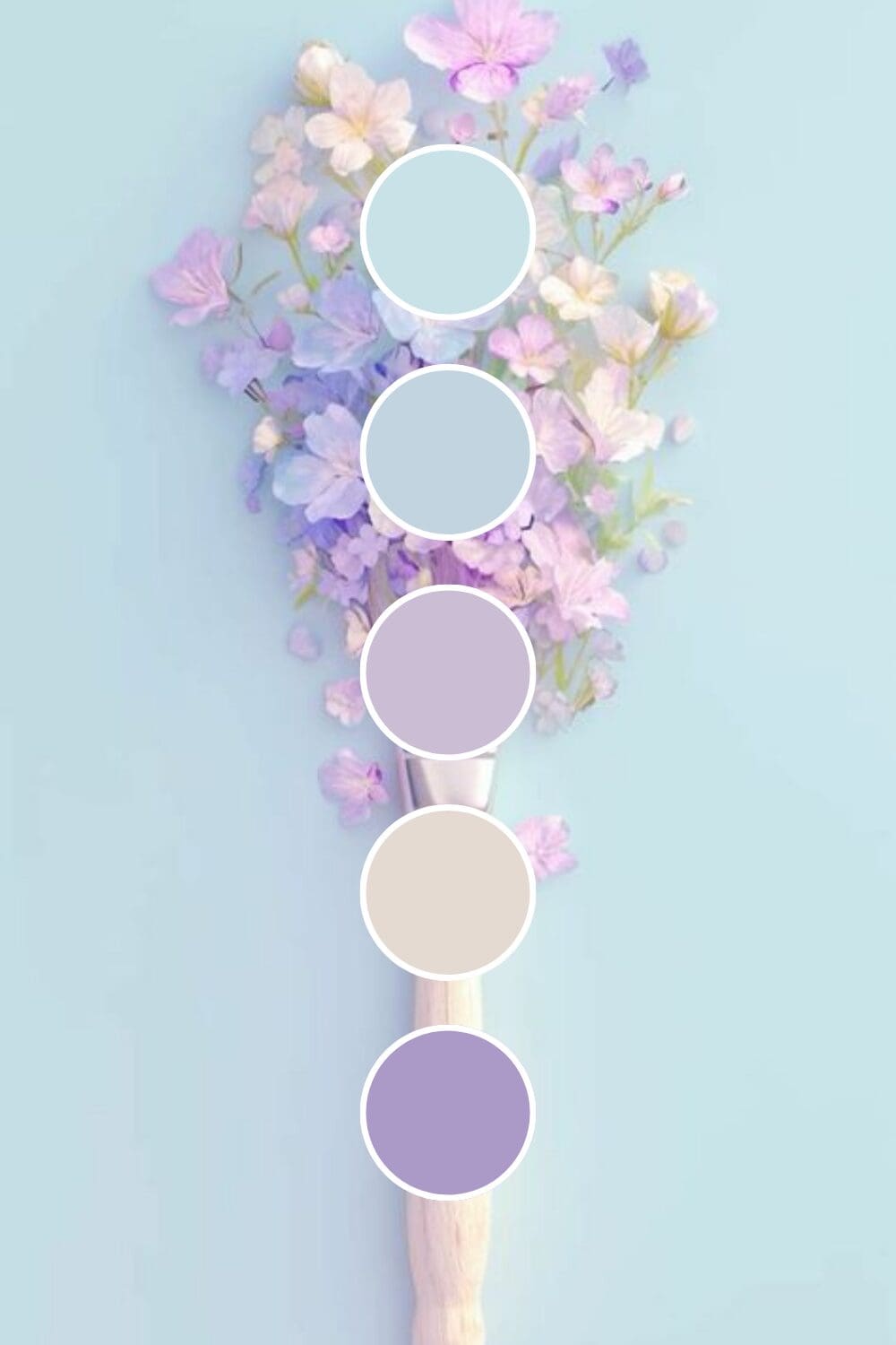
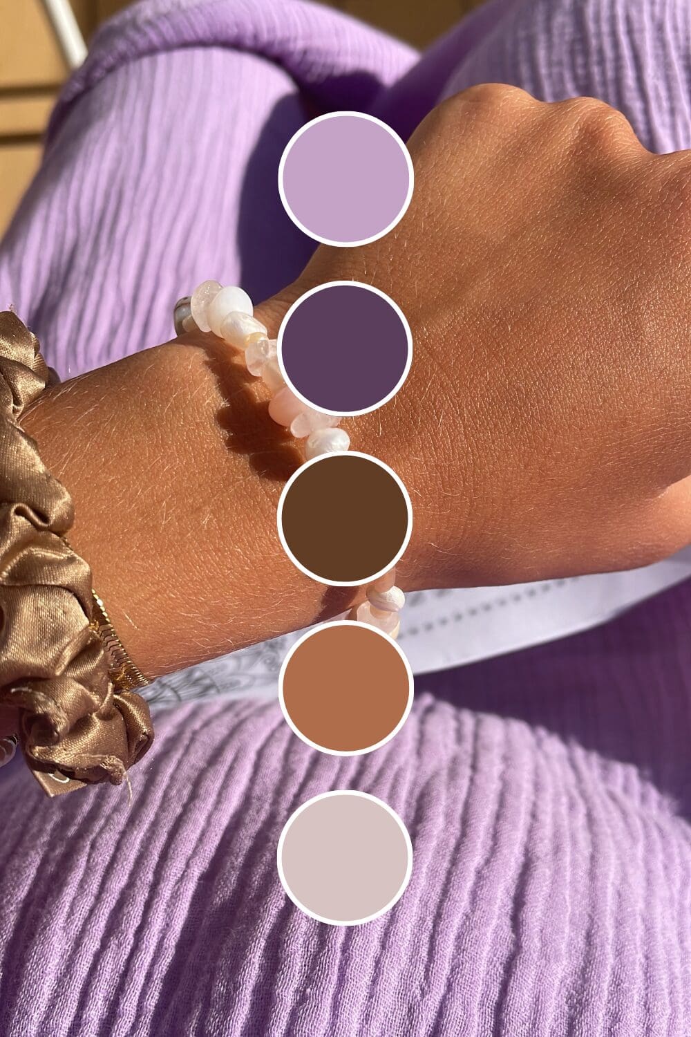
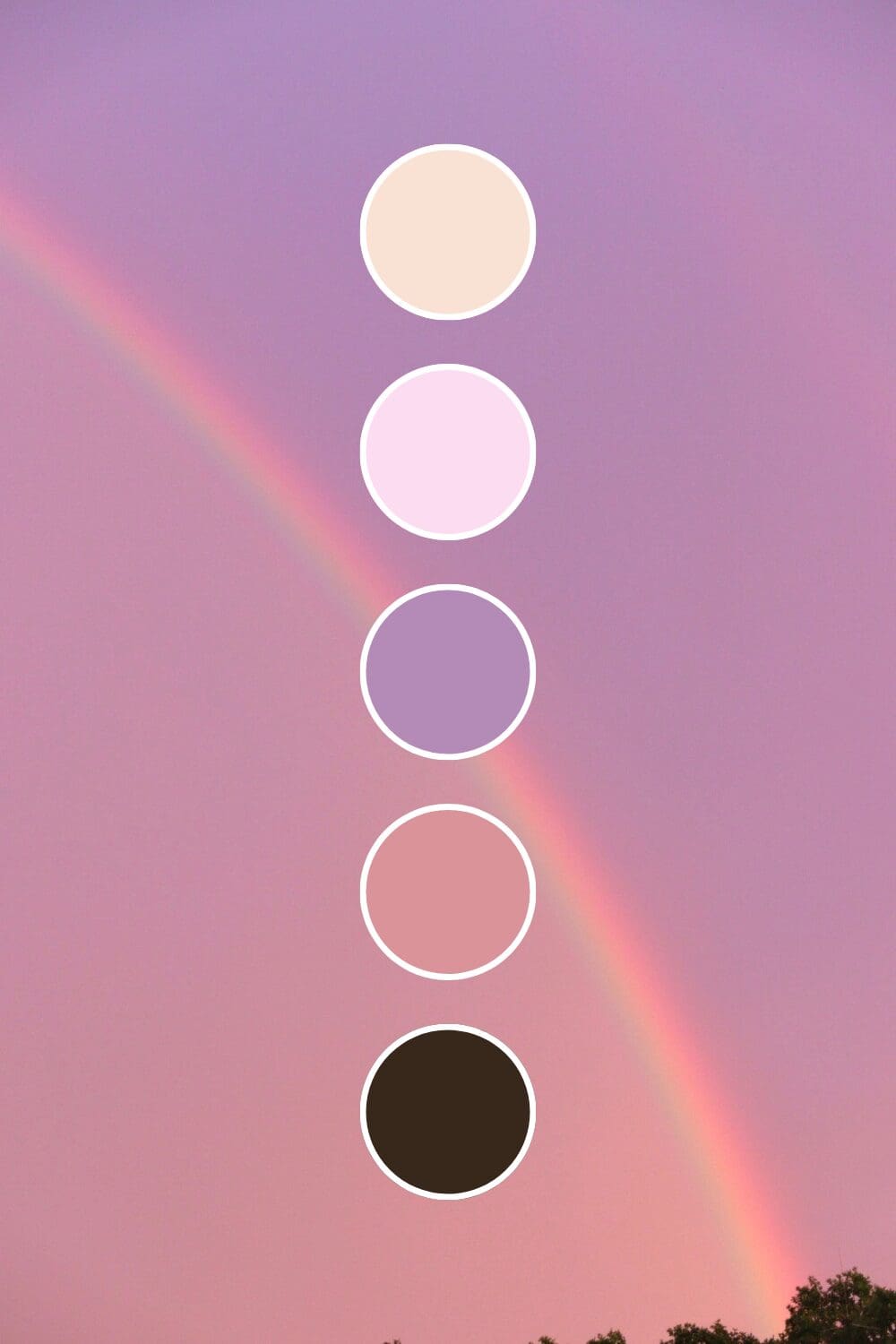
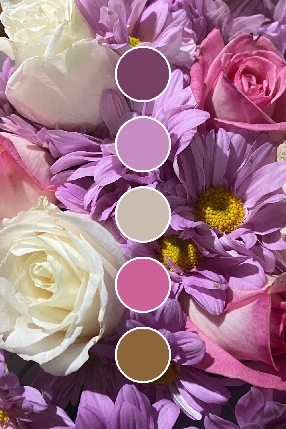
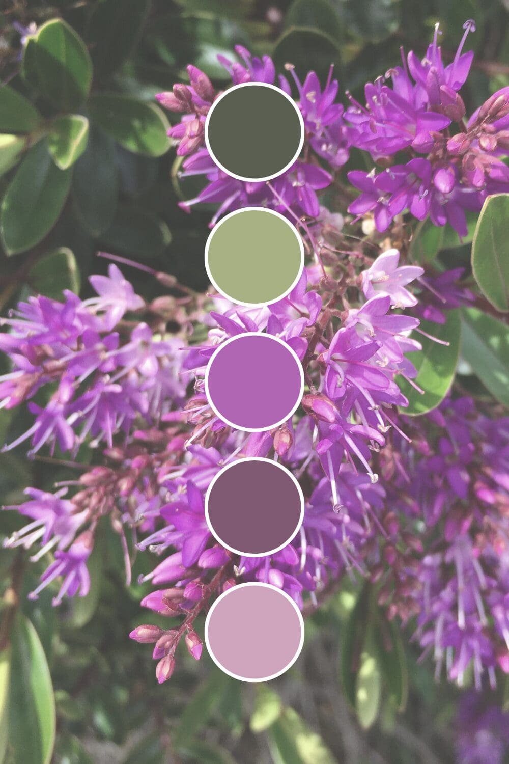
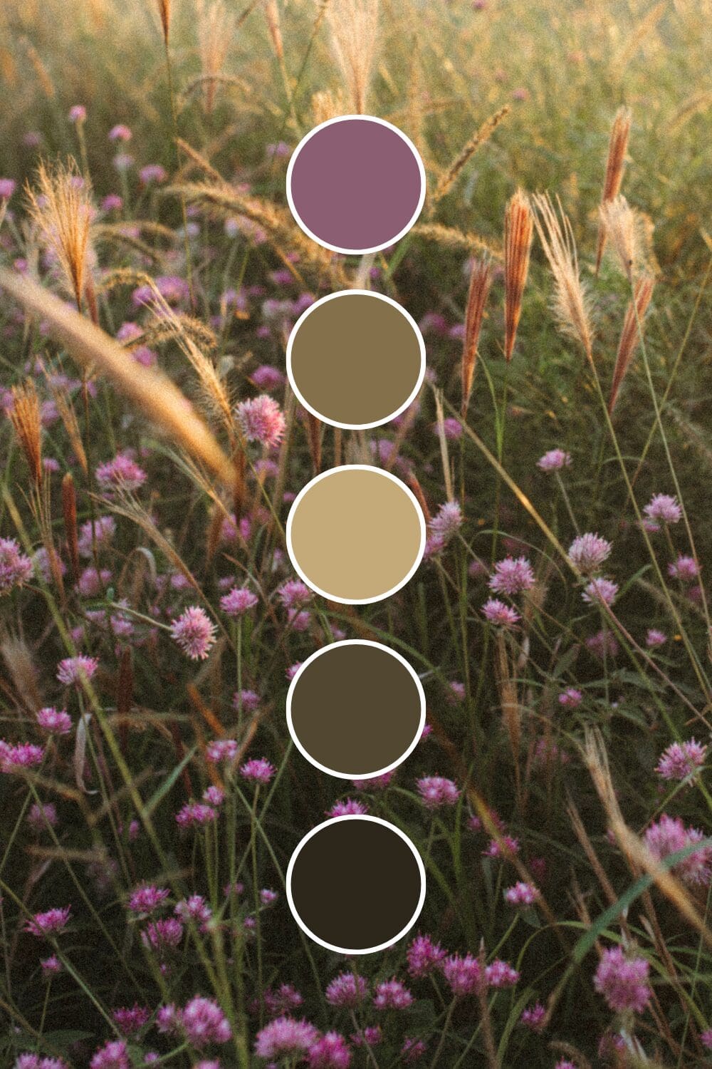
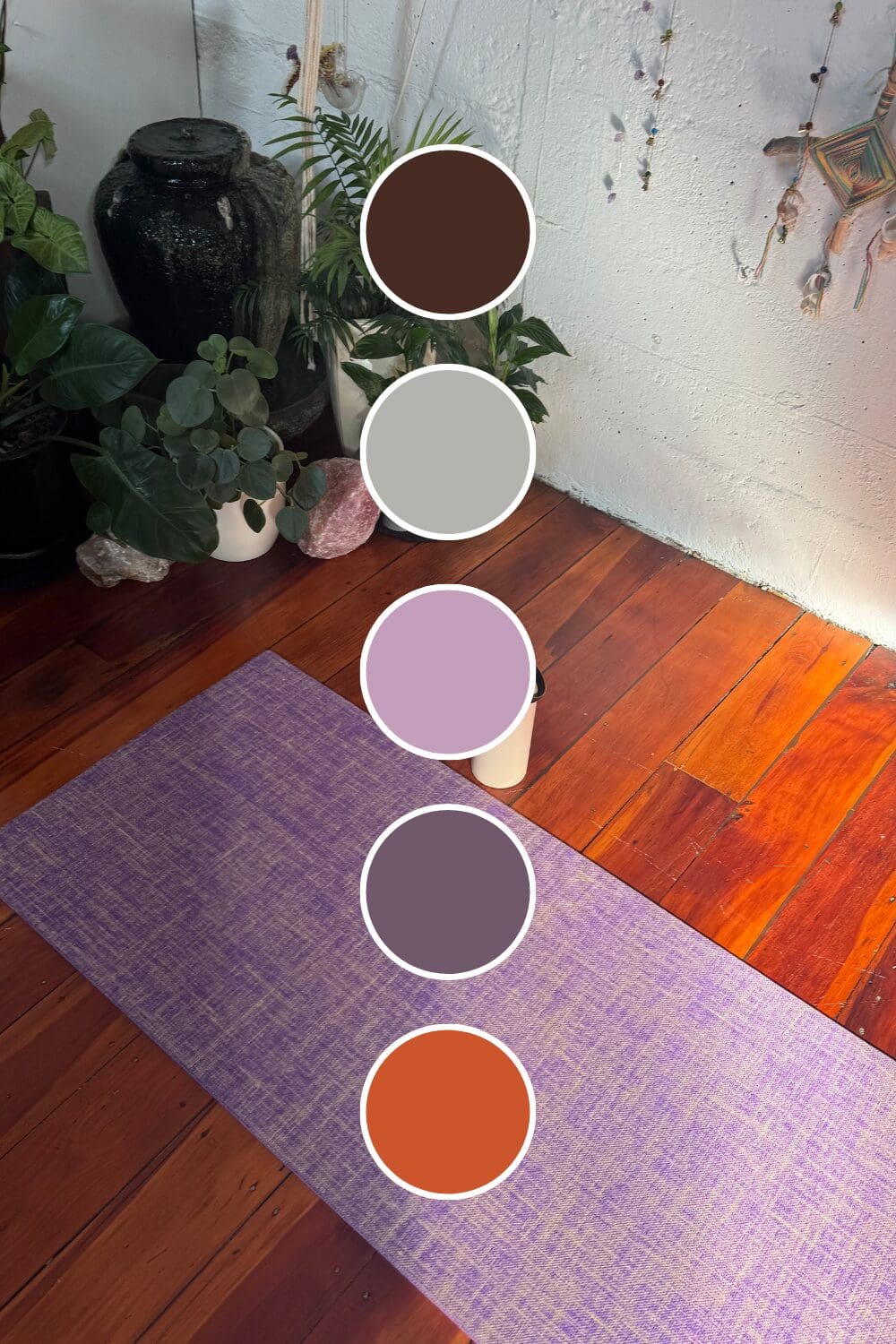
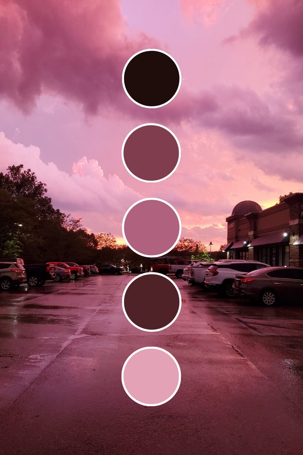
Lavender feels calming and approachable. Wellness coaches and therapists love this because it puts people at ease while suggesting gentle transformation.
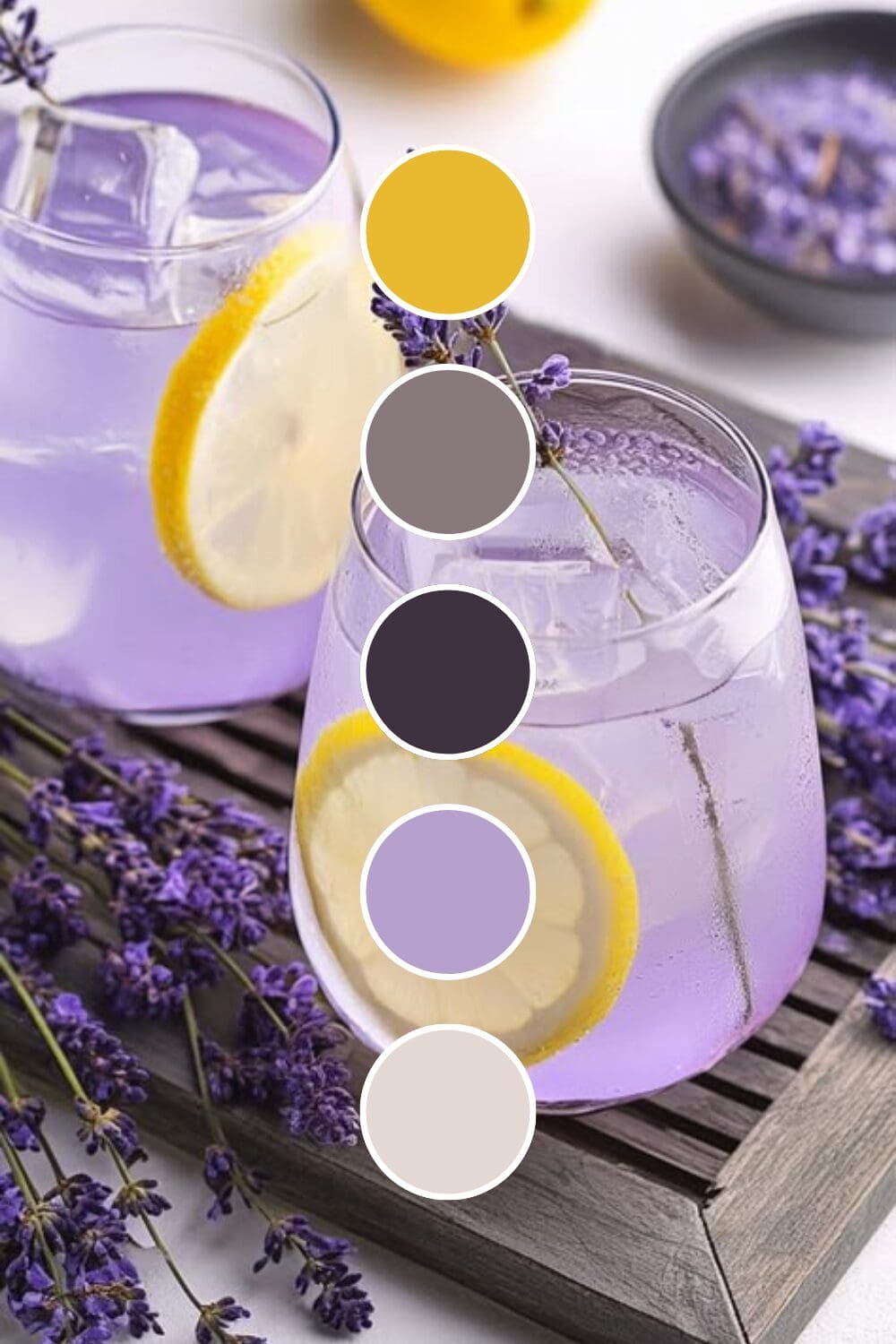
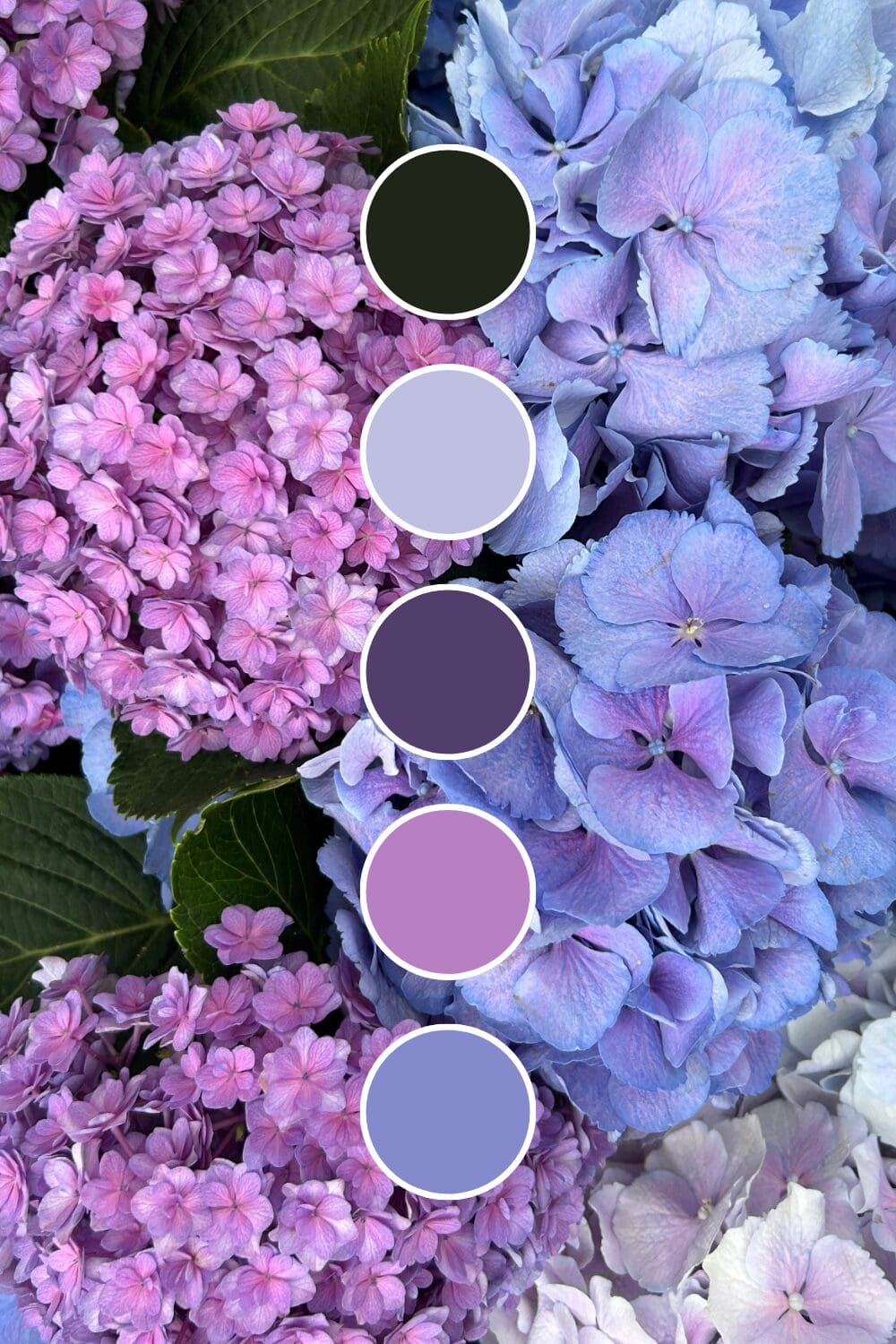
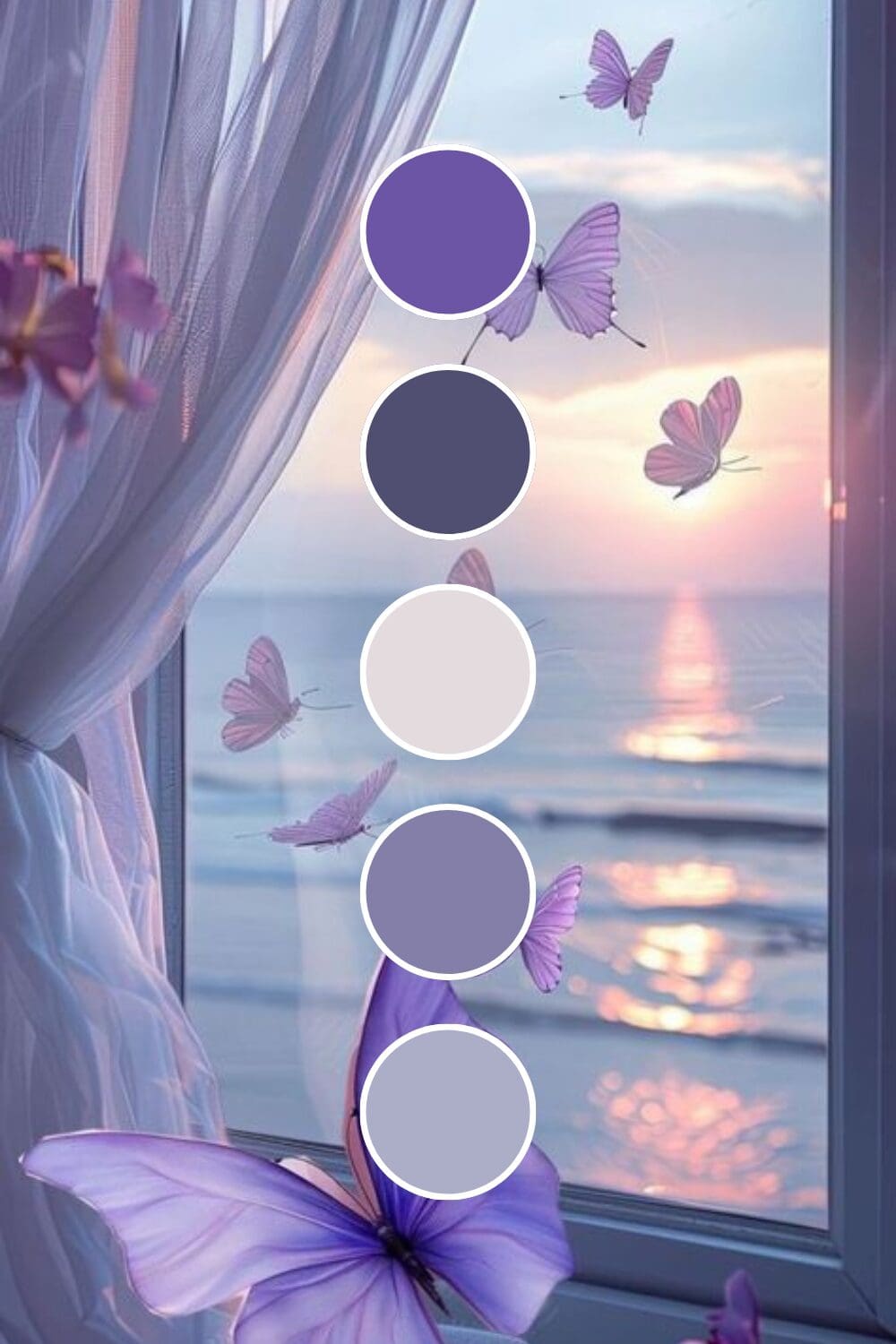
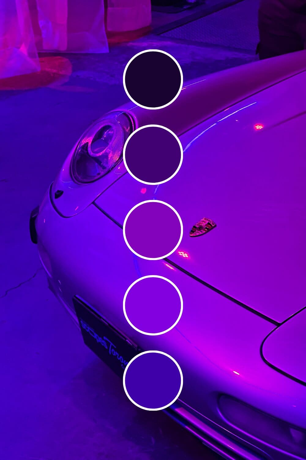
Amethyst brings spiritual depth and premium positioning. Life coaches and healers often choose this when they want to attract clients ready for deep work.
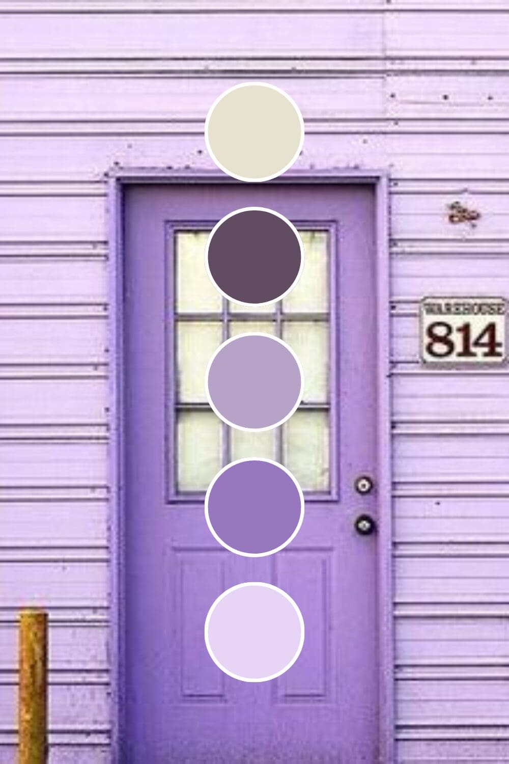
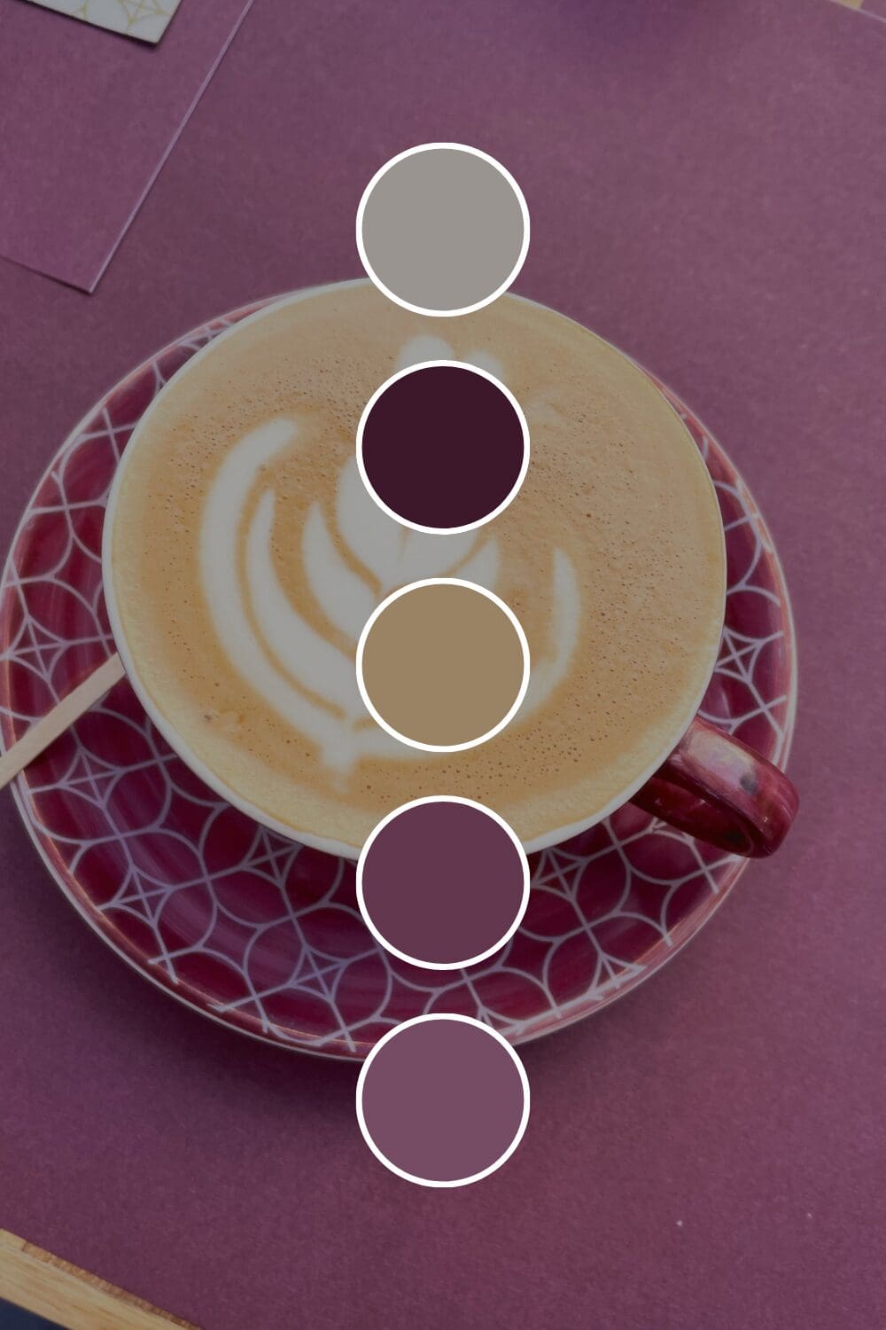
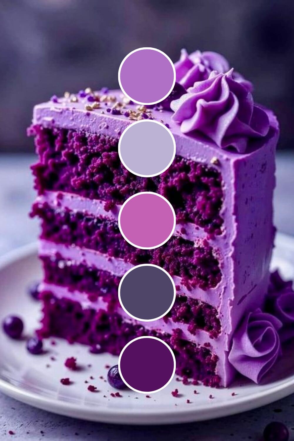
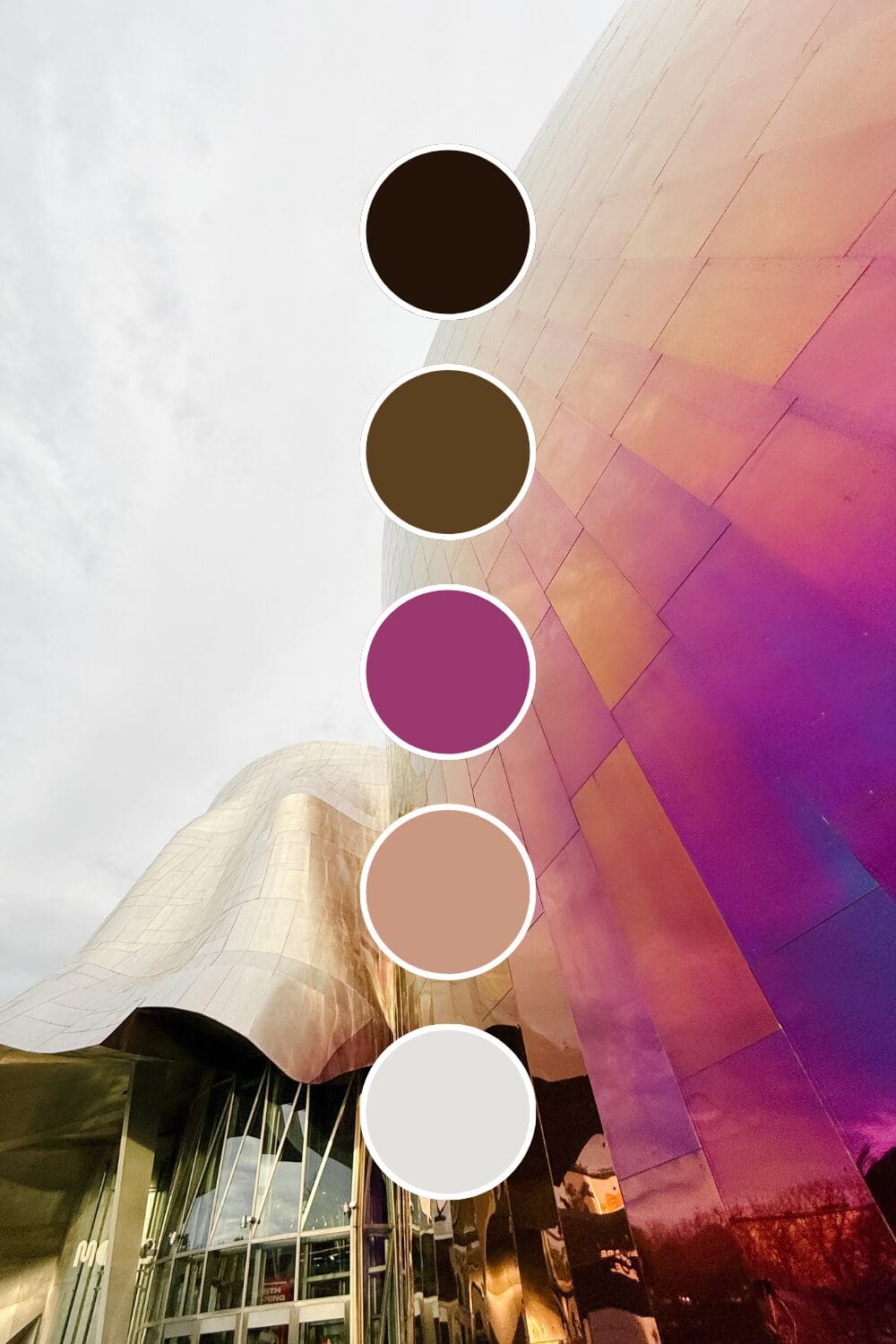
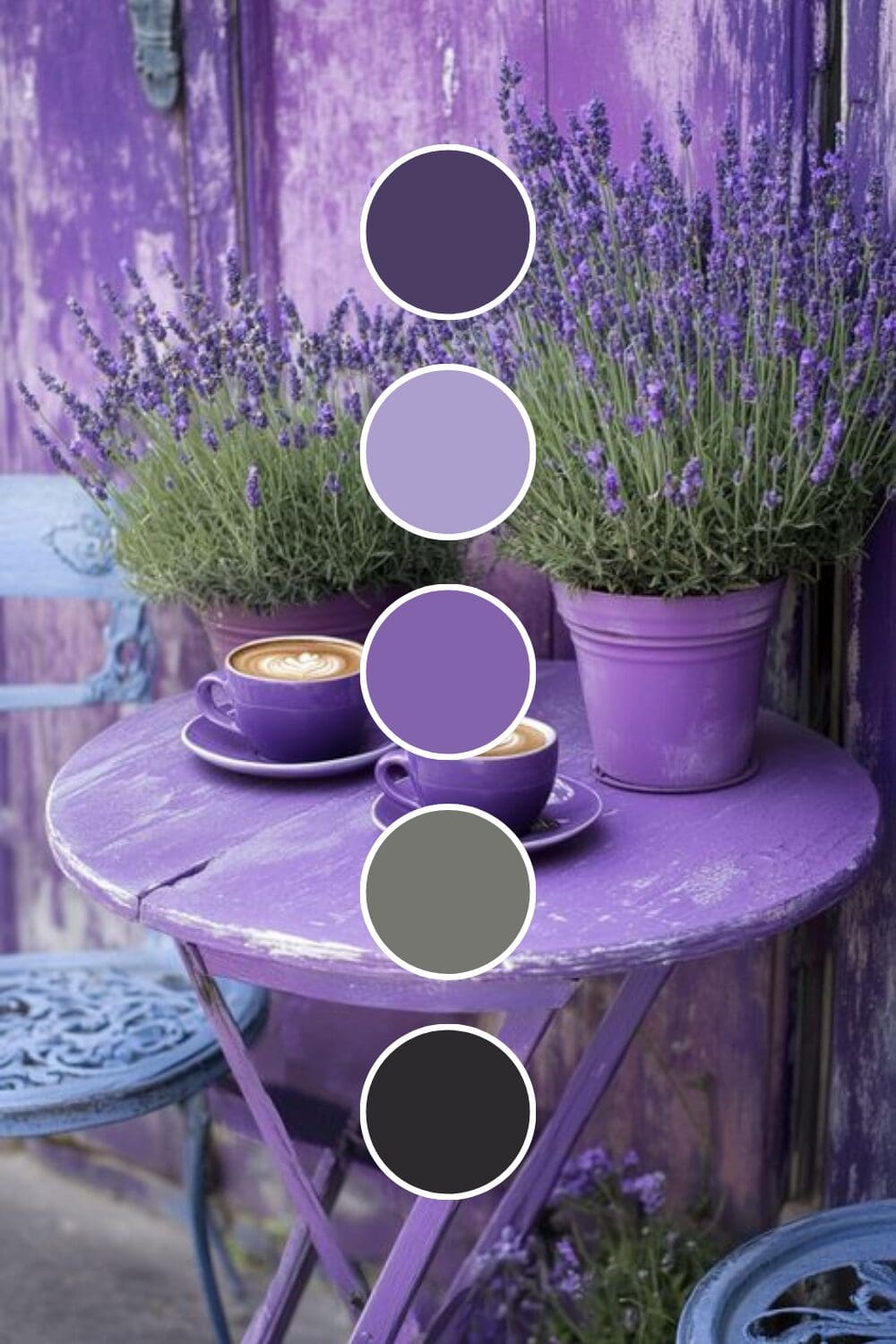
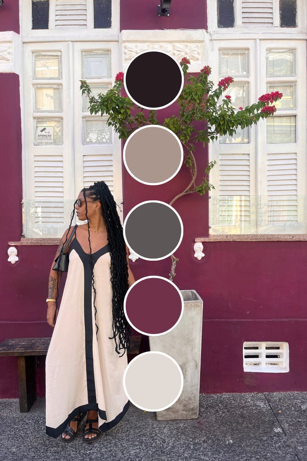
Plum Purple suggests established sophistication. Business consultants and executive coaches gravitate toward this because it feels both professional and unique.
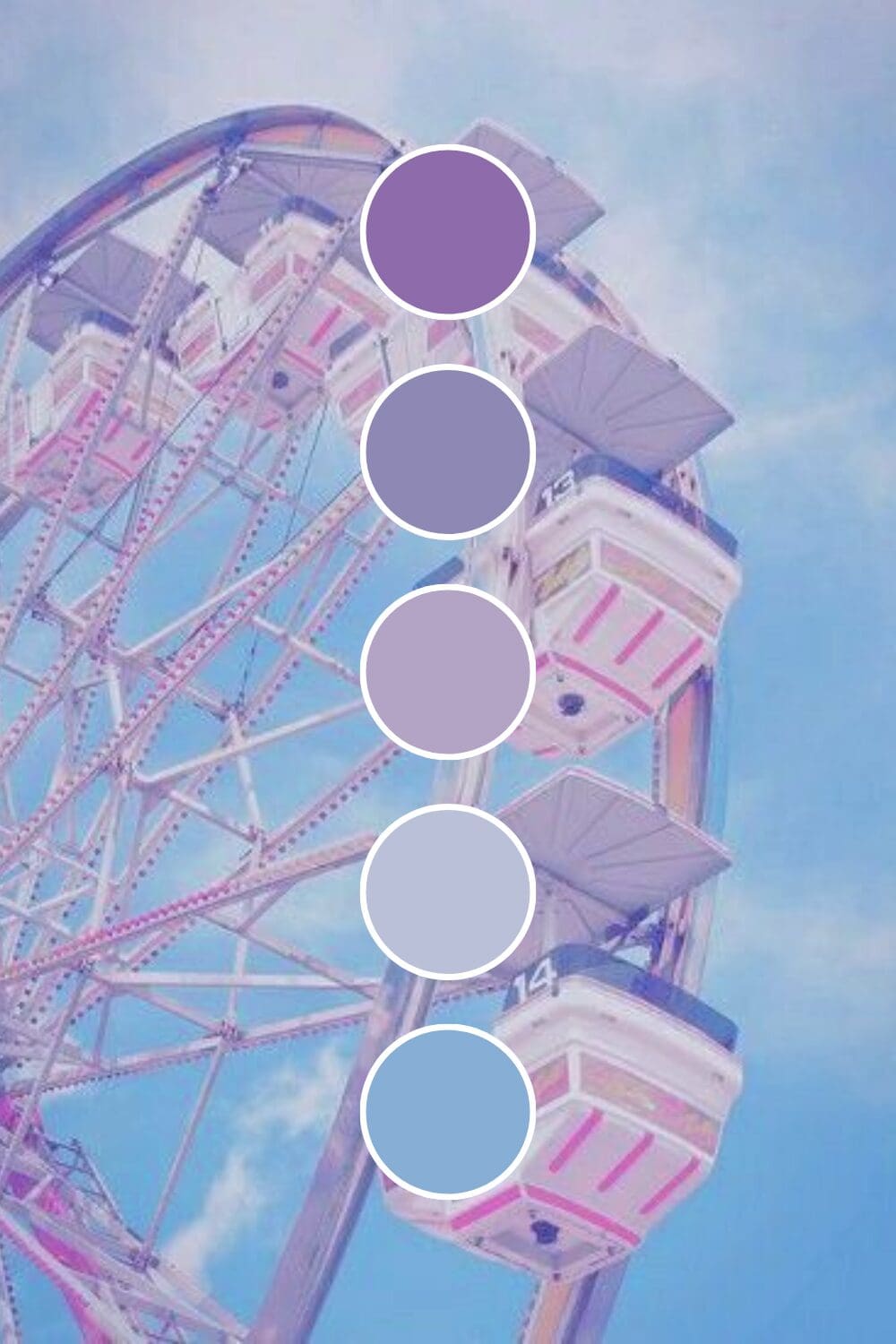
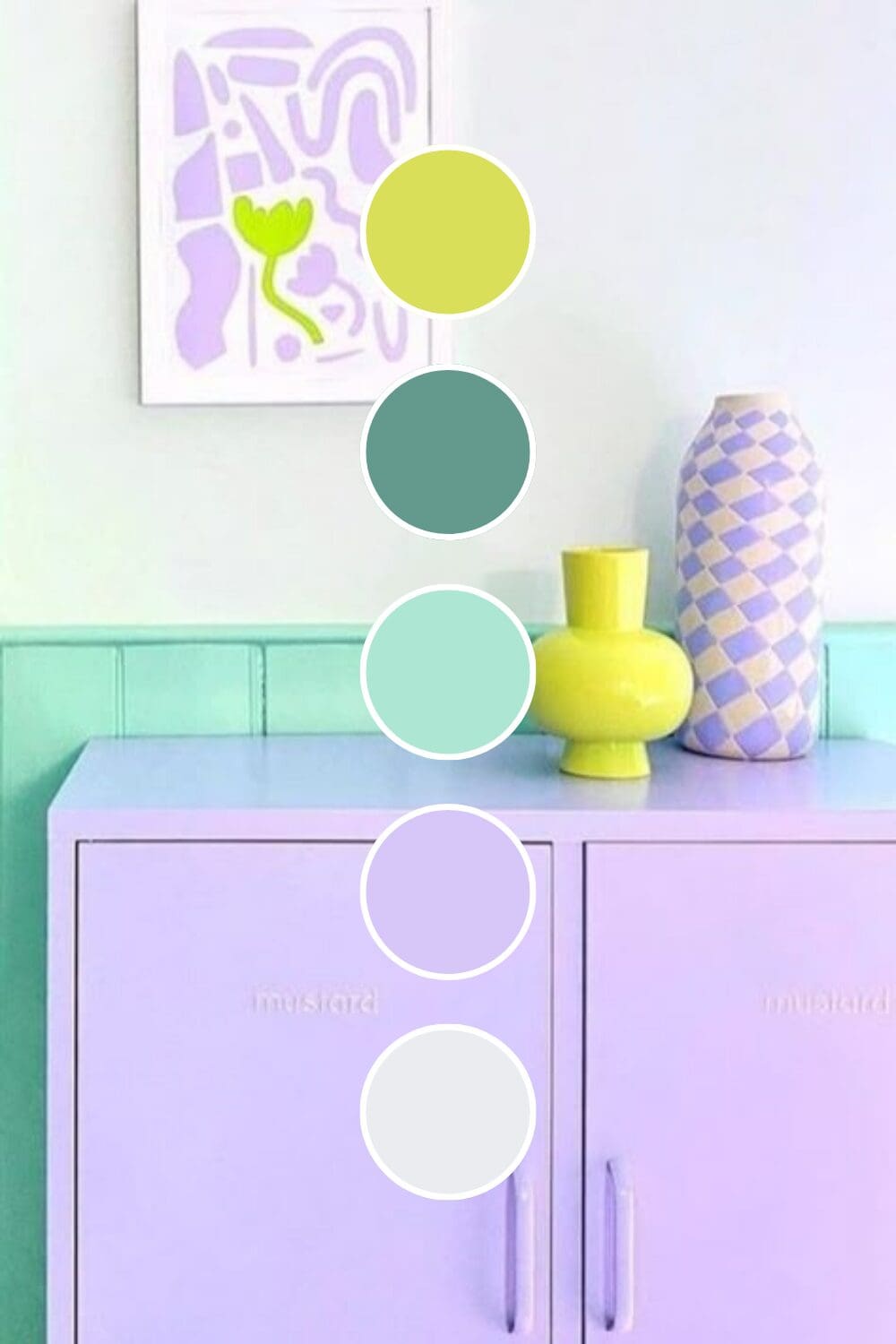
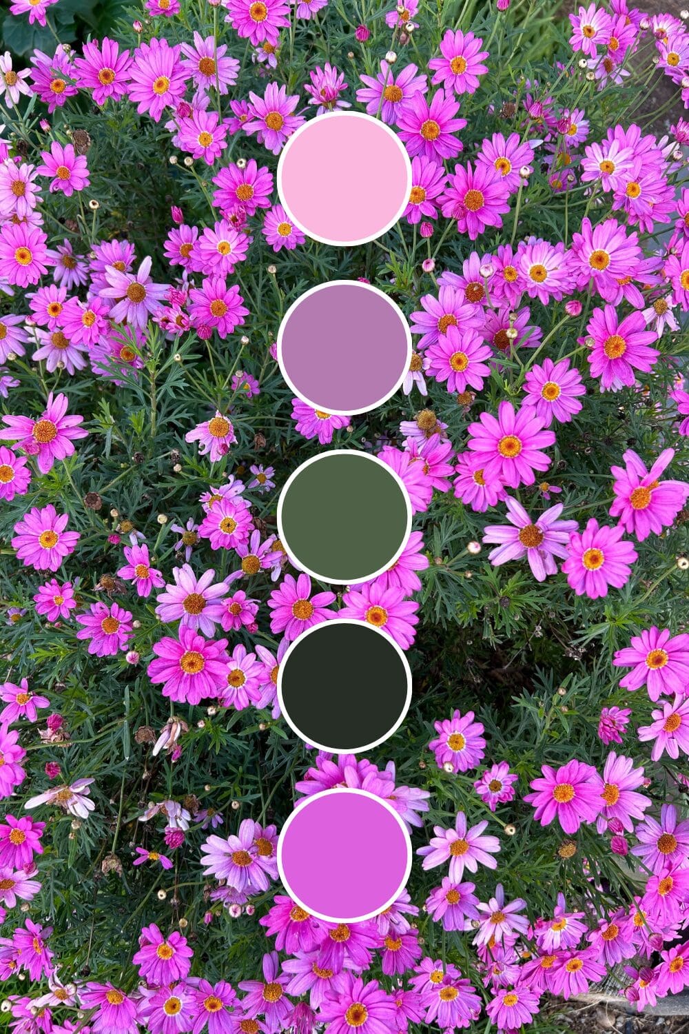
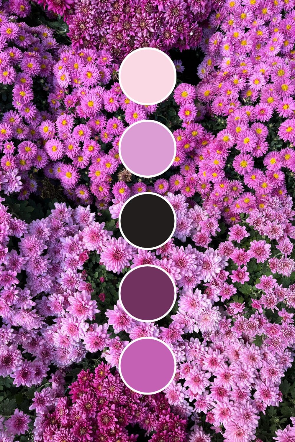
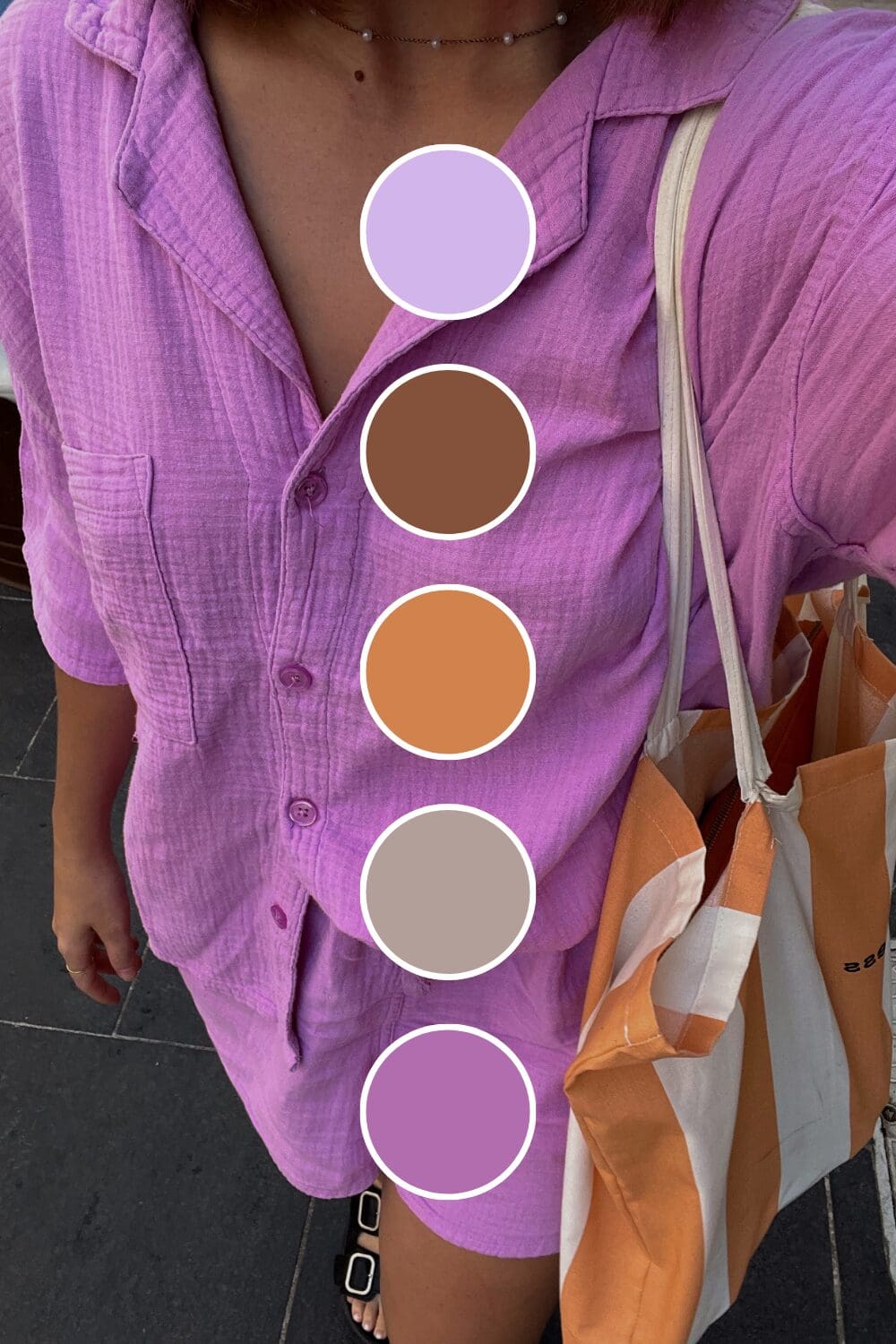
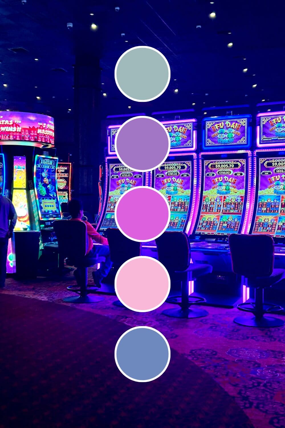
Orchid Purple adds feminine power without being overly soft. Female entrepreneurs often choose this when they want to stand out while maintaining authority.
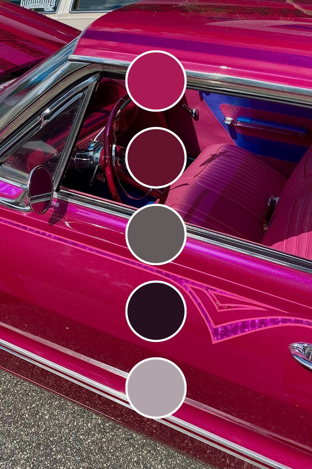
Royal Purple doesn’t apologize for taking up space. Thought leaders and industry experts love this because it commands respect immediately.
Starting with one powerful purple foundation might feel bold, but it’s exactly how the most memorable premium brands begin. You’ve got this!
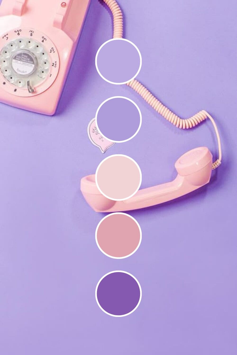
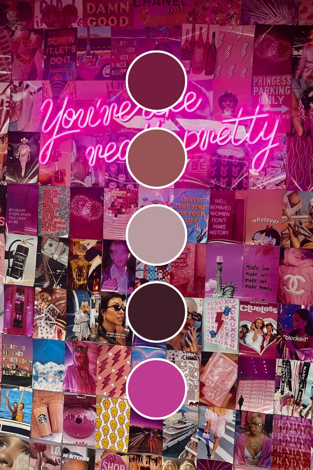
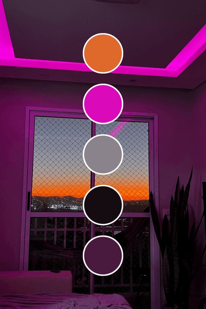
Color Combinations That Command Attention
This is where purple really shows its versatility. The right combinations can make your purple work for any industry:
The Sophisticated Standards
These combinations have been proven by successful premium brands:
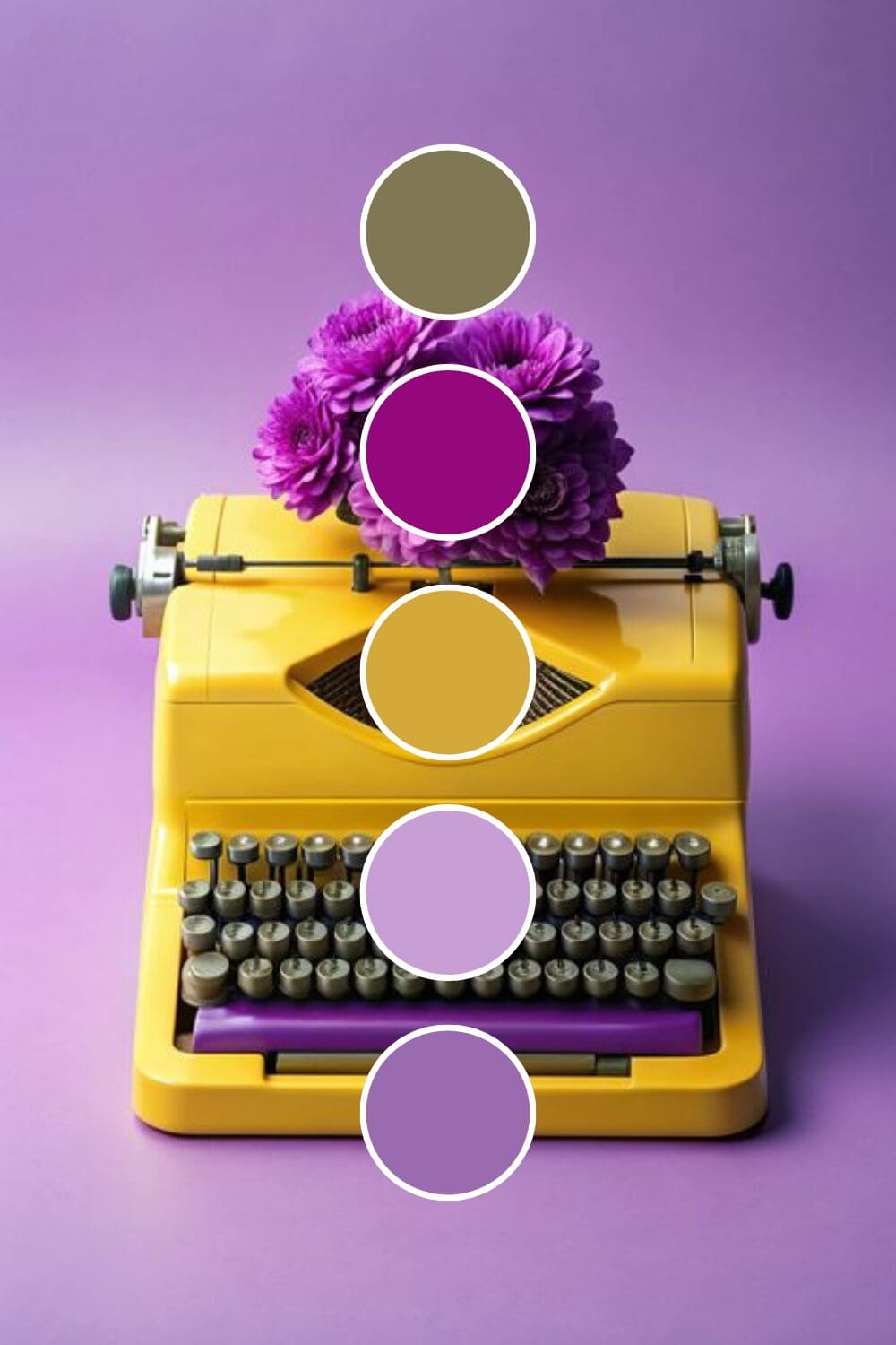
• Purple + Gold creates instant luxury that’s impossible to ignore.
• Purple + Cream brings elegant sophistication that photographs beautifully.
• Purple + Silver suggests innovation and premium quality.
• Purple + White feels clean and high-end (perfect for wellness and consulting).
The Unexpected Powerhouses
Here’s where you can really set yourself apart (and these often convert better because they’re memorable):
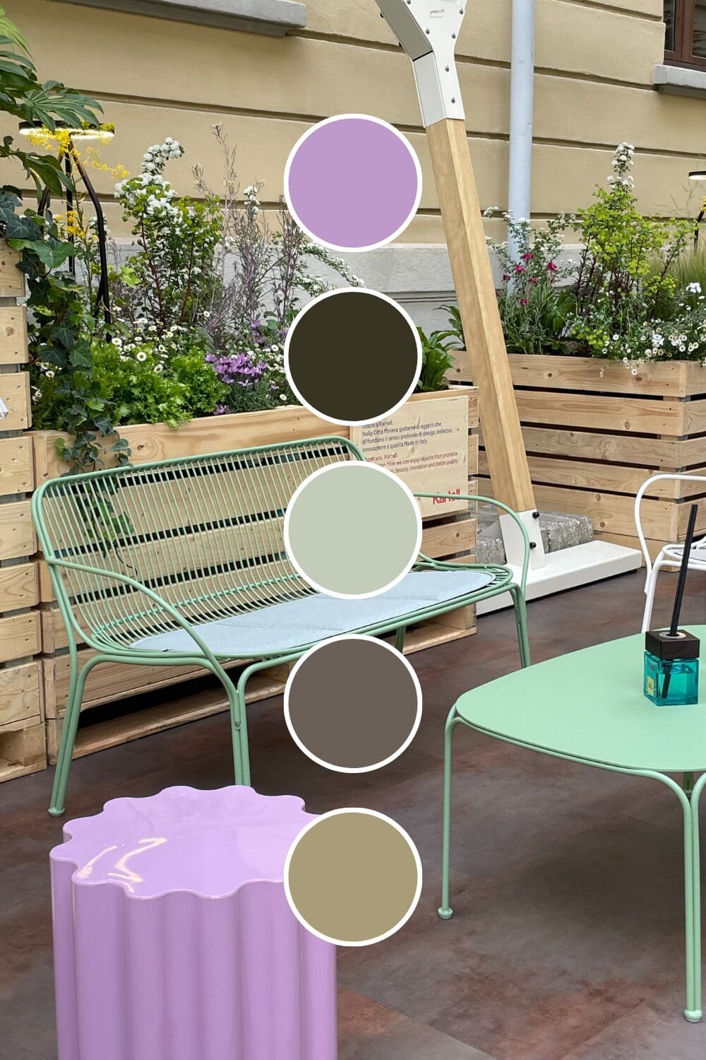
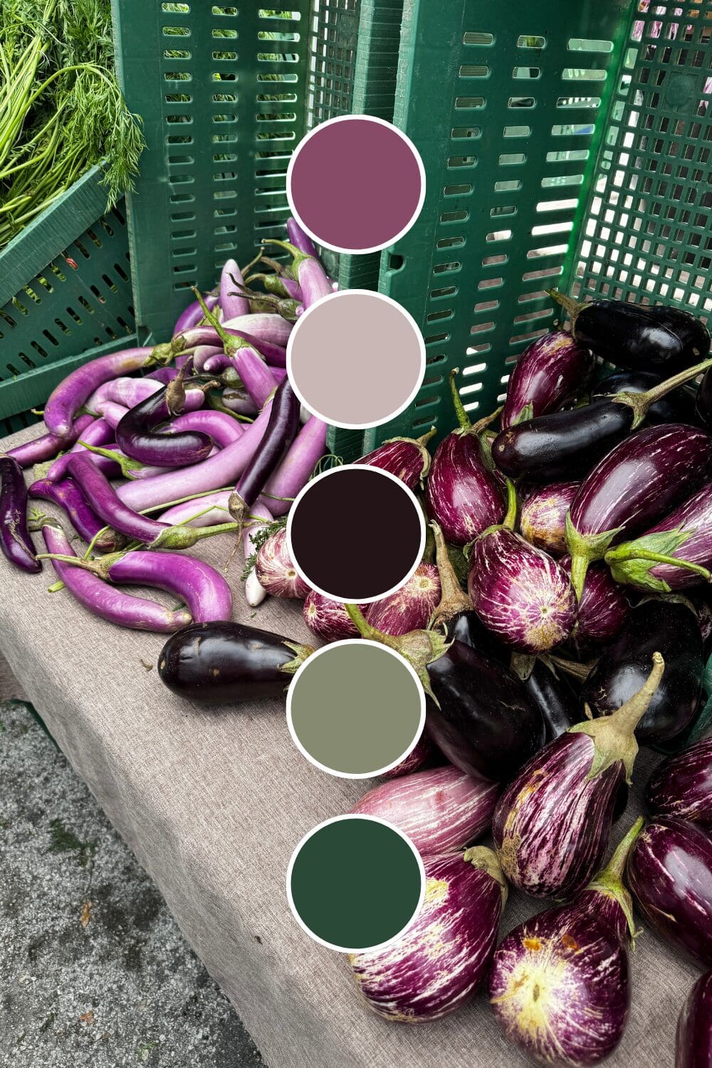
• Purple + Sage Green creates natural luxury that feels both grounded and elevated.
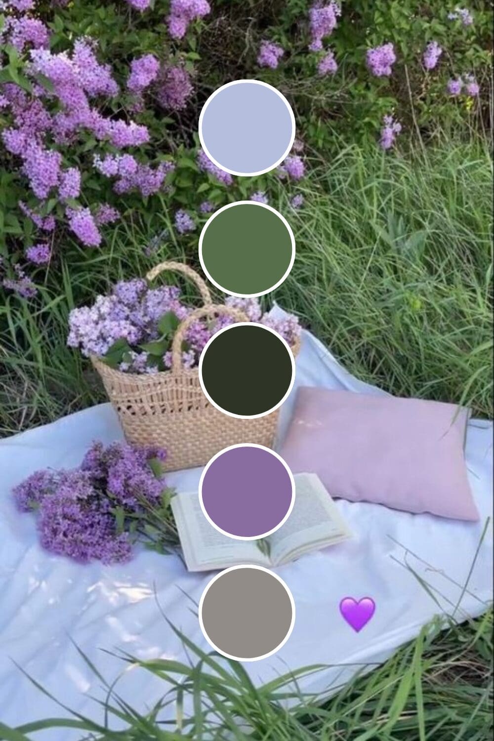
• Purple + Blush Pink brings feminine sophistication that’s both powerful and approachable.
• Purple + Charcoal Gray offers modern elegance that works across industries.
• Purple + Warm Beige creates approachable luxury that doesn’t intimidate potential clients.
Just between us, these unexpected combinations often perform better than the obvious choices because they stick in people’s minds longer.
Creating Your Premium Color System
Your brand needs to feel intentional and cohesive. Here’s my proven formula for purple palettes that work:
- Select your main purple – choose one that matches your positioning and personality
- Pick 1-2 complementary colors that enhance purple’s sophistication
- Include neutral grounding colors (cream, white, or soft gray work perfectly)
- Test everything together across all your brand touchpoints
Purple can shift dramatically under different lighting. Always check your colors on various devices and in different environments before making your final decision.
Consistency is everything. Your website should feel seamlessly connected to your social media, which should align with your proposals and business cards.

Where Purple Creates the Most Impact
Purple isn’t just for spiritual businesses (though it certainly works there). I’ve seen it transform:
• High-ticket coaching where premium positioning is essential
• Creative agencies that need to showcase both innovation and reliability
• Wellness brands targeting clients ready to invest in transformation
• Consulting services where expertise needs to be obvious immediately
• Personal brands for women wanting to stand out while maintaining sophistication
This works especially well if you’re ready to move from competing on price to competing on value. Purple helps justify premium pricing like no other color can.
Addressing Purple Concerns (Because I Know You Have Them)
Let me tackle the most common hesitations I hear about purple:
“Won’t it look too feminine?” – Pair with charcoal or navy for universal appeal.
“Is it too bold for my industry?” – Start with deeper, more muted purples that feel sophisticated rather than bright.
“What if it doesn’t feel professional?” – Purple has been associated with royalty and luxury for centuries – it’s inherently professional.
Remember, you’re not trying to appeal to everyone. You’re trying to attract clients who value quality and are willing to invest in results.
Your Purple Brand Transformation Starts Now
Ready to explore purple in your brand? Here’s how to test the waters without diving in completely:
Week 1: Add purple accents to your social media templates.
Week 2: Create one marketing piece using your purple palette.
Week 3: Update your email signature with purple elements.
Week 4: Get honest feedback from colleagues and trusted clients.
You don’t need to overhaul everything immediately. The most important thing is to start experimenting and notice how purple makes you feel about your own brand.
Here’s something exciting to think about:
What if this time next year, people associated your brand with premium quality and sophisticated expertise?
These possibilities are absolutely within your reach. Sometimes the most sophisticated move is the one that feels slightly outside your comfort zone – and that’s exactly where the magic happens!

-high fidelity-3x")


")
